|
|

These topics help you understand how to use QPM monitoring to analyze the effect of your QoS policies on your network traffic. By graphing traffic based on how it matches the filters in your policies, QPM helps you see the types of traffic on your network as well as how the traffic is modified by the policies. This can help you adjust your policy definitions to obtain the desired impact on traffic.
QPM monitors traffic based on the QoS policies that have been distributed to network interfaces using QPM. QPM cannot monitor traffic on interfaces that do not have QoS policies, or on interfaces where QoS policies have been defined by other means.
These topics help you understand QPM's monitoring capabilities.
QoS Analysis serves these main purposes:
You can monitor the traffic on any interface on which you have distributed QoS policies using QPM. These policies do not have to be created using QPM. If you already have QoS policies defined on your interfaces, you can use QPM to import the policies, and then have QPM redistribute the policies to the interfaces. This action does not change the policies on the interface; it simply makes QPM aware of the policies. It also lets you thenceforth use QPM to modify and redistribute these policies.
If you do not already have QoS policies defined, you can use QPM to create a set of QoS policies that do not affect traffic to categorize traffic and help you establish a baseline for the traffic on your network, as described in Lesson 4-1: Doing a Baseline Traffic Analysis. Or, if you already know what you want to do with QoS, you can create QoS policies that do affect network traffic and monitor the results, as described in Lesson 4-2: Monitoring QoS.
QPM has two types of monitoring: historical and real-time. Historical monitoring is best used when you want to collect a lot of data over several hours, days, or even months. Real-time monitoring is best used for immediate troubleshooting. Table 4-1 shows some differences between the types of monitoring.
| Characteristic | Historical | Real-Time |
|---|---|---|
Maximum number of interfaces monitored per task | 12 | 1 |
Disk space requirements | Substantial. See How Much Disk Space Is Required for Historical Monitoring? | No disk space used. Data is only presented on web page; it is not saved. |
Polling interval for data collection | From 1 to 60 minutes. | From 10 to 30 seconds. |
Length of task | Up to several months, depending on polling interval. QPM enforces a duration limit based on polling interval. See the User Guide for CiscoWorks QoS Policy Manager 3.0 for the specific limits. | As long as you want, but you must be at the computer to see the data. |
Reuse of monitoring task | Can only be run once, because you set a start and end time. | Can be rerun any time desired, because there is no set start or end time. |
Reviewing results | Can review the results as many times as you want. | Results must be reviewed as they are collected. |
Historical monitoring tasks can create a large amount of data. For example, an historical monitoring task for two interfaces that each have three policies (each with two conditions in the filter and one action), with a polling interval of 10 minutes, would generate approximately 600KB if run for 32 hours. The same task would generate 3000KB if the polling interval was reduced to 2 minutes.
These would both be considered small tasks. An historical monitoring task for 12 interfaces that each have six policies (each with one condition in the filter and two actions), with a polling interval of 10 minutes, would generate 66MB if run for ten days.
These are the factors that increase disk space usage for each historical monitoring task:
When you install QPM, you specify how much free disk space should be maintained for database backups. If you leave insufficient space, monitoring tasks might use up your disk space. If this happens, all historical monitoring tasks stop and you must delete them. Thus, you should manage the disk space used by historical monitoring tasks by:
Before you develop QoS policies, you might want to analyze your existing network traffic to help you determine the types of policies from which your network might benefit. To monitor your existing network traffic using QPM, you must first deploy QoS policies to the interfaces you want to monitor. These policies should filter traffic into meaningful groups, but they should not affect the traffic.
These topics explain how to set up a baseline traffic analysis in more detail:
QPM can only monitor traffic if the traffic meets the filter requirements of a QoS policy. Thus, to create graphs that show your existing network traffic, you must deploy QoS policies to each network interface where you want to take a baseline reading. These QoS policies should filter traffic without affecting the traffic.
You can use class-based policing policies to accomplish this type of filtering. Specifically, the policing policies should have these characteristics:
Before you can do a baseline analysis of the traffic on an interface, you must create a policy group with the interfaces and an appropriate set of policies. The policies filter traffic into analyzable groups.
This step assumes you have already added devices and interfaces to QPM, and that you have created a deployment group. The lessons in Introduction and Data Network Tutorial describe how to define these items in QPM.
As you follow this procedure, you must substitute your own device names and constraints for the example names and constraints. Also, modify the policy filters to make them meaningful for your network; the examples shown might not provide you with meaningful baseline information for your network.
Step 1 Select Configure > Policy Groups. The Policy Groups page appears.
Step 2 Select your deployment group from the Deployment Group list box.
The page refreshes to display the policy groups in the deployment group, if any.
Step 3 Create the policy group:
a. Click Create. The Policy Group Definition wizard starts.
b. In the Policy Group Definition Wizard - General Definition page, enter a name and optionally a description for the policy group. For this example, the policy group name is BaselineMonitoringDemo.
Click Next. The Policy Group Definition Wizard - Constraints Definition page appears.
c. In the Policy Group Definition Wizard - Constraints Definition page, click Define Manually, and enter the device constraints for the devices and interfaces you want to monitor. For this example, the device constraints are:
Click OK to save the device constraints. The Policy Group Definition Wizard - Constraints Definition page appears.
If you want to add other device constraints, click Define Manually and add them.
d. After you are finished defining device constraints, click Next in the Policy Group Definition Wizard - Constraints Definition page.
The Policy Group Definition Wizard - Capabilities Report page appears, where you can view a summary of the QoS features that can be configured for the policy group, according to the device constraints.
e. In the Policy Group Definition Wizard - Capabilities Report page, click Finish. The QoS Properties page appears.
Step 4 Select Class-based QoS as the QoS property for the policy group:
a. In the QoS Properties page, click Edit. The QoS Properties Wizard - Congestion Management page appears.
b. In the QoS Properties Wizard - Congestion Management page, select Class-based QoS for the scheduling method and click Finish. The QoS Properties Wizard - Summary page appears, where you can view a summary of the QoS properties for the policy group.
c. Click Finish again to save your changes. The QoS Properties page appears.
Step 5 Assign network elements to the policy group:
a. Select Assigned Network Elements in the TOC. The Assigned Network Elements page appears.
b. In the Assigned Network Elements page, select Add. The Assignment dialog box opens.
c. In the Assignment dialog box, select the network elements that you want to monitor. In this example, we are selecting the single interface Serial0 on 10.51.116.154.
d. Click Assign. The dialog box closes and the selected network elements appear on the Assigned Network Elements page.
Step 6 Create the policies to filter traffic into meaningful groups. In this example, we will create five policies. The policy characteristics are described in Table 4-2. This procedure will show you how to create the EF policy. Repeat the process to create the other policies.
| Policy Order | Policy Name | Filter | Action |
|---|---|---|---|
1 | EF |
| Policing:
|
2 | AF3 |
| Policing:
|
3 | AF2 |
| Policing:
|
4 | AF1 |
| Policing:
|
5 | BestEffort | Class Default | Policing:
|
a. Select In Policies in the TOC. The In Policies page appears.
b. In the In Policies page, click Create. The In Policy wizard opens, displaying the In Policy Wizard - General page.
c. In the In Policy Wizard - General page:
Click Next. The In Policy Wizard - Filter page appears.
d. In the In Policy Wizard - Filter page:
e. In the In Policy Wizard - Filter page, click Create to define a filter condition. The Rule Settings page appears. Create the filter as follows:
In the In Policy Wizard - Filter page, click Next. The In Policy Wizard - Marking page appears.
f. Without making a selection in the Marking page, select Policing from the TOC. The In Policy Wizard - Policing page appears. Make these selections to define the policing policy:
g. Click Finish. The In Policy Wizard - Summary page appears, where you can view a summary of the policy.
h. In the In Policy Wizard - Summary page, click Finish to save the policy. The In Policies page appears. Repeat the process to define the other policies.
Step 7 Select Deploy > Deployment and follow the wizard to deploy the policy group. See Lesson 2-6: Deploying the Data Network Tutorial Policies and Lesson 2-7: Monitoring the Deployment Process for more detailed information on deploying policies and monitoring the deployment.
Proceed with Step 2: Setting Up an Historical Monitoring Task.
This step describes how to set up and run an historical monitoring task.
You must use QPM to deploy policies to an interface before you can use QPM to monitor the interface. The policies you deploy do not have to affect the traffic, they just have to filter the traffic. Step 1: Filtering Traffic for Analysis, describes how to create QoS policies that do not affect traffic.
Step 1 Select Reports > Analysis. The Historical Monitoring Tasks page appears. This page lists all the historical monitoring tasks that you have defined.
Step 2 Click Create. The Monitoring Task Wizard starts at Step 1, Task Definition.
Step 3 On the Monitoring Task Wizard - Task Definition page, fill in these fields to define the historical monitoring task:
When you are finished defining the task, click Next. The Monitoring Task Wizard - Select Devices page appears.
Step 4 On the Monitoring Task Wizard - Select Devices page, select each device you want to include in this monitoring task by checking the box next to the device. Keep in mind that each monitoring task can have a maximum of 12 interfaces, so do not select more devices than you can use in this task.
When you are finished selecting devices, click Next. The Monitoring Task Wizard - Select Interfaces page appears.
Step 5 On the Monitoring Task Wizard - Select Interfaces page, select the interfaces you want to include in the monitoring task. You can select a maximum of 12 interfaces.
When you are finished selecting interfaces, click Next. The Monitoring Task Wizard - Select Policies page appears.
Step 6 On the Monitoring Task Wizard - Select Policies page, select the policies you want to include in the monitoring task. To select all policies, you can check the box in the table heading.
When you are finished selecting policies, click Next. The Monitoring Task Wizard - Summary page appears.
Step 7 On the Monitoring Task Wizard - Summary page, review your task settings. If you want to make changes, click the links in the TOC to go to the page in the wizard that you want to change.
When you are satisfied with the task definition, click Finish. The task is saved and the Historical Monitoring Task page appears (Figure 4-1). Your task should be added to the list.
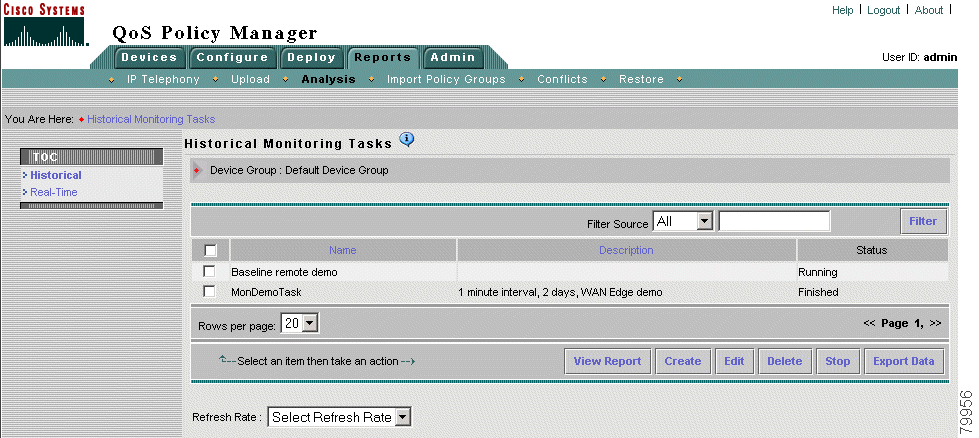
If the status of your task is "Processing," QPM is still analyzing your task. Select Reports > Analysis to refresh the page. When the status changes to "Running," the task is ready to run at the start date and time. A task with a status of "Running" will not contain data until the start date and time has passed.
Proceed with Step 3: Reading the Historical Monitoring Graphs.
This step describes how to view an historical monitoring task, and how to read the graphs.
You can view any historical monitoring task, but a task will not have any data to display until the start date and time has been reached, QPM has polled the device three times, and at least one hour has passed. If you view a task before it is finished running, you can see the data that has been collected up to the latest polling period.
Step 1 Select Reports > Analysis. The Historical Monitoring Tasks page appears. This page lists all the historical monitoring tasks that you have defined.
Step 2 Select the task you want to view by checking the box next to the task. For this example, the task is Baseline remote demo.
Step 3 Click View Report. The Policies Graphs page appears (Figure 4-2).
| 1 | Task details—The historical monitoring task details, including name, duration, and polling interval. Use this information to help you understand the displayed data. |
| 2 | Customization controls—Fields that let you change how the data is displayed:
|
| 3 | Group folders—Folders that you can open or close to see the graphs related to that item.
|
| 4 | Graphs—The collected data displayed according to your customization selections. You can open or close each graph by clicking the arrow to the left of the graph's name. The colors used on the graphs are the colors used in the graphed items list (number 5 below). |
| 5 | Graphed items—The items that can be displayed on the graphs (either policies or interfaces, depending on your selection in the Group customization control). In this example, the items graphed are policies. You can control which policies are graphed by checking or unchecking the associated box and clicking Show Graphs (not shown in this figure; the button is at the bottom of this group). If you have trouble seeing the data for an item (for example, because two lines occupy the same space), deselect the other items until you see the desired line. Switching between line and bar graphs can also help you identify overlapping data. |
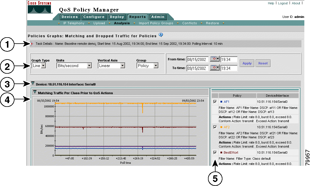
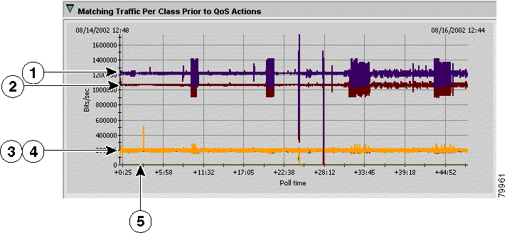
Figure 4-3 shows the matching traffic per class prior to QoS actions graph from Figure 4-2.
| 1 | Policy AF2. This policy matches DSCP af 21, af22, or af23. |
| 2 | Policy BestEffort. This is the default class policy. Any traffic not matching the other policies matches this policy. |
| 3 | Policy EF. This policy matches DSCP ef. |
| 4 | Policy AF1.This policy matches DSCP af11, af12, or af13. |
| 5 | Policy AF3. This policy matches DSCP af31, af32, or af33. |
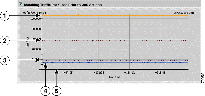
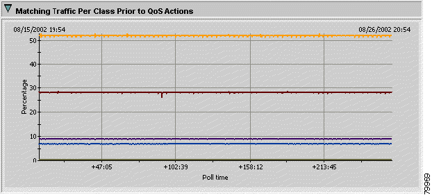
From the information in Figure 4-3, you can see that traffic that matches the AF2 policy's filter consumes approximately 1050 Kbps of the interface's bandwidth. If you select Percentage from the Vertical Axis list box, you can see that this is approximately 52% of the interface's bandwidth (Figure 4-4). Policy AF3, on the other hand, accounts for almost no traffic.
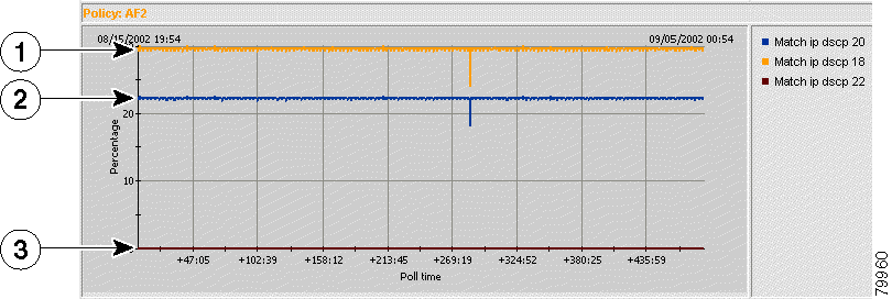
If a policy has more than one filter condition, like policy AF2 in this example, you can further analyze the traffic by looking at the filter graphs. The filter graphs show how much traffic matched each filter in a policy. To see the filter graphs, click the Filters Graphs button at the bottom of the page. Figure 4-5 shows the filter graph for policy AF2. In this case, no traffic matched DSCP 22 (af23). DSCP 20 (af22) used approximately 22% of the bandwidth; DSCP 18 (af21) used approximately 30%.
| 1 | Match IP DSCP 18 (af21) |
| 2 | Match IP DSCP 20 (af22) |
| 3 | Match IP DSCP 22 (af23) |
The graphs also include ones that show the matching traffic after applying QoS, and the traffic that was dropped due to QoS action. However, because this is a baseline traffic analysis, the QoS policies do not affect traffic, so these graphs do not contain interesting information.
After you apply QoS policies that do affect traffic, you can monitor how the policies affect the traffic using the same techniques discussed in this section. Proceed with Lesson 4-2: Monitoring QoS for a detailed example of monitoring QoS.
Monitoring QoS is similar to baseline monitoring, as described in Lesson 4-1: Doing a Baseline Traffic Analysis. The only difference is that the QoS policies you are monitoring are designed to affect the traffic on the interfaces. Thus, you should see some evidence of your policies reducing the bandwidth used by some applications, with subsequent packet dropping for those applications.
This lesson assumes you have already created and deployed QoS policies to some devices using QPM. This lesson uses a specific interface and set of policies deployed on a Cisco test network. Replace the sample device and interface names with names from your network to create a monitoring task that can run on your network. These examples are meant to help you understand how to analyze the data QPM produces.
This example monitors 10.51.116.60 Serial 1/1, an HDLC 2048 Kbps interface on a Catalyst 3600, running IOS 12.2T. Table 4-3 shows the policies deployed to the interface for outbound traffic. The policy group uses Class-based QoS scheduling. The policies have these purposes:
| Policy Order | Policy Name | Filter | Action |
|---|---|---|---|
1 | RealTime |
|
|
2 | VoiceControl |
|
|
3 | Gold |
|
|
4 | Silver |
|
|
5 | BestEffort | Class Default |
|
Step 1 Select Reports > Analysis, and click Create, to set up a new historical monitoring task. Step 2: Setting Up an Historical Monitoring Task explains in detail how to set up an historical monitoring task using this wizard.
For this example, the historical monitoring task has these characteristics. The task you create will differ based on the devices and policies in your network:
Step 2 After the task has run long enough to poll the device at least 3 times (and at minimum one hour has passed), you can view the task and start analyzing the graphs. From the Historical Monitoring Tasks page (Reports > Analysis), check the box next to the task and click View Report. The Policies Graphs page appears and shows the graphs of the data collected by the task.
Step 3: Reading the Historical Monitoring Graphs explains some of the basics of reading these graphs. This discussion assumes you have already read that information.
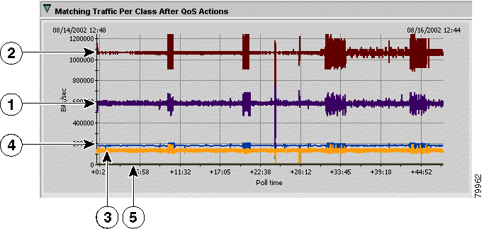
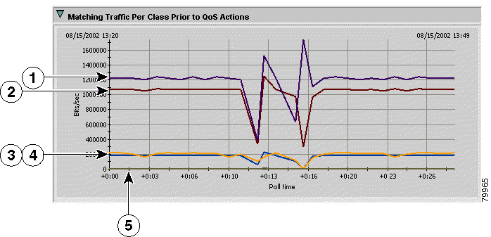
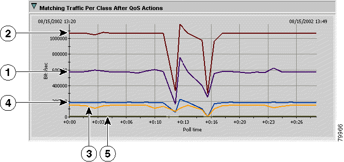
Because this monitoring task is monitoring QoS policies that are intended to affect the network traffic on the interface, you should see a difference between the "Matching Traffic Per Class Prior to QoS Actions" (Figure 4-6) and the "Matching Traffic Per Class After QoS Actions" (Figure 4-7) graphs.
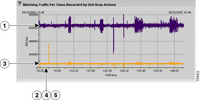
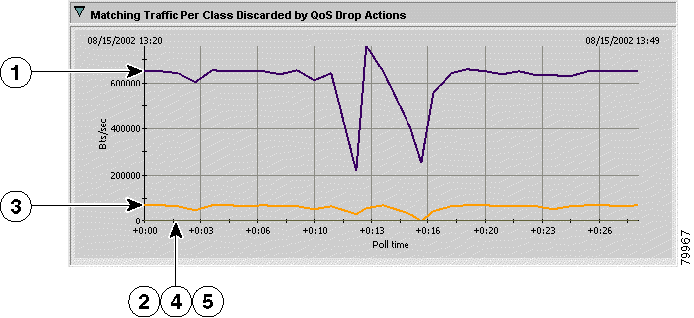
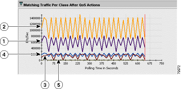
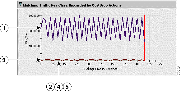
In this example, notice that traffic matching the BestEffort policy (number 1 in the figures) is approximately 1200 Kbps before QoS actions (roughly 60% of the interface's bandwidth), but only 600 Kbps after QoS actions. If you open the "Matching Traffic Per Class Discarded by QoS Drop Actions" graph (Figure 4-8), you can see that roughly 600 Kbps of BestEffort traffic is being dropped. Also note that there is some Silver traffic dropping, but that no RealTime, VoiceControl, or Gold traffic is dropped. This is exactly the desired result for this set of policies.
| 1 | BestEffort |
| 2 | Gold |
| 3 | Silver |
| 4 | RealTime. The line for RealTime is behind the line for Silver. |
| 5 | VoiceControl. This line is just above the zero line. |
| 1 | BestEffort |
| 2 | Gold |
| 3 | Silver |
| 4 | RealTime |
| 5 | VoiceControl |
| 1 | BestEffort |
| 2 | Gold |
| 3 | Silver |
| 4 | RealTime |
| 5 | VoiceControl. Gold, VoiceControl, and RealTime overlap and are all 0 (no dropped traffic.) |
Step 3 Because linear graphs display all collected data points, the lines can be difficult to read if you are trying to analyze a portion of the data. To get a clearer view, you can zoom in on a specific time period.
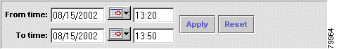
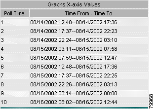
For example, in Figure 4-6, you can see some significant spikes approximately 25 hours into the task. To zoom in on the first spike, modify the From Time and To Time fields to approximate this period, and click Apply. In this case, change the From Time to 08/15/2002 13:20:00 and the To Time to 08/15/2002 13:50:00 (Figure 4-9).
The resulting graphs show the network activity much more clearly for this time period.
| 1 | BestEffort |
| 2 | Gold |
| 3 | Silver |
| 4 | RealTime. The line for RealTime is mostly below the line for Silver. The lines occasionally cross. |
| 5 | VoiceControl. This line is just above the zero line. |
| 1 | BestEffort |
| 2 | Gold |
| 3 | Silver |
| 4 | RealTime |
| 5 | VoiceControl |
| 1 | BestEffort |
| 2 | Gold |
| 3 | Silver |
| 4 | RealTime |
| 5 | VoiceControl. Gold, VoiceControl, and RealTime overlap and are all 0 (no dropped traffic.) |
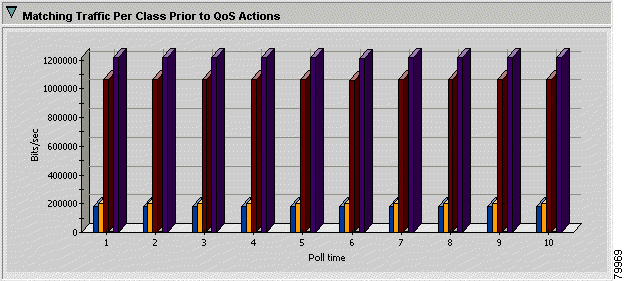
Step 4 To get a simplified view of the network traffic, you can select Bar for Graph Type to see bar graphs.
Unlike linear graphs, bar graphs do not show every data point collected. Instead, bar graphs show 10 data points, each one an average of the data collected over one tenth of the task's duration. The collection periods are shown in the lower right of the Policies Graphs page (Figure 4-13).
Bar graphs can hide variations in traffic patterns. For example, the bar graph for "Matching Traffic Per Class Prior to QoS Actions" (Figure 4-14) does not show the spikes and lolls in traffic that appear on the linear version of the graph (Figure 4-6). On the other hand, bar graphs clearly show each traffic class, because bars cannot overlap like lines. These types of graphs can help you see broader traffic patterns, and can be useful for presentations.
This lesson describes how to set up and use a real-time monitoring task. Real-time monitoring is useful for troubleshooting an interface. If there seems to be a problem on an interface, you can monitor it to determine if there is a problem with the QoS policies. With real-time monitoring, you can only monitor one interface per task. However, you can start more than one task to view multiple interfaces.
You must use QPM to create QoS policies on an interface before you can use QPM to monitor the interface. Because you can only monitor real devices, this lesson uses devices on a Cisco test network as an example of how to set up and view a real-time monitoring task. When following this lesson, use devices and interfaces that reside on your own network. Only devices and interfaces you have defined in QPM are available for selection when you create a monitoring task.
Step 1 Select Reports > Analysis > Real-Time. The Real-Time Monitoring Tasks page appears.
Step 2 Click Create. The Real-Time Monitoring Wizard starts at the Device Selection page. Make these selections:
When finished, click Next. The Real-Time Monitoring Wizard - Interface Selection page appears.
Step 3 On the Real-Time Monitoring Wizard - Interface Selection page, select the interface you want to monitor. For this example, the interface is Serial 1/1, an HDLC interface.
Step 4 Click Finish to save your task definition. QPM opens a separate window and automatically starts the real-time monitoring task. You will not see any data until QPM has polled the interface three times. Then, data is posted to the real-time monitoring graphs as it is collected.
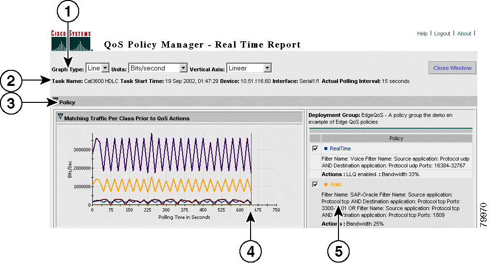
As data fills the graphs left to right, a vertical red line indicates which part of the data is the most recently gathered. When the graphical information reaches the right side of the graph, new data is overwritten on the graph left to right (Figure 4-15).
| 1 | Customization controls—Fields that let you change how the data is displayed:
|
| 2 | Task details—The real-time monitoring task details, including name, start time, device, interface, and polling interval. Use this information to help you understand the displayed data. |
| 3 | Group folders—Folders that you can open or close to see the graphs related to that item. You can open or close each graph by clicking the arrow to the left of the graph's name. The colors used on the graphs are related to the colors used in the graphed items list.
|
| 4 | Cursor—This vertical line indicates the place where the most recent data point has been graphed. Data to the left of the line is most recent, data to the right of the line is old and is in the process of being overwritten. |
| 5 | Graphed items—The policies that can be displayed on the graphs. You can control which policies are graphed by checking or unchecking the associated box and clicking Show Graphs (not shown in this figure; the button is at the bottom of this group). If you have trouble seeing the data for an item (for example, because two lines occupy the same space), deselect the other items until you see the desired line. Switching between line and bar graphs can also help you identify overlapping data. |
The following figures show examples of the real-time report for this interface. Because it is the same interface used in Lesson 4-2: Monitoring QoS, you can compare these figures with the equivalent figures in that lesson.
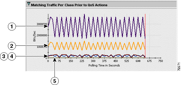
| 1 | BestEffort |
| 2 | Gold |
| 3 | Silver |
| 4 | RealTime. The line for RealTime is mostly below the line for Silver. The lines occasionally cross. |
| 5 | VoiceControl. This line is just above the zero line. |
| 1 | BestEffort |
| 2 | Gold |
| 3 | Silver |
| 4 | RealTime |
| 5 | VoiceControl |
| 1 | BestEffort |
| 2 | Gold |
| 3 | Silver |
| 4 | RealTime |
| 5 | VoiceControl. Gold, VoiceControl, and RealTime overlap and are all 0 (no dropped traffic.) |
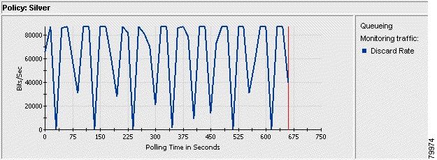
As you can see in Figure 4-18, the discard rate for Silver traffic is close to zero. To get a clearer view of the discard rate, open the Action folder and look at the Silver policy (Figure 4-19).
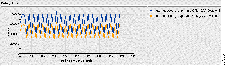
If you have a policy with multiple filter conditions, open the Filter folder and look at the graph for the policy. QPM shows you the matching traffic for each filter condition in this graph. In this example, the Gold policy has two conditions (Figure 4-20).
Step 5 Click Close Window to close the Real-Time Report window and end the task.
![]()
![]()
![]()
![]()
![]()
![]()
![]()
![]()
Posted: Tue Oct 15 08:32:40 PDT 2002
All contents are Copyright © 1992--2002 Cisco Systems, Inc. All rights reserved.
Important Notices and Privacy Statement.