
8.4. Style Properties
At the heart of the CSS2 specification are the many properties that let you control how the styles-conscious browser presents your documents to the user. The standard collects these properties into six groups: fonts, colors and backgrounds, text, boxes and layout, lists, and tag classification. We'll stick with that taxonomy and preface the whole shebang with a discussion of property values and inheritance before diving into the properties themselves.
You'll find a summary of the style properties in Appendix C, "Cascading Style Sheet Properties Quick Reference".
8.4.1. Property Values
There are five distinct kinds of property values: keywords, length values, percentage values, URLs, and colors.
8.4.1.1. Keyword property values
A property may have a keyword value that expresses action or dimension. For instance, the effects of underline and line-through are obvious property values. And you can express property dimensions with keywords like small and xx-large. Some keywords are even relational: bolder, for instance, is an acceptable value for the font-weight property. Keyword values are not case-sensitive: Underline, UNDERLINE, and underline are all acceptable keyword values.
8.4.1.2. Length property values
So-called length values (a term taken from the CSS2 standard) explicitly state the size of a property. They are numbers, some with decimals, too. Length values may have a leading + or - sign to indicate that the value is to be added to or subtracted from the immediate value of the property. Length values must be followed immediately by a two-letter unit abbreviation -- with no intervening spaces.
There are three kinds of length-value units: relative, pixels, and absolute. Relative units specify a size that is relative to the size of some other property of the content. Currently, there are only two relative units: em, which is the width of m in the current font (written as em); and x-height, which is the height of the letter "x" in the current font (abbreviated ex). The pixels unit, abbreviated px, is equal to the size of a pixel on the browser's display. Absolute property value units are more familiar to us all. They include inches (abbreviated in), centimeters (cm), millimeters (mm), points (pt, 1/72 of an inch), and picas (pc, twelve points).
All of the following are valid length values, although not all units are recognized by the styles-conscious browsers:
1in
1.5cm
+0.25mm
-3pt
-2.5pc
+100em
-2.75ex
250px
8.4.1.3. Percentage property values
Similar to the relative length-value type, a percentage value describes a proportion relative to some other aspect of the content. It has an optional sign and decimal portion to its numeric value, and must have the percent sign (%) suffix. For example:
line-height: 120%
computes the separation between lines to be 120 percent of the current line height (usually relative to the text font height). Note that this value is not dynamic, though: changes made to the font height after the rule has been processed by the browser will not affect the computed line height.
8.4.1.4. URL property values
Some properties also accept, if not expect, a URL as a value. The syntax for using a URL in a style property is different from conventional HTML/XHTML:
url(service://server.com/pathname)
The keyword url is required, as are the opening and closing parentheses. Do not leave any spaces between url and the opening parenthesis. The url value may contain either an absolute or a relative URL. However, note that the URL is relative to the immediate style sheet's URL, the one in which it is declared. This means that if you use a url value in a document-level or inline style, the URL is relative to the HTML document containing the style document. Otherwise, the URL is relative to the @imported or <link>ed external style sheet's URL.
8.4.1.5. Color property values
Color values specify colors in a property (surprised?). You can specify a color as a color name or a hexadecimal RGB triple, as is done for common attributes, or as a decimal RGB triple unique to style properties. Both color names and hexadecimal RGB triple notation are described in Appendix G, "Color Names and Values".
Unlike regular HTML or XHTML, style sheets will accept three-digit hexadecimal color values. The single digit is doubled to create a conventional six-digit triple. Thus, the color #78C is equivalent to #7788CC. In general, three-digit color values are handy only for simple colors.
The decimal RGB triple notation is a bit different:
rgb(red, green, blue)
The red, green, and blue intensity value are integers in the range zero to 255 or integer percentages. As with a URL value, do not leave any spaces between rgb and the opening parenthesis.
For example, in decimal RGB convention, the color white is rgb(255, 255, 255) or rgb(100%, 100%, 100%), and a medium yellow is rgb(127, 127, 0) or rgb(50%, 50%, 0%).
8.4.2. Property Inheritance
In lieu of a specific rule for a particular element, properties and their values for tags within tags are inherited from the parent tag. Thus, setting a property for the <body> tag effectively applies that property to every tag in the body of your document, except for those that specifically override it. So, to make all the text in your document blue, you need only say:
body {color: blue}rather than create a rule for every tag you use in your document.
This inheritance extends to any level. If you later created a <div> tag with text of a different color, the styles-conscious browser will display all the text contents of the <div> tag and all its enclosed tags in that new color. When the <div> tag ends, the color reverts to that of the containing <body> tag.
In many of the following property descriptions, we refer to the tag containing the current tag as the "parent element" of that tag.
8.4.3. Font Properties
The loudest complaint we hear is that HTML and its progeny XHTML lack font styles and characteristics that even the simplest of text editors implement. The various <font> attributes address part of the problem, but they are tedious to use since each text font change requires a different <font> tag.
Style sheets change all that, of course. The CSS2 standard provides seven font properties that modify the appearance of text contained within the affected tag: font-family, font-size, font-size-adjust, font-style, font-variant, font-stretch, and font-weight. In addition, there is a universal font property that lets you declare all of the font changes with a single property.
Please be aware that style sheets cannot overcome limitations of the client system nor can the browser conjure effects if the fonts it uses do not provide the means.
8.4.3.1. The font-family property
The font-family property accepts a comma-separated list of font names, one of which will be selected by the styles-conscious browser for display of the tag's text. The browser uses the first font named in the list that also is installed and available for display on the client machine.
Font name values are for specific font styles, such as Helvetica or Courier, or a generic font style as defined by the CSS2 standard: serif, sans-serif, cursive, fantasy, and monospace. Each browser defines which actual font name is to be used for each generic font. For instance, Courier is the most popular choice for a monospace font.
Since fonts vary wildly among browsers, when specifying a font style, you should always provide several choices, ending with a suitable generic font. For example:
h1 {font-family: Helvetica, Univers, sans-serif}causes the browser to look for and use Helvetica, and then Univers. If neither font is available for the client display, the browser will use the generic sans serif typeface.
Enclose font names that contain spaces -- New Century Schoolbook, for example -- in quotation marks. For example:
p {font-family: Times, "New Century Schoolbook", Palatino, serif}That extra set of double quotation marks in an inline style rule will cause problems. Accordingly, use single quotation marks in an inline style:
<p style="font-family: Times, 'New Century Schoolbook', Palatino, serif">
In practice, you need not use quotation marks: the browser will ignore spaces before and after the font name, and convert multiple internal spaces to a single space. Thus:
p {font-family: Times, New Century Schoolbook, Palatino, serif}
<p style="font-family: Times, New Century Schoolbook, Palatino, serif">
are both legal, but we recommend that you use quotation marks anyway, just in case things change.
8.4.3.2. The font-size property
The font-size property lets you prescribe absolute or relative length values, percentages, and keywords to define the font size. For example:
p {font-size: 12pt}
p {font-size: 120%}
p {font-size: +2pt}
p {font-size: medium}
p {font-size: larger}
The first rule is probably the most used because it is the most familiar: it sets the font size to a specific number of points (12 in this example). The second example rule sets the font size to be 20 percent larger than the parent element's font size. The third increases the font's normal size by two points.
The fourth example selects a predefined size set by the browser, identified by the medium keyword. Valid absolute-size keywords are xx-small, x-small, small, medium, large, x-large, and xx-large, and usually correspond to the seven font sizes used with the size attribute of the <font> tag.
The last font-size rule selects the next size larger than the font associated with the parent element. Thus, if the size were normally medium, it would be changed to large. You can also specify smaller, with the expected results.
None of the current browsers handle the incremented font-size correctly. Rather, they ignore the increment/decrement sign and use its value as an absolute size. So, for instance in the middle example in this section, the font-size would end up as two points, not two points larger than the normal size.
8.4.3.3. The font-stretch property
Besides different sizes, font families sometimes contain condensed and expanded versions in which the characters are squeezed or stretched, respectively. Use the font-stretch property to choose more compressed or stretched-out characters from your font.
Use the property value of normal to, of course, select the normal-sized version of the font. The relative values wider and narrower select the next wider or next narrower variant of the font's characters, respectively, but not wider or narrower than the most ("ultra") expanded or contracted one in the family.
The remaining font-stretch property values choose specific variants from the font family. Starting from the most condensed and ending with the most expanded, the values are ultra-condensed, extra-condensed, condensed, semi-condensed, semi-expanded, expanded, extra-expanded, and ultra-expanded.
The font-stretch property, of course, assumes that your display fonts support stretchable fonts. Even so, the current popular browsers ignore this property.
8.4.3.4. The font-size-adjust property
Without too many details, the legibility and display size of a font depends principally on its aspect ratio: the ratio of its rendered size to its x-height, which is a measure of the font's lowercase glyph height. Fonts with aspect ratios approaching 1.0 tend to be more legible at smaller sizes than fonts with aspect ratios approaching zero.
Also, because of aspect ratios, the actual display size of one font may be apparently smaller or larger than another font at the same size. So, when one font is not available for rendering, the substituted font may distort the presentation.
The font-size-adjust property lets you readjust the substituted font's aspect ratio so that it will better fit the display. Use the property value of none to ignore the aspect ratio. Otherwise, include your desired aspect ratio (a decimal value less than one), typically the aspect ratio for your first-choice display font. The styles-conscious browser thereby will compute and display the substituted font at a size adjusted to your specified aspect ratio:
s = (n/a) * fs
where s is the new, computer font-size for display of the substituted font, calculated as the font-size-adjust value n divided by the substituted font's aspect ratio a times the current font-size fs. For example, let's imagine that your first-choice font Times New Roman, which has an aspect ratio of 0.45, is not available, so the browser then substitutes Comic Sans MS, which has an aspect ratio of 0.54. So that the substitution maintains nearly equivalent sizing for the font display, say at a 18 px font-size, with the font-size-adjust property set to 0.45, the CSS2-compliant browser would display or print the text with the substituted Comic Sans MS font at the smaller (0.45/0.54 x 18 px) = 15 px.
Sorry that we can't show you how the popular browsers would do this because they don't support it.
8.4.3.5. The font-style property
Use the font-style property to slant text. The default style is normal and may be changed to italic or oblique. For example:
h2 {font-style: italic}makes all level-2 header text italic. As of this writing, Netscape 4 supports only the italic value for font-style; Internet Explorer 4 and 5 support both values, although it is usually hard to distinguish italic from oblique.
8.4.3.6. The font-variant property
The font-variant property lets you select a variant of the desired font. The default value for this property is normal, indicating the conventional version of the font. You may also specify small-caps to select a version of the font in which the lowercase letters have been replaced with small capital letters.
This property is not supported by Netscape; Internet Explorer versions 4 and 5 incorrectly implements small-caps as all uppercase letters.
8.4.3.7. The font-weight property
The font-weight property controls the weight or boldness of the lettering. The default value of this property is normal. You may specify bold to obtain a bold version of a font, or use the relative bolder and lighter values to obtain a version of the font that is bolder or lighter than the parent element's font.
To specify varying levels of lightness or boldness, set the value to a multiple of 100, between the values 100 (lightest) and 900 (boldest). The value 400 is equal to the normal version of the font, and 700 is the same as specifying bold.
Internet Explorer and Netscape Navigator support the normal and bold values. Only Internet Explorer supports the lighter and bolder values, as well. Both browsers support the numeric boldness values.
8.4.3.8. The font property
More often than not, you'll find yourself specifying more than one font-related property at a time for a tag's text content display. A complete font specification can get somewhat unwieldy; for example:
font property
p {font-family: Times, Garamond, serif;
   font-weight: bold;
   font-size: 12pt;
   line-height: 14pt}
To mitigate this troublesome and potentially unreadable collection, use the comprehensive font property and group all the attributes into one set of declarations:
p {font: bold 12pt/14pt Times, Garamond, serif}The grouping and ordering of font attributes is important within the font property. The font style, weight, and variant attributes must be specified first, followed by the font size and the line height separated by a slash character, and ending with the list of font families. Of all the properties, the size and family are required; the others may be omitted.
Here are some more sample font properties:
em {font: italic 14pt Times}
h1 {font: 24pt/48pt sans-serif}
code {font: 12pt Courier, monospace}
The first example tells the styles-conscious browser to emphasize <em> text using a 14-point italic Times face. The second rule has <h1> text displayed in the boldest 24-point sans-serif font available, with an extra 24 points of space between the lines of text. Finally, text within a <code> tag is set in 12-point Courier or the browser-defined monospace font.
We leave it to your imagination to conjure up examples of the abuses you could foster with the font styles. Perhaps a recent issue of Wired magazine, notorious for avant-garde fonts and other print-related abuses, would be helpful in that regard?
8.4.4. Color and Background Properties
Every element in your document has a foreground and a background color. In some cases, the background is not one color, but a colorful image. The color and background style properties control these colors and images.
The children of an HTML/XHTML element normally inherit the foreground color of their parent. For instance, if you make <body> text red, the styles-conscious browser also will display header and paragraph text in red.
Background properties behave differently, however -- they are not inherited. Instead, each element has a default background that is transparent, allowing the parent's background to show through. Thus, setting the background image of the <body> tag does not cause that image to be reloaded for every element within the body tag. Instead, the browser loads the image once and displays it behind the rest of the document, serving as the background for all elements which do not themselves have an explicit background color or image.
8.4.4.1. The background-attachment property
If you specify a background image for an element, use the background-attachment property to control how that image is attached to the browser's display window. With the default value scroll , the browser moves the background image with the element as the user scrolls through the document. A value of fixed prevents the image from moving.
Netscape does not support this style property.
8.4.4.2. The background-color property
The background-color property controls the (you guessed it!) background color of an element. Set it to a color value or to the keyword transparent. The default value is transparent. The effects should be obvious.
While you may have become accustomed to setting the background color of an entire document through the special attributes for the <body> tag, the background-color style property can be applied to any element. For example, to set the background color of one item in a bulleted list, you could use:
<li style="background-color: blue">
Similarly, all the table header cells in a document could be given a reverse video effect with:
th {background-color: black; color: white}If you really want your emphasized text to stand out, paint its background red:
em {background-color: red}Netscape does not support this CSS2 property explicitly, but you may achieve the same effects through its support of the general background property, as discussed in Section 8.4.4.6, "The background property".
8.4.4.3. The background-image property
The background-image property puts an image behind the contents of an element. Its value is either a URL or the keyword none. The default value is none.
As with background colors, you can place a background image behind the entire document or behind selected elements of a document. With this style property, effects like placing an image behind a table or selected text are now simple:
<table style="background-image: url(backgrounds/woodgrain.gif)">
li.marble {background-image: url(backgrounds/marble.gif)}
The first example uses an inline style to place a woodgrain finish behind a table. The second defines a list item class that places a marble background behind <li> tags that use the class=marble attribute. For example, in XHTML:
<h2>Here's what's for dinner tonight:</h2>
<ul>
   <li class="marble">Liver with Onions</li>
   <li class="marble">Mashed Potatoes and Gravy</li>
   <li class="marble">Green Beans</li>
   <li class="marble">Choice of Milk, Tea, or Coffee</li>
</ul>
<h2>And for dessert:</h2>
<ul>
   <li>Creamed Quats in Milk  (YUM! YUM!)</li>
</ul>
will produce a result like that in Figure 8-3.
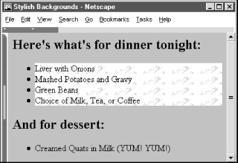
Figure 8-3. Placing a background image behind an element
If the image is larger than the containing element, it will be clipped to the area occupied by the element. If the image is smaller, the image will be repeated to tile the area occupied by the element, as dictated by the value of the background-repeat attribute.
You control the position of the image within the element with the background-position property. The scrolling behavior of the image is managed by the background-attachment property.
While it may seem that a background color and a background image are mutually exclusive, you should usually define a background color even if you are using a background image. That way, if the image is unavailable, such as when the user doesn't automatically download images, the browser will display the background color instead. In addition, if the background image has transparent areas, the background color will be used to fill in those areas.
8.4.4.4. The background-position property
By default, the styles-conscious browser renders a background image starting in the upper-left corner of the allotted display area and tiled (if necessary) down and over to the lower-right corner of that same area. With the background-position property, you can offset the starting position of the background image down and to the right of that default point by an absolute (length) or relative (percentage or keyword) offset. The resulting image fills the area from that offset starting point to the lower-right corner of the display space.
You may specify one or two values for the background-position property. If you use a single value, it applies to both the vertical and horizontal positions. With two values, the first is the horizontal offset, and the second is the vertical offset.
Length values (with their appropriate units; see Section 8.4.1.2, "Length property values") indicate an absolute distance from the upper-left corner of the element behind which you display the background image. For instance:
table {background-image: url(backgrounds/marble.gif);
       background-position: 10px 20px}
offsets the marble background 10 pixels to the right and 20 pixels down from the upper-left corner of any <table> element in your document.
Percentage values are a bit trickier, but somewhat easier to use. Measured from to 100 percent from left to right and top to bottom, the center of the element's content display space is at 50%, 50%. Similarly, the position one-third of the way across the area and two-thirds of the way down is at 33%, 66%. So, to offset the background for our example dinner menu to the center of the element's content display space, we use:
background-position: 50% 50%
Notice that the browser places the first marble.gif tile at the center of the content display area and tiles to the right and down the window, as shown in Figure 8-4.
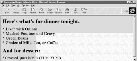
Figure 8-4. Marbled background offset to the center of the display
So why use a number when a single word will do? You can use the keywords left, center, and right, as well as top, center, and bottom, for 0%, 50%, and 100%, respectively. To center an image in the tag's content area write:
background-position: center center
You can mix and match length and percentage values,[54]
[54]That is, if the browser supports the value units. So far, Internet Explorer and Netscape support only a meager repertoire of length units -- pixels and percents.
so that:
background-position: 1cm center
places the image one centimeter to the right of the tag's left edge, centered vertically in the tag's area.
8.4.4.5. The background-repeat property
Normally, the browser tiles a background image to fill the allotted space, repeating the image both down and to the right. Use the background-repeat property to alter this "repeat" (default value) behavior. To have the image repeat horizontally but not vertically, use the value repeat-x. For only vertical repetition, use repeat-y. To suppress tiling altogether, use no-repeat.
A common use of this property is to place a watermark or logo in the background of a page without repeating the image over and over. For instance:
body {background-image: url(backgrounds/watermark.gif);
      background-position: center center;
      background-repeat: no-repeat
     }
will place the watermark image in the background at the center of the page.
A popular trick is to create a vertical ribbon down the right-hand side of the page:
body {background-image: url(backgrounds/ribbon.gif);
      background-position: top right;
      background-repeat: repeat-y
     }
8.4.4.6. The background property
Like the various font properties, the many background CSS2 properties can get cumbersome to write and hard to read later. So, like the font property, there also is a general background property.
The background property accepts values from any and all of the background-color, background-image, background-attachment, background-repeat, and background-position properties, in any order. If you do not specify values for some of the properties, that property is explicitly set to its default value. Thus:
background: red
sets the background-color property to red and resets the other background properties to their default values. A more complex example:
background: url(backgrounds/marble.gif) blue repeat-y fixed center
sets all the background image and color properties at once, resulting in a marble image on top of a blue background (blue showing through any transparent areas). The image repeats vertically, starting from the center of the content display area, and does not scroll when the user scrolls the display. Notice that we included just a single position value (center) and the browser used it for both the vertical and horizontal positions.
Although Netscape Navigator version 6 provides full support, the browser's version 4 supports only the background property and does not honor any of the individual background ones. For this reason, you may want to use the background property to achieve the broadest acceptance of your background image and color properties.
8.4.4.7. The color property
The color property sets the foreground color for a tag's contents -- the color of the text lettering, for instance. Its value is either the name of a color, a hexadecimal RGB triple, or a decimal RGB triple, as outlined in Section 8.4.1.5, "Color property values". Thus, the following are all valid property declarations:
color: mauve
color: #ff7bd5
color: rgb(255, 125, 213)
color: rgb(100%, 49%, 84%)
Generally, you'll use the color property with text, but you may also modify non-textual content of a tag. For example, the following example produces a green horizontal rule:
hr {color: green}If you don't specify a color for an element, it inherits the color of its parent element.
8.4.5. Text Properties
Cascading style sheets make a distinction between font properties, which control the size, style, and appearance of text, and text properties, which control how text is aligned and presented to the user.
8.4.5.1. The letter-spacing property
The letter-spacing property puts additional space between text letters as they are displayed by the browser. Set the property with either a length value or the default keyword normal, indicating that the browser should use normal letter spacing. For example:
blockquote {letter-spacing: 2px}puts an additional two pixels between adjacent letters within the <blockquote> tag. Figure 8-5 illustrates what happens when you put 5 pixels between characters.
This property currently is supported by Internet Explorer and by the latest Netscape Version 6.
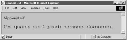
Figure 8-5. The letter-spacing property lets you stretch text out
8.4.5.2. The line-height property
Use the line-height property to define the spacing between lines of a tag's text content. Normally, browsers single-space text lines -- the top of the next line is just a few points below the last line. By adding to that line height, you increase the amount of space between lines.
The line-height value can be an absolute or relative length, a percentage, a scaling factor, or the keyword normal. For example:
p {line-height: 14pt}
p {line-height: 120%}
p {line-height: 2.0}
The first example sets the line height to exactly 14 points between baselines of adjacent lines of text. The second computes the line height to 120 percent of the font size. The last example uses a scaling factor to set the line height to twice as large as the font size, creating double-spaced text. The value normal, the default, is usually equal to a scaling factor of 1.0 to 1.2.
Keep in mind that absolute and percentage values for line-height compute the line height based upon the value of the font-size property when the line-height property is defined. The computed property value will be inherited by children of the element. Subsequent changes to font-size by either the parent or child elements will not change the computed line-height.
Scaling factors, on the other hand, defer the line-height computation until the text is actually displayed. Hence, varying font-sizes affect line-height locally. In general, it is best to use a scaling factor for the line-height property so that the line height will change automatically when the font size is changed.
Although usually considered separate from font properties, you may include this text-related line-height property's value as part of the shorthand notation of the font property. Section 8.4.3.8, "The font property"
8.4.5.3. The text-align property
Text justified with respect to the page margins is a rudimentary feature of nearly all text processors. The text-align property brings that capability to HTML for any block-level tag. (The W3C standards people prefer that you use CSS2 text-align styles rather than the explicit align attribute for those block-level tags like <div> and <p>.) Use one of four values: left, right, center, or justify. The default value is, of course, left. For example:
div {text-align: right}tells the styles-conscious browser to align all the text inside <div> tags against the right margin. The justify value tells the browser to align the text to both the left and right margins, spreading the letters and words in the middle to fit.
8.4.5.4. The text-decoration property
The text-decoration property produces text embellishments, some of which also are available with the original physical style tags. Its value is one or more of the keywords underline, overline, line-through, and blink. The value none is the default and tells the styles-conscious browser to present text normally.
The text-decoration property is handy for defining different link appearances. For example:
a:visited, a:link, a:active {text-decoration: underline overline}puts lines above and below the links in your document.
This text property is not inherited, and non-textual elements are not affected by the text-decoration property.
Like the <blink> tag, Netscape Navigator supports the blink text-decoration property value, but not Internet Explorer.
8.4.5.5. The text-indent property
Although less common today, it still is standard practice to indent the first line of a paragraph of text.[55]
[55]But not, obviously, in this book.
And some text blocks, such as definitions, typically "out-dent" the first line, creating what is called a hanging indent.
The CSS2 text-indent property lets you apply these features to any block tag and thereby control the amount of indentation of the first line of the block. Use length and percentage values; negative values create the hanging indent. Percentage values compute the indentation as a percentage of the parent element's width. The default value is zero.
To indent all the paragraphs in your document, for example:
p {text-indent: 3em}The length unit em scales the indent as the font of the paragraph changes in size on different browsers.
Hanging indents are a bit trickier because you have to watch out for the element borders. Negative indentation does not shift the left margin of the text; it simply shifts the first line of the element left, possibly into the margin, border, or padding of the parent element. For this reason, hanging indents only work as expected if you also shift the left margin of the element to the right by an amount equal to or greater than the size of the hanging indent. For example:
p.wrong {text-indent: -3em}
p.hang  {text-indent: -3em; margin-left: 3em}
p.large {text-indent: -3em; margin-left: 6em}
creates three paragraph styles. The first creates a hanging indent that extends into the left margin. The second creates a conventional hanging indent. And the third creates a paragraph whose body is indented more than the hanging indent. All three styles are shown in use in Figure 8-6.
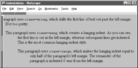
Figure 8-6. The effects of text-indent and margin-left on a paragraph
8.4.5.6. The text-shadow property
The text-shadow property lets you give your text a three-dimensional appearance through the time-honored use of shadowing. Values for the property include a required offset, and optional blur-radius and color. The property may include more than one set of values, separated with commas, to achieve a stack of shadows, with each subsequent set of values layered on top the previous one, but always beneath the original text.
The property's required offset is comprised of two length values. The first specifies the horizontal offset; the second specifies the vertical offset. Positive values place the shadow to the right and below the respective length distance from the text. Negative values move the shadow left and up, respectively.
The optional blur-radius also is a length value that specifies the boundaries for blurring, which effect depends on the rendering agent. The other shadow value is color. This, of course, may be an RGB triple or color name, as for other properties, and specifies the shadow color. Otherwise, text-shadow uses the color value of the color property.
h1 {text-shadow; 10px 10px 2px yellow}
p:first-letter {text-shadow: -5px -5px purple, 10px 10px orange}
The first text-shadow example puts a 2-pixel blurred-yellow shadow behind, 10 pixels below, and 10 pixels to the right of level-1 headers in your document. The second example puts two shadows behind the first letter of each paragraph. The purple shadow sits five pixels above and five pixels to the left of that first letter. The other shadow, like in the first example although orange in this case, goes 10 pixels to the right and 10 pixels below the first letter of each paragraph.
Sorry, we can't show you any of these effects since none of the popular browsers support this property, nor do they support the first-letter pseudo-element.
8.4.5.7. The vertical-align property
The vertical-align property controls the relative position of an element with respect to the line containing the element. Valid values for this property include:
- baseline
-
Align the baseline of the element with the baseline of the containing element.
- middle
-
Align the middle of the element with the middle (usually the x-height) of the containing element.
- sub
-
Subscript the element.
- super
-
Superscript the element.
- text-top
-
Align the top of the element with the top of the font of the parent element.
- text-bottom
-
Align the bottom of the element with the bottom of the font of the parent element.
- top
-
Align the top of the element with the top of the tallest element in the current line.
- bottom
-
Align the bottom of the element with the bottom of the lowest element in the current line.
In addition, a percentage value indicates a position relative to the current baseline, so that a position of 50% puts the element halfway up the line height above the baseline. A position value of -100% puts the element an entire line-height below the baseline of the current line.
Netscape supports all but the sub, super, and baseline values only when this property is applied to the <img> tag. Internet Explorer supports only sub and super when applied to text elements.
8.4.5.8. The word-spacing property
Use the word-spacing property to add additional space between words within a tag. You can specify a length value or the keyword normal to revert to normal word spacing. For example:
h3 {word-spacing: 25px}places an additional 25 pixels of space between words in the <h3> tag.
Netscape 6 supports the word-spacing property, but Internet Explorer does not.
8.4.5.9. The text-transform property
The text-transform property lets you automatically convert portions or all of your document's text into uppercase or lowercase lettering. Acceptable values are capitalize, uppercase, lowercase, or none.
Capitalize renders each first letter of each word in the text into uppercase, even if the source document's text is in lowercase. Uppercase and lowercase values repectively render all the text in the corresponding case. None, of course, cancels any transformations.
For example:
h1 {text-transform: uppercase}makes all the letters in level-1 headers, presumably titles, appear in uppercase text, whereas:
h2 {text-transform: capitalize}makes sure that each word in level-2 headers begins with a capital letter, appropriate for section heads, for instance.
Note that while uppercase and lowercase affect the entire text, capitalize affects only the first letter of each word in the text. Consequently, transforming the word htMl with capitalize will make it appear HtMl.
The text-transform property is supported by both Internet Explorer and Netscape Navigator.
8.4.6. Box Properties
The CSS2 model assumes that HTML and XHTML elements always fit within a rectangular box. Using the properties defined in this section, you can control the size, appearance, and position of the boxes containing the elements in your documents.
8.4.6.1. The CSS2 formatting model
Each element in a document can fit in a rectangular box. The CSS2 authors call this box the "core content area" and surround it with three more boxes: the padding, the border, and the margin. Figure 8-7 shows these boxes and defines some useful terminology.
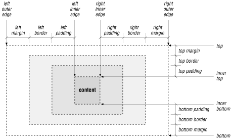
Figure 8-7. The CSS2 formatting model and terminology
The top, bottom, left-outer, and right-outer edges bound the content area of an element and all of its padding, border, and margin spaces. The inner-top, inner-bottom, left-inner, and right-inner edges define the sides of the core content area. The extra space around the element is the area between the inner and outer edges, including the padding, border, and margin. A browser may omit any and all of these extra spaces for any element, and for many, the inner and outer edges are the same.
When elements are vertically adjacent, the bottom margin of the upper elements and the top margin of the lower elements overlap, so that the total space between the elements is the greater of the adjacent margins. For example, if one paragraph has a bottom margin of one inch, and the next paragraph has a top margin of one-half inch, the greater of the two margins, one inch, will be placed between the two paragraphs. This practice is known as margin collapsing and generally results in better document appearance.
Horizontally adjacent elements do not have overlapping margins. Instead, the CSS2 model adds together adjacent horizontal margins. For example, if a paragraph has a left margin of 1 inch and is adjacent to an image with a right margin of 0.5 inch, the total space between the two will be 1.5 inches. This rule also applies to nested elements, so that a paragraph within a division will have a left margin equal to the sum of the division's left margin and the paragraph's left margin.
As shown in Figure 8-7, the total width of an element is equal to the sum of seven items: the left and right margins, the left and right borders, the left and right padding, and the element's content itself. The sum of these seven items must equal the width of the containing element. Of these seven items, only three (the element's width and its left and right margins) can be given the value auto, indicating that the browser can compute a value for that property. When this becomes necessary, the browser follows these rules:
-
If none of these properties is set to auto and the total width is less than the width of the parent element, the margin-right property will be set to auto and made large enough to make the total width equal to the width of the parent element.
-
If exactly one property is set to auto, that property will be made large enough to make the total width equal to the width of the parent element.
-
If width, margin-left and margin-right are set to auto, the CSS2-compliant browser will set both margin-left and margin-right to zero and set width large enough to make the total equal to the width of the parent element.
-
If both the left and right margins are set to auto, they will always be set to equal values, centering the element within its parent.
There are special rules for floating elements. A floating element (such as an image with align=left specified) will not have its margins collapsed with the margins of containing or preceding elements, unless the floating element has negative margins. Figure 8-8 shows how this bit of HTML might be rendered:
<body>
<p>
<img align=left src="pics/img.gif">
Some sample text...
</body>
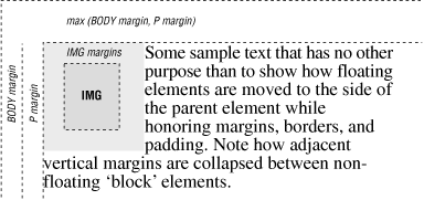
Figure 8-8. Handling the margins of floating elements
The browser moves the image, including its margins, as far as possible to the left and towards the top of the paragraph without overlapping the left and top margins of the paragraph or the document body. The left margins of the paragraph and the containing body are added, while their top margins are collapsed.
8.4.6.2. The border properties
The border surrounding an element has a color, a thickness, and a style. You can use various properties to control these three aspects of the border on each of the four sides of an element. Shorthand properties make it easy to define the same color, thickness, and style for the entire border, if desired. Border properties are not inherited; you must explicitly set them for each element that has a border.
8.4.6.3. The border-color property
Use the border-color property to set the border color. If not specified, the browser draws the border using the value of the element's color property.
The border-color property accepts from one to four color values. The number of values determines how they are applied to the borders (summarized in Table 8-1). If you include just one property value, all four sides of the border are set to the specified color. Two values set the top and bottom borders to the first value and the left and right borders to the second value. With three values, the first is the top border, the second sets the right and left borders, and the third color value is for the bottom border. Four values specify colors for each side, clockwise from the top, then right, bottom, and left borders, in that order.
Table 8-1. Order of Effects for Multiple Border, Margin, and Padding Property Values
|
Number of Values |
Affected Border(s), Margin(s), or Padding |
|---|---|
|
1 |
All items have the same value. |
|
2 |
First value sets top and bottom; second value sets left and right. |
|
3 |
First value sets top ; second sets both left and right; third value sets bottom. |
|
4 |
First value sets top ; second sets right; third sets bottom; fourth value sets left. |
8.4.6.4. The border-width property
The border-width property lets you change the width of the border. Like the border-color property, it accepts from one to four values that are applied to the various borders in a similar manner (Table 8-1).
Besides a specific length value, you may also specify the width of a border as one of the keywords thin, medium, or thick. The default value, if the width is not explicitly set, is medium. Some typical border widths are:
border: 1px
border: thin thick medium
border: thick 2mm
The first example sets all four borders to exactly one pixel. The second makes the top border thin, the right and left borders thick, and the bottom border medium. The last example makes the top and bottom borders thick, while the right and left borders will be two millimeters wide.
If you are uncomfortable defining all four borders with one property, you can use the individual border-top-width, border-bottom-width, border-left-width, and border-right-width properties to define the thickness of each border. Each property accepts just one value; the default is medium.
Netscape Navigator and Internet Explorer 5 support this property even when used alone; Internet Explorer 4 honors this property only if borders are enabled through other border properties.
8.4.6.5. The border-style property
According to the CSS2 model, there are a number of embellishments that you may apply to your HTML element borders.
The border-styleproperty values include none (default), dotted, dashed, solid, double, groove, ridge, inset, and outset. The border-style-conscious browser applies one to four values for the property to each of the borders in the same order as for the border colors and widths, as described in Table 8-1.
The browser draws dotted, dashed, solid, and double borders as flat lines atop the tag's background. The groove, ridge, inset, and outset values create three-dimensional borders: the groove is an incised line, the ridge is an embossed line, the inset border makes the entire tag area appear set into the document, and the outset border makes the entire tag area appear raised above the document. The effect of the three-dimensional nature of these last four styles upon the tag's background image is undefined and left up to the browser. Netscape supports three-dimensional effects.
Neither Internet Explorer nor Netscape supports the dotted or dashed values.
8.4.6.6. Borders in shorthand
Since specifying a complex border can get tedious, the CSS2 standard provides five shorthand properties that accept any or all of the width, color, and style values for one or all of the border edges. The border-top, border-bottom, border-left, andborder-right properties affect their respective borders' sides; the comprehensive border property controls all four sides of the border simultaneously. For example:
border-top: thick solid blue
border-left: 1ex inset
border-bottom: blue dashed
border: red double 2px
The first property makes the top border a thick, solid, blue line. The second sets the left border to use an inset effect that is as thick as the x-height of the element's font, while leaving the color the same as the element's color. The third property creates a blue dashed line at the bottom of the element, using the default medium thickness. Finally, the last property makes all four borders a red double line two pixels thick.
That last property raises two issues. First, you cannot supply multiple values to the border property to selectively affect certain borders like you can with the individual border-color, border-width, and border-style properties. The border property always affects all four borders around an element.
Secondly, a bit of reflection should reveal that it is not possible to create a double-line border just two pixels thick. In cases like this, the browser is free to adjust the thickness to render the border properly.
While we usually think of borders surrounding block elements like images, tables, and text flows, borders can also be applied to inline tags. This lets you put a box around a word or phrase within a text flow. The implementation of borders on inline tags that span multiple lines is undefined and left to the browser.
Both Netscape and Internet Explorer support the border property, but only Internet Explorer supports the individual side properties.
8.4.6.7. The clear property
Like its cousin attribute for the <br> tag, the clear property tells the browser whether to place a tag's contents adjacent to a "floating" element or on the first line below. Text flows around floating elements like images and tables with an align=left or align=right attribute or any HTML element with its float property set to anything but none. Section 4.7.1, "The <br> Tag" Section 8.4.6.8, "The float property"
The value of the clear property can be none, left, right, or both. A value of none, the default, means that the browser acts normally and places the tag's contents adjacent to floating elements on either side if there is room to do so. The value left prevents contents from being placed adjacent to a floating element on its left; right prevents placement against a floating element on the right; and both prevents the tag's contents from appearing adjacent to any floating element.
The effect of this style is the same as having preceded the tag with a <br> tag with its clear attribute. Hence:
h1 {clear: left}has the same effect as preceding every <h1> tag with <br clear=left>.
8.4.6.8. The float property
The float property designates a tag's display space as a floating element and causes text to flow around it in a specified manner. It is generally analogous to the align attribute for images and tables but can be applied to any element, including text, images, and tables. Section 5.2.6.4, "The align attribute" Section 10.2.1.1, "The align attribute (deprecated)"
The float property accepts one of three values: left, right, or none, the default. Using none disables the float property; the others work like their align attribute-value counterparts, telling the browser to place the content to either side of the flow and allow other content to be rendered next to it.
Accordingly, the styles-conscious browser will place a tag's contents specified with float: left against the left margin of the current text flow, and subsequent content will flow to its right, down and below the tag's contents. The float: right pair puts the tag contents against the right edge of the flow and flows other content on its left, down and below the tag's contents.
Although most commonly used with tables and images, it is perfectly acceptable to apply the float property to a text element. For example, the following would create a "run-in" header, with the text flowing around the header text:
h1 {float: left}This property is supported by Internet Explorer only for images. Netscape honors it for textual elements as well.
8.4.6.9. The height property
As you might suspect, the height property controls the height of the associated tag's display region. You'll find it most often used with images and tables, but it can be used to control the height of other document elements as well.
The value of the height property is either a length value or the keyword auto, the default. Using auto implies that the affected tag has an initial height that should be used when displaying the tag. Otherwise, the height of the tag is set to the desired height. If an absolute value is used, the height is set to that length value. For example:
img {height: 100px}tells the browser to display the image referenced by the <img> tag scaled so that it is 100 pixels tall. If you use a relative value, the base size to which it is relative is browser- and tag-dependent.
When scaling elements to a specific height, the aspect ratio of the object can be preserved by also setting the width property of the tag to auto. Thus:
img {height: 100px; width: auto}ensures that the images are always 100 pixels tall, with an appropriately scaled width. Section 8.4.6.12, "The width property"
This property is fully supported by Internet Explorer and Netscape Navigator Version 6. Netscape Navigator 4 honors it only when used with the <img> tag.
8.4.6.10. The margin properties
Like the border properties, the various margin properties let you control the margin space around an element, just outside of its border (Figure 8-7). Margins are always transparent, allowing the background color or image of the containing element to show through. As a result, you can specify only the size of a margin; it has no color or rendered style.
The margin-left , margin-right, margin-top, and margin-bottom properties all accept a length or percentage value indicating the amount of space to reserve around the element. In addition, the keyword auto tells the styles-conscious browser to revert to the margins it normally would place around an element. Percentage values are computed as a percentage of the containing element's width. The default margin, if not specified, is zero.
These are all valid margin settings:
body {margin-left: 1in; margin-top: 0.5in; margin-right: 1in}
p {margin-left: -0.5cm}
img {margin-left: 10%}
The first example creates one-inch margins down the right and left edges of the entire document and a half-inch margin across the top of the document. The second example shifts the <p> tag one-half centimeter left into the left margin. The last example creates a margin to the left of the <img> tag equal to ten percent of the parent element's width.
Like the shorthand border property, you can use the shorthand margin property to define all four margins, using from one to four values which affect the margins in the order described in Table 8-1. Using this notation, our <body> margins in the previous example also could have been specified as:
body {margin: 0.5in 1in}The margin-left and margin-right properties interact with the width property to determine the total width of an element, as described in Section 8.4.6.1, "The CSS2 formatting model".
8.4.6.11. The padding properties
Like the margin properties, the various padding properties let you control the padding space around an element, between the element's content area and its border (Figure 8-7). Padding is always rendered using the background color or image of the element. As a result, you can specify only the size of the padding; it has no color or rendered style.
The padding-left, padding-right, padding-top, and padding-bottomproperties all accept a length or percentage value indicating the amount of space the styles-conscious browser should reserve around the element. Percentage values are computed as a percentage of the containing element's width. The default padding is zero.
These are valid padding settings:
p {padding-left: 0.5cm}
img {padding-left: 10%}
The first example creates half a centimeter of padding between the contents of the <p> tag and its left border. The last example creates padding to the left of the <img> tag equal to ten percent of the parent element's width.
Like the shorthand margin and border properties, you can use the shorthand padding property to define all four padding amounts, using one to four values to effect the padding sides as described in Table 8-1. The padding property is not supported by Internet Explorer, but is supported by Netscape Navigator.
8.4.6.12. The width property
The width property is the companion to the height property and controls the width of an associated tag. Specifically, it defines the width of the element's content area, as shown in Figure 8-7. You'll see it most often used with images and tables, but you could conceivably use it to control the width of other elements as well.
The value for width property is either a length or percentage value or the keyword auto. The value auto is the default and implies that the affected tag has an initial width that should be used when displaying the tag. If a length value is used, the width is set to that value; percentage values compute the width to be a percentage of the width of the containing element. For example:
img {width: 100px}displays the image referenced by the <img> tag scaled to 100 pixels wide.
When scaling elements to a specific width, the aspect ratio of the object is preserved if the height property of the tag is set to auto. Thus:
img {width: 100px; height: auto}makes the images all 100 pixels wide and scales their heights appropriately. Section 8.4.6.9, "The height property"
The width property interacts with the margin-left and margin-right properties to determine the total width of an element, as described in Section 8.4.6.1, "The CSS2 formatting model".
8.4.7. List Properties
The CSS2 standard lets you also control the appearance of list elements -- specifically, ordered and unordered lists.
Browsers format list items just like any other block item, except that the block has some sort of marker preceding the contents. For unordered lists, the marker is a bullet of some sort; for numbered lists, the marker is a numeric or alphabetic character or symbol. The CSS2 list properties let you control the appearance and position of the marker associated with a list item.
8.4.7.1. The list-style-image property
The list-style-image property defines the image that the browser uses to mark a list item. The value of this property is the URL of an image file, or the keyword none. The default value is none.
The image is the preferred list marker. If it is available, the browser will display it in place of any other defined marker. If the image is unavailable or if the user has disabled image loading, the marker defined by the list-style-type property (see Section 8.4.7.3, "The list-style-type property") will be used.
Authors can use this property to define custom bullets for their unordered lists. While any image could conceivably be used as a bullet, we recommend that you keep your marker GIF or JPEG images small to ensure attractively rendered lists.
For example, by placing the desired bullet image in the file mybullet.gif on your server, you could use that image:
li {list-style-image: url(pics/mybullet.gif); list-style-type: square}In this case, the image will be used if the browser successfully downloads mybullet.gif. Otherwise, the browser will use a conventional square bullet.
This property is supported by Internet Explorer and by the latest version of Netscape Navigator (version 6). However, they differ in where they position the list marker: Netscape 6 puts it outside, and Internet Explorer 5 puts it inside, the item. Read the next section for an explanation.
8.4.7.2. The list-style-position property
There are two ways to position the marker associated with a list item: inside the block associated with the item or outside the block. Accordingly, the list-style-position property accepts one of two values: inside or outside.
The default value is outside, meaning that the item marker will hang to the left of the item like this:
-
This is a bulleted list with an "outside" marker
The value inside causes the marker to be drawn with the list item flowing around it, much like a floating image:
-
This is a bulleted list with an "inside" marker
Notice how the second line of text is not indented, but instead lines up with the left edge of the marker.
None of the popular browsers support this property.
8.4.7.3. The list-style-type property
The list-style-type property serves double-duty in a sense, determining how both ordered and unordered list items are rendered by a styles-conscious browser. This property has the same effect on a list item as its type attribute does. Section 7.3.1.1, "The type attribute"
When used with items within an unordered list, the list-style-type property accepts one of four values: disc, circle, square, or none. The browser marks the unordered list items with the corresponding specified dingbat. The default value is disc; browsers change that default depending on the nesting level of the list.
When used with items within an ordered list, the list-style-type property accepts one of six values: decimal, lower-roman, upper-roman, lower-alpha, upper-alpha, or none. These values format the item numbers as decimal values, lowercase Roman numerals, uppercase Roman numerals, lowercase letters, or uppercase letters, respectively. Most browsers will use decimal numbering schemes if you don't set this property.
8.4.7.4. The list-style property
The list-style property is the shorthand version for all the other list-style properties. It accepts any or all of the values allowed for the list-style-type, list-style-position, and list-style-image properties, in any order and with values appropriate for the type of list they are to affect. These are valid list-style properties:
li {list-style: disc}
li {list-style: lower-roman inside}
li {list-style: url(http://www.kumquat.com/images/tiny-quat.gif)
     square}
The first example creates list items that use a disc as the bullet image. The second causes numbered list items to use lowercase Roman numerals, drawn inside the list item's block. In the last example, a square will be used as the bullet image if the referenced image is unavailable.
8.4.7.5. Using list properties effectively
Although you may apply list properties to any element, they will affect only the appearance of elements whose display property is set to list-item. Normally, the only tag with this property is the <li> tag. Section 8.4.8.1, "The display property"
This shouldn't deter you from using these properties elsewhere, particularly with the <ul> and <ol> tags. Since these properties are inherited by elements whose parents have them set, modifying a list property for the <ul> and <ol> tags will subsequently modify it for all the <li> tags contained within that list. This makes it much easier to define lists with a particular appearance.
For example, suppose you want to create a list style that uses lowercase Roman numerals. One way is to define a class of the <li> tag with the appropriate list-style-type defined:
li.roman {list-style-type: lower-roman}Within your list, you'll need to specify each list element using that class:
<ol>
  <li class=roman>Item one</li>
  <li class=roman>Item two</li>
  <li class=roman>And so forth</li>
</ol>
Having to repeat the class name is tedious and error-prone. A better solution is to define a class of the <ol> tag:
ol.roman {list-style-type: lower-roman}Any <li> tag within the list will inherit the property and use lowercase Roman numerals:
<ol class=roman>
  <li>Item one</li>
  <li>Item two</li>
  <li>And so forth</li>
</ol>
This is much easier to understand and manage. If at a later date you want to change the numbering style, you need only change the <ol> tag properties, rather than find and change each instance of the <li> tag in the list.
You can use these properties in a much more global sense as well. Setting a list property on the <body> tag will change the appearance of all lists in the document; setting it on a <div> tag will change all the lists within that division.
8.4.8. Classification Properties
Classification properties are the most esoteric of the CSS2 style properties. They do not directly control how a styles-conscious browser will render HTML or XHTML elements. Instead, they tell the browser how to classify and handle various tags and their contents as they are encountered.
For the most part, you should not set these properties on an element unless you are trying to achieve a specific effect. Even then, it is unlikely that the property will be supported by most browsers.
8.4.8.1. The display property
Every element in an HTML or XHTML document can be classified, for display purposes, as a block item, an inline item, or a list item. Block elements, like headings, paragraphs, tables, and lists, are formatted as a separate block of text, separated from the previous and next block items. Inline items, like the physical and content-based style tags and hyperlink anchors, are rendered within the current line of text within a containing block. List items, specifically the <li> tag, are rendered like a block item, with a bullet or number known as the marker.
The display property lets you change an element's display type to block, inline, list-item, or none. The first three values change the element's classification accordingly; the value none turns off the element, preventing it or its children from being displayed in the document.
Conceivably, you could wreak all sorts of havoc by switching element classifications, forcing paragraphs to be displayed as list items and converting hyperlinks to block elements. In practice, this is just puerile monkey business, and we don't recommend that you change element classifications without having a very good reason to do so.
Netscape Navigator fully supports this property; Internet Explorer supports only the block and none values.
8.4.8.2. The white-space property
The white-space property defines how the styles-conscious browser treats whitespace (tabs, spaces, and carriage returns) within a block tag. The keyword value normal -- the default -- collapses whitespace, so that one or more spaces, tabs, and carriage returns are treated as a single space between words. The value pre emulates the <pre> tag, in that the browser retains and displays all spaces, tabs, and carriage returns. And, finally, the nowrap value tells the browser to ignore carriage returns and not insert automatic line breaks; all line-breaking must be done with explicit <br> tags.
Like the display property, the white-space property is rarely used for good instead of evil. Don't change how elements handle whitespace without having a compelling reason for doing so.
This property is not supported by Internet Explorer; Netscape Navigator supports the pre and normal values.
 |  |  |
| 8.3. Style Classes |  | 8.5. Tag-less Styles: The <span> Tag |

Copyright © 2002 O'Reilly & Associates. All rights reserved.