
5.3. Font Size
The methods for determining font size are both very familiar and very different.
In a fashion very similar to the font-weight keywords bolder and lighter, the property font-size has relative-size keywords called larger and smaller. Much as we saw with relative font weights, these keywords cause the computed value of font-size to move up and down a scale of absolute values, which we'll need to understand before we can explore larger and smaller. First, though, we need to explore how fonts are sized in the first place.
In fact, the relation of the font-size property to what you actually see rendered is determined by the font's designer. This relationship is set as an em square (some call it an em box) within the font itself. This em square, and thus the font size, doesn't have to refer to any boundaries established by the characters in a font themselves. Instead, it refers to the distance between baselines when the font is set without any extra leading (line-height in CSS). It is quite possible for fonts to have characters that are taller than the default distance between baselines. For that matter, a font might be defined such that all of its characters are smaller than its em square. Some hypothetical examples are shown in Figure 5-17.
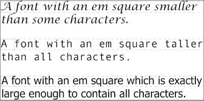
Figure 5-17. Fonts and font size
Thus, the effect of font-size is to provide a size for the em box of a given font. This does not guarantee that any of the actual characters which are displayed will be this size.
5.3.1. Absolute Sizes
Having established all that, we turn now to the absolute-size keywords. There are seven absolute-size values for font-size: xx-small, x-small, small, medium , large, x-large, and xx-large. These are not defined precisely, but are relative to each other, as Figure 5-18 demonstrates:
P.one {font-size: xx-small}
P.two {font-size: x-small;}
P.three {font-size: small;}
P.four {font-size: medium;}
P.five {font-size: large;}
P.six {font-size: x-large;}
P.seven {font-size: xx-large;}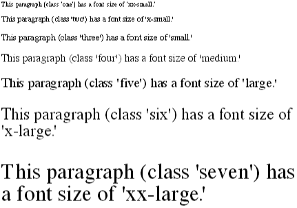
Figure 5-18. Absolute font sizes
According to the CSS1 specification, the difference (or scaling factor) between one absolute size and the next should about 1.5 going up the ladder, or 0.66 going down. Thus, if medium is the same as 10px , then large should be the same as 15px . On the other hand, the scaling factor does not have to be 1.5; not only might it be different for different user agents, but it's already been changed to a factor of 1.2 by CSS2.
Working from the assumption that medium equals 12px, for different scaling factors, we get the absolute sizes shown in Table 5-3. (The values are approximations, of course.)
Table 5-3. Scaling Factors Translated to Points
|
Keyword |
Scaling: 1.5 |
Scaling: 1.3 |
Scaling: 1.2 |
|---|---|---|---|
|
xx-small |
4px |
5px |
6px |
|
x-small |
6px |
7px |
8px |
|
small |
8px |
9px |
10px |
|
medium |
12px |
12px |
12px |
|
large |
18px |
16px |
14px |
|
x-large |
27px |
21px |
17px |
|
xx-large |
42px |
27px |
In general, these sizes are precomputed by browsers and do not change once they have been computed. Thus, if a browser considers x-large to be 27px, then it will be that size no matter what happens. This is a shame, because it would make far more sense (and be more in line with the aims of CSS) to have the absolute sizes recomputed whenever users change their browser preferences.
Further complicating the situation is the fact that different user agents can assign the "default" font size to different absolute keywords. Take the Version 4 browsers as an example: Navigator makes medium the same size as unstyled text, whereas Internet Explorer assumes that small text is equivalent in size to unstyled text. Despite the fact that the default value for font-style is supposed to be medium, Internet Explorer's behavior isn't quite so wrongheaded as it might first appear.[2]
[2]Note that there are seven absolute-size keywords, just as there are seven FONT sizes (e.g., <FONT SIZE="5">). Since the typical default font size has historically been 3, it makes some sense that the third value on the CSS absolute-size keyword list would be used to indicate a default font size. Since the third keyword turns out to be small, you get Explorer's behavior. Technically, Microsoft has included this default style: BODY {font-size: small;}. The only way to override it is to explicitly declare a value of medium, but then the document's font size would be different in Internet Explorer than in Navigator.
5.3.2. Relative Sizes
Compared to all this, the keywords larger and smaller are simple to understand: they cause the size of an element to be shifted up or down the absolute-size scale, relative to their parent element, using the same scaling factor employed to calculate absolute sizes. In other words, if the browser used a scaling factor of 1.2 for absolute sizes, then it should use the same factor when applying relative-size keywords. Thus:
P {font-size: medium;}
STRONG, EM {font-size: larger;}

<P>This paragraph element contain <STRONG>a strong-emphasis element
which itself contains <EM>an emphasis element that also contains
<STRONG>a strong element.</STRONG></EM></STRONG></P>

<P> medium <STRONG>large <EM> x-large
<STRONG>xx-large</STRONG></EM></STRONG></P>
Thanks to the way font-size operates, the sizes get larger (or smaller) as shown in Figure 5-19.
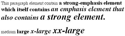
Figure 5-19. Relative font sizing
Unlike the relative values for weight, the relative-size values are not necessarily constrained to the limits of the absolute-size range. Thus, a font's size can be pushed beyond the values for xx-small and xx-large. For example:
H1 {font-size: xx-large;}
EM {font-size: larger;}

<H1>A Heading with <EM>Emphasis</EM> added</H1>
<P>This paragraph has some <EM>emphasis</EM> as well.</P>

<H1> xx-large <EM> xx-large </EM> xx-large </H1>
<P> medium <EM>large </EM> medium </P>
As we can see in Figure 5-20, the emphasized text in the H1 element is slightly larger than xx-large. The amount of scaling is left up to the user agent, with the recommended scaling factor of 1.2 being preferred. The EM text in the paragraph, of course, is shifted one slot up the absolute-size scale (large).
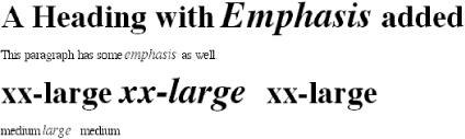
Figure 5-20. Relative font sizing at the edges of the absolute sizes
5.3.3. Percentages and Sizes
In a way, percentage values are very similar to the relative-size keywords in that a percentage value is always computed in terms of whatever size is inherited from an element's parent. Percentages, unlike the relative-size keywords, permit much finer control over the computed font size. Consider the following, illustrated in Figure 5-21:
P {font-size: 12px;}
EM {font-size: 120%;}
STRONG {font-size: 135%;}
SMALL, .fnote {font-size: 75%;}

<P>This paragraph contains both <EM>emphasis</EM> and <STRONG>strong
emphasis</STRONG>, both of which are larger than their parent element.
The <SMALL>small text</SMALL>, on the other hand, is smaller by a quarter.</P>
<P CLASS="fnote">This is a 'footnote' and is smaller than regular text.</P>

<P> 12px <EM> 14.4px </EM> 12px <STRONG> 16.2px </STRONG>  12px
<SMALL> 9px </SMALL> 12px </P>
<P CLASS="fnote"> 9px </P> 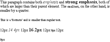
Figure 5-21. Throwing percentages into the mix
In this example, the exact pixel size values are shown. In practice, a web browser would very likely not round the values off to the nearest whole-number point size, such as 14px, but instead would use fractional sizes.
Incidentally, CSS defines the length value em to be equivalent to percentage values, in the sense that 1em is the same as 100%. Thus, the following would yield identical results:
P.one {font-size: 166%;}
P.two {font-size: 1.6em;}
When using em measures, the same principles apply as with percentages, such as the inheritance of computed sizes and so forth.
5.3.4. Font Size and Inheritance
In CSS, although font-size is inherited, it is the computed values that are inherited, not percentages, as shown in Figure 5-21. Thus, the value inherited by the STRONG element is 12px, and this value is modified by the declared value 135% to arrive at 16.2 pixels (which might be rounded off to 16 pixels).
As with the relative-size keywords, percentages are effectively cumulative. Thus, the following markup is displayed as shown in Figure 5-22:
P {font-size: 12px;}
EM {font-size: 120%;}
STRONG {font-size: 135%;}

<P>This paragraph contains both <EM>emphasis and <STRONG>strong
emphasis</STRONG></EM>, both of which are larger than the paragraph text. </P>

<P> 12px <EM>14.4px <STRONG>19.44px</STRONG></EM> 12px  </P>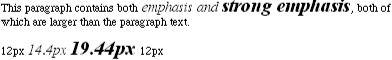
Figure 5-22. The issues of inheritance
The size value for the STRONG element shown in Figure 5-22 is computed as follows:
12 px x 120% = 14.4 px
14.4 px x 135% = 19.44 px (possibly rounded to 19 px)
There is an alternative scenario, however, in which the final value is slightly different. In this scenario, the user agent rounds off pixel size, and these rounded values are then inherited normally by any child elements. Thus, we would have:
12 px x 120% = 14.4 px [14.4 px
14 px]
14 px x 135% = 18.9 px [18.9 px
If one assumes that the user agent is rounding off at each step, then the end result of both this calculation and the previous one is the same: 19 pixels. However, as more and more percentages are multiplied together, the rounding errors will begin to accumulate. This shouldn't be a major problem -- after all, CSS doesn't guarantee you precise control over anything -- but it is still a factor to consider.
5.3.5. Using Length Units
The font-size can be set using any of the length values discussed in detail in Chapter 3, "Units and Values". In a 72 dots-per-inch (dpi) environment, all of the following font-size declarations should be equivalent:
P.one {font-size: 36pt;}   /* assuming 72 dpi, these are all the same thing */
P.two {font-size: 3pc;}
P.three {font-size: 0.5in;}
P.four {font-size: 1.27cm;}
P.five {font-size: 12.7mm;}
Correct display assumes that the user agent knows how many dots per inch are used in the display medium. Different user agents make different assumptions -- some based on the operating system, some based on preferences settings, and some based on the assumptions of the programmer who wrote the user agent. However, the five lines should always be the same size. So, while the result may not exactly match reality (for example, the actual size of P.three may not be half an inch), the measures should all be consistent to one another.
There is one more value that is potentially the same as those just discussed, and that's 36px , which would be the same physical distance if the display medium is 72 pixels per inch (ppi). However, there are very few monitors with that setting anymore. Most are much higher, in the range of 96 dpi to 120 ppi. Despite this, many Macintosh web browsers tend to treat points (pt) and pixels (px) as though they were equivalent, so the values 14pt and 14px may look the same on a Macintosh. This is not the case, however, for Windows and other platforms, which is one of the primary reasons why points can be a very difficult measure to use in document design.
The variations between operating systems are a primary reason why many authors choose to use pixel values for font sizes. This approach is especially attractive when mixing text and images together on a web page, since text can (in theory) be set to the same height as graphic elements on the page by declaring font-size: 11px; or something similar, as illustrated by Figure 5-23.
Figure 5-23. Keeping text and graphics in scale with pixel sizes
Using pixel measures is certainly one way to get "consistent" results with font-size (and, indeed, with any length at all), but remember what can happen when a user agent mistakenly defines "pixel" to be the same as "smallest dot." In a 300-dpi environment, that will make text nearly twenty times smaller than was likely intended. In addition, pixel-sized text will be of different physical sizes on different monitors, and under different resolutions, such that any use of px for measurements effectively prohibits the use of measurements such as in and cm within the same document. In fact, if you're designing for display in a web browser, it's generally best to avoid length units altogether. The other approaches shown in this chapter, such as keywords and percentages, are a much more robust (and user-friendly) way to go.
 |  |  |
| 5.2. Font Weights |  | 5.4. Styles and Variants |

Copyright © 2002 O'Reilly & Associates. All rights reserved.