
5.2. Font Weights
font-weight
- Values
normal | bold | bolder | lighter | 100 | 200 | 300 | 400 | 500 | 600 | 700 | 800 | 900
- Initial value
normal
- Inherited
yes
- Applies to
all elements
Even though you may not realize it, you're already familiar with font weights: boldfaced text is a very common example of an increased font weight. Generally speaking, the darker and "more bold" a font appears, the heavier it is said to be. There are a great many ways to label the heaviness of fonts. For example, the font family known as Zurich has a number of variants such as Zurich Bold, Zurich Black, Zurich UltraBlack, Zurich Light, and Zurich Regular. Each of these uses the same basic font, but each has a different weight.
So let's say that you want to use Zurich for a document, but you'd like to make use of all those different heaviness levels. You could refer to them directly through the font-family property, but you really shouldn't have to do that. Besides, it's no fun having to write a style sheet such as this:
H1 {font-family: 'Zurich UltraBlack', sans-serif;}
H2 {font-family: 'Zurich Black', sans-serif;}
H3 {font-family: 'Zurich Bold', sans-serif;}
H4, P {font-family: Zurich, sans-serif;}
SMALL {font-family: 'Zurich Light', sans-serif;}
Besides the obvious tedium of writing such a style sheet, it only works if everyone has these fonts installed, and it's pretty safe bet that most people don't. It would make far more sense to specify a single font family for the whole document and then assign weights to various elements. You can do this, in theory, using the various values for the property font-weight. A fairly obvious font-weight declaration is this:
B {font-weight: bold;}This says, simply, that the B element should be displayed using a boldface font; or, to put it another way, a font that is heavier than is normal for the document, as shown in Figure 5-8. This is what we're used to, of course, since B does cause text to be boldfaced.
Figure 5-8. Making the B tag bold
However, what's really happening is that a heavier variant of the font is used for displaying a B element. Thus, if you have a paragraph displayed using Times, and part of it is boldfaced, then there are really two variants of the same font in use: Times and TimesBold. The regular text is displayed using Times, and the boldfaced text uses TimesBold.
5.2.1. How Weights Work
In order to understand how a user agent determines the heaviness, or weight, of a given font variant, not to mention how weight is inherited, it's easiest to start by talking about the keywords 100 through 900. These number keywords were defined to map to a relatively common feature of font design in which a font is given nine levels of weight. OpenType, for example, employs a numeric scale with nine values. If a font has these levels built in, then the numbers are mapped directly to the predefined levels, with 100 as the lightest variant of the font, and 900 as the heaviest.
In fact, there is no intrinsic weight in these numbers. The CSS specification says only that each number corresponds to a weight at least as heavy as the number that precedes it. Thus, 100, 200, 300, and 400 might all map to the same relatively lightweight variant, while 500 and 600 could correspond to the same heavier font variant, and 700, 800, and 900 could all produce the same very heavy font variant. As long as no keyword corresponds to a variant that is lighter than the variant assigned to the previous keyword, then everything will be all right.
As it happens, these numbers are defined to be equivalent to certain common variant names, not to mention other values for font-weight. 400 is defined to be equivalent to normal, and 700 corresponds to bold. The other numbers do not match up with any other values for font-weight, but they can correspond to common variant names. If there is a font variant labeled something such as "Normal," "Regular," "Roman," or "Book," then it is assigned to the number 400 and any variant with the label "Medium" is assigned to 500. However, if a variant labeled "Medium" is the only variant available, it is not assigned to 500.
A user agent has to do even more work if there are less than nine weights in a given font family. In this case, it has to fill in the gaps in a predetermined way:
-
If the value 500 is unassigned, it is given the same font weight as that assigned to 400.
-
If 300 is unassigned, it is given the next variant lighter than 400. If no lighter variant is available, 300 is assigned the same variant as 400. In this case, it will usually be "Normal" or "Medium." This method is also used for 200 and 100.
-
If 600 is unassigned, it is given the next variant darker than 400. If no darker variant is available, 600 is assigned the same variant as 500. This method is also used for 700, 800, and 900.
In order to understand this more clearly, let's look at three examples of font-weight assignment. In the first, assume that the font family Karrank% is an OpenType font and so already has nine weights already defined. In this case, the numbers are assigned to each level, and the keywords normal and bold are assigned to the numbers 400 and 700, respectively.
In our second example, we consider the font family Zurich, which was discussed near the beginning of this section. Hypothetically, its variants might be assigned values for font-weight as shown in Table 5-3.
Table 5-1. Hypothetical Weight Assignments for a Specific Font
|
Font Face |
Assigned Keyword |
Assigned Number(s) |
|---|---|---|
|
Zurich Light |
100, 200, 300 |
|
|
normal |
400 |
|
|
Zurich Medium |
500 |
|
|
Zurich Bold |
bold |
600, 700 |
|
Zurich Black |
800 |
|
|
Zurich UltraBlack |
900 |
The first three number values are assigned to the lightest weight. The Regular face gets the keywords 400 and normal, as expected. Since there is a Medium font, it's assigned to the number 500. There is nothing to assign to 600, so it's mapped to the Bold font face, which is also the variant to which 700 and bold are assigned. Finally, 800 and 900 are assigned to the Black and UltraBlack variants. Note that this last would only happen if those faces had the top two weight levels already assigned. Otherwise, the user agent might ignore them, and assign 800 and 900 to the Bold face instead, or it might assign them both to one or the other of the Black variants.
Finally, let's consider a stripped-down version of Times, in which there are only two weight variants, TimesRegular and TimesBold, as shown in Table 5-2.
Table 5-2. Hypothetical Weight Assignments for Times
|
Font Face |
Assigned Keyword |
Assigned Number(s) |
|---|---|---|
|
TimesRegular |
normal |
100, 200, 300, 400, 500 |
|
TimesBold |
bold |
600, 700, 800, 900 |
The assignment of the keywords normal and bold is straightforward enough, of course. As for the numbers, 100 through 300 are assigned to the Regular face because there isn't a lighter face available. 400 goes to Regular as expected, but what about 500 ? It is assigned to the Regular (or normal) face because there isn't a Medium face available; thus, it is assigned the same as 400. As for the rest, 700 goes with bold as always, while 800 and 900, lacking a heavier face, are assigned to the Bold font face. Finally, 600 is assigned to the next-heavier face, which is, of course, the Bold face.
font-weight is inherited, so if you set a paragraph to be bold, then all of its children will inherit that boldness, as we see in Figure 5-9.
P.one {font-weight: bold;}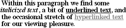
Figure 5-9. Inherited font weight
This isn't unusual, but the situation gets interesting when you use the last two values we have to discuss: bolder and lighter. In general terms, these keywords have the effect you'd anticipate: they make text more or less bold with comparison to its parent's font weight. Let's consider bolder first.
5.2.2. Getting Bolder
If you set an element to have a weight of bolder, then the user agent first must determine what font-weight was inherited from the parent element. It then selects the lowest number which corresponds to a font weight darker than what was inherited. If none is available, then the user agent sets the element's font weight to the next numerical value, unless the value is already 900, in which case the weight remains at 900. Thus, you might encounter the following situations, illustrated in Figure 5-10:
P {font-weight: normal;}
P EM {font-weight: bolder;}  /* results in 'bold' text, evaluates to '700' */

H1 {font-weight: bold;}
H1 B {font-weight: bolder;}  /* if no bolder face exists, evaluates to '800' */

P {font-weight: 100;} /* assume 'Light' face exists ; see explanation */
P STRONG {font-weight: bolder;} /* results in 'normal' text, weight '400' */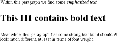
Figure 5-10. Text trying to be more bold
In the first example, the user agent moves up the weight ladder from normal to bold ; in numeric terms, this is a jump from 400 to 700. In the second example, H1 text is already set to bold. If there is no bolder face available, then the user agent sets the weight of B text within an H1 to 800, since that is the next step up from 700 (the numeric equivalent to bold). Since 800 is assigned to the same font face as 700, there is no visible difference between normal H1 text and boldfaced H1 text, but nonetheless the weights are different.
In the last example, paragraphs are set to be the lightest possible font weight, which we assume exists as a Light variant. Furthermore, the other faces in this font family are Regular and Bold. Any EM text within a paragraph will evaluate to normal, since that is the next-heaviest face within the font family. However, what if the only faces in the font are Regular and Bold ? In that case, the declarations would evaluate like this:
/*   assume only two faces for this example: 'Regular' and 'Bold'   */
P {font-weight: 100;}   /* looks the same as 'normal' text */
P SPAN {font-weight: bolder;}   /* maps to '700' */
As we can see, the weight 100 is assigned to the normal font face, but the value of font-weight is still 100. Thus, the SPAN text (which is set to be bolder) will inherit the value of 100 and then evaluate to the next-heaviest face, which is the Bold face and which has a numerical weight of 700. Figure 5-11 shows us the visual result of all this.
Figure 5-11. Greater weight will usually confer visual boldness
Let's take this all one step further, and add two more rules, plus some markup, to illustrate how all this works (see Figure 5-12 for the results):
/*   assume only two faces for this example: 'Regular' and 'Bold'   */
P {font-weight: 100;}   /* looks the same as 'normal' text */
P SPAN {font-weight: 400;}   /* so does this */
STRONG {font-weight: bolder;}   /* bolder than its parent */
STRONG B {font-weight: bolder;}   /* bolder still */

<P>
This paragraph contains elements of increasing weight: there is an
<SPAN>SPAN element which contains a <STRONG>strongly emphasized
element, and that contains a <B>boldface element</B></STRONG></SPAN>.
</P>
Figure 5-12. Moving up the weight scale
In the last two nested elements, the computed value of font-weight is increased because of the liberal use of the keyword bolder. If we were to replace the text in the paragraph with numbers representing the font-weight of each element, we would get the results in Figure 5-13:
<P>
100 <SPAN> 400 <STRONG> 700 <B> 800 </B></STRONG></SPAN>.
</P>
Figure 5-13. Changing weight, with the numbers to illustrate it
The first two weight increases are large because they represent jumps from 100 to 400, and from 400 to bold (700). From 700, there is no heavier face, so the user agent simply moves the value of font-weight one notch up the numeric scale (800). Furthermore, if we were to insert a STRONG element into the B element, it would come out like Figure 5-14:
<P>
100 <SPAN> 400 <STRONG> 700 <B> 800 <STRONG> 900
</STRONG></B></STRONG></SPAN>.
</P>
Figure 5-14. Weight numbers, again
If there were yet another B element inserted into the innermost STRONG element, its weight would also be 900, since font-weight can never be higher than 900. Assuming, as we have, that there are only two font faces available, then the text would appear to be either Regular or Bold text, as we see in Figure 5-15:
<P>
regular <SPAN> regular <STRONG> bold <B> bold
<STRONG> bold </STRONG></B></STRONG></SPAN>.
</P>
Figure 5-15. Visual weight, with descriptors
5.2.3. Lightening Weights
As you might expect, lighter works in just the same way, except that it causes the user agent to move down the weight scale, instead of up. With a quick modification of the previous example, we can see this very clearly:
/*   assume only two faces for this example: 'Regular' and 'Bold'   */
P {font-weight: 900;}   /* as bold as possible, which will look 'bold' */
P SPAN {font-weight: 700;}   /* this will also be bold */
STRONG {font-weight: lighter;}   /* lighter than its parent */
B {font-weight: lighter;}   /*lighter still */

<P>
900 <SPAN> 700 <STRONG> 400 <B> 300 <STRONG> 200
</STRONG></B></STRONG></SPAN>.
</P>
<!-- ...or, to put it another way... -->
<P>
bold <SPAN> bold <STRONG> regular <B> regular
<STRONG> regular </STRONG></B></STRONG></SPAN>.
</P>
Ignoring the fact that this would be entirely counterintuitive, what we see in Figure 5-16 is that the main paragraph text has a weight of 900 and the SPAN aweight of 700. When the STRONG text is set to lighter, it evaluates to the next-lighter face, which is the regular face, or 400 (the same as normal) on the numeric scale. The next step down is to 300, which comes out the same as normal since no lighter faces exist. From there, the user agent can only reduce the weight one numeric step at a time until it reaches 100 (which it doesn't do in the example). The second paragraph shows which text will be bold, and which regular.
Figure 5-16. Making text lighter
 |  |  |
| 5. Fonts |  | 5.3. Font Size |

Copyright © 2002 O'Reilly & Associates. All rights reserved.