
5.4. Styles and Variants
In comparison with everything that's gone before, this section is practically a no-brainer. The properties discussed herein are so straightforward, and the complexities so minimal, that this will probably all come as a great relief. First we'll talk about font-style, and then move on to font-variant before wrapping up the font properties.
5.4.1. Fonts with Style
font-style is very simple: it's used to select between normal text, italic text, and oblique text. That's it! The only complications are in recognizing the difference between italic and oblique text and knowing why browsers don't always give you a choice anyway.
font-style
- Values
italic | oblique | normal
- Initial value
normal
- Inherited
yes
- Applies to
all elements
The default value of font-style is, as we can see, normal. This refers to "upright" text, which is probably best described as "text that is not italic or otherwise slanted." The vast majority of text in this book is upright, for instance.
That leaves only an explanation of the difference between italic and oblique text. For that, it's easiest to turn to Figure 5-24, which illustrates the differences very clearly.
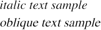
Figure 5-24. Italic and oblique text in detail
Basically, italic text is in some way its own font, with small changes made to the structure of each letter to account for the altered appearance. This is especially true of serif fonts, where in addition to the fact that the text characters "lean," the serifs may be altered in an italic face. Oblique text, on the other hand, is simply a slanted version of the normal, upright text. Font faces with labels like Italic, Cursive, and Kursiv are usually mapped to the italic keyword, while oblique can be assigned faces with labels such as Oblique, Slanted, and Incline.
If you wanted to make sure that a document uses italic text in familiar ways, you could write a style sheet like this:
P {font-style: normal;}
EM, I {font-style: italic;}
As we can see in Figure 5-25, these styles would make paragraphs use an upright font, as usual, and cause the EM and I elements to use an italic font -- again, as usual.
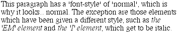
Figure 5-25. Ordinary document behavior through CSS
On the other hand, you might decide that there should be a subtle difference between EM and I:
P {font-style: normal;}
EM {font-style: oblique;}
I {font-style: italic;}
If you look closely at Figure 5-26, you'll see there is no apparent difference between the EM and I elements. In practice, not every font is so sophisticated as to have both an italic face and an oblique face, and even fewer web browsers are sophisticated enough to tell the difference when both faces do exist.
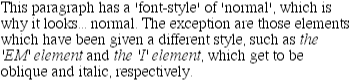
Figure 5-26. More font styles
If either of these is the case, a few things can happen. If there is no Italic face, but there is an Oblique face, then the latter can be used for the former. If the situation is reversed -- an Italic face exists, but there is no defined Oblique face -- the user agent may not substitute the former for the latter, according to the CSS specification. Finally, the user agent can simply generate the oblique face by computing a slanted version of the upright font. In fact, this is what most often happens in a digital world, where it's fairly easy to slant a font using a simple computation.
Furthermore, you may find that in some operating systems, a given font that has been declared to be italic may switch from being italic to oblique depending on the actual size of the font. The display of Times on a Macintosh, for example, is as shown in Figure 5-27, and the only difference there is a single point in size.
Figure 5-27. Same font, same style, different sizes
There isn't much that can be done about this, unfortunately, save better font handling by operating systems. Usually, the italic and oblique fonts look exactly the same in web browsers.
Still, font-style can be useful. For example, it is a common typographic convention that a block quote should be italicized, but that any specially emphasized text within the quote should be upright. In order to employ this effect, shown in Figure 5-28, you would use these styles:
BLOCKQUOTE {font-style: italic;}
BLOCKQUOTE EM, BLOCKQUOTE I {font-style: normal;}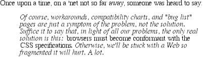
Figure 5-28. Common typographical conventions through CSS
5.4.2. Font Variations
In addition to sizes and styles, fonts can also have variants. CSS offers a way to address one very common variant.
font-variant
- Values
small-caps | normal
- Initial value
normal
- Inherited
yes
- Applies to
all elements
As for font-variant, it has but two values: the default of normal, which describes ordinary text, and small-caps, which calls for the use of small caps text. If you aren't familiar with such an effect, It Looks Something Like This . Instead of upper- and lowercase letters, a small-caps font employs uppercase letters of different sizes. Thus you might see something like the following, shown in Figure 5-29:
H1 {font-variant: small-caps;}
P {font-variant: normal;}

<H1>The Uses of font-variant</H1>
<P>
The property <CODE>font-variant</CODE> is very interesting...
</P>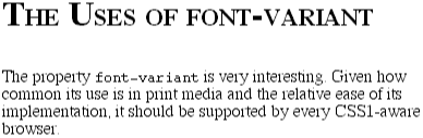
Figure 5-29. Small caps in use
As you may notice, in the display of the H1 element, there is a larger uppercase letter wherever an uppercase letter appears in the source and a small uppercase wherever there is a lowercase letter in the source. This may remind you rather strongly of text-transform: uppercase, with the only real difference that here, the uppercase letters are of different sizes. That's true, but the reason that small-caps is declared using a font property is that some fonts have a specific small-caps face. Thus, a font property is used to select that face.
What happens if no such face exists? There are two options provided in the specification. The first is for the user agent to create a small-caps face by scaling uppercase letters on its own. The second is simply to make all letters uppercase and the same size, exactly as if the declaration text-transform: uppercase; had been used instead, as shown in Figure 5-30. This is obviously not an ideal solution, but it is permitted.
H1 {font-variant: small-caps;}Figure 5-30. Legal, if not optimal, rendering of small caps
WARNING
Of the browsers which even recognize font-variant: small-caps (Explorer 4 and 5, and Opera 3.5), only Opera and IE5 for Macintosh do what authors would expect in the display of the text. Other versions of Explorer take the all-capitals route.
 |  |  |
| 5.3. Font Size |  | 5.5. Using Shorthand: The font Property |

Copyright © 2002 O'Reilly & Associates. All rights reserved.