
 |  |
18.2. Element Positioning with CSS
For DHTML content developers, the most important feature of CSS is the ability to use ordinary CSS style attributes to specify the visibility, size, and precise position of individual elements of a document. In order to do DHTML programming, it is important to understand how these style attributes work. They are summarized in Table 18-2 and documented in more detail in the sections that follow.
Table 18-2. CSS positioning and visibility attributes
|
Attribute(s) |
Description |
|---|---|
|
position |
Specifies the type of positioning applied to an element |
|
top, left |
Specifies the position of the top and left edges of an element |
|
bottom, right |
Specifies the position of the bottom and right edges of an element |
|
width, height |
Specifies the size of an element |
|
z-index |
Specifies the "stacking order" of an element relative to any overlapping elements; defines a third dimension of element positioning |
|
display |
Specifies how and whether an element is displayed |
|
visibility |
Specifies whether an element is visible |
|
clip |
Defines a "clipping region" for an element; only portions of the element within this region are displayed |
|
overflow |
Specifies what to do if an element is bigger than the space allotted for it |
18.2.1. The Key to DHTML: The position Attribute
The CSS position attribute specifies the type of positioning applied to an element. The four possible values for this attribute are:
- static
- This is the default value and specifies that the element is positioned according to the normal flow of document content (for most Western languages, this is left to right and top to bottom.) Statically positioned elements are not DHTML elements and cannot be positioned with the top, left, and other attributes. To use DHTML positioning techniques with a document element, you must first set its position attribute to one of the other three values.
- absolute
- This value allows you to specify the position of an element relative to its containing element. Absolutely positioned elements are positioned independently of all other elements and are not part of the flow of statically positioned elements. An absolutely positioned element is positioned either relative to the <body> of the document or, if it is nested within another absolutely positioned element, relative to that element. This is the most commonly used positioning type for DHTML.
- fixed
- This value allows you to specify an element's position with respect to the browser window. Elements with fixed positioning do not scroll with the rest of the document and thus can be used to achieve frame-like effects. Like absolutely positioned elements, fixed-position elements are independent of all others and are not part of the document flow. Fixed positioning is a CSS2 feature and is not supported by fourth-generation browsers. (It is supported in Netscape 6 and IE 5 for the Macintosh, but it is not supported by IE 5 or IE 6 for Windows).
- relative
- When the position attribute is set to relative, an element is laid out according to the normal flow, and its position is then adjusted relative to its position in the normal flow. The space allocated for the element in the normal document flow remains allocated for it, and the elements on either side of it do not close up to fill in that space, nor are they "pushed away" from the new position of the element. Relative positioning can be useful for some static graphic design purposes, but it is not commonly used for DHTML effects.
18.2.2. Specifying the Position and Size of Elements
Once you have set the position attribute of an element to something other than static, you can specify the position of that element with some combination of the left , top, right, and bottom attributes. The most common positioning technique is to specify the left and top attributes, which specify the distance from the left edge of the containing element (usually the document itself ) to the left edge of the element, and the distance from the top edge of the container to the top edge of the element. For example, to place an element 100 pixels from the left and 100 pixels from the top of the document, you can specify CSS styles in a style attribute as follows:
<div style="position: absolute; left: 100px; top: 100px;">
The containing element relative to which a dynamic element is positioned is not necessarily the same as the containing element within which the element is defined in the document source. Since dynamic elements are not part of normal element flow, their positions are not specified relative to the static container element within which they are defined. Most dynamic elements are positioned relative to the document (the <body> tag) itself. The exception is dynamic elements that are defined within other dynamic elements. In this case, the nested dynamic element is positioned relative to its nearest dynamic ancestor.
Although it is most common to specify the position of the upper-left corner of an element with left and top, you can also use right and bottom to specify the position of the bottom and right edges of an element relative to the bottom and right edges of the containing element. For example, to position an element so that its bottom-right corner is at the bottom-right of the document (assuming it is not nested within another dynamic element), use the following styles:
position: absolute; right: 0px; bottom: 0px;
To position an element so that its top edge is 10 pixels from the top of the window and its right edge is 10 pixels from the right of the window, you can use these styles:
position: fixed; right: 10px; top: 10px;
Note that the right and bottom attributes are newer additions to the CSS standard and are not supported by fourth-generation browsers, as top and left are.
In addition to the position of elements, CSS allows you to specify their size. This is most commonly done by providing values for the width and height style attributes. For example, the following HTML creates an absolutely positioned element with no content. Its width, height, and background-color attributes make it appear as a small blue square:
<div style="position: absolute; left: 10px; right: 10px;
            width: 10px; height: 10px; background-color: blue">
</div>
Another way to specify the width of an element is to specify a value for both the left and right attributes. Similarly, you can specify the height of an element by specifying both top and bottom. If you specify a value for left, right, and width, however, the width attribute overrides the right attribute; if the height of an element is over-constrained, height takes priority over bottom.
Bear in mind that it is not necessary to specify the size of every dynamic element. Some elements, such as images, have an intrinsic size. Furthermore, for dynamic elements that contain text or other flowed content, it is often sufficient to specify the desired width of the element and allow the height to be determined automatically by the layout of the element's content.
In the previous positioning examples, values for the position and size attributes were specified with the suffix "px". This stands for pixels. The CSS standard allows measurements to be done in a number of other units, including inches ("in"), centimeters ("cm"), points ("pt"), and ems ("em" -- a measure of the line height for the current font). Pixel units are most commonly used with DHTML programming. Note that the CSS standard requires a unit to be specified. Some browsers may assume pixels if you omit the unit specification, but you should not rely on this behavior.
Instead of specifying absolute positions and sizes using the units shown above, CSS also allows you to specify the position and size of an element as a percentage of the size of the containing element. For example, the following HTML creates an empty element with a black border that is half as wide and half as high as the containing element (or the browser window) and centered within that element:
<div style="position: absolute; left: 25%; top: 25%; width: 50%; height: 50%;
            border: 2px solid black">
</div>
18.2.2.1. Element size and position details
It is important to understand some details about how the left , right, width, top, bottom, and height attributes work. First, width and height specify the size of an element's content area only; they do not include any additional space required for the element's padding, border, or margins. To determine the full onscreen size of an element with a border, you must add the left and right padding and left and right border widths to the element width, and you must add the top and bottom padding and top and bottom border widths to the element's height.
Since width and height specify the element content area only, you might think that left and top (and right and bottom) would be measured relative to the content area of the containing element. In fact, the CSS standard specifies that these values are measured relative to the outside edge of the containing element's padding (which is the same as the inside edge of the element's border).
Let's consider an example to make this clearer. Suppose you've created a dynamically positioned container element that has 10 pixels of padding all the way around its content area and a 5 pixel border all the way around the padding. Now suppose you dynamically position a child element inside this container. If you set the left attribute of the child to "0 px", you'll discover that the child is positioned with its left edge right up against the inner edge of the container's border. With this setting, the child overlaps the container's padding, which presumably was supposed to remain empty (since that is the purpose of padding). If you want to position the child element in the upper left corner of the container's content area, you should set both the left and top attributes to "10px". Figure 18-1 helps to clarify this.
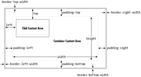
Figure 18-1. Dynamically positioned container and child elements with some CSS attributes
Now that you understand that width and height specify the size of an element's content area only and that the left, top, right, and bottom attributes are measured relative to the containing element's padding, there is one more detail you must be aware of: Internet Explorer Versions 4 through 5.5 for Windows (but not IE 5 for the Mac) implement the width and height attributes incorrectly and include an element's border and padding (but not its margins). For example, if you set the width of an element to 100 pixels and place a 10-pixel margin and a 5-pixel border on the left and right, the content area of the element ends up being only 70 pixels wide in these buggy versions of Internet Explorer.
In IE 6, the CSS position and size attributes work correctly when the browser is in standards mode and incorrectly (but compatibly with earlier versions) when the browser is in compatibility mode. Standards mode, and hence correct implementation of the CSS "box model," is triggered by the presence of a <!DOCTYPE> tag at the start of the document, declaring that the document adheres to the HTML 4.0 (or later) standard or some version of the XHTML standards. For example, any of the following three HTML document type declarations cause IE 6 to display documents in standards mode:
<!DOCTYPE HTML PUBLIC "-//W3C//DTD HTML 4.0//EN">
<!DOCTYPE HTML PUBLIC "-//W3C//DTD HTML 4.0 Strict//EN">
<!DOCTYPE HTML PUBLIC "-//W3C//DTD HTML 4.0 Transitional//EN"
    "http://www.w3.org/TR/html4/loose.dtd">
Netscape 6 and the Mozilla browser handle the width and height attributes correctly. But these browsers also have standards and compatibility modes, just as IE does. The absence of a <!DOCTYPE> declaration puts the Netscape browser in quirks mode, in which it mimics certain (relatively minor) nonstandard layout behaviors of Netscape 4. The presence of <!DOCTYPE> causes the browser to break compatibility with Netscape 4 and correctly implement the standards.
18.2.3. The Third Dimension: z-index
We've seen that the left, top, right, and bottom attributes can be used to specify the X and Y coordinates of an element within the two-dimensional plane of the containing element. The z-index attribute defines a kind of third dimension: it allows you to specify the stacking order of elements and indicate which of two or more overlapping elements is drawn on top of the others. The z-index attribute is an integer. The default value is zero, but you may specify positive or negative values (although fourth-generation browsers may not support negative z-index values). When two or more elements overlap, they are drawn in order from lowest to highest z-index; the element with the highest z-index appears on top of all the others. If overlapping elements have the same z-index, they are drawn in the order in which they appear in the document, so the last overlapping element appears on top.
Note that z-index stacking applies only to sibling elements (i.e., elements that are children of the same container). If two elements that are not siblings overlap, setting their individual z-index attributes does not allow you to specify which one is on top. Instead, you must specify the z-index attribute for the two sibling containers of the two overlapping elements.
Nonpositioned elements are always laid out in a way that prevents overlaps, so the z-index attribute does not apply to them. Nevertheless, they have a default z-index of zero, which means that positioned elements with a positive z-index appear on top of the normal document flow, and positioned elements with a negative z-index appear beneath the normal document flow.
Note, finally, that some browsers do not honor the z-index attribute when it is applied to <iframe> tags, and you may find that inline frames float on top of other elements, regardless of the specified stacking order. You may have the same problem with other "windowed" elements such as <select> drop-down menus. Fourth-generation browsers may display all form-control elements on top of absolutely positioned elements, regardless of z-index settings.
18.2.4. Element Display and Visibility
There are two CSS attributes you can use to affect the visibility of a document element: visibility and display. The visibility attribute is simple: when the attribute is set to the value hidden, the element is not shown; when it is set to the value visible, the element is shown. The display attribute is more general and is used to specify the type of display an item receives. It specifies whether an element is a block element, an inline element, a list item, and so on. When display is set to none, however, the affected element is not displayed, or even laid out, at all.
The difference between the visibility and display style attributes has to do with their effect on elements that are not dynamically positioned. For an element that appears in the normal layout flow (with the position attribute set to static or relative), setting visibility to none makes the element invisible but reserves space for it in the document layout. Such an element can be repeatedly hidden and shown without changing the document layout. If an element's display attribute is set to none, however, no space is allocated for it in the document layout; elements on either side of it close up as if it were not there. (visibility and display have equivalent effects when used with absolute- or fixed-position elements, since these elements are never part of the document layout anyway.) You'll typically use the visibility attribute when you are working with dynamically positioned elements. The display attribute is useful when creating things like expanding and collapsing outlines.
Note that it doesn't make much sense to use visibility or display to make an element invisible unless you are going to use JavaScript to dynamically set these attributes and make the element visible at some point![66] You'll see how you can do this later in the chapter.
[66]There is an exception: if you are creating a document that depends on CSS, you can warn users of browsers that do not support CSS with code like this:
18.2.5. Partial Visibility: overflow and clip
The visibility attribute allows you to completely hide a document element. The overflow and clip attributes allow you to display only part of an element. The overflow attribute specifies what happens when the content of an element exceeds the size specified (with the width and height style attributes, for example) for the element. The allowed values and their meanings for this attribute are as follows:
- visible
- Content may overflow and be drawn outside of the element's box if necessary. This is the default.
- hidden
- Content that overflows is clipped and hidden so that no content is ever drawn outside the region defined by the size and positioning attributes.
- scroll
- The element's box has permanent horizontal and vertical scrollbars. If the content exceeds the size of the box, the scrollbars allow the user to scroll to view the extra content. This value is honored only when the document is displayed on a computer screen; when the document is printed on paper, for example, scrollbars obviously do not make sense.
- auto
- Scrollbars are displayed only when content exceeds the element's size, rather than being permanently displayed.
While the overflow property allows you to specify what happens when an element's content is bigger than the element's box, the clip property allows you to specify exactly which portion of an element should be displayed, whether or not the element overflows. This attribute is especially useful for scripted DHTML effects in which an element is progressively displayed or uncovered.
The value of the clip property specifies the clipping region for the element. In CSS2 clipping regions are rectangular, but the syntax of the clip attribute leaves open the possibility that future versions of the standard will support clipping shapes other than rectangles. The syntax of the clip attribute is:
rect(top right bottom left)
The top, right, bottom, and left values specify the boundaries of the clipping rectangle relative to the upper-left corner of the element's box.[67] For example, to display only a 100 x 100-pixel portion of an element, you can give that element this style attribute:
[67]As the CSS2 specification was originally written, these four values specified the offset of the edges of the clipping region from each of the corresponding edges of the element's box. All major browser implementations got it wrong, however, and interpreted the right and bottom values as offsets from the left and top edges. Because the implementations consistently disagree with the specification, the specification is being modified to match the implementations.
style="clip: rect(0px 100px 100px 0px);"
Note that the four values within the parentheses are length values and must include a unit specification, such as "px" for pixels. Percentages are not allowed. Values may be negative to specify that the clipping region extends beyond the box specified for the element. You may also use the keyword auto for any of the four values to specify that that edge of the clipping region is the same as the corresponding edge of the element's box. For example, you can display just the leftmost 100 pixels of an element with this style attribute:
style="clip: rect(auto 100px auto auto);"
Note that there are no commas between the values, and the edges of the clipping region are specified in clockwise order from the top edge.
18.2.6. CSS Positioning Example
Example 18-2 is a nontrivial example using CSS style sheets and CSS positioning attributes. When this HTML document is displayed in a CSS-compliant browser, it creates the visual effect of "subwindows" within the browser window. Figure 18-2 shows the effect created by the code in Example 18-2. Although the listing contains no JavaScript code, it is a useful demonstration of the powerful effects that can be achieved with CSS in general and the CSS positioning attributes in particular.
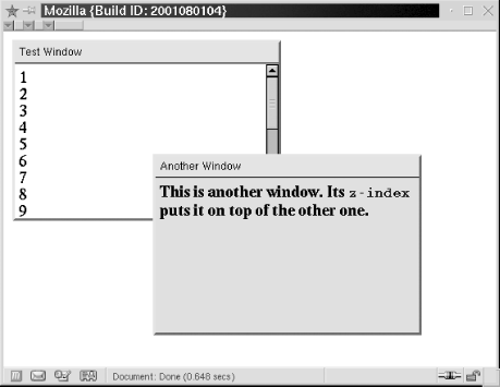
Figure 18-2. Windows created with CSS
Example 18-2. Displaying windows with CSS
<head>
<style type="text/css">
/**
 * This is a CSS style sheet that defines three style rules that we use
 * in the body of the document to create a "window" visual effect.
 * The rules use positioning attributes to set the overall size of the window
 * and the position of its components. Changing the size of the window
 * requires careful changes to positioning attributes in all three rules.
 **/
div.window {  /* Specifies size and border of the window */
    position: absolute;            /* The position is specified elsewhere */
    width: 300px; height: 200px;   /* Window size, not including borders */
    border: outset gray 3px;       /* Note 3D "outset" border effect */
}

div.titlebar {  /* Specifies position, size, and style of the titlebar */
    position: absolute;      /* It's a positioned element */
    top: 0px; height: 18px;  /* Titlebar is 18px + padding and borders */
    width: 290px;            /* 290 + 5px padding on left and right = 300 */
    background-color: ActiveCaption;  /* Use system titlebar color */
    border-bottom: groove black 2px;  /* Titlebar has border on bottom only */
    padding: 3px 5px 2px 5px;  /* Values clockwise: top, right, bottom, left */
    font: caption;             /* Use system font for titlebar */
}

div.content {  /* Specifies size, position and scrolling for window content */
    position: absolute;         /* It's a positioned element */
    top: 25px;                  /* 18px title+2px border+3px+2px padding */
    height: 165px;              /* 200px total - 25px titlebar - 10px padding */
    width: 290px;               /* 300px width - 10px of padding */
    padding: 5px;               /* Allow space on all four sides */
    overflow: auto;             /* Give us scrollbars if we need them */
    background-color: #ffffff;  /* White background by default */
}
</style>
</head>

<body>
<!-- Here is how we define a window: a "window" div with a titlebar and -->
<!-- content div nested between them. Note how position is specified with -->
<!-- a style attribute that augments the styles from the style sheet. -->
<div class="window" style="left: 10px; top: 10px; z-index: 10;">
<div class="titlebar">Test Window</div>
<div class="content">
1<br>2<br>3<br>4<br>5<br>6<br>7<br>8<br>9<br>0<br> <!-- Lots of lines to -->
1<br>2<br>3<br>4<br>5<br>6<br>7<br>8<br>9<br>0<br> <!-- demonstrate scrolling -->
</div>
</div>

<!-- Here's another window with different position, color, and font weight -->
<div class="window" style="left: 170px; top: 140px; z-index: 20;">
<div class="titlebar">Another Window</div>
<div class="content" style="background-color:#d0d0d0; font-weight:bold;">
This is another window. Its <tt>z-index</tt> puts it on top of the other one.
</div>
</div>
</body>
The major shortcoming of this example is that the style sheet specifies a fixed size for all windows. Because the titlebar and content portions of the window must be precisely positioned within the overall window, changing the size of a window requires changing the value of various positioning attributes in all three rules defined by the style sheet. This is difficult to do in a static HTML document, but it would not be so difficult if we could use a script to set all of the necessary attributes. We'll explore this topic in the next section.
|  | |
| 18. Cascading Style Sheets and Dynamic HTML |  | 18.3. Scripting Styles |

Copyright © 2003 O'Reilly & Associates. All rights reserved.