
 |  |
Chapter 4. Adding Dynamic Positioning to Documents
Contents:
Creating Positionable Elements
Positioning Attributes
Changing Attribute Values via Scripting
Cross-Platform Position Scripting
Common Positioning Tasks
Now a part of Cascading Style Sheets Level 2, element positioning standards began life as a CSS1 supplement, called CSS-Positioning (or CSS-P for short). CSS attributes that govern positioning are a well-defined subset of CSS (they comprise a separate module of CSS3), so this chapter occasionally refers to this group as CSS-P.
A fundamental concept of positioning is direct control of the placement of elements on the page, when the browser-controlled flow of content just isn't good enough. To accomplish element positioning, a browser must be able to treat positionable elements as layers that can be dropped anywhere on the page, even overlapping other fixed or positionable elements—something that normal HTML rendering scrupulously avoids.[3]
[3]I use the term "layer" guardedly here. While the word appeared originally in the Navigator 4 DHTML lexicon (derived from Navigator 4's <layer> tag and a scriptable layer object), you probably won't see the same word being used by the Microsoft camp. My application of the term is generic and it aptly describes what's going on here: a positionable element is like an acetate layer of a film cartoon cel. The cartoon artist starts with a base layer for the scene's backdrop and then positions one or more acetate layers atop the background; each layer is transparent except for some or all of the art for a single frame of the film. For the next frame of the cartoon, perhaps one of the layers for a character in the background must move a fraction of an inch. The artist repositions that layer, while the others stay the same. That's what I mean by "layer" in this context.
The notion of layering adds a third dimension to a page, even if a video monitor (or a printed page) is undoubtedly a two-dimensional realm. That third dimension—the layering of elements—is of concern to you as the author of positionable content, but is probably of no concern to the page's human viewer.
While the primary concern of the CSS-P recommendation is the way an author lays out elements in a document, the IE 4 and W3C DOMs expose positioning attributes as scriptable properties that can be changed in response to user action. Now you have the opportunity to create some very interactive content: content that flies around the page, hides and shows itself at will, centers itself horizontally and vertically in the currently sized browser window, and even lets itself be dragged around the page by the user.
Netscape Navigator 4 was the first released browser to incorporate positioned elements. Because its HTML, CSS, and DOM approaches to positioning did not gain favor in the W3C, the techniques were not carried forward in newer browsers. These techniques—as well as their coexistence with the incompatible IE 4 model—were documented at length in the first edition of this book. This new edition, however, addresses only the far more compatible and prevalent IE and W3C implementations.
4.1. Creating Positionable Elements
You can turn any rendered HTML element into a positionable element. This includes block elements, such as p or div containers, as well as arbitrary inline elements, such as img elements or span containers.
4.1.1. Setting the position Attribute
To turn an HTML element into a positionable element, you must assign it a CSS style rule that includes the position attribute and a value other than the default (static). As demonstrated in Chapter 3, you can assign this style attribute by including a style attribute in the actual HTML tag or using an ID selector for the rule and setting the corresponding id attribute in the element's HTML tag.
The following HTML document demonstrates the two techniques you can use to turn an element into a positionable element:
<html>
<head>
<style type="text/css">
    #someSpan {position:absolute; left:10px; top:30px}
</style>
</head>
<body>
<div id="someDiv" style="position:absolute; left:100px; top:50px">
Hello.
<span id="someSpan">
Hello, again.
</span>
</div>
</body>
</html>
The first technique defines an ID selector inside a <style> tag that is mated to an id attribute of a span element in the document's body. The second approach defines the style as an inline attribute of a <div> tag. As with ordinary CSS style sheets, you can use any combination of methodologies (including imported style sheets) to apply position style rules to elements in a document.
Once you have set the position attribute, you can set other CSS-P attributes, such as left and top, to position the element. Possible values for the position attribute are:
- absolute
- Element becomes a block element (even it is normally an inline element) and is positionable relative to the element's positioning context.
- fixed
- Element becomes a block element and positioned like absolute but typically remains in that window position even if the document scrolls.
- relative
- Element maintains its normal position in element geography (unless you override it) and establishes a positioning context for nested items.
- static
- Item is not positionable and maintains its normal position in element geography (default value).
- inherit
- Item inherits the attribute value of its next outermost HTML containing element.
4.1.2. Absolute Versus Relative Positioning
The position attribute terminology can be confusing because the coordinate system used to place an element depends on the positioning context of the element, rather than on a universally absolute or relative coordinate system. A positioning context is nothing more than a rectangular space with edges that become zero reference points for specifying a location within the rectangle. The most basic positioning context is an invisible box created by the root document node. In early CSS-P browsers, this box equated to the body element container.[4] But today (under the influence of the DOM node tree architecture), the document is the most global context. If the document were a sheet of paper, the 0,0 point would be at the very top, left corner of the page. In other words, the entire (scrollable, if necessary) space of the browser window or frame that displays the content of the document is the default positioning context. The 0,0 coordinate point for the default positioning context is the upper left corner of the unscrolled window or frame. You can position an element within this context by setting the position attribute to absolute and assigning values to the left and top attributes of the style rule:
[4]Including IE for Windows through Version 6, when the latter operates in backward-compatibility mode as specified by the <!DOCTYPE> element declaration, described in Chapter 8.
<div id="someDiv" style="position:absolute; left:100px; top:50px">
Hello. And now it's time to say goodbye.
</div>
Figure 4-1 shows how this simple block-level element appears in a browser window.
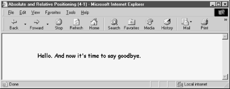
Figure 4-1. An element positioned within the default positioning context
Each time an element is positioned, it spawns its own, new positioning context with the 0,0 position located at the top left corner of that element. Therefore, if we insert a positioned element in the previous example nested within the div element that forms the new positioning context, the newly inserted element lives in the new context. In the following example, we insert a span element inside the div element. Positioning attributes for the span element place it 10 pixels in from the left and 30 pixels down from the top of its positioning context—the div element in this case:
<div id="someDiv" style="position:absolute; left:100px; top:50px">
Hello.
<span id="someSpan" style="position:absolute; left:10px; top:30px">
Hello, again.
</span>
And now it's time to say goodbye.
</div>
Figure 4-2 shows the results; note how the div element's positioning context governs the span element's location on the page.
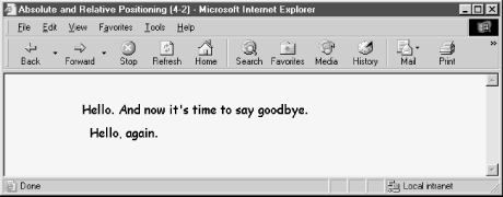
Figure 4-2. A second element nested inside another
Notice in the code listing that the position attribute for each element is absolute, even though you might say that the nested span element is positioned relative to its parent element. Now you see why the terminology gets confusing. The absolute positioning of the span element removes that element from the document's content flow entirely. The split content of the parent div element closes up, as if the content of the span element wasn't there. But the span element is in the document—in its own plane and shifted into a position within the div element's positioning context. All other parent-child relationships of the div and span elements remain intact (style sheet rule inheritance, for instance), but physically on the page, the two elements appear to be disconnected.
The true meaning of relative positioning can be difficult to visualize because experiments with the combination of absolute and relative positioning often yield bewildering results. Whereas an absolute-positioned element adopts the positioning context of the next outermost context, a relative-positioned element creates its own positioning context with respect to the element's normal (unpositioned) location within the document's content flow. A sequence of modifications to some content should help demonstrate these concepts.
To begin, here is a fragment with a single, absolute-positioned div element that contains three sentences:
<div id="someDiv" style="position:absolute; left:100px; top:50px">
Hello.
Hello, again.
And now it's time to say goodbye.
</div>
This code generates a simple line of text on the page, as shown in Figure 4-3.
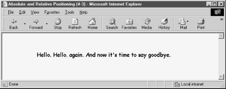
Figure 4-3. A simple three-sentence DIV element
Pay special attention to the location of the middle sentence as it flows in normal HTML. Now, if you turn that middle sentence into a relative-positioned span element supplied with some offset (left and top) values, something quite unusual happens on the screen. The following fragment positions the second sentence 10 pixels in from the left and 30 pixels down from the top of some positioning context:
<div id="someDiv" style="position:absolute; left:100px; top:50px; right:100px">
Hello.
<span id="someSpan" style="position:relative; left:10px; top:30px">
Hello, again.
</span>
And now it's time to say goodbye.
</div>
But what is that context? With a relative-positioned element, the anchor point of its positioning context is the top left corner of the place (the box) where the normal flow of the content would go. Therefore, by setting the left and top attributes of a relative-positioned element, as in the previous code fragment, you instruct the browser to offset the content relative to its normal location. You can see the results in Figure 4-4.
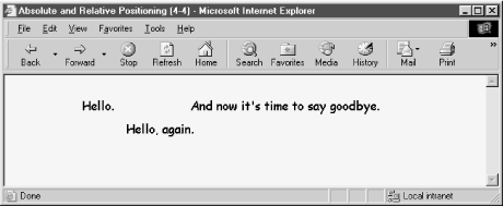
Figure 4-4. The relative-positioned element generates its own positioning context
Note how the middle sentence is shifted within the context of its normal flow location. The positioning context established by the relative-positioned element is now available for positioning of other elements (most likely as absolute-positioned elements) that you may wish to insert within the <span> tag pair. Take special notice in Figure 4-4 that the browser does not close up the space normally occupied by the span element's content because it is a relative-positioned element; if it is absolute-positioned, the element gets yanked from its parent's rendering, and placed into its own layer. Since the element is no longer in the same block as its parent, the surrounding parent text closes the gap.
In most cases, you don't assign values for left and top to a relative-positioned element because you want to use a relative-positioned element to create a positioning context for more deeply nested elements that are absolutely positioned within that context. Using this technique, regular content flows according to the browser window's current size or as its appearance is affected by style rules, while elements that must be positioned relative to some running content are always positioned properly.
To demonstrate this concept, consider the following fragment that produces a long string of one-word sentences plus one longer sentence. The goal is to have the final sentence always appear aligned with the final period of the last "Hello" and 20 pixels down. This means that the final sentence needs to be positioned within a context created for the final period of the last "Hello." In other words, the period character must be defined as a relative-positioned element, so that the nested span element can be positioned absolutely with respect to the period. The following code shows how it's done:
<div id="someDiv" style="position:absolute; left:100px; top:50px; right:100px">
Hello. Hello.
Hello. Hello. Hello. Hello. Hello. Hello. Hello. Hello. Hello. Hello. Hello.
Hello. Hello. Hello<span id="someSpan" style="position:relative">.
<span id="anotherSpan" style="position:absolute; top:20px; width:80px">
And now it's time to say goodbye.
</span>
</span>
</div>
Carefully observe the nesting of the elements in the previous example. Figure 4-5 shows the results.
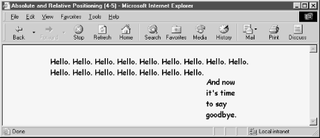
Figure 4-5. A relative-positioned element creates a positioning context for another element
If you resize the browser window so that the final "Hello" appears on another line or in another vertical position on the page, the final sentence moves so that it always starts 20 pixels below and just to the right of the period of the final "Hello" of the content. When applied in this fashion, the term "relative positioning" makes perfect sense.
4.1.3. Overlapping Versus Wrapping Elements
One of the advantages of CSS-Positioning is that you can set an absolute position for any element along both the horizontal and vertical axes as well as its position in stacking order—the third dimension. This makes it possible for more than one element to occupy the same pixel on the page, if you so desire. It is also important to remember that absolute-positioned elements exist independently of the surrounding content of the document. In other words, if a script shifts the horizontal or vertical position of such an element, the surrounding content does not automatically wrap itself around the new position of the element.
If your design calls for the content of an element to wrap around another element, you should use the CSS float attribute, rather than CSS-Positioning. Properties of the float attribute let you affix an element at the left or right margin of a containing block element and at a specific location within the running content. A floating element defined in this manner, however, is not a positionable element in that you cannot script positionable element properties of such an item.
|  | |
| 3.10. Cross-Platform Style Differences |  | 4.2. Positioning Attributes |

Copyright © 2003 O'Reilly & Associates. All rights reserved.