
15.4. Form Elements
There are a variety of elements (also sometimes called "controls" or "widgets") that can be used for gathering information from a form. This section looks at each control and its specific attributes. Every form control (except submit and reset) requires that you give it a name (using the name attribute) so the form-processing application can sort the information. For easier processing of form data on the server, the value of the name should not have any character spaces (use underscores or periods instead).
15.4.1. Input Controls: <input>
The controls described in the following sections are entered as attribute options within the <input> tag.
15.4.1.1. Text entry (type=text)
The simplest type of form element is the text entry field (type=text), which is the default setting for the <input> element. This field allows the user to enter a single word or a line of text. By default, the browser displays a text-entry box that is 20 characters wide, but you can set it to be any length using the size attribute.
By default the user can type an unlimited number of characters into the field (the display scrolls to the right if the text exceeds the width of the supplied box), but you can set a maximum number of characters using the maxlength attribute.
Use the value attribute to specify text to appear when the form is loaded. This can be changed by the user. If you have a form that consists of only one text input element, hitting the Enter key submits the form without requiring a specific Submit button in the form. The following code creates a text field with a size of 15 characters, a maximum length of 50 characters, and the text "enter your name" displayed in the field (Figure 15-2).
<P>What is your name?</P>
<INPUT TYPE="text" NAME="name"  SIZE="18" MAXLENGTH="50" VALUE="enter your name">
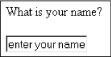
Figure 15-2. Text entry input
15.4.1.2. Password text entry (type=password)
A
password field
(type=password) works just like text entry, except
the characters are obscured from view using asterisk
(*) or bullet ( ) characters (which one
depends on the browser). Although the characters are not displayed in
the browser (Figure 15-3), the actual characters are
available in the form data, so this is not a secure system for
transmitting passwords. For example, the following code text reveals
the actual characters in the default value:
) characters (which one
depends on the browser). Although the characters are not displayed in
the browser (Figure 15-3), the actual characters are
available in the form data, so this is not a secure system for
transmitting passwords. For example, the following code text reveals
the actual characters in the default value:
<P>What is your password?</P>
<INPUT TYPE="password" NAME="password"  SIZE="8" MAXLENGTH="8" VALUE="abcdefg">
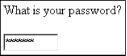
Figure 15-3. Password input
15.4.1.3. Hidden entry (type=hidden)
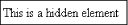
The hidden input (type=hidden) adds a control that isn't displayed in the browser. It is useful for sending information to be processed along with the user-entered data, such as labels used by the script to sort forms. Some scripts require specific hidden fields be added to the form in order to function properly. Here is a hidden element (Figure 15-4):
<P>This is a hidden element</P>
<INPUT TYPE="hidden" NAME="extra_info" value="important">
Figure 15-4. Hidden input
15.4.1.4. Checkbox (type=checkbox)
Checkboxes (type=checkbox) are typically used for multiple-choice questions. They work best when more than one answer is acceptable. When the box is checked, the corresponding value is transmitted with the form to the processing program on the server.
Checkboxes can be used individually to transmit specific name/value coordinates to the server when checked. By default a checkbox is not checked; to make it checked when the page loads, simply add the checked attribute to the corresponding <input> tag.
If you assign a group of checkboxes the same name, they behave like a multiple-choice list in which the user can select more than one option for a given property, as shown in the following code and in Figure 15-5.
<P>Which of the following operating systems have you used?</P>
<INPUT TYPE="checkbox" NAME="os" VALUE="Unix" CHECKED> Unix
<INPUT TYPE="checkbox" NAME="os" VALUE="Win98"> Windows 98
<INPUT TYPE="checkbox" NAME="os" VALUE="WinNT"> Windows NT
<INPUT TYPE="checkbox" NAME="os" VALUE="Mac" CHECKED> Macintosh 9.0
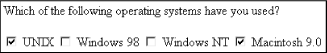
Figure 15-5. Multiple checkboxes in a group may be selected
15.4.1.5. Radio button (type=radio)
Radio buttons (type=radio) are used to select among choices. When a radio button is checked, its corresponding value is sent to the server for processing. Radio buttons are different from checkboxes in that when several radio buttons are grouped together by the same name, only one radio button can be selected at one time, as shown in the following code and in Figure 15-6.
<P>Which operating system do you like the best?</P>
<INPUT TYPE="radio" NAME="os" VALUE="Unix"> Unix
<INPUT TYPE="radio" NAME="os" VALUE="Win98"> Windows 98
<INPUT TYPE="radio" NAME="os" VALUE="WinNT"> Windows NT
<INPUT TYPE="radio" NAME="os" VALUE="Mac" CHECKED> Macintosh 9.0
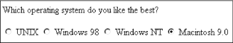
Figure 15-6. Only one radio button in a group may be selected
15.4.1.6. Submit and reset buttons (type=submit; type=reset)
Every form (unless it consists of exactly one text field) needs a submit button control to initiate the transmission of information to the server. By default, the submit button (type=submit) says "Submit" or "Submit Query," but you can change it by adding your own text after the value attribute.
The reset button (type=reset) reverts all form controls back to the state they were in when the form loaded (either blank or with default values). The default value (and hence the label for the button) is "Reset," but like the submit button, you can change its text by specifying its value, as shown in Figure 15-7.
<P>You have completed the form.</P>
<INPUT TYPE="submit"><INPUT TYPE="reset" VALUE="Start Over">
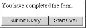
Figure 15-7. Submit and reset buttons
Some designers opt to leave the Reset button out entirely because there is no error-checking mechanism. If a user presses it accidentally, all the data already entered is lost. This isn't an uncommon occurrence.
15.4.1.7. Custom button (type=button)
This button (type=button) has no predefined function, but rather is a generic tool that can be customized with JavaScript. Use the value attribute to write your own text on the button, as shown in the following code and in Figure 15-8. It is supported only on Version 4.0 browsers and higher. The data from a type=button input element is never sent when a form is submitted; this type is only useful with JavaScript programs on the browser.
<P>This does something really exciting.</P>
<INPUT TYPE="button" VALUE="Push Me!">
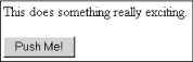
Figure 15-8. Custom button
15.4.1.8. Image button (type=image)
You can replace the submit button with a graphic of your choice by using the image input (type=image), as shown in the following code and in Figure 15-9. Clicking on the image submits the form to the server and includes the coordinates of the mouse click with the form data. You must provide the URL of the graphic with the src attribute. It is recommended that you use alternative text (with the alt attribute) for image buttons.
<INPUT TYPE="image" SRC="graphics/sendme.gif" ALT="Send me">
Figure 15-9. Using an image for a button
15.4.1.9. File selection (type=file)
The file-selection form field (type=file) lets users select a file stored on their computer and send it to the server when they submit the form. It is displayed as a text entry field with an accompanying "Browse" button for selecting the file, as shown in the following code and in Figure 15-10. Like other text fields, you can set the size and maxwidth values as well as the field's default text. When using the file input type, you should specify enctype="multipart/form-data" in the <form> tag. Ask your server administrator to confirm this setting.
<FORM ENCTYPE="multipart/form-data">
<P>Send this file with my form information:</P>
<INPUT TYPE="file" SIZE="28">
</FORM>
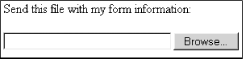
Figure 15-10. The file-selection form field
15.4.2. Text Area: <textarea>
The <textarea> tag creates a multiline, scrollable text entry box that allows users to input extended text entries, as shown in the following code and in Figure 15-11. When the form is transmitted, the browser sends the text along with the name specified by the required name attribute.
Specify the number of lines of text the area should display using the rows attribute. The cols attribute specifies the width (measured in characters). These attributes are required according to the HTML 4.01 specification. Scrollbars are provided if the user types more text than fits in the allotted space.
Normally, the text is submitted just as it is typed in, with line returns only where the user presses the Enter key. However, you can use the wrap attribute to control text wrapping. When wrap is set to virtual or soft, the text wraps in the user's display. Physical or hard wrap settings transmit every new line with a hard-coded line return. When wrap is set to off, the default setting, the lines do not wrap. The wrap functions are browser-dependent.
The text that appears between <textarea> and its end tag </textarea> will be the initial contents of the text entry window when the form is displayed.
<P>What did you dream last night?</P>
<TEXTAREA NAME="dream" ROWS="4" COLS="45">Tell us your dream in 100 words or less</TEXTAREA>
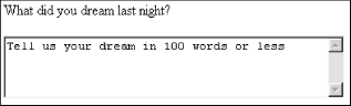
Figure 15-11. The textarea form field
15.4.3. Creating Menus with the <select> Tag
The <select> tag creates a menu of options that is more compact than groupings of checkboxes or radio buttons. A menu displays as either a pull-down menu or as a scrolling list of choices, depending on how the size is specified. The <select> tag works as a container for any number of <option>s.
The text between the opening and ending <option> tags is the value that is sent to the server. If you want to send a value for that choice that is not displayed in the list, use the value attribute within the <option> tag.
15.4.3.1. Pull-down menus
The <select> element displays as a pull-down menu of options when no size specification is listed (the default) or when size=1. In a pull-down menu, only one item may be selected at a time. (Note that adding the multiple attribute turns the menu into a scrolling list, as described in the next section.) By default, the first <option> in the list displays when the form loads, but you can preselect another option by adding selected within its <option> tag.
<P>What is your favorite ice cream flavor?</P>
<SELECT NAME="ice_cream">
<OPTION>Rocky Road
<OPTION>Mint Chocolate Chip
<OPTION>Pistachio
<OPTION SELECTED>Vanilla
<OPTION>Chocolate
<OPTION VALUE="swirl">Fudge Ripple
<OPTION>Praline Pecan
<OPTION>Bubblegum
</SELECT>
Use the selected attribute in the <option> tag to indicate the default value for the menu (the option will be highlighted when the form loads). Clicking on the arrows or bar pops up the full menu, as shown in Figure 15-12.
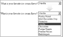
Figure 15-12. Items in a select menu can be set to display after menu is collapsed
15.4.3.2. Scrolling menus
To make the menu display as a scrolling list, simply specify the number of lines you'd like to be visible in the list using the size attribute, or add the multiple attribute to the <select> tag, as shown in the following code and in Figure 15-13. The multiple attribute makes it possible for users to select more than one option from the list.
<P>What are your favorite ice cream flavors?<P>
<SELECT NAME="ice_cream" SIZE=6 MULTIPLE>
<OPTION>Rocky Road
<OPTION>Mint Chocolate Chip
<OPTION>Pistachio
<OPTION SELECTED>Vanilla
<OPTION SELECTED>Chocolate
<OPTION VALUE="swirl">Fudge Ripple
<OPTION>Praline Pecan
<OPTION>Bubblegum
</SELECT>
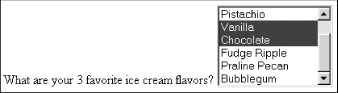
Figure 15-13. Use the size attribute to display a select menu as a scrolling list
 |  |  |
| 15.3. The Basic Form |  | 15.5. New Form Attributes in HTML 4.01 |

Copyright © 2002 O'Reilly & Associates. All rights reserved.