Chapter 3. Web Design Principles for Print Designers
If you are accustomed to designing for print, the Web introduces a number of new concepts and new ways of doing things. Part of what makes web design unique is that the pages are displayed on a computer monitor, not paper, requiring familiarity with new color models. In addition, you need to work within the unique environment of the web browser. The HTML markup language brings its own limitations to the mix.
This chapter discusses some basic web design concepts, which may be new for print designers or for anyone who is just getting started in web design. It provides necessary background information about the web environment, including how browsers deal with color, graphics, and typography, so that you can make design decisions that are appropriate to the medium.
3.1. The Web Is Not Like Print
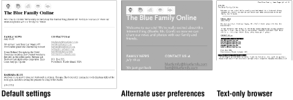
Designing pages for the Web is fundamentally different from designing a printed page. The single most difficult challenge in making the transition from print to web design is that on the Web, you cannot control absolutely the way your page looks to the end user. The way the page displays is a function of the browser it is viewed on and the user's preference settings, as shown in Figure 3-1. By its nature, the Web forces designers to give up control over the very things designers are traditionally responsible for controlling, such as page size, alignment, fonts, and colors. The experience is a shock until you get used to it. Becoming a good web designer requires a solid understanding of the web environment in order to anticipate and plan for these shifting variables.

Figure 3-1. The same HTML page viewed on different browsers and with different user preferences
3.1.1. Designing for the Unknown
When you design a web page, you are creating a page that will be viewed under a vast range of unknown conditions. There are a number of factors that will directly impact the design and functionality of a web page.
- Unknown browsers
-
As discussed in Chapter 1, "Designing for a Variety of Browsers", there are hundreds of browser versions in use today. The same page source may look and function differently depending on the browser rendering it.
- Unknown platform
-
The user's operating system also impacts how a web page looks and functions. Some technologies are better supported on Windows than on a Macintosh or Unix system. The platform also affects basic display elements, such as fonts, colors, and form elements.
- Unknown user preferences
-
Every browser is built with the opportunity for users to set the default appearance of the pages they view. The user's settings will override yours, and there's not much you can do about it. Not only can users adjust the fonts and colors, but they may also opt to turn off basic functionality, such as image display, JavaScript, and Java support.
- Unknown window size
-
In print, one of the first things you establish about a project is its trim size (the size of the printed page). On the Web, there is no way to know the size of the "page" since browser windows can fill a variety of monitor resolutions or be resized to any random dimension. This is discussed in Chapter 2, "Designing for a Variety of Displays".
- Unknown connection speed
-
Most likely, the people viewing your pages access the Internet at a wide range of speeds: from high speed T1, cable, and DSL connections all the way down to pokey 28.8-kilobaud modems. Unless you are designing specifically for broadband applications, assume the worst when it comes to connection speeds. The golden rule of web design is to keep your files as small as possible. On the Web, graphics should measure just a few kilobytes (K). For commercial sites, pages with files totalling more than 50K or 60K are considered bloated (although it seems miniscule compared to file sizes typically used in desktop publishing for print).
- Unknown colors
-
When you are publishing materials that will be viewed on computer monitors, you need to deal with the varying ways computers and browsers handle color. This is discussed later in this chapter.
- Unknown fonts
-
It may come as a shock to learn that you cannot really specify fonts on web pages. The way text appears is a result of browser settings, platform, and user preferences. Typography on the Web is discussed later in this chapter.
To sum it up bluntly, there's no way to know exactly how your page will look or function for the end user. This is a tough pill to swallow for most print designers.
3.1.2. Surviving the Unknown
The best advice for conquering this new medium is to let go of some of the control you are accustomed to having over the page. Elements shift around, text resizes, and pages look different to different people. That's the way it works. Don't expect to design a page in Quark and have it reproduced precisely in a web browser or you're bucking the medium. Good web design is judged by a different set of criteria. On the Web, what's important is how a page works and that it is accessible to everyone. As a web designer, you will learn to design structures and impose a set of rules rather than fuss with absolute alignment. After a while, you will develop a feel for designing around the "unknowns" on the Web.
For an excellent explanation of the unique characteristics of web design and the new responsibilities it places on designers, read The Art and Science of Web Design by Jeffrey Veen (New Riders, 2001). And for a thoughtful essay on how to work with the medium, not against it, see "The Dao of Web Design" by John Allsopp, published on A List Apart (http://www.alistapart.com/stories/dao/dao_1.html).

Copyright © 2002 O'Reilly & Associates. All rights reserved.


