3.4. Graphics on the Web
Print designers need to adapt their graphics production skills for the Web to take into account the peculiarities of graphics that are distributed over a network and displayed on computer monitors.
3.4.1. Graphics File Formats
As of this writing, nearly all the graphics that you see on the Web are in one of two formats: GIF and JPEG. A third worthy contender, the PNG file, is struggling for browser support and attention. What follows is a very brief introduction to each of these online graphic formats. More detailed descriptions are provided in the chapters dedicated to each format.
3.4.1.1. The ubiquitous GIF
The GIF (Graphic Interchange Format) file format is the traditional darling of the Web. It was the first file format to be supported by web browsers, and it continues to be the format for the vast majority of graphics on the Web today.
GIFs are indexed color files with a maximum 8-bit palette capacity, which means that a GIF can contain a maximum of 256 pixel colors. Because they compress color information by rows of pixels, GIF files are most appropriate for graphics that contain areas of flat color.
See Chapter 19, "GIF Format" for complete information on the GIF file format.
3.4.1.2. The handy JPEG
The second most popular graphics format on the Web today is the JPEG ( Joint Photographic Experts Group) format. JPEGs contain 24-bit color information -- that's millions of colors, as opposed to GIF's 256. They use what is called a "lossy" compression scheme, which means that some image information is thrown out in the compression process, but in most cases, the degradation of the image is not detrimental or even noticeable.
Photographic images, or any image with subtle gradations of color, are best saved as JPEG files because they offer better image quality packed into a smaller file. JPEGs, however, are not a good solution for flat, graphical images, because they tend to mottle colors, and the resulting file will generally be a lot larger than the same image saved as a GIF.
See Chapter 20, "JPEG Format" for complete information on the JPEG file format.
3.4.1.3. The lurking PNG
There is a third graphic format vying for usage on the Web -- PNG (Portable Network Graphic), which, despite some very attractive features, has been slow to catch on.
PNGs can support 8-bit indexed color, 16-bit grayscale, or 24-bit true color images with a "lossless" compression scheme, which means higher image quality and, in some cases, file sizes even smaller than their GIF counterparts. Not only that, but PNG files also have some nifty features such as built-in gamma control and variable transparency levels (which means you can have a background pattern show through a soft drop-shadow).
See Chapter 21, "PNG Format" for complete information on the PNG file format
3.4.2. Image Resolution
Simply put, all graphics on the Web need to be low-resolution: 72ppi (pixels per inch). Since web graphics are always displayed on low-resolution computer screens, higher resolution files are unnecessary.
Working at such a low resolution can be quite an adjustment for a designer accustomed to handling the 300dpi images appropriate for print. Most notably, the image quality is lower because there is not as much image information in a given space. This tends to make the image look more grainy or pixelated, and unfortunately, that's just the nature of images on the Web.
3.4.2.1. Image size
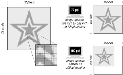
When a graphic is displayed on a web page, the pixels in the image map one-to-one with the display resolution of the monitor. When the resolution is higher, the pixel size is smaller. Therefore, a graphic that appears to be about one inch square on your 72ppi monitor may actually appear to be quite a bit smaller on a monitor with a resolution closer to 100. (See Figure 3-3.)

Figure 3-3. The size of an image is dependent on monitor resolution
3.4.2.2. Good-bye inches, hello pixels
Because the actual dimensions of a graphic are dependent on the resolution of the monitor, the whole notion of "inches" becomes irrelevant in the web environment. The only meaningful unit of measurement is the pixel.
It is general practice to create images at 72ppi (it puts you in the ballpark for screen presentation), but to pay attention only to the overall pixel dimensions. You can disregard inches entirely in the web graphics production process. After a while, thinking in pixels comes quite naturally. What's important is the size of the graphic relevant to other graphics on that page and to the overall size of the browser window.
For instance, some users still have monitors with resolutions of 640
 480 pixels. To guarantee that my banner graphic fits in the
screen in its entirety, I would make it no more than 600 pixels wide
(taking into account that some pixels will be used on the left and
right for the window and the scrollbar). The size of the remaining
buttons and images on my page are measured in pixels relative to my
600-pixel-wide banner. For more information on designing for standard
monitor resolutions, see Chapter 2, "Designing for a Variety of Displays".
3.4.3. Be Aware of File Size
It goes without saying that graphics have made the Web what it is today; however, as a web designer, you should know that many users have a love/hate relationship with graphics on the Web. Remember that graphics increase the time it takes a web page to move across the network; large graphics mean substantial download times, which can try the user's patience, particularly a user dialing in on a standard modem connection.
Here is the single most important guideline a web designer can follow: Keep the file sizes of your graphics as small as possible! The nature of publishing over a network creates a new responsibility for designers to be sensitive to the issue of download times. Fortunately, new web graphics tools, such as Macromedia Fireworks and Adobe Photoshop 5.5 and higher (including ImageReady), make it easy to make adjustments to the image while keeping an eye on the resulting file size.
Detailed strategies for minimizing graphic file size for each file format appear in the graphics chapters in Part III, "Graphics" of this book.
3.4.4. Web Graphics Production Tips
The following is a collection of tips for maintaining quality in web graphics.
3.4.4.1. Work in RGB mode
When you are creating graphics for the Web, it is important to work in the RGB color mode. CMYK mode, while common to the print world, is incorrect for web graphics. When creating a GIF file, do your designing and editing in RGB mode and convert it to Indexed Color as the final step before saving. It's a good idea to hang onto an RGB original for later changes. To make this process easier, web graphics tools such as Photoshop 5.5 and higher, ImageReady, and Fireworks have separate export functions that create the final graphics while retaining the RGB original. JPEG graphics should simply be saved in RGB mode.
If you need to make adjustments to an existing GIF, you should convert it back to RGB mode before editing. When an image is in indexed color mode, the colors are restricted to those in its defined Color Table, and no new colors can be added. This prevents the color blends and adjustments that occur when image elements are transformed (resized, rotated, etc.) or when adding anti-aliased text. When the image is in indexed color mode, any text you add will automatically have aliased (stair-stepped) edges. (If you only need to crop the GIF or make other changes that don't require the addition of new pixel colors, it is okay to work directly in indexed color mode.)
The typical steps that should be taken when editing an existing GIF are:
-
Open the GIF in the image editing tool.
-
Change it to RGB color mode (in Photoshop, select Image
 Mode
Mode
 RGB Color).
-
Edit the image as necessary.
-
Change it back to indexed color mode, setting the desired palette and bit-depth.
-
Save or export to GIF format.
3.4.4.2. Resizing tips
The following tips pertain to resizing web graphics:
-
Convert to RGB before resizing. As mentioned earlier, in order to resize an image, Photoshop (or any bitmap image editing tool) needs to create new transitions between areas of color in the image. Indexed color images (such as GIFs) are limited to the colors in the image's color table, which does not give Photoshop enough colors to create convincing "in-between" colors for these transitions.
-
Don't resize larger. As a general rule, it is a bad idea to increase the dimensions of a low-resolution image (such as 72ppi images typically used on the Web). Image editing tools cannot add image information to the file -- they can only stretch out what's already there. This results in a pixelated and blotchy image.
-
Resize smaller in increments. Images can be made slightly smaller without much degradation in image quality; however, drastic resizing (making a snapshot-sized image postage-stamp size) usually results in an unacceptably blurry image. When acquiring an image (whether by scanning or from a CD-ROM), it is best to choose an image that is slightly larger than final size. That way, you don't need to make it larger, and you won't have to scale it down too much. If you must make a very large image very small, try doing it in a number of steps, fixing quality at each stage.
Be sure to keep a clean copy of the original image in case you make something too small. Starting over is better than enlarging the image or resizing repeatedly.
3.4.4.3. Use anti-aliased text
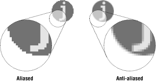
In general, to create professional-looking graphics for the Web, you should use anti-aliased text. Anti-aliasing is the slight blur used on curved edges to make smoother transitions between colors. Aliased edges, by contrast, are blocky and stair-stepped. Figure 3-4 shows the effect of aliasing (left) and anti-aliasing (right).

Figure 3-4. Aliased and anti-aliased edges
The exception to this guideline is very small text (10 to 12 points or smaller, depending on the font design), for which anti-aliased edges blur the characters to the point of illegibility. Text at small sizes may fare much better when anti-aliasing is turned off or set to "None."
The trade-off for better-looking graphics is file size -- anti-aliasing adds to the number of colors in the image and may result in a slightly larger file size. In this case, the improved quality is usually worth a couple of extra bytes.
3.4.5. For Further Reading
If you feel you need more of a primer on making the transition to web design, check out my other book, Learning Web Design (O'Reilly, 2001), which is specifically for beginners. You can get more information about it at http://www.learningwebdesign.com or on O'Reilly's web site at http://www.oreilly.com/catalog/learnweb/.
For more information on basic design principles as they apply to the Web, see Lynda Weinman's very popular book, Designing Web Graphics, Third Edition (New Riders, 2000).
One of the best online resources for designers is Joe Gillespie's site, Web Page Design for Designers (http://www.wpdfd.com). It is packed with very detailed explanations of how type and graphics work on the Web.

Copyright © 2002 O'Reilly & Associates. All rights reserved.


