
8.4. Inline Elements
Any visible element that is not a block-level element (either directly, or by implication, as with floated elements) is an inline element. Setting box properties for inline elements gets into even more interesting territory than we've already covered. Some good examples of inline elements are the EM tag and the A tag, both of which are nonreplaced elements, and images, which are replaced elements.
WARNING
Note that none of this applies to table elements. CSS2 introduces new properties and behaviors for handling tables and table content, and these new features behave in ways fairly distinct from either block-level or inline formatting. See Section 10.1, "Changes from CSS1" for an overview.
8.4.1. Line Layout
First, we need to understand how inline content is laid out. It isn't as simple and straightforward as block-level elements, which just generate boxes and usually don't let anything coexist next to them. That's all well and good, of course (even if it does ignore floats), but look inside a block-level element such as a paragraph. There are all these lines of text, and we may well ask, "How did they get there? What controls their arrangement? How can I affect that?"
In order to understand how lines are generated, let's first consider the case of an element containing one very long line of text, as shown in Figure 8-45. Note that we've put a border around the line; this has been accomplished by wrapping the entire line in a SPAN element, and assigning it a border style:
SPAN {border: 1px dashed black;}
Figure 8-45. A single-line inline element
This is the simplest case of an inline element contained by a block-level element, no different in its way than a paragraph with two words in it. The only differences are that in Figure 8-45, we have a few dozen words and that most paragraphs don't contain an explicit inline element such as SPAN.
In order to get from this simplified state to something more familiar, all we have to do is determine how wide the element should be, and then break up the line so that the resulting pieces will fit into the width of the element. Thus we arrive at the state shown in Figure 8-46.
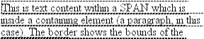
Figure 8-46. A multiple-line inline element
Basically, nothing's changed. All we did was take the single line and break it into pieces, and then stack those pieces on top of each other. Piece of cake.
In Figure 8-46, the borders for each line of text also happen to coincide with the top and bottom of each line box. This is only true because no padding or line height has been set for the inline text, but for the moment, let's use the visual cue for reference. Also, notice that the borders actually overlap each other slightly: for example, the bottom border of the first line is just below the top border of the second line. This is because the border is actually drawn on the next pixel (assuming we're using a monitor) to the outside of each line box. Since the line boxes are touching each other, their borders will overlap as shown in Figure 8-46.
If we alter the SPAN styles to have a background color, the actual placement of the line boxes becomes quite clear, as we can see in Figure 8-47.
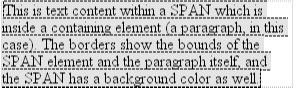
Figure 8-47. The full extent of each line box
Here we see that not every line reaches to the right edge of the paragraph's content area, which has been denoted with a dotted gray border. The end of each line box is determined by the content of the line box. For comparison, let's try the same thing, but this time right-justify the paragraph, as shown in Figure 8-48.
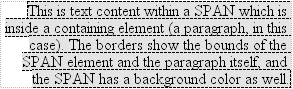
Figure 8-48. Line-box layout with right justification
Again, all we have here are the pieces of a single line of text which have been stacked on top of one another with their right sides lined up with each other. If we had set the paragraph to have a text-align of center, then the centers of the line boxes would have lined up, and if it were set to justify, then each line box would be forced to be as wide as the paragraph's content area. The difference is made up in letter- and word-spacing, as we see in Figure 8-49.
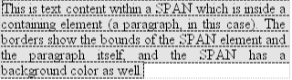
Figure 8-49. Line-box layout with full justification
That pretty well covers how line boxes are generated, at least in the simplest cases. As we're about to see, however, the inline formatting model is not exactly simple.
8.4.2. Inline Formatting
As we saw in Chapter 4, "Text Properties", all elements have a line-height. This fact has a great deal to do with how inline elements are displayed, and it needs to be covered in detail before we move on.
First, let's establish how the height of a line is determined. A line's height (or the height of the line box) is determined by the height of its constituent elements and other content (such as text). It's important to understand that line-height really only applies to inline elements and other inline content and not to block-level elements. We can set a line-height value for a block-level element, but the only way this will have any visual impact is by being applied to inline content within that block-level element. Consider the following paragraph, for example:
<P STYLE="line-height: 0.25em;"></P>
Without content, the paragraph won't have anything to display, so it will not. The fact that this paragraph has a line-height of any value -- be it 0.25em or 25in -- makes no difference without inline content to take advantage of it.
In a certain sense, then, each line of text contained within a block-level element is its own inline element, even though it isn't surrounded by any tags. If you like, picture a fictional tag sequence something like this:
<P>
<LINE>This is a paragraph with a number of</LINE>
<LINE>lines of text which make up the</LINE>
<LINE>contents.</LINE>
</P>
Even though the LINE tags don't exist, the situation is the same as if they did. Each line of text inherits styles from the paragraph, so they may as well be contained within tags such as these. Therefore, the only reason we create line-height rules for block-level elements is so that we don't have to explicitly declare a line-height for all its inline elements, fictional or otherwise.
TIP
The fictional LINE element actually clarifies the behavior that results from setting line-height on a block-level element. According to the CSS specification, declaring line-height on a block-level element sets a minimum line-box height for the content of that block-level element. Thus, declaring P.spacious {line-height: 24pt;} means that the minimum height for each line box is 24 points. Technically, the only way content will inherit this line height is if it is inherited by an inline element. Most text isn't contained by an inline element. Thus, if we pretend that each line is contained by the fictional LINE element, then the model works out very nicely.
8.4.2.1. Generating a line box
Here are the steps a user agent has to go through in order to generate a line box. First, for each inline nonreplaced element (or string of text outside of an inline element), the font-size is used to determine the initial content-height. Thus, if an inline element has a font-size of 15px , then the content-height starts out as 15px .
Second, all of the inline elements in a given line are aligned according to their values for vertical-align. By default, this will cause all text in the line to be aligned along their baselines, but of course different vertical-align values will have different effects. All of the elements could be top-aligned, for example. We'll return to vertical alignment later in the chapter, but for now will assume that everything is baseline-aligned.
Now the line-height comes into play. Let's assume the following case:
<P STYLE="font-size: 12px; line-height: 12px;">
This is text, <EM>some of which is emphasized</EM>, plus other text<BR>
which is <B STYLE="font-size: 24px;">boldfaced</B> and which is<BR>
larger than the surrounding text.
</P>
What we have here is a situation where some of the text has a font-size of 12px , while other text has a size of 24px . However, all of the text has a line-height of 12px, since line-height is an inherited property. What happens is that the difference between font-size and line-height is divided in half, and then applied to the top and bottom of each element's content-height to arrive at the inline box. Each half of the divided difference is referred to as half-leading .
Thus, for each bit of text where both the font-size and line-height are 12px , nothing is applied to the content-height (since 12 minus 12 equals zero, and half of nothing is nothing), and so the inline box is 12px high. For the boldfaced text, however, the difference between font-size and line-height is 12px . This is divided in half to determine the half-leading (6px), and the half-leading is subtracted from both the top and bottom of the content-height to arrive at an inline box which is, in this case, 12px high. This 12-pixel inline box is centered vertically within the content-height of the element.
So far it sounds like we've done the same thing to each bit of text. This is not quite the case. The inline boxes don't actually line up, as we can see in Figure 8-50, because the text is all baseline-aligned.
Figure 8-50. How the inline boxes (gray) influence the height of the line box
However, it is precisely the inline boxes which determine the height of the overall line box. The line box is defined to be the distance from the top of the highest inline box in the line to the bottom of the lowest inline box, as illustrated by Figure 8-51.
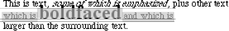
Figure 8-51. Stacking the line boxes together
Then the top of the line box is placed against the bottom of the line box for the preceding line. This will give us a paragraph as shown in Figure 8-52.
Figure 8-52. The final paragraph of stacked line boxes
As we can see, the middle line is taller than the other two, but it still isn't big enough to contain the text within it. That's because the position of the inline boxes in the line forces it to be taller than 12 pixels, but the line-box still isn't tall enough for the text to avoid overlapping other lines.
The situation can become markedly different if we change the vertical alignment of the inline boxes. Suppose that we change the boldface text to have a vertical alignment of middle. This would have the result shown in Figure 8-53.
Figure 8-53. Changing the vertical alignment of the larger text
Here, the middle of the boldfaced text's inline box has lined up with the middle of the inline boxes of the other text in the line. Because the inline boxes are all 12px tall, and their middles are all lined up, this means that the line box for this line is now only 12 pixels high, just like the others. However, it also means that the oversized text intrudes into other lines even more than before.
Let's consider another situation where another inline element is in the same line as the boldfaced text, but its alignment is other than the baseline:
<P STYLE="font-size: 12px; line-height: 12px;">
This is text, <EM>some of which is emphasized</EM>, plus other text<BR>
which is <B STYLE="font-size: 24px;">boldfaced</B>
and <SPAN STYLE="vertical-align: top;">tall</SPAN> and which is<BR>
larger than the surrounding text.
</P>
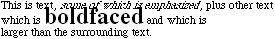
Now we're back to our earlier example, where the middle line box is taller than the other line boxes. However, notice how the "tall" text is aligned in Figure 8-54.
Figure 8-54. Top-aligning text
What's happened here is that the top of the "tall" text's inline box is aligned with the top of the line box. Since the "tall" text has equal values for font-size and line-height, its content height and inline box are the same thing. However, consider this:
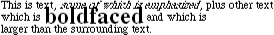
<P STYLE="font-size: 12px; line-height: 12px;">
This is text, <EM>some of which is emphasized</EM>, plus other text<BR>
which is <B STYLE="font-size: 24px;">boldfaced</B>
and <SPAN STYLE="vertical-align: top; line-height: 4px;">tall</SPAN>
and which is<BR>
larger than the surrounding text.
</P>
Since the line-height for the "tall" text is less than its font-size, the inline box for that element is smaller. This will change the placement of the text itself, since the top of its inline box must be aligned with the top of the line box for its line. Thus we get the result shown in Figure 8-55.
Figure 8-55. The effects of a very small inline box
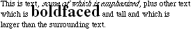
On the other hand, we could set the "tall" text to have a line-height which is actually bigger than its font-size. For example:
<P STYLE="font-size: 12px; line-height: 12px;">
This is text, <EM>some of which is emphasized</EM>, plus other text<BR>
which is <B STYLE="font-size: 24px;">boldfaced</B>
and <SPAN STYLE="vertical-align: top; line-height: 18px;">tall</SPAN>
and which is<BR>
larger than the surrounding text.
</P>
Since we've given the "tall" text a line-height of 18px , the difference between font-size and line-height is 6 pixels. In this case, though, the half-leading of 3 pixels is added to the content area, not subtracted (since the line-height is more than the font-size). This will result in an inline box 18 pixels tall, and its top is aligned with the top of the line box. Thus Figure 8-56.
Figure 8-56. Top-aligning text with a different line height
Before we go any further, let's see what happens when we add box properties to inline elements.
8.4.2.2. Adding box properties
As we're aware from previous discussions, padding, margins, and borders may all be applied to inline nonreplaced elements, and they don't influence the line-height at all. If we were to apply some borders to a SPAN element without any margins or padding, we'd get results such as that shown in Figure 8-57.
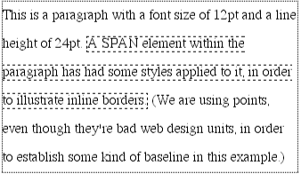
Figure 8-57. Inline borders and line-box layout
The borders are placed as they are because the border edge of inline elements is controlled by the font-size, not the line-height. In other words, if a SPAN element has a font-size of 12pt and a line-height of 36pt, its content area is 12pt high, and the content area is what will be surrounded with the border.
This behavior can be altered by assigning padding to the inline element, which will push the borders away from the text itself (shown in Figure 8-58):
SPAN {border: 1px dashed black; padding: 4pt;}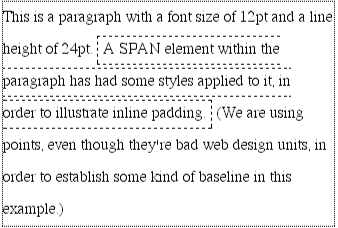
Figure 8-58. Inline padding and line-box layout
Note that this padding does not alter the actual shape of the content-height, and so will not affect the height of the inline box for this element. Adding borders to an inline element will not affect the way line boxes are generated, as Figure 8-59 illustrates.
Figure 8-59. Large inline boxes can overlap many other lines
One can assign margins to nonreplaced inline elements as well, but these effectively do not apply to the top and bottom of a nonreplaced inline element, and so don't affect the height of the line box. The ends of the element are another story, as we saw in Chapter 7, "Boxes and Borders". Once again, this is because an inline element that is displayed on multiple lines is just the same as a single-line element that has been broken into pieces. Consult Figure 8-60 for a more detailed look at this situation caused by using these styles:
SPAN {border: 1px dashed black; padding: 4pt; margin: 8pt;}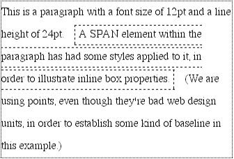
Figure 8-60. Inline margins and line-box layout
8.4.3. Managing the Line Height of Inline Elements
In the previous section, we had a few cases where changing the line-height of an inline element led to the possibility of text from one line overlapping another. In each case, though, the changes were made on individual elements. So how can we affect the line-height of elements in a more general way, in order to keep them from overlapping?
One way to do this is to use the em unit in conjunction with an element whose font-size has changed. For example:
P {font-size: 14pt; line-height: 16pt;}
SPAN {background: gray;}
BIG {font-size: 250%; line-height: 1em; background: silver;}

...line in which</SPAN><BIG>some big text</BIG><SPAN>is found...
The results of this are shown in Figure 8-61. By setting a line-height for the BIG element, the overall height of the line box has been increased, thus providing enough room for the BIG element to be displayed without overlapping any other text and without changing the line-height of all lines in the paragraph. We use a value 1em so that the line-height for the BIG element will be set to the same size as BIG's font-size -- remember, line-height is set in relation to the font-size of the element itself, not the parent element.
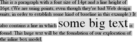
Figure 8-61. Assigning the line-height property to inline elements
It's important to keep these sorts of things in mind when you're trying to do things like add borders to an inline element. Let's say you want to put 5-pixel borders around any hyperlink:
A:link {border: 5px solid blue;}If you don't set a large enough line-height to accommodate the border, it will be in danger of overwriting other lines, as shown in Figure 8-62.
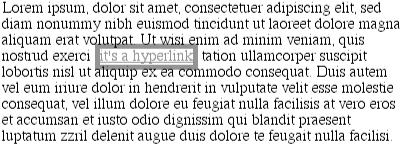
Figure 8-62. Inline borders can be overlapped
One solution is to increase the line-height of the paragraph. This will affect every line in the entire element, not just the line in which the bordered hyperlink appears:
A:link {border: 5px solid blue;}
P {font-size: 14px; line-height: 24px;}
Because there is extra space added above and below each line, the border around the hyperlink doesn't impinge on any other line, as we can see in Figure 8-63.
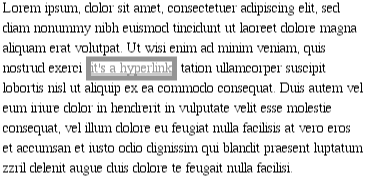
Figure 8-63. Increasing line-height to leave room for inline borders
This approach works in this particular case, of course, because all of the text is the same size. Just to cover all the bases, though, it might make more sense to simply increase the line-height of the anchor element itself, like this:
A:link {border: 5px solid blue; line-height: 24px;}
P {font-size: 14px;}
If all the content of a line is text of the same size, then the line box is always as tall as the biggest line-height value contained within that line box (since this will coincide with the height of the tallest inline box in the line), so this works. Furthermore, it only affects those lines in which a hyperlink appears. However, there is yet another alternative.
8.4.3.1. Scaling the line heights
There's an even better way to set line-height, as it turns out, and that's to use a raw number as the value of line-height. This is so much better because the number is used as a scaling factor, and it is the factor that is inherited, not the computed value. Let's say you want the line-height of all elements in a document to be one-and-one-half times their font-size. You would declare:
BODY {line-height: 1.5;}This scaling factor of 1.5 is passed down from element to element, and at each level the factor is used as a multiplier of the font-size of each element. Therefore, the following markup would be displayed as shown in Figure 8-64 (backgrounds added for illustrative purposes):
P {font-size: 12px; line-height: 1.5;}
SMALL {font-size: 66%;}
BIG {font-size: 200%;}

<P>This paragraph has a line-height of 1.5 times its font-size. In addition,
any elements within it <SMALL>such as this small element</SMALL> also have
line-heights 1.5 time their font-size... and that includes <BIG>this big
element right here</BIG>. By using a scaling factor, line-heights scale
to match the font-size of any element.</P>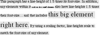
Figure 8-64. Using a scaling factor for line-height
In this example, the line-height for the SMALL element turns out to be 12px , and for the BIG element, it's 36px . These may seem excessive, but they're in keeping with the overall page design. Of course, if you don't want your BIG text to generate too much extra leading, just use these rules instead:
P {font-size: 12px; line-height: 1.5;}
SMALL {font-size: 66%;}
BIG {font-size: 200%; line-height: 1em;}
WARNING
Anything this useful has to have a drawback, right? As it happens, Internet Explorer 3.x will treat scaling factors as though they were pixel units. Just try to imagine a paragraph with a line-height of 1.5px . It isn't pretty.
Another solution is to set the styles such that lines are no taller than absolutely necessary to hold their content. This is where you might use a line-height of 1.0. This value will multiply itself by every font-size to get the same value as the font-size of every element. Thus, for every element, the inline box will be the same as the content area.
8.4.4. Inline Replaced Elements
Inline replaced elements, such as images, are subject to a few crucial differences in how inline formatting is handled. This difference stems from the fact that replaced elements are still assumed to have an intrinsic height and width; for example, an image will be a certain number of pixels high and wide.
However, a replaced element with an intrinsic height can cause a line box to become taller than normal. This does not change the value of line-height for any element in the line, including the image itself. Instead, the line box is simply made tall enough to accommodate the replaced element, plus any box properties. In other words, the entirety of the replaced element -- content, margins, borders, and padding -- is used to define the element's inline box. The following markup gives one such example, (shown in Figure 8-65):
P {font-size: 12px; line-height: 18px;}
IMG {height: 30px; margin: 0; padding: 0;}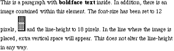
Figure 8-65. Replaced elements don't actually increase the line height
Despite all the blank space, the effective value of line-height has not changed. It simply has no effect on the image's inline box, which is in this case 30px tall.
Nonetheless, an inline replaced element still has a value for line-height. Why? In order to be able to correctly position the element if it's been vertically aligned. Recall that, percentage values for vertical-align are calculated with respect to an element's line height. Thus:
P {line-height: 18px;}
IMG {vertical-align: 50%;}

<P>The image in this paragraph <IMG SRC="test.gif" ALT="test image">
will be raised 9px.</P>
The inherited value of line-height is what causes the image to be raised nine pixels, instead of some other number. Without a value for line-height, it wouldn't be possible to perform percentage-value vertical alignments. The height of the image itself has no relevance when it comes to vertical alignment: the value of line-height is all that matters.
8.4.4.1. Adding box properties
After everything else, applying margins, borders, and padding to inline replaced elements almost seems simple.
Padding and borders are applied to replaced elements as normal; padding inserts space around the actual content (for example, a graphic) and the border surrounds the padding. What's interesting is that these two things actually do influence the height of the line box. Consider Figure 8-66.
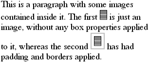
Figure 8-66. Adding padding and borders to an inline replaced element
Note that the "first" line box is tall enough to contain the image, whereas the "second" is tall enough to contain the image, its padding, and its border. This is because the totality of the replaced element (content, padding, borders) make up the inline box for the replaced element. This is what forces the line boxes to be taller in Figure 8-66.
Margins are also contained within the line box, but they have their own wrinkle. Setting a positive margin is no mystery: it will simply make the line box taller, as in Figure 8-67.
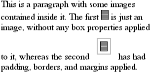
Figure 8-67. Adding padding, borders, and margins to an inline replaced element
Setting negative margins, meanwhile, has exactly the effect you might expect: it makes the line-box shorter. This is illustrated in Figure 8-68, where we can see the line above the image has been pulled down toward it.
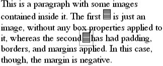
Figure 8-68. The effect of negative margins on an inline replaced element
This is quite similar to the operation of negative margins on block-level elements, of course. In this case, the negative margins are making the replaced element's inline box smaller than ordinary. This is the only way to cause inline replaced elements to bleed into other lines.
 |  |  |
| 8.3. Floated Elements |  | 8.5. Summary |

Copyright © 2002 O'Reilly & Associates. All rights reserved.