
8.2. Block-Level Elements
Block-level elements -- such as paragraphs, H1s, lists, and list elements -- behave in interesting ways, sometimes predictable, sometimes surprising. There are differences in the handling of element placement along the horizontal and vertical axes, for example. In order to fully understand how block-level elements are handled, you must clearly understand a number of boundaries and areas. They are shown in detail in Figure 8-2.
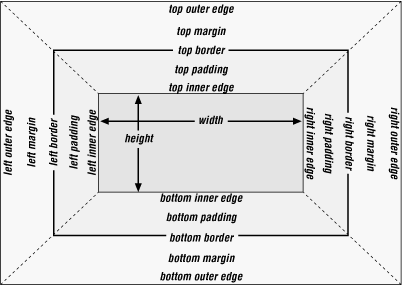
Figure 8-2. The complete box model
In general, the width of an element is defined to be the distance from the left inner edge to the right inner edge, and the height is the distance from the inner top to the inner bottom. These are both, not coincidentally, properties that can be applied to an element.
The various widths, heights, padding, margins, and borders all combine to determine how a document is laid out. In most cases, the height and width are automatically determined by the browser, based on the available display region and other factors. Under CSS, of course, you can assert more direct control over the way elements are sized and displayed. There are different effects to consider for horizontal and vertical layout, so we'll tackle them separately.
8.2.1. Vertical Formatting
Vertical formatting is much easier to cover, so let's do that first. A good deal of this was covered in the previous chapter, so we'll revisit the high points and delve into some trivia before moving on to the much more complex subject of horizontal formatting.
8.2.1.1. Height
In general, the height of an element is determined by its content. This can be affected by its width, of course; the skinnier a paragraph becomes, for example, the taller it has to be in order to contain all of the textual (and other) content.
In CSS, it is possible to set an explicit height on any block-level element. If this is done, the resulting behavior is somewhat uncertain. Assume that the specified height is greater than that needed to display the content:
<P STYLE="height: 10em;">
In this case, then the extra height is treated somewhat like extra padding, as depicted in Figure 8-3.
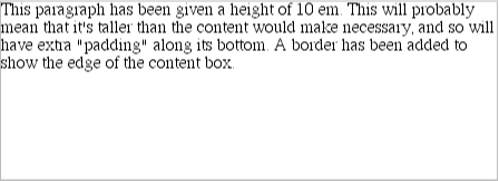
Figure 8-3. Setting the height property for block-level elements
If, on the other hand, the height is less than that needed to display the content:
<P STYLE="height: 3em;">
then the browser is supposed to provide a way to see all content without increasing the height. This could possibly mean adding a scrollbar to the element, as shown in Figure 8-4.
Figure 8-4. One way to handle a short height on a tall element
In practice, most browsers will not do this. They will instead simply increase the height of the element, as though the value of height had been set to auto. This is permitted under CSS1, which states that browsers can ignore any value of height other than auto if an element is not a replaced element such as an image. Under CSS2, it is possible to set up a situation where scrollbars would be applied to an element such as a paragraph.
It's also possible to set the top and bottom margins of a block-level element to be auto. If either of these properties is set to auto, it is reset to 0 (zero), effectively removing any top or bottom margin from the element box, as shown in Figure 8-5. The lack of any space between the borders of each paragraph is a result of auto being reinterpreted as zero:
P {margin-top: auto; margin-bottom: auto;}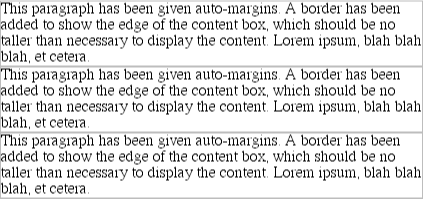
Figure 8-5. Automatically setting margins to zero
8.2.1.2. Collapsing vertical margins
There is one other important aspect of vertical formatting, which is the collapsing of adjacent margins. This comes into play when an element with declared margins immediately follows another such element in the document's layout. This was discussed in the previous chapter, using this example:
LI {margin-top: 10px; margin-bottom: 20px;}Padding and borders, where they exist, are never collapsed. If neither is declared, then both will default to 0 (zero). This assumes that no style is set for the border. If a border style is set, then the value of border-width defaults to medium , not zero. The exact width of medium will depend on the user agent's programming, but a common value is 2 or 3 pixels.
8.2.2. Horizontal Formatting
In contrast to vertical formatting, horizontal formatting can get a little complicated. Fortunately, it starts out simply enough; it's only when you start putting things together that the situation becomes difficult.
First off, the simplest rule is this: unlike vertical margins, horizontal margins are not collapsed. If you somehow manage to have two block-level elements next to each other, and each has a margin, the margins will not collapse. The easiest way to illustrate this principle is to set margins on two images and then have them appear on the same line, as they do in Figure 8-6:
<IMG SRC="test1.gif" STYLE="margin: 5px;" ALT="first test">
<IMG SRC="test2.gif" STYLE="margin: 5px;" ALT="second test">
(Note that the images in Figure 8-6 are actually inline elements, but they effectively demonstrate that horizontally adjacent margins do not collapse.)
Figure 8-6. Horizontal margins don't collapse
Almost as simple is this: the sum of the horizontal components of a nonfloated block-level element box always equals the width of the parent. Take two paragraphs within a DIV, for example, whose margins have been set to be 1em. The content width (in other words, the value of width) of the paragraph, plus its left and right padding, borders, and margins, always add up to the width of the DIV 's content, as illustrated in Figure 8-7.
Figure 8-7. Element boxes are as wide as the width of their parent element
Thus, if the width of the DIV is 30em , then the sum total of the content width, padding, borders, and margins of each paragraph will be 30em. In Figure 8-7, the "blank" space around the paragraphs is actually their margins. (If the DIV had any padding, there would be even more blank space, but that wasn't the case here.)
In a similar fashion, the overall width of a list item's element box is equal to the content width of the list element that contains it. As you can see in Figure 8-8, the margins of a parent element can influence the layout of a child element.
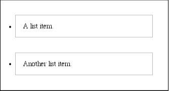
Figure 8-8. List items' overall width equals the width of the UL element
8.2.2.1. Horizontal properties
There are a number of properties relating to the layout of boxes. These are known as the "seven properties" of horizontal formatting: (from the left) margin-left, border-left, padding-left, width , padding-right, border-right, and margin-right. These are illustrated in Figure 8-9. The values of these seven properties must equal the value of width for an element's parent.
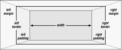
Figure 8-9. The "seven properties" of horizontal formatting
Only three of these seven properties can be set to auto: the width of the element's content, and the left and right margins. The left and right padding and borders must be set to specific values, or else they default to a width of zero (again, assuming no border-style is declared; if one has been set, then the width of the borders is set to be the vaguely defined value medium ). Figure 8-10 provides a handy illustration for remembering which parts of the box can take a value of auto, and which cannot.
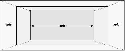
Figure 8-10. Horizontal properties that can be set to auto
width must be set to either auto or a non-negative value of some type. CSS also allows browsers to set a minimum value for width, below which a block-level element's width cannot drop. The value of this minimum can vary between browsers, as it is not defined in the specification.
8.2.2.2. Using auto
If only one of width , margin-left, or margin-right is set to a value of auto, while the others are given specific values, then the property set to be auto will evaluate to whatever length is required to make the element box's width equal the parent element's width. Thus, if the sum of the seven properties must equal 400 pixels, and no padding or borders are set, and the right margin and width are set to 100px while the left margin is set to auto, then the left margin will be 200 pixels wide:
P {margin-left: auto; margin-right: 100px; width: 100px;} The results are shown in Figure 8-11.

Figure 8-11. Automatic left margin
In a sense, auto can be used to say, "make up the difference between everything else and the required total." However, what if all three of these properties are set to 100px , and none of them to auto ?
In the case where all three properties are set to something other than auto -- or, to borrow a term from the CSS specification, when these formatting properties have been over-constrained -- then margin-right is always forced to be auto. This means that if both margins and the width are set to 100px , then the right margin will be set by the user agent to auto:
P {margin-left: 100px; margin-right: 100px; width: 100px;}It will then evaluate to 200px , as shown in Figure 8-12.

Figure 8-12. Overriding the margin-right setting
TIP
Note that margin-right is forced to be auto only for left-to-right languages such as English. In right-to-left languages, everything gets flipped around, so margin-left is forced to be auto, not margin-right. This is not so much an issue under CSS1 as it is in CSS2, which introduces properties related to writing direction.
If both margins are set explicitly, and width is auto, then the value of width will be set to be whatever is needed to reach the required total (that is, the content width of the parent element). The following markup is displayed as shown in Figure 8-13:
P {margin-left: 100px; margin-right: 100px; width: auto;}
Figure 8-13. Automatic width
This is the most common case, in fact, since it is equivalent to setting the margins and not declaring anything for the width. The result of this markup is exactly the same as that shown in Figure 8-13:
P {margin-left: 100px; margin-right: 100px;} /* same as before */WARNING
In practice, only browsers released in early 1999 or later correctly handle auto, and not even all of them get it right. Those that do not handle auto margins correctly will behave in inconsistent ways, but the safest bet is to assume that they will set both margins to zero. The browsers that do get this right are Internet Explorer 4.5 and 5 for Macintosh, and Opera 3.6.
8.2.2.3. More than one auto
Now let us consider the cases where two of these three properties are set to auto. If both the margins are set to auto, then they are set to equal lengths, thus centering the element within its parent, as you can see from Figure 8-14:
P {width: 100px; margin-left: auto; margin-right: auto;}
Figure 8-14. Setting an explicit width
This is the correct way to center block-level elements, as a matter of fact. text-align is supposed to apply to only the inline content of a block-level element, so setting an element to have a text-align of center shouldn't center it. Instead, you should declare:
P {margin-left: auto; margin-right: auto; width: 50%;}This will center all paragraphs within their parent elements, as shown in Figure 8-15.

Figure 8-15. Centering an element with automatic margins
WARNING
As of this writing, only Internet Explorer 4.5 and 5 for the Macintosh and Opera 3.6 will center elements using auto margins.
The other possibility is when one of the margins and the width are set to be auto. In this case, then the margin set to be auto is reduced to zero:
P {width: auto; margin-left: auto; margin-right: 100px;}The width is then set to the value necessary to reach the required total, as demonstrated in Figure 8-16.
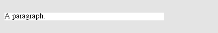
Figure 8-16. Setting an explicit right margin
Finally, what happens when all three properties are set to auto ? The answer is simple: both margins are set to zero, and the width is made as wide as possible. This result is the same as the default situation when there are no values explicitly declared for margins or the width. In such a case, the margins default to zero (0) and the width defaults to auto. This is illustrated in Figure 8-17.
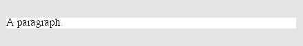
Figure 8-17. Everything set to auto
Note that since horizontal margins do not collapse, the padding, borders, and margin of a parent element can affect its children. This is an indirect effect, of course, in that the margins (and so on) of an element can induce an offset for child elements. Vertical margins are still collapsed, as shown in Figure 8-18:
DIV {margin: 20px; padding: 20px;}
P {margin: 10px; padding: 10px;}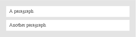
Figure 8-18. Offset is implicit in the parent's margins and padding
8.2.2.4. Negative margins
So far, this probably all seems rather straightforward, and you may be wondering why I said things could be complicated. As it turns out, the complication is that margins can have negative values.
You'll remember that I said the second-simplest rule of horizontal formatting was this: the total of the seven horizontal properties always equals the width of the parent element. At first glance, this can be interpreted to mean that an element can never be wider than its parent's content area -- and as long as all properties are zero or greater, that's quite true. However, consider the following, depicted in Figure 8-19:
DIV {width: 400px; border: 3px solid black}
P.wide {margin-left: 10px; width: auto; margin-right: -50px;
  border: 1px solid gray;}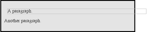
Figure 8-19. Wider children through negative margins
Yes, the child element is wider than its parent! This is mathematically correct: 10 + + + 450 + + - 50 = 400. Even though this leads to a child element sticking out of its parent, technically the specification hasn't been violated, because the values of the seven properties add up to the required total. It's a semantic dodge, but it's valid behavior.
Let's consider another example, illustrated in Figure 8-20, where the left margin is set to be negative:
DIV {width: 400px; border: 1px solid black;}
P.wide {margin-left: -50px; width: auto; margin-right: 10px;
  border: 3px solid gray;}
Figure 8-20. Setting a negative left margin
In this case, not only does the paragraph spill beyond the borders of the DIV, but also beyond the edge of the browser window itself!
TIP
Remember that padding, borders, and content widths can never be negative. Only margins can be less than zero.
Negative margins have an impact on vertical formatting as well, affecting how margins are collapsed. If there are negative vertical margins, then the browser should take the absolute maximum of the negative margins and subtract that from the maximum of any positive margins.
In the case where there are only two margins to be collapsed, one positive and the other negative, the situation is handled in a fairly simple manner. The absolute value of the negative margin is subtracted from the positive margin -- or, to put it another way, the negative is added to the positive -- and the resulting value is the distance between the elements. Figure 8-21 provides two concrete examples.
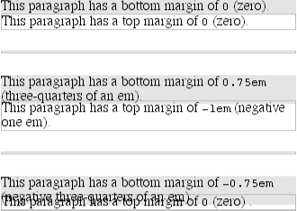
Figure 8-21. Examples of negative vertical margins
You'll notice the "pulling" effect of negative top and bottom margins. This is really no different from the way in which negative horizontal margins cause an element to push outside of its parent. Consider:
DIV {width: 400px; border: 1px solid black;}
P.neg {margin-top: -50px; width: auto; margin-right: 10px;
  margin-left: 10px; border: 3px solid gray;}

<DIV STYLE="width: 420px; background-color: silver;
   padding: 10px; margin-top: 75px;">
<P CLASSS="neg">
A paragraph.
</P>
</DIV>
As we can see from Figure 8-22, the paragraph has simply been pulled upward by its negative top margin, such that it's outside the parent DIV !
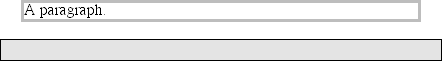
Figure 8-22. The effects of a negative top margin
With a negative bottom margin, though, it looks as though everything following the paragraph has been pulled upward. Compare the following markup to the situation shown in Figure 8-23:
DIV {border: 1px solid black;}
P.neg {margin-bottom: -50px; width: auto; margin-right: 10px;
  margin-left: 10px; border: 3px solid gray;}

<DIV STYLE="width: 420px; background-color: silver;
   padding: 10px; margin-top: 75px;">
<P CLASS="neg">
A paragraph.
</P>
</DIV>
<P>
The next paragraph.
</P>
Figure 8-23. The effects of a negative bottom margin
What's really happening in Figure 8-23 is that the elements following the DIV are placed according to the location of the bottom of the DIV. As we can see, the end of the DIV is actually above the visual bottom of its child paragraph. The next element after the DIV is the appropriate distance from the bottom of the DIV. The fact that it overlaps the paragraph doesn't matter, at least not technically.
Now let's consider an example where the margins of a list item, an unordered list, and a heading are all collapsed. In this case, the unordered list and heading will be set to have negative margins:
LI {margin-bottom: 20px;}
UL {margin-bottom: -15px;}
H1 {margin-top: -18px;}
The larger of the two negative margins (-18px ) is added to the largest positive margin (20px ), yielding (20px-18px = 2px ). Thus, there are only two pixels between the bottom of the list item's content and the top of the paragraph's content. This is what we see in Figure 8-24.
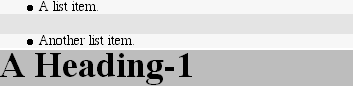
Figure 8-24. Collapsing margins and negative margins, in detail
There is one area of unresolved behavior, which is this: if elements overlap each other due to negative margins, which elements are "on top?" You'll note that few of the examples in this section use background colors for all elements. That's because if they did, content might get overwritten by the background color of a following element. The CSS specification does not say what should happen when elements overlap in this manner; instead, it's left up to implementors to decide.
It has been argued that all foreground content is always shown "in front of " all background content, and the behavior of floated elements seems to support this interpretation. On the other hand, the CSS2 property z-index makes this reasoning more complicated. As of this writing, implementations have not yet advanced sufficiently to test this out, and the CSS2 description of z-index doesn't really shed any light on this subject.
Ultimately, if you use negative margins, you may not get the same results from all browsers. Since no one can clearly say which is right, none of them can really be considered to be buggy -- at least, not until the specification is sufficiently clarified.
8.2.3. List Items
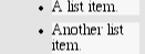
Speaking of list items, they have a few special rules in addition to everything discussed so far. List items are typically preceded by a marker, such as a small dot or a number. This marker isn't actually part of the list-item's content area, so you get effects like those illustrated in Figure 8-25.
Figure 8-25. The content of list items
In CSS1, very little is said about the placement and effects of this marker with regard to the layout of a document. CSS2 introduces properties specifically designed to address this issue, such as marker-offset. Since this property and its cousins are not widely supported at the time of this writing, we will not spend time on it here. There is a brief discussion of the marker properties in Chapter 10, "CSS2: A Look Ahead".
8.2.4. Block-Level Replaced Elements
Block-level replaced elements are also subject to a few differences in how formatting is handled. The most important is that replaced elements are assumed to have an intrinsic height and width; for example, an image will be a certain number of pixels high and wide. Given this, if either height or width are set to auto for a replaced element, then the value will always evaluate to the intrinsic height or width of the element. Thus, if an image is 150 pixels wide, and its width property is set to the value auto, then its width will evaluate to 150px , as shown in Figure 8-26:
IMG {display: block; width: auto;}
Figure 8-26. Replaced elements with auto width are rendered using their intrinsic size
Replaced elements can have their height and width set to a value other than auto or their intrinsic dimensions. This is most commonly used to "scale" images, either up or down. Thus, if an image is 150 pixels wide and its width is set to 75px , then the image will be displayed half as wide as it would ordinarily appear. In most browsers, the height will be scaled to match, unless it has been explicitly set to a certain value. Figure 8-27 shows a few possibilities.
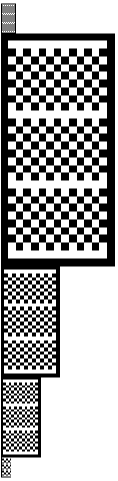
Figure 8-27. Scaling images with the width property
It's also possible to scale an image (or other replaced element) using height:
<IMG SRC="test.gif" STYLE="display: block;" ALT="test image">
<IMG SRC="test.gif" STYLE="display: block; height: 50px;" ALT="test image">
<IMG SRC="test.gif" STYLE="display: block; height: 200px;" ALT="test image">
This is exactly the same as using the HEIGHT attribute on the IMG tag in HTML. If an image is 100 pixels tall, then by default its height will be 100px . If you specify another value, then the image will be scaled appropriately, as illustrated in Figure 8-28.
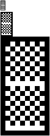
Figure 8-28. Scaling images with the height property
In almost all other ways, block-level replaced elements behave the same as block-level elements when it comes to formatting: vertical margins are collapsed while horizontal margins are not, and the borders and padding default to zero unless explicitly declared otherwise. Remember, however, that not all replaced elements are images. Most form elements are replaced, for example.
In general, all replaced elements (block-level or otherwise) can be scaled using height and width. In most other ways, inline replaced elements are handled very differently, as we'll see later in this chapter.
 |  |  |
| 8. Visual Formatting |  | 8.3. Floated Elements |

Copyright © 2002 O'Reilly & Associates. All rights reserved.