
6.2. Complex Backgrounds
Having covered the basics of foreground and background colors, we turn now to the subject of background images. In HTML, it's possible to associate an image with the background of the document by using the BODY attribute BACKGROUND:
<BODY BACKGROUND="bg23.gif">
This will cause a user agent to load the file bg23.gif and then "tile" it in the document background, repeating it in both the horizontal and vertical directions to fill up the entire background of the document, as shown in Figure 6-22.
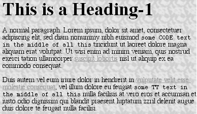
Figure 6-22. Applying a background image in HTML
This effect can be duplicated in CSS, but CSS contains a great deal more than simple tiling of background images. We'll start with the basics and then work our way up.
6.2.1. Background Images
In order to get an image into the background in the first place, the property background-image is used.
background-image
- Values
<url> | none
- Initial value
none
- Inherited
no
- Applies to
all elements
The default value of none means about what you'd expect: no image is placed in the background. If you want a background image, then you need only give this property a URL value:
BODY {background-image: url(bg23.gif);}Due to the default values of other background properties, this will cause the image bg23.gif to be tiled in the document's background, as shown in Figure 6-22.
It's usually a good idea to specify a background color to go along with your background image. I won't do so in this section, since we're concentrating on background-image for the moment. We'll come back to why setting a color is a good idea later on in the chapter.
A background image can be applied to any element, whether block-level or inline. BODY is the most common element to which backgrounds are applied, of course, but there's no need to stop there. For example:
P.starry{background-image: url(http://www.site.web/pix/stars.gif);
   color: white;}

<P CLASS="starry">It's the end of autumn, which means the stars will be
brighter than  ever!  Join us...
As we can see in Figure 6-23, a background has been applied to a single paragraph and no other part of the document.
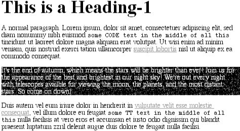
Figure 6-23. Applying a background image for a single element
This ability goes even further, allowing you to place background images on inline elements like hyperlinks, as depicted in Figure 6-24. Of course, if you want to be able to see the tiling pattern, the image will probably need to be pretty small. After all, individual letters aren't that large!
A.grid {background-image: url(smallgrid.gif);}

<P>This paragraph contains <A HREF="..." CLASS="grid">an anchor with a
background image</A> which is tiled only within the anchor.</P>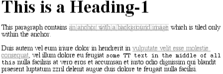
Figure 6-24. A background image on an inline element
There are a number of ways to employ this technique. You might place an image in the background of STRONG elements, in order to make them stand out more. You could fill in the background of headings with a wavy pattern, or with little dots. You can even fill in the cells of tables with patterns to make them distinct from the rest of the page, as shown in Figure 6-25:
TD.nav {background-image: url(darkgrid.gif);}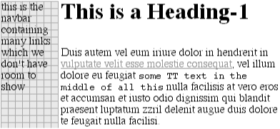
Figure 6-25. Setting a background image for a table cell
You could even, in theory, apply images to the background of replaced elements like TEXTAREAs and SELECT lists, although user agents aren't very good about that sort of thing yet -- in fact, as of this writing, no browser will correctly place images in the backgrounds of form elements.
WARNING
Just like background-color, background-image is not inherited -- in fact, none of the background properties are inherited. Remember also that when specifying the URL of a background image, it falls under the usual restrictions and caveats for url values: a relative URL should be interpreted with respect to the style sheet, but Navigator 4.x doesn't do this correctly, so absolute URLs may be a better answer.
6.2.1.1. Good background practices
An interesting thing about images is that they're laid on top of whatever background color you may have specified. If you're completely tiling GIF, JPEG, or other opaque image types, this doesn't really make a difference, since they'll fill up the document background, leaving nowhere for the color to "peek through," so to speak. However, image formats with an alpha channel, such as PNG, can be partially or wholly transparent, and this will cause the image to be combined with the background color. In addition, if the image fails to load for some reason, the user agent will use the background color specified in place of the image. Consider how the "starry paragraph" example would look if the background image failed to load, as in Figure 6-26.
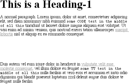
Figure 6-26. The consequences of a missing background image
Given this reason alone, it's always a good idea to specify a background color when using a background image, so that your white text will at least be visible:
P.starry {background-image: url(http://www.site.web/pix/stars.gif);
   background-color: black; color: white;}

<P CLASS="starry">It's the end of autumn, which means the stars will be
brighter than ever!  Join us...
Besides, if you have the image do something other than fully tile across the entire background of the document, then you'll need a color to cover the parts that the image doesn't. Speaking of which ...
6.2.2. Repeats with Direction
Thus far, all we've ever been able to do in document design is repeat background images in both the horizontal and vertical directions. If we wanted some kind of "sidebar" background, it was necessary to create a very short, but incredibly wide, image to place in the background; a favorite size for these images is 10 pixels tall by 2,500 pixels wide. Most of that image is blank space, of course. Only the left 100 or so pixels contain the "sidebar" image. The rest of the image is basically wasted, as we can see in Figure 6-27.
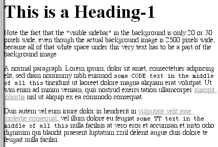
Figure 6-27. Using a really wide image for a really small effect
Wouldn't it be much nicer to just create a sidebar image which is 10 pixels tall and 100 pixels wide, with no wasted blank space, and then repeat it only in the vertical direction? This would certainly make your design job a little easier, and your users' download times a lot shorter. Enter background-repeat.
background-repeat
- Values
repeat | repeat-x | repeat-y | no-repeat
- Initial value
repeat
- Inherited
no
- Applies to
all elements
As you might guess, repeat causes the image to tile in both the horizontal and vertical directions, just as background images have always done in the past. repeat-x and repeat-y cause the image to be repeated in the horizontal or vertical directions, respectively, and no-repeat prevents the image from tiling in any direction.
By default, the background image will start from the top left corner of an element. (We'll see how to change this later in the chapter.) Therefore, the following rules will have the effect seen in Figure 6-28:
BODY {background-image: url(yinyang.gif);
   background-repeat: repeat;}
Figure 6-28. Tiling the background image in CSS
I've left out a background color in order to keep the rule short, but remember to include a background color any time you have a background image. And, of course, the effect shown in Figure 6-28 would have been the same if we'd left out the background-repeat property altogether, since repeat is its default value.
Let's assume, though, that we just want images down the left side of the document. Instead of having to create a special image with a whole lot of blank space to the right of the image, we can instead make a small change to our styles:
BODY {background-image: url(yinyang.gif);
   background-repeat: repeat-y;}
As Figure 6-29 demonstrates, the image is simply repeated along the y-axis (that is, vertically) from its starting position -- in this case, the top left corner of the browser window.

Figure 6-29. Tiling along the vertical axis
In effect, there is a repeated column in the background, and there is only one such column. Should you want two columns of symbols in this example, then the base image would have to be altered to contain side-by-side symbols, as in Figure 6-30.
Figure 6-30. Tiling a slightly larger image on the vertical axis
The expected result occurs when we change the repeat value to be repeat-x:
BODY {background-image: url(yinyang.gif);
   background-repeat: repeat-x;}
Now the image is repeated along the x-axis (in other words, horizontally), as illustrated in Figure 6-31.
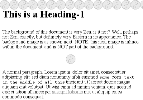
Figure 6-31. Tiling along the horizontal axis
Finally, of course, we may wish not to repeat the background image at all. In that case, we use the last value, no-repeat, which is illustrated in Figure 6-32:
Figure 6-32. No tiling at all
BODY {background-image: url(yinyang.gif);
   background-repeat: no-repeat;}
This may not seem terribly useful, given that there is only a small symbol in the top left corner of the document, but let's try it again with a much bigger symbol, as shown in Figure 6-33:

Figure 6-33. Placing a single, large backround image
BODY {background-image: url(bigyinyang.gif);
   background-repeat: no-repeat;}
6.2.2.1. Real-world uses
The ability to control the repeat direction dramatically expands the range of effects possible in document design. For example, let's say you want a triple border on the left side of each H1 element in your document. You could then declare the following:
H1 {background-image: url(triplebor.gif); background-repeat: repeat-y;}As we can see in Figure 6-34, the very small image triplebor.gif is repeated vertically along the left side of the heading element, resulting in an effect that isn't otherwise possible.
Figure 6-34. Creating a "triple border" on H2 elements
We can take that further and decide to set a wavy border along the top of each H1 element, as illustrated in Figure 6-35. The image is colored in such a way that it blends with the background color and produces the wavy effect shown:
H1 {background-image: url(wavybord.gif); background-repeat: repeat-x;
    background-color: #CCCCCC;}
Figure 6-35. Setting a wavy top border on H1 elements
Simply by choosing the appropriate image for the job, and employing it in some creative ways, you can set up some truly astonishing appearances. And that isn't the end of what's possible. Now that we know how to keep a background image from repeating, how about moving it around in the background?
6.2.3. Background Positioning
Thanks to background-repeat, it's possible to place a large image in the background of a document, and then keep it from repeating. Let's add to that and actually change the image's position in the background.
background-position
- Values
[<percentage> | <length>]{1,2} | [top | center | bottom ] || [left | center | right]
- Initial value
0% 0%
- Inherited
no
- Applies to
block-level and replaced elements
WARNING
Percentage values refer to a point on both the element and the origin image (see explanation in Section 6.2.3.2, "Percentage values" later in this chapter).
For example, we could center it, with the result depicted in Figure 6-36:
BODY {background-image: url(bigyinyang.gif);
   background-repeat: no-repeat;
   background-position: center;}
Figure 6-36. Centering a single background image
This positioning is all done using background-position, of course, but there are a whole lot of ways to supply values for this property. First off, there are the keywords top, bottom , left, right, and center. Usually, these appear in pairs, but (as Figure 6-36} shows) this is not always true. Then there are length values, such as 50px or 2cm , and finally, percentage values. Each type of value has a slightly different effect on the placement of the background image.
6.2.3.1. Keywords
Easiest to understand are the keywords. They have the effects you'd expect from their names; for example, top right would cause the background image to be placed in the top right corner of the element. Let's go back to the small yin-yang symbol:
BODY {background-image: url(yinyang.gif);
   background-repeat: no-repeat;
   background-position: top right;}
Incidentally, the result, shown in Figure 6-37, would have been exactly the same had the position been declared as right top. When using the position keywords, they can appear in any order, so long as there are no more than two of them, one for the horizontal and the other for the vertical.
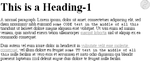
Figure 6-37. Placing the background image in the top right corner of the browser window
If only one keyword appears, then the other is assumed to be center. Table 6-1 shows equivalent keyword statements.
Table 6-1. Position Keyword Equivalents
|
Single Keyword |
Equivalent To |
|---|---|
|
center |
center center |
|
top center center top |
|
|
bottom |
bottom center center bottom |
|
right |
center right right center |
|
left |
center left left center |
So if you want an image to appear in the very top center of each paragraph, as in Figure 6-38, you need only declare:
P {background-image: url(bg23.gif);
   background-repeat: no-repeat;
   background-position: top;}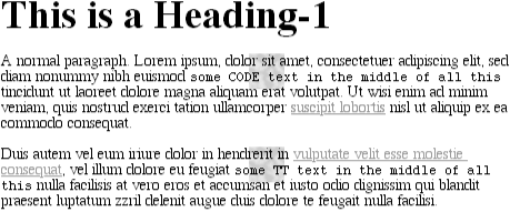
Figure 6-38. Putting a single background image at the top of every paragraph
6.2.3.2. Percentage values
Closely related to the keywords are percentage values, although they behave in a rather interesting way. Let's say that you want to center a background image within its element by using percentage values. That's easy enough:
BODY {background-image: url(bigyinyang.gif);
   background-repeat: no-repeat;
   background-position: 50% 50%;}
This causes the background image to be placed such that its center is aligned with the center of its parent element, as demonstrated in Figure 6-39. In other words, the percentage values apply to both the element and the background image.
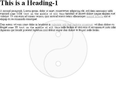
Figure 6-39. Centering the background image using percentages
In order to understand this concept, let's examine this process in closer detail. When you center a background image in an element, the point in the image which can be described as 50% 50% is lined up with the point in the element that can be described the same way. This is shown in Figure 6-40.
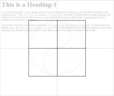
Figure 6-40. Lining up the center of the image with the center of the browser window
Thus, if you want to place a single background image a third of the way across the element and two-thirds of the way down, then your declaration would be:
BODY {background-image: url(bigyinyang.gif);
   background-repeat: no-repeat;
   background-position: 33% 66%;}
The point in the background image that is one-third across and two-thirds down from the top left corner of the image will be aligned with the point that is as far from the top left corner of the containing element, as shown in Figure 6-41.
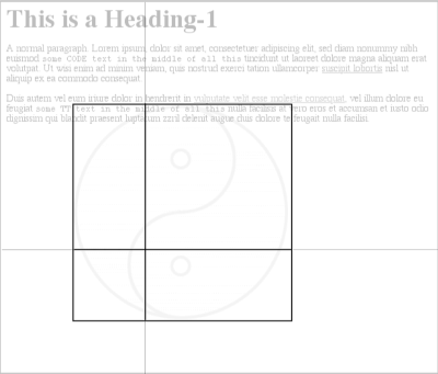
Figure 6-41. More percentage positioning
Note that with percentages the horizontal value always comes first. If you were to switch the percentages in the preceding example, the image would be placed two-thirds of the way across the element and one-third of the way down. It's also worth noting what happens if you only supply one value. In that case, the single value supplied is taken to be the horizontal value, and the vertical is assumed to be 50%. This is basically the same as with the keywords, where if only one keyword is given, the other is assumed to be center. Thus:
BODY {background-image: url(bigyinyang.gif);
   background-repeat: no-repeat;
   background-position: 33%;}
The background image is placed one-third of the way across the page, and halfway down it, as depicted in Figure 6-42.
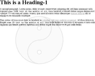
Figure 6-42. Declaring only one percentage means the vertical position evaluates to 50%
Table 6-2 gives a breakdown of keyword and percentage equivalencies.
Table 6-2. Positional Equivalents
|
Single Keyword |
Equivalent To |
Equivalent To |
|---|---|---|
|
center |
center center |
50% 50% |
|
top center center top |
50% 0% |
|
|
bottom |
bottom center center bottom |
50% 100% |
|
right |
center right right center |
100% 50% 100% |
|
left |
center left left center |
0% 50% 0% |
|
top left left top |
0% 0% |
|
|
top right right top |
0% 100% |
|
|
bottom right right bottom |
100% 100% |
|
|
bottom left left bottom |
0% 100% |
In case you were wondering, the default values for background-position are 0% 0%, which is functionally the same as top left. That's why, unless you set different values for the position, background images always start tiling from the top left corner of the containing element.
6.2.3.3. Length values
Finally, we turn to length values for positioning. When you supply lengths for the position of the background image, they are interpreted as offsets from the top left corner of the element. The offset point is the top left corner of the background image; thus, if you set the values 20px 30px , the top left corner of the background image will be 20 pixels to the right of, and 30 pixels below, the top left corner of the containing element, as in Figure 6-43:
BODY {background-image: url(bg23.gif);
   background-repeat: no-repeat;
   background-position: 20px 30px;}
Figure 6-43. Offsetting the background image using length measures
This is, of course, different than percentage values, in the sense that the offset is simply from one top left corner to another. In other words, the top left corner of the background image lines up with the point specified in the background-position declaration. You can combine length and percentage values, though, to get a sort of "best of both worlds" effect. Let's say you need to have a background image that is all the way to the right side of an element and 10 pixels down from the top, as illustrated in Figure 6-44. As always, the horizontal value comes first:
BODY {background-image: url(bg23.gif);
   background-repeat: no-repeat;
   background-position: 100% 10px;}
Figure 6-44. Mixing percentages and length values
You cannot, however, mix keywords with other values. Thus, top 75% is not valid. If you use a keyword, you're stuck using only keywords, but percentages and lengths can be mixed together.
Not only that, but if you're using lengths or percentages, you can give negative values, thus pushing the image out of the element, to some degree. Consider the example with the very large yin-yang symbol for a background. At one point, we centered it, but what if we only want part of it visible in the top left corner of the containing element? No problem, at least in theory. First, assume the image is 300 pixels tall by 300 pixels wide. Then, assume that only the bottom right third of it should be visible. We can get the desired effect (shown in Figure 6-45) like this:
BODY {background-image: url(bigyinyang.gif);
   background-repeat: no-repeat;
   background-position: -200px -200px;}
Figure 6-45. Using negative length values
Or, let's say we want a little more of it visible, as in Figure 6-46:
BODY {background-image: url(bigyinyang.gif);
   background-repeat: no-repeat;
   background-position: -150px -100px;}
Figure 6-46. Another set of negative lengths
Negative percentages are also possible in theory, although there are two issues involved. The first is the limitations of user agents, which may not recognize negative values for background-position. The other is that negative percentages are somewhat interesting to calculate. Figure 6-47 shows why.
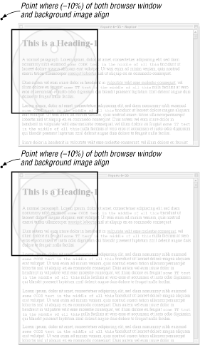
Figure 6-47. Aligning negative percentage points: two scenarios
This isn't to say that you shouldn't use negative values, of course, just that there are issues to consider. As always.
WARNING
Although most CSS-aware browsers (Explorer 4.x and 5.x and Opera 3.5 and later) honor negative background positions, the effects are wildly unpredictable at best. This applies even to negative lengths, which can cause unwanted tiling, inappropriate positioning of the background images, and more. If you really need to set a single background image so that it's hanging off the page, you're probably better off producing an image that is already cut off and just putting it in the top left corner.
Throughout this section, every example has had a repeat value of no-repeat. The reason for this is simple: with only a single background image, it's much easier to see how positioning affects the placement of the first background image. We don't have to prevent the background image from repeating, though:
BODY {background-image: url(bigyinyang.gif);
   background-position: -150px -100px;}
So, with the background repeating, we can see from Figure 6-48 that the tiling pattern starts with the position specified by background-position. This first image is known as the origin image , and it's very important to understanding the next section.
Figure 6-48. Use of the background-position property sets the origin of the tiling pattern
As it happens, the positioning of backgrounds does contradict something I said earlier. background-position is the only background property with restrictions, as it may only be applied to block-level and replaced elements; background image positioning cannot be done on inline elements such as hyperlinks.
6.2.4. Repeats with Direction (Revisited)
In the previous section on repetition, we explored the values repeat-x , repeat-y, and repeat, and how they affect the tiling of background images. In each case, however, the tiling pattern always started from the top left corner of the containing element (e.g., BODY). That isn't a requirement, of course; as we've seen, the default values for background-position are 0% 0%. So, unless you change the position of the origin image, that's where the tiling starts. Now that we know how to change the position of the origin image, we need to figure out how user agents will handle the situation.
It will be easier to show an example, and then explain it. Consider the following, which is illustrated by Figure 6-49:
BODY {background-image: url(bg23.gif);
   background-repeat: repeat-y;
   background-position: center;}
Figure 6-49. Centering the origin image and repeating vertically
So there you have it: a stripe running through the center of the document. It may look wrong, but it isn't.
The example shown in Figure 6-49 is correct because the origin image has been placed in the center of the BODY element and then tiled along the y-axis in both directions -- in other words, both up and down. In a similar fashion, when the repeat direction is horizontal, the background image is repeated to both the right and the left, as shown in Figure 6-50:
BODY {background-image: url(bg23.gif);
   background-repeat: repeat-x;
   background-position: center;}
Figure 6-50. Centering with a horizontal repeat
Therefore, setting a large image in the center of the BODY and then letting it repeat will cause it to tile in all four directions: up, down, left, and right. The only difference background-position makes is in where the tiling starts. Figure 6-51 shows the difference between tiling from the center of the BODY, and from its top left corner.
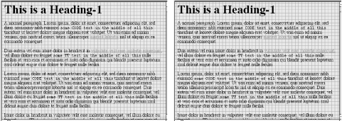
Figure 6-51. The difference between starting a repeat from top left (left) and centering it (right)
Note the differences along the edges of the browser window. When the background repeats from the center, the grid is centered within the viewport, resulting in consistent "clipping" along the edges. The variations may seem subtle, but the odds are that you'll have reason to use both approaches at some point in your design career.
In case you're wondering, there is no way to control the repeat any more than we've already discussed. There is no repeat-left, for example, although it could certainly be added in some future version of CSS. For now, you get full tiling, horizontal tiling, vertical tiling, or no tiling at all.
6.2.4.1. Repeating: Real-world issues
There are a few things to keep in mind when it comes to web browsers. First is that in Navigator 4 and Internet Explorer 4, tiling only happened down and to the right. If you're using Explorer 4, centering an image in the background and then tiling it would look like Figure 6-52.
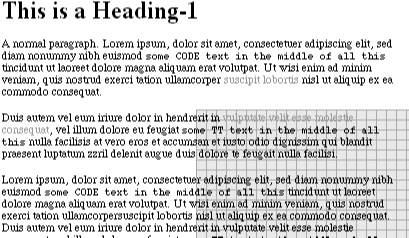
Figure 6-52. Incorrect behavior in Internet Explorer 4
Navigator 4 manages to avoid this error by not honoring background positioning at all, which means that the origin image always appears in the top left corner of an element under Navigator 4. Of the browsers that correctly position background images, only four managed correct repeating, as of this writing: Opera 3.6 for Windows, Internet Explorer 4.5 and 5 for Macintosh, and Internet Explorer 5 for Windows.
6.2.5. Getting Attached
Okay, so we can place the origin image for the background anywhere in the background of an element, and we can control (to a degree) how it tiles. As you may have already realized, setting an image to be in the center of the document may mean, given a sufficiently long document, that the background image isn't initially visible to the reader. After all, a browser only provides a window onto the document. If the document is too long to be displayed in the window, then the user can scroll back and forth through the document. The center could be two or three "screens" below the beginning of the document, or just far enough down to push much of the background image beyond the bottom of the browser window, as shown in Figure 6-53.
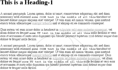
Figure 6-53. The background image appears too low to be seen fully
Furthermore, even assuming that the background image is initially visible, it always scrolls with the document. Perhaps you don't want to see what Figure 6-54 depicts:
BODY {background-image: url(bigyinyang.gif);
   background-repeat: no-repeat;
   background-position: center;}
Figure 6-54. Scrolling the background image out of view
Never fear: there is a way to prevent this scrolling.
background-attachment
- Values
scroll | fixed
- Initial value
scroll
- Inherited
no
- Applies to
all elements
Using the property background-attachment, you can declare the background to be fixed with respect to the viewing area and therefore immune to the effects of scrolling:
BODY {background-image: url(bigyinyang.gif);
   background-repeat: no-repeat;
   background-position: center;
   background-attachment: fixed;}
Doing this has two immediate effects, as we can see from Figure 6-55. The first is that the background does not scroll along with the document. The second is that the position of the image is determined by the viewing area, not the document size.

Figure 6-55. Nailing the background in place
When printed, of course, the two are the same, since the display area (the paper) is the same as the document size, at least for that page. In a web browser, though, the viewing area can change as the user resizes the browser's window. This will cause the background's origin image to shift as the window changes size. Figure 6-56 depicts several views of the same document. So in a certain sense the image isn't fixed in place, but it will remain fixed so long as the viewing area isn't resized.
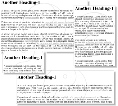
Figure 6-56. Centering still holds, even if the image is "fixed"
There is only one other value for background-attachment, and that's the default value scroll. As you'd expect, this causes the background to scroll along with the rest of the document when viewed in a web browser, and it doesn't necessarily change the origin image's position as the window is resized. If the document width is fixed (perhaps by assigning an explicit width to the BODY element), then resizing the viewing area won't affect the placement of the origin image.
6.2.5.1. Interesting effects
In technical terms, when a background image has been set to be fixed, it is positioned with respect to the viewing area, not the element that contains it. However, the background will only be visible within its containing element. This leads to a rather interesting consequence.
Let's say we have a document with a tiled background that actually looks like it's tiled and an H1 element with the same pattern, only in a different color. Both the BODY and H1 elements are set to have fixed backgrounds, resulting in something like Figure 6-57:
BODY {background-image: url(tile1.gif);  background-repeat: repeat;
   background-attachment: fixed;}
H1 {background-image: url(tile2.gif);  background-repeat: repeat;
   background-attachment: fixed;}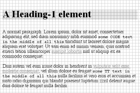
Figure 6-57. Perfect alignment of backgrounds
How is this perfect alignment possible? Remember, when a background is fixed , the origin element is positioned with respect to the canvas. Thus, both background patterns begin tiling from the top left corner of the document, not the individual elements. For the BODY, we can see the entire repeat pattern. For the H1, however, the only place we can see its background is in the padding and content of the H1 itself. Since both background images are the same size, and they have precisely the same origin position, they appear to "line up" as shown in Figure 6-57.
WARNING
There's a downside: as of this writing, web browsers don't get this fixed alignment right, so this example was just an interesting theoretical exercise.
6.2.6. Bringing It All Together
Just like with the font properties, the background properties can all be brought together in a single shorthand property: background. This property can take a single value from each of the other background properties, in literally any order.
Thus the following statements are all equivalent and will have the effect shown in Figure 6-58:
BODY {background-color: white; background-image: url(yinyang.gif);
   background-position: top left; background-repeat: repeat-y;
   background-attachment: fixed;}
BODY {background: white url(yinyang.gif) top left repeat-y fixed;}
BODY {background: fixed url(yinyang.gif) white top left repeat-y;}
BODY {background: url(yinyang.gif) white repeat-y fixed top left;}
Figure 6-58. Using shorthand
Actually, there is one slight restriction to how the values are ordered in background , which is that if you have two values for background-position , they must appear together, horizontal first, then vertical. That probably isn't a surprise, but it is important to remember.
As is the case for shorthand properties, if you leave out any values, the defaults for the relevant properties are filled in automatically. Thus, the following two are equivalent:
BODY {background: white url(yinyang.gif;}
BODY {background: white url(yinyang.gif) top left repeat scroll;}
What's even better, there are no required values for background -- as long as you have at least one value present, you can omit all the rest. Therefore, it's possible to set just the background color using the shorthand property, which is a very common practice:
BODY {background: white;}This is perfectly legal, and in some ways preferred, given the reduced number of keystrokes. In addition, it has the effect of setting all of the other background properties to their defaults, which means that background-image will be set to none. This helps ensure readability by preventing other rules (in, for example, the reader style sheet) from setting an image in the background.
Any of the following rules are also legal, as illustrated by Figure 6-59:
H1 {background: silver;}
H2 {background: url(h2bg.gif);}
P {background: url(parabg.gif);}
P.type1 {background: repeat-x left center;} /* BG from previous rule is lost */
P.type2 {background: center;}  /* same BG loss applies here as well */
Figure 6-59. Applying many backgrounds to one document
Note the absence of an image on two of the paragraphs. This is because the styles for type1 and type2 paragraphs do not include the URL of a background image.
WARNING
In older browsers, such as the early version of Navigator 4, the background property was supported while many of the individual properties, such as background-color, were not. Therefore, it generally makes sense to use background whenever possible and to avoid the more specific properties when you can.
 |  |  |
| 6. Colors and Backgrounds |  | 6.3. Summary |

Copyright © 2002 O'Reilly & Associates. All rights reserved.