

|
Chapter 18 |

|
18. Perl/Tk
Contents:
Widgets
Geometry Managers
Common Widget Configuration Options
The Button Widget
The Checkbutton Widget
The Radiobutton Widget
The Label Widget
The Entry Widget
The Scrollbar Widget
The Listbox Widget
The Text Widget
The Canvas Widget
The Scale Widget
The Menubutton Widget
The Menu Widget
The Optionmenu Widget
The Frame Widget
The Toplevel Widget
Perl/Tk is an extension for writing Perl programs with a Graphical User Interface (GUI) on both Unix and Windows 95/NT. Tk was originally developed as an extension to the Tcl language, for use with the X Window System on Unix. With its port to Perl, Tk gives Perl programmers the same control over the graphical desktop that Tcl programmers have taken for granted.
The Tk extension makes it easy to draw a window, put widgets into it (such as buttons, checkboxes, entry fields, menus, etc.) and have them perform certain actions based on user input. A simple "Hello World" program would look like this:
#!/usr/bin/perl -w
use Tk;
my $mw = MainWindow->new;
$mw->Button(-text => "Hello World!", -command =>sub{exit})->pack;
MainLoop;
When you run it, it would look like
Figure 18.1
.
Figure 18.1: A simple Perl/Tk program
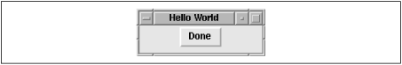
Pushing the "Hello World!" button exits the program, and your window disappears.
Let's walk through these few lines of code.
After calling the Perl interpreter, the program calls the Tk module.
Then it proceeds to build a generic, standard window (
MainWindow
)
to act as a parent
for any other widgets you create. Line 4 of the
program creates a button and displays it using the
pack
geometry
manager.
It also gives the button something to do when pushed (in this case,
exit the program).
The very last line tells the program to "go do it."
MainLoop
starts the event handler for the graphical interface, and the program
draws any windows until it reaches the
MainLoop
statement.
Everything up to that point is preparation;
until you reach the
MainLoop
statement, the program simply
prepares its windows and defines what to do when certain events
happen (such as a mouse click on the "Hello World!" button).
Nothing is drawn until the
MainLoop
statement is reached.
18.1 Widgets
Widgets in Perl/Tk are created with
widget creation commands
,
which include
Button
,
Canvas
,
CheckButton
,
Entry
,
Frame
,
Label
,
Listbox
,
Menu
,
Menubutton
,
Message
,
Radiobutton
,
Scale
,
Scrollbar
,
Text
, and
Toplevel
.
Positioning widgets is done with
geometry managers
.
In the "Hello World" example shown earlier, the
pack
command is the geometry manager. Geometry managers determine
where in the window (or frame) the widget will sit. We'll talk
more about the Perl/Tk geometry managers later in this chapter.
18.1.1 Widget Methods
Widgets can be configured, queried, or manipulated via various
widget
methods
. For example, all widgets support the
configure
widget method for changing widget
properties after the widget is created.
In addition, most widgets have specialized
methods associated with them for manipulating the widget
as needed throughout the program. For example, widgets
that scroll support the
xview
and
yview
methods
for determining the viewable portion of the content when the
scrollbar is moved.
The Entry and Text widgets have methods for
inserting and deleting values. The Canvas widget has a
whole series of methods for drawing shapes and inserting
text into the canvas. And so on.
Widget methods are listed in the discussion of each widget
later in this chapter. However, since all widgets support
the
configure
and
cget
methods, we're going to
cover them now.
18.1.1.1 The configure method
The
configure
method can be used to
set and retrieve widget configuration values.
For example, to change the width of a button:
To get the value for a current widget, just supply it without a value:$button->configure(-width => 100);
The result is an array of scalars; the values you care about are the last two, which represent the default value and its current value, respectively.$button->configure(-width);
You can also call
configure
without any options at all,
which will give you a listing of all options and their values.
18.1.1.2 The cget method
For simply retrieving the value of an option,
configure
returns more information than you generally want. The
cget
method returns just the current value.
18.1.2 Scrollbars
Many widgets have scrollbars associated with them. Scrollbars
can be added to a widget in two ways: either using an independent Scrollbar
widget or using the
Scrolled
method when creating a
widget. For simple
scrollbars, the
Scrolled
method is much easier and therefore
preferable.
18.1.2.1 Using the Scrolled method
You use the
Scrolled
method to create both the widget and
the scrollbar in a single command. For example:
$mainwindow->Scrolled('Entry', -scrollbars => 'os'
	-textvariable => \$address)->pack;
This creates an Entry widget with an "optional" scrollbar on
the bottom. The first argument to
Scrolled
is the type
of widget (in this case, an Entry widget). Then use the
-scrollbars
option to list the location of the scrollbar
("s" for the south, or bottom, edge of the widget). Here, we
specify an "optional" scrollbar with "o", meaning that the
scrollbar will only appear if needed.
Any additional options to the
Scrolled
method are taken as
options to the widget itself. In this case, we're setting
the
-textvariable
option to the Entry widget.
18.1.2.2 The Scrollbar widget
For more flexibility with a scrollbar, you can use the Scrollbar
widget. To do so, you need to create the target widget to scroll, set
the
-xscrollcommand
or
-yscrollcommand
option as appropriate,
configure the scrollbar to talk to the widget,
and position the scrollbar and target widget next to one another.
For example:
First, we create the scrollbar with vertical orientation (which is actually the default). Next, we create the Listbox widget with the$scrollbar = $mainwindow->Scrollbar(-orient => 'vertical'); $listbox = $mainwindow->Entry(-yscrollcommand => ['set' => $scrollbar]); $scrollbar->configure(-command => ['yview' => $listbox]); $scrollbar->pack(-side => 'right', -fill => 'y'); $listbox->pack(-side => 'left', -fill => 'both');
-yscrollcommand
option to define a callback when the widget is scrolled vertically.
The scrollbar is then configured with a callback that says to inform
the Listbox widget when it is clicked vertically.
Finally, the Scrollbar and Listbox widgets are packed side-by-side.
See further discussion of the Scrollbar widget later in this chapter
for more information.
18.1.3 Callbacks
Many widgets allow you to define a callback , which is a command to execute when the widget is selected. For example, when you press an exit button, the callback might be to a routine that cleans up and quits the program. When you click on a radio button, you might want to change the window to reflect the new preferences.
Widgets that support callbacks have a
-command
option
to provide the callback function.
In the "Hello World!" example
shown previously in this chapter, the callback is to
sub {exit}
. In that example, the callback is called as an
anonymous subroutine. You could also use a reference to a
subroutine (e.g.,
\&routine
). If you want to provide
arguments to a subroutine, you can call it as an anonymous list
(e.g.,
[ \&routine, $arg, $arg, ... ]
).
18.1.4 Colors and Fonts
Tk was originally created for the X Window System and is still primarily used in that environment. For that reason, it has inherited the font and color scheme used for the X Window System.
Colors that can be used with Tk widgets are identified either by an RGB value or by a name that has been associated with an RGB value. In general it is easiest to use a color name rather than an explicit RGB value; for a listing of the color names that are supported, see the rgb.txt file in your X distribution or use the showrgb command. (Most common color names are supported, so you can say things like "red," "pink," "green," and even "chartreuse" with confidence.)
Fonts are another matter. Under the X Window System, fonts
are named things like
-adobe-helvetica-medium-o-normal--12-120-75-75-p-67-iso8859-1
.
Wildcards can make the fonts easier to use, but they're still a
mouthful. For a listing of fonts available for a particular
X server, use the
xlsfonts
command. There are a few font
"aliases" that have been defined for your convenience (such as
fixed
,
6x10
,
9x15
, etc.), and you
might prefer to just stick to those.
|
|

|
|
| VII. Perl/Tk |

|
18.2 Geometry Managers |