
16.3. The KDE Control Center
The KDE Control Center contains a number of configuration tools, called modules, that allow you to configure and view information about your system. You can configure the desktop, the window manager, input devices, and any other important part of your system here. The Control Center is split into two windows: the left window shows a hierarchical list of installed modules, and the right window displays them when they are selected. (You also have the option to display each module in its own window. Go to the Options menu and click the Swallow Modules entry, which is checked by default, to unselect it.)
16.3.1. Applications
The Applications modules set preferences for important KDE components, such as the login manager, kfm, and the panel.
16.3.1.1. Login manager (root only)
The KDE login manager is the program that controls the graphical login screen. This module lets you configure the graphical style of the login screen, as well as set some default display options, such as prelisted users and available session environments.
The Appearance tab lets you edit the greeting string displayed on the login screen and choose a logo. A drop-down box offers you a choice of the GUI style of the login screen: either Windows or a Motif style. The Language option on this tab lets you select the default character encoding for the login manager.
The Fonts tab lets you choose the font style and size for the Greeting, Fail, and Standard screen messages. Select which type you want to configure from the drop-down list and click the Change Font button. The pop-up window shows a list of available fonts and lets you set the point size. Click the OK button to close the pop-up window. The font you have chosen is displayed in the Example area of the tab.
The Background tab lets you select the background for the login screen. Like the desktop background, you can choose a color or wallpaper to use.
The Users tab allows you to show a list of users on the login screen. The users are listed by username with a logo above the login boxes. A user can simply click her logo to automatically enter her name into the login box, but she still must supply her password. The tab contains listings for all users, selected users, and no-show users. You can select names from the lists and use the arrow buttons to move them from one box to another. Two options are available for who to display on the login screen. You can place names in the selected users list and click the Show Only Selected Users button. Or, you can edit the all users list and click the Show All Users But No-Show Users button. No-show users are user IDs that are used to control access-restricted system resources (e.g., root, news, and nobody).
The Sessions tab configures session settings. The drop-down list at the top sets who is allowed to shut down the system. You have the choices None, All, Root Only, and Console Only. The Commands section allows you to set the commands used for shutdown and restart. The Session Types section configures the list of session types that a user can log into from the login screen. The Default list contains the various environments that are installed on your system such as KDE and GNOME. You can add a new type or remove a type from the listing.
16.3.1.2. File manager
This module contains configuration settings for kfm, the KDE file manager and browser. The first tab contains the font settings. Set the font size used in the file manager to either small, medium, or large by selecting the corresponding button. You can set the font styles used for displayed files or web pages with the Standard Font and Fixed Font settings. You can also set the character set to use.
The Color tab allows you to set the colors used for background, text, and links. You can set two colors for URL links: one for new links and one for links that have already been followed (as recorded by the URL history). There are also settings to change the cursor when it is over a link, underline links, and override HTML-specified colors with the default colors set on this tab.
The Other tab allows you to enable URL-specific settings. If you have set certain properties to view a certain URL or local directory, like menu bar display or the view settings, you can have them saved for the next time you visit that URL. The Tree View Follows Navigation button causes the directory tree in the left pane of the file manager to match the current open folders in the right pane. The final settings on this page allow you to select the default programs the file manager uses for a terminal when you use Open Terminal from the File Menu and the editor used to view the source of documents.
16.3.1.3. Web browser
This module configures settings used for kfm's web browsing functionality.
If your system is behind a firewall, you may need to use a proxy server for HTTP and FTP services. The Proxy tabs lets you enable the use of a proxy and configure it. Check the Use Proxy box, and supply the hostname or IP address for the proxy server and the port number to use. Some sites may not work properly when accessing them through a proxy server. The No Proxy For: box lets you specify a list of hostnames and domains that will not be accessed via the proxy server.
The HTTP tab sets a few of the parameters sent in HTTP requests by the browser. The Accept Languages box contains a list of two-letter abbreviations used to indicate the language that the browser can accept. The abbreviations, like en for English and fr for French, can be comma-or-space separated. The order of the list determines the preference of language. The Accept-Language HTTP request header is configured with this setting.
The Accept Character Sets box contains a list of character sets that the browser is capable of receiving. (This sets the Accept-Charset HTTP request header.) The list can accept the standardized character set strings, separated by spaces or commas. The Assume HTML button tells the browser to render as HTML documents whose type is not fully specified from the server response header.
The User Agent tab allows you to specify the user-agent string reported by the browser for sites that may not recognize kfm, or anything that's not a major commercial web browser. The user-agent string contains the name and version number of the client program making the request. The default for kfm at the time of this writing is "Konqueror/1.1.2". To set a different string for a specific server, type the server name in the On Server box and supply the user-agent string in the Login As box. Click Add to save this setting. All settings will be listed in the Known Bindings box. If you want to remove a setting, select it from the list, and click the Delete button.
The Cookies tab configures how kfm will manage cookies. Cookies are not used at all unless you check the Enable Cookies box at the top of the tab. You should set the default cookie policy to either accept all cookies, reject all cookies, or prompt for action each time a cookie is received. You can specify the policy for individual domains as well. Type the domain into the Change Domain Accept Policy box, and specify Accept, Ask, or Reject for the policy. Click the Change button, and the setting is saved. You will see it listed in the Domain Specific Settings list. If you would like to remove a setting, select it from the list and click the Delete button.
16.3.1.4. Panel
The panel configuration module controls the panel, the toolbar, virtual desktops, and the disk navigator.
The Panel tab contains settings for the location of the panel. You can choose to place it at the top, bottom, left side, or right side of the screen by clicking the appropriate radio button. Three settings are available to set the size of the panel to either Tiny, Normal, or Large. You also have choices for how the taskbar is displayed. If you do not want the taskbar to be displayed at all, click the Hidden radio button. If you want the taskbar displayed fully across the top or bottom of the screen, click either the Top or Bottom button. If you choose the Bottom option, the taskbar will appear just above the panel. Finally, the Top/Left option displays the taskbar at the top-left corner of your screen, with window buttons stacked on top of each other.
The Options tab, shown in Figure 16-7, is divided into three sections. The Menu Tooltips section contains a button to enable tooltips to be shown on menu items. You can use the slider to set the amount of time that the pointer is held over the item before the tooltip appears. The Visuals section allows you to set the panel and taskbar to autohide (i.e., disappear when not being used). Enable these settings by clicking the Auto Hide Panel and Auto Hide Taskbar buttons. Each option has two slider settings if autohide is enabled. The Delay slider sets the amount of time after use (after the pointer has left the panel/taskbar) that the panel will reduce. The Speed slider sets how fast or slow the panel or taskbar will open and hide. The Animate Show/Hide setting enables the panel to use a sliding visual effect when you show or hide it with its side arrow buttons. The slider sets the speed of this animation.
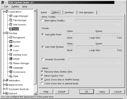
Figure 16-7. Panel options configuration
The Options tab contains the following additional settings:
- Personal Menu Entries First
Check this box to display your personal menu section instead of the default system menu at the top of the main menu. The system menus will be contained in the default submenu.
- Menu Folders First
Check this box if you want folders to appear at the top of your personal menu, above individual items. This setting can be overridden by customizing the menu order with the menu editor.
- Clock Shows Time in AM/PM Format
This option enables AM/PM designation on your panel clock. Otherwise, the hour listing will range from 00 to 24.
- Clock Shows Time in Internet Beats
This option allows you to have the panel clock display the Swatch-created time format, which divides a day into 1000 beats, in the GMT+1 time zone.
The Desktops tab sets the number of virtual desktops you can divide your workspace into. The default is 4, and you can use up to 8. The Visible slider selects the number of desktops (you can choose only even numbers). The desktops are listed, numbered 1 through 8. If enabled, the desktop listing has a usable textbox next to it. You can type in a label for the desktop that will be used in the pager display on the panel. The Width slider sets the width of the pager buttons shown on the panel.
The Disk Navigator tab allows you to configure the disk navigator shown on the menu and the taskbar. The History section of this tab has two buttons: Edit Personal and Edit Shared, which allow you to edit the contents of the Personal and Shared sections of the disk navigator from the file manager.
The Edit Personal button opens kfm in the ~/.kde/share/apps/kdisknav directory. This folder in the user's home directory contains kdelnk files for the items displayed in the Personal section of the disk navigator. The Edit Shared button opens /usr/share/apps/kdisknav in kfm, which contains kdelnk files for the contents of the Shared section. This directory can be edited only by root; other users will have this button disabled.
Additional options set the number of folder entries and file entries displayed in the Recent section of the disk navigator and the maximum number of files that can be displayed in a folder.
The Options section of the Disk Navigator tab contains buttons for the following settings: Show Dot Files (which shows the hidden files that start with a dot), Show Shared Section, Show Recent Section, Show Personal Section, Show Option Entry, and Ignore Case When Sorting. There is also a selection for the default terminal application to use.
16.3.2. Desktop
The Desktop modules set preferences for the visual display of your environment. You can individually set the background, fonts, or window colors or use the Theme Manager to configure all of the settings from an installed package.
16.3.2.1. Background
This module sets the desktop background. It allows you to specify a background for each virtual desktop or just one for all of them. Select the desktop you want to configure from the list, or check the Common Background box. You can use colors or a wallpaper image for your background. The One Color setting applies a solid color to the background. The Two Color setting lets you choose a blend of two colors. Select the colors you desire by clicking on the color bars. The Setup button opens a dialog box for two-color settings. You can select to blend the colors vertically, horizontally, or with a pattern.
If you would like to use an image file as wallpaper on the background, select it from the drop-down list, or click the Browse button to look for the image on the filesystem. The Arrangement setting determines how the image file is laid out. You can choose from the basic tiling layout to such effects as symmetrical mirroring. You can also choose a random background. A new image file and settings will be used every session.
16.3.2.2. Borders
This module sets up border properties for windows and the screen. Active desktop borders enable you to switch between desktops by moving the mouse pointer to an adjacent screen edge. Check the box to enable this setting. The Desktop switch-delay slider sets a delay time for the switch to the adjacent desktop. Set this time to a comfortable setting that doesn't cause an unwanted desktop switch every time you move the pointer to the screen edge. Check the Move Pointer Towards Center After Switch box if you want the pointer to go to the center of the screen when you switch desktops.
Magic Borders sets up "snap-to" zones around windows and at the edge of screens. You can set the width of zones, in pixels, in which moved windows will be placed.
16.3.2.3. Colors
The Colors module allows you to select the colors for the various window widgets, the components used to build windows. You can select the colors based on a scheme installed on your system. Available schemes are listed. Select one from the list, and click Add to change the color scheme. You can also set colors for individual components. The top of the tab shows sample windows components. Click on the component you want to configure, such as the active titlebar or window background to select it. You can also select a component from the widget color list. Click the color bar under the list to open the color selector dialog box and choose your color. You can also set the contrast of the component with the Contrast slider.
16.3.2.4. Fonts
The Fonts module sets the default fonts used in your display. You can set the font for the following listed selections: the general font, fixed-width font, window titles, panel buttons, and the panel clock. You can set the typeface of the font from the drop-down list and choose if you want it either bold or italic. Select the point size of the font, and optionally change the character set used. A sample of the selected font is displayed at the bottom of the window.
16.3.2.5. Desktop icons
This module controls the display of icons on the desktop. Icons are placed along invisible grid lines on the desktop. The grid spacing sets the number of pixels surrounding each icon. Two controls allow you to set the horizontal grid spacing and the vertical grid spacing.
Labels for icons are displayed with transparent backgrounds, allowing the background to be visible underneath them by default. Uncheck the Transparent Text for Desktop Icons box if you would like to view the background box of the label. You can set the color of text labels by clicking the Icon Foreground Color button. If backgrounds are nontransparent, you can choose their color by clicking the Icon Background Color button.
The final setting on this tab allows you to show hidden files (files that begin with a dot) on the desktop.
16.3.2.6. DPMS
DPMS stands for Display Power Management System. If your hardware supports power management, you can enable it by clicking the DPMS enabled button. Now you can set the amount of idle time before the system goes to standby mode, then suspend mode, and finally turns off.
16.3.2.7. Theme manager
Themes provide an overall visual style to your desktop, instead of you having to configure items individually. A theme can determine the color scheme of windows, the font styles, icons, the background, and even sound events for your desktop. A couple of themes are installed by default with KDE, and many more are available for downloading at http://kde.themes.org.
TheInstaller tab, shown in Figure 16-8, lists the themes you have installed on your system. These include global themes, which are stored in the /share/apps/ kthememgr/Themes directory of your default KDE directory, and local themes, stored in ~/.kde/share/apps/kthememgr/Themes in your home directory. Local themes are themes that are installed or customized by the user and stored in his home directory. The user is able to edit and save local themes. Global themes cannot be altered by individual users.
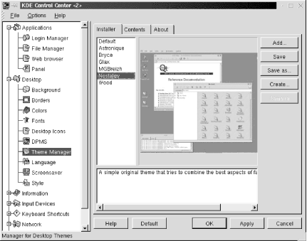
Figure 16-8. Theme Manager installer
If you select a theme from the list, a sample desktop image using the theme is displayed on the tab, with a short text description. If you would like to apply a new theme, select from the list and click the Apply button. The selected theme will be copied to the user's theme manager work directory (~/.kde/share/apps/kthememgr/Work).
You can also manage installed themes on the Installer tab. To install a new theme that you have downloaded, click the Add button. Specify the filename and location of the theme's .tgz file in the pop-up dialog box and click OK. The Save button lets you save the currently configured theme as local or save a global theme as local. The Save As button saves the currently configured theme as a separate local package without altering the original theme. The Create button works similarly, allowing you to copy your current working theme as a new local theme package. The Remove button deletes a local theme or inactivates a global theme.
The Contents tab shows the components that are configured by a theme. A theme may not have settings available for all the listed components. If a theme configures a specific component, it is listed as available. Otherwise, the component is listed as empty. Use the checkboxes to select which theme components you want to use. If you choose to not activate a specific component, information on that component from a previous theme will be used if its information is still in the theme manager work directory. If you don't want this to happen, activate the component, even if it is listed as empty, and default settings will be used.
The About tab shows you author and version information for a selected theme.
16.3.2.8. Language
The Language module sets the preferred locale (language) settings for your programs. The drop-down lists allow you to choose first, second, and third choices for the language, if programs make them available.
16.3.2.9. Screensaver
This module sets up your screensaver. A list of available screensavers is shown with a preview window. If you do not want to use the screensaver, select No Screensaver from the top of the list. Otherwise, select the screensaver you want to use. The Setup button opens a dialog box that contains specific configuration settings for each screensaver. For a full-screen test of the screensaver, click the Test button.
The Settings section allows you to set the amount of time the system is inactive before the screensaver starts. Type in the number of minutes in the Wait For box to set this time. If you check the Require Password box, the user must supply her password before returning to the desktop. You can also check the box to Show Password as Stars to display the password text as asterisks, instead of the field being blank. The Priority control lets you adjust the priority that the screensaver process has when it is run. If you have lots of important server activity, for example, set the priority to low so the performance of other programs will not suffer.
16.3.2.10. Style
The Style module contains a couple of settings for the display of windows and icons. Draw Widgets in the Style of Windows 95 enables window components to have a similar look to those used in Windows. The Menu bar on Top of the Screen in the Style of MacOS setting places a window's menu bar across the top of screen. Apply Fonts and Colors to Non-KDE Apps will apply the styles you've chosen to programs that were not written for KDE.
The Icon Style section allows you to set the size of icons to either Normal or Large. You can set the size for icons in the following locations: on the panel, in the file manager and desktop, and at all other locations.
16.3.3. Information
The Information modules allow you to view status information about various system components. There are no configuration settings here, but if you need to see information about your processor or what PCI devices you have installed, use these modules. Information is provided for the following system components:
Devices
DMA-Channels
Interrupts
IO-Ports
Memory
Partitions
PCI
Processor
SCSI
Samba Status
Sound
X-Server
16.3.4. Input Devices
The modules here control the configuration of the keyboard and mouse.
16.3.4.1. Keyboard
This module configures keyboard repeat. Select the On option to enable keyboard repeat, and use the slider to set the volume of keyclicks. If you don't want keyclicks, set the slider to 0.
16.3.4.2. Mouse
This module configures the movement and button layout of your mouse. The Acceleration slider sets the speed at which the pointer moves on your screen when you move your mouse. The Threshold slider set the distance (in pixels) that the mouse must move before pointer movement occurs. The Button Mapping options let you choose if you use the mouse with your right hand or left hand.
16.3.5. Keyboard Shortcuts
You can choose the scheme used for shortcuts by selecting the KDE defaults or the current scheme if you have customized the shortcuts. The bottom section of the tab allows you to edit the selected keyboard shortcut. You can choose no key for the action, the default key, or a custom key. If you want to customize a key, check the box for the modifier you want to use (Shift, Ctrl, or Alt), or unselect all of them if you don't want a modifier. Then click the key button and press the key on the keyboard that you want to use. Click the Save Changes button if you want to save the change to the current scheme.
16.3.5.1. Global keys
The following table lists the keyboard combinations that cause global window events:
| Keys | Action |
|---|---|
| Alt-Esc, Ctrl-Esc | Displays a list of currently running applications |
| Alt-Tab, Alt-Shift-Tab | Switches among windows on the desktop |
| Ctrl-Tab, Ctrl-Shift-Tab | Switches among virtual desktops |
| Alt-F2 | Opens the single-command-line utility |
| Alt-F3 | Opens the control menu of the current window |
| Alt-F4 | Closes the current window |
| Ctrl-F[1..8] | Switches to the correspondingly numbered virtual desktop |
| Ctrl-Alt-Esc | Kills the current window |
16.3.5.2. Standard keys
The standard key mappings are shortcuts to common actions that you would find in most KDE programs like the file manager or graphical text editor.
| Keys | Actions |
|---|---|
| Ctrl-W | Close |
| Ctrl-C | Copy |
| Ctrl-X | Cut |
| Ctrl-End | End |
| Ctrl-F | Find |
| F1 | Help |
| Ctrl-Home | Home |
| Ctrl-Insert | Insert |
| Ctrl-N | New |
| PageDown | Next |
| Ctrl-O | Open |
| Ctrl-V | Paste |
| Ctrl-P | |
| PageUp | Prior (or Previous) |
| Ctrl-Q | Quit |
| Ctrl-R | Replace |
| Ctrl-S | Save |
| Ctrl-Z | Undo |
16.3.6. Sound
The modules contained in this section configure the keyboard bell and other system sounds.
16.3.6.1. Bell
This module configures the system bell.
The Volume slider sets the volume of the bell. The Pitch slider sets the tone of the slider in Hz. You can set the duration of the system bell with the Duration slider control. To listen to your settings, click the Test button.
16.3.6.2. System Sounds
Desktop themes can set .wav audio files to play for specific events, such as raising a window or clicking a dialog button. This module allows you to enable and configure sound events. Check the Enable System Sounds checkbox to enable sound events.
The tab contains two panes. The left pane contains the Event list of the available actions that you can apply a sound to. The right pane contains a list of .wav files that you can assign to actions. Selecting an event will highlight its currently assigned sound in the Sounds list. To set a sound event, select an action from the Events list, then select a sound file from the Sounds list. The Test button allows you to listen to a selected sound. Click the Apply button to save your settings.
16.3.7. Window Behavior
The modules contained in this section allow you to set the look and functions of window titlebars, mouse button actions, and focus and placement policy.
16.3.7.1. Advanced
The Keyboard and Mouse section of the Advanced tab contains the following settings:
- Ctrl-Tab walks through desktops
This checkbox sets the Ctrl-Tab key combination to switch through your virtual desktops. It is checked by default.
- Alt-Tab is limited to current desktop
This checkbox restricts the action of the Alt-Tab key combination to switch through windows on the current desktop only. It is checked by default.
- Alt-Tab mode
This setting describes the style of using Alt-Tab to switch through windows. The KDE setting uses a graphical style. When you press Alt-Tab, a window appears indicating the current window and other available windows. The CDE setting switches directly without a graphic.
- Grab the Right Mouse Button
This setting is on by default. It sets the control of the right mouse button to KDE by default. Some non-KDE applications require control over the right mouse button. If you need control for these applications, unselect this setting.
The Filters section of the Advanced tab contains settings that let you customize window styles or functions for application windows based on their titles or classes. The drop-down box contains a list of settings that you can define for a filtered window. After the Windows Will label, you can choose the following settings:
Have tiny decorations
Have no decorations
Never gain focus
Start as sticky
Be excluded from session management
Select a setting, then define the window in the next section, which begins with If They Match the Following. Here you have two boxes, Titles and Classes. You can define one or both properties. Put the title of the application window in the Title box and the application's class name in the Classes box. (This is usually the capitalized name of the application, preceded by an X, for example, XEmacs for an Emacs window.) You can specify more than one title or class for a window setting.
16.3.7.2. Buttons
This module configures the layout of buttons that appear on the titlebars of windows. There are five buttons: minimize (dot), maximize (square), sticky (pushpin), close (X), and menu (dash or application-specified icon). Each button has three placement options, specified by radio buttons: left, right, or off. You can place no more than three buttons on one side of the titlebar.
16.3.7.3. Mouse
This module configures the actions of mouse buttons on the various window components. Drop-down boxes contain several options, such as raise or lower, for the left, middle, and right buttons, as shown in Figure 16-9. Select from the following options in each category:
- For active titlebars and frames
Raise
Lower
Operations menu
Toggle raise and lower
- For inactive titlebars and frames
Activate
Activate and raise
Activate and lower
- For an inactive inner window
Activate, raise, and pass click
Activate and pass click
Activate
Activate and raise
- For titlebars and frames of inner windows
Move
Toggle raise and lower
Resize
Raise
Lower
Nothing
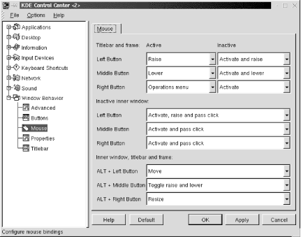
Figure 16-9. Mouse button configuration settings
16.3.7.4. Properties
This tab sets windows options and the placement and focus policy. The Windows section of the tab has three settings:
- Vertical maximization only by default
Check this box to cause the maximize window command to expand a window only to the full screen height, but leaving its width unchanged.
- Display content in moving windows
Check this box to enable the display of window contents when the window is moved.
- Display content in resizing window
Check this box to enable the display of window contents when the window is resized.
- Resize animation
This slider controls the animation of windows that are maximized or minimized. Setting the slider all the way to the left (None), disables animation, and windows will maximize or minimize instantly. You can set the speed of the animation faster by setting the slider farther to the right.
The Placement Policy section of the tab contains a drop-down box with five options for determining the initial placement of new windows on the desktop:
- Smart (default)
This setting uses a placement scheme that attempts to keep windows as uncluttered as possible.
- Cascade
This setting attempts to place windows in a cascaded pattern, with a set of offset positions available on each desktop.
- Interactive
This setting enables the "allowed overlap" setting. If a window can be placed on the desktop without overlapping another by the specified percentage, it will be placed automatically. If the overlap exceeds the setting, you will be given manual control of the window placement.
- Random
This setting randomly places a new window on the desktop.
- Manual
This setting opens a window with the mouse pointer activated in move mode on the titlebar. Move the window to the desired position and click once to place the window.
The Focus Policy section sets the policy for giving a window keyboard focus and an active titlebar. The drop-down box contains four focus styles. The default is Click to Focus, which gives a window the keyboard focus and brings it to the foreground only when you click on it. The remaining settings follow the mouse and activate the Auto Raise and Click Raise options.
- Click to focus
The default focus policy requires a mouseclick in a window to give it focus and raise it (bring it to the foreground). This setting uses a graphical Alt-Tab style to switch through windows on a desktop.
- Focus follows mouse
This setting causes a window to receive focus when the mouse pointer enters it. The window will not come to the foreground unless the Auto Raise button is checked. The window will maintain focus until the pointer enters another window.
- Classic focus follows mouse
This setting is similar to the Focus Follows Mouse setting, except that the window loses focus when the mouse pointer moves out of it. If the pointer is not in a window, no window has focus. Also, Alt-Tab switches directly among windows, without showing the graphical listing of windows.
- Classic sloppy focus
This setting is similar to Focus Follows Mouse, with focus remaining in a window even when a mouse pointer leaves it. The only difference is that the nongraphical Alt-Tab style is used.
For any of the nondefault settings, you need to check either the Auto Raise or Click Raise boxes to be able to raise windows to the foreground. Click Raise raises a window when you click on it. Auto Raise raises a window after a short delay, which you can set with the Delay slider.
16.3.7.5. Titlebar
This tab contains many settings for the appearance and action of window titlebars. The Title Alignment sets the positioning of the window title in the titlebar to either Left, Middle, or Right.
The Appearance settings adjust the graphical decoration of the titlebar:
- Shaded Vertically
Uses a two-color background in a top-to-bottom gradient.
- Shaded Horizontally
Uses a two-color background in a left-to-right gradient.
- Plain
Uses a solid color for the background.
- Pixmap
Uses a pixmap image for the titlebar background. This enables the Pixmap settings, which allow you to choose images for both active and inactive titlebars. If you don't want the image to appear under the window title text for better clarity, check the box labeled No Pixmap Under Text.
The checkbox labeled Active Title has Shaded Frame gives a shadowed, 3D appearance to active titlebars.
The Mouse Action options specify the action of double-clicking on a window titlebar. The available options are (Un)Shade (the default), (Un)Maximize, Iconify, (Un)Sticky, and Close. The settings identified with (Un) are toggle settings.
Title animation can be enabled to display a sliding titlebar animation when a title is too long for the display area. The slider sets the speed of the back-and-forth motion.
 |  |  |
| 16.2. The Panel and Taskbar |  | 17. An Alternative Window Manager: fvwm2 |

Copyright © 2001 O'Reilly & Associates. All rights reserved.