6.4. Creating Effective Links
A document becomes hypertext by tossing in a few links in the same way that water becomes soup when you throw in a few vegetables. Technically, you've met the goal, but the outcome may not be very palatable.
Inserting anchors into your documents is something of an art, requiring good writing skills, HTML/XHTML prowess, and an architectural sense of your documents and their relationships to others on the Web. Effective links flow seamlessly into a document, quietly supplying additional browsing opportunities to the reader without disturbing the current document. Poorly designed links scream out, interrupt the flow of the source document, and generally annoy the reader.
While there are as many linking styles as there are authors, here are a few of the more popular ways to link your documents. All do two things: they give the reader quick access to related information, and they tell the reader how the link is related to the current contents.
6.4.1. Lists of Links
Perhaps the most common way to present hyperlinks is in ordered or unordered lists in the style of a table of contents or list of resources.
Two schools of style exist. One puts the entire list item into the source anchor; the other abbreviates the item and puts a shorthand phrase in the source anchor. In the former, make sure you keep the anchor content short and sweet; in the latter, use a direct writing style that makes it easy to embed the link.
If your list of links becomes overly long, consider organizing it into several sublists grouped by topic. Readers can then scan the topics (set off, perhaps, as <h3> headers) for the appropriate list and then scan that list for the desired document.
The alternative list style is much more descriptive, but also more wordy, so you have to be careful that it doesn't end up cluttered:
<p>
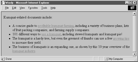
Kumquat-related documents include:
<ul>
  <li>A concise guide to <a href="kumquat_farming.html">
      profitable kumquat farming</a>,
      including a variety of business plans, lists of fruit
      packing companies, and farming supply companies.
  <li>101 different ways to <a href="kumquat_uses">
      use a kumquat</a>, including stewed kumquats and kumquat pie!
  <li>The kumquat is a hardy tree, but even the greenest of
      thumbs can use a few <a href="news:alt.kumquat_growers">
      growing tips</a> to increase
      their yield.
  <li>The business of kumquats is an expanding one, as
      shown by this 10 year overview of the
      <a outsideurl=/kumquat_report/">
      kumquat industry</a>.
</ul>
It sometimes gets hard to read a source HTML document, and it will become even more tedious with XHTML. Imagine the clutter if we'd used anchors with fragment identifiers for each of the subtopics in the list item explanations. Nonetheless, it all looks pristine and easily navigable when displayed by the browser, such as with Internet Explorer as shown in Figure 6-4.
This more descriptive style of presenting a link list tries hard to draw readers into the linked document by giving a fuller taste of what they can expect to find. Because each list element is longer and requires more scanning by the reader, you should use this style sparingly and dramatically limit the number of links.
Use the brief list style when presenting large numbers of links to a well-informed audience. The second, more descriptive style is better suited to a smaller number of links for which your readership is less well-versed in the topic at hand.

Figure 6-4. Wordy but effectively descriptive link list
6.4.2. Inline References
If you aren't collecting links into lists, you're probably sprinkling them throughout your document. So-called inline links are more in keeping with the true spirit of hypertext, since they enable readers to mark their current place in the document, visit the related topic in more depth or find a better explanation, and then come back to the original and continue reading. That's very personalized information processing.
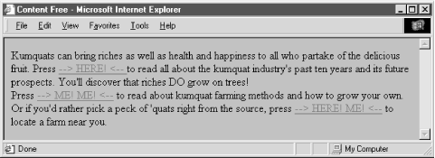
The biggest mistake made by novice authors, however, is to overload their documents with links and treat them as if they are panic buttons demanding to be pressed. You may have seen this style of linking; HTML pages with the word "here" all over the place, like the panic-ridden example in Figure 6-5 (we can't bring ourselves to show you the source for this travesty).

Figure 6-5. Links should not wave and yell like first-graders, "Here! Me! Me!"
As links, phrases like "click here" and "also available" are content-free and annoying. They make the person who is scanning the page for an important link read all the surrounding text to actually find the reference.
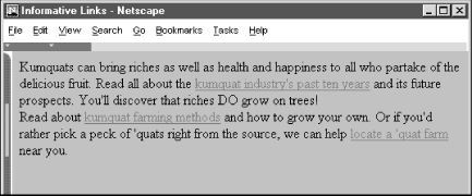
The better, more refined style for an inline link is to make every one contain a noun or noun/verb phrase relating to the topic at hand. Compare how kumquat farming and industry news references are treated in Figure 6-6 to the "Here! Me! Me!" example in Figure 6-5.

Figure 6-6. Kinder, gentler inline links work best
A quick scan of Figure 6-6 immediately yields useful links to "kumquat farming methods" and "kumquat industry's past ten years." There is no need to read the surrounding text to understand where the link will take you. Indeed, the immediately surrounding content in our example, as for most inline links, serves only as syntactic sugar in support of the embedded links.
Embedding links into the general discourse of a document takes more effort to create than link lists. You've got to actually understand the content of the current as well as the target documents, be able to express that relationship in just a few words, and then intelligently incorporate that link at some key place in the source document. Hopefully this key place is where you might expect the user is ready to interrupt their reading and ask a question or request more information. To make matters even more difficult, particularly for the traditional tech writer, this form of author-reader conversation is most effective when presented in active voice (he, she, or it does something to an object versus the object having something done to it). The effort expended is worthwhile, though, resulting in more informative, easily read documents. Remember, you'll write the document once, but it will be read thousands, if not millions, of times. Please your readers, please.
6.4.3. Linking Do's and Don'ts
Here are some hints for creating links:
- Keep the link content as concise as possible
-
Long links or huge inline graphic icons for links are visually disruptive and potentially confusing.
- Never place two links immediately adjacent to one another
-
Most browsers make it difficult to tell where one link stops and the next link starts. Separate them with regular text or line breaks.
- Be consistent
-
If you are using inline references, make all of your links inline references. If you choose to use lists of links, stick to either the short or long form; don't mix styles in a single document.
- Try reading your document with all the nonanchor text removed
-
If some links suddenly make no sense, rewrite them so that they stand on their own. (Many people scan documents looking only for links; the surrounding text becomes little more than a gray background to the visually more compelling links.)
6.4.4. Using Images and Links
It has become fashionable to use images and icons instead of words for link contents. For instance, instead of the word "next," you might use an icon of a little pointing hand. A link to the home page is not complete without a picture of a little house. Links to searching tools must now contain a picture of a magnifying glass, question mark, or binoculars. And all those flashing, GIF-animated little advertisements!
Resist falling prey to the "Mount Everest syndrome" of inserting images simply because you can. Again, it's a matter of context. If you or your document's readers can't tell at a glance what relationship a link has with the current document, you've failed. Use cute images for links sparingly, consistently, and only in ways that help readers scan your document for important information and leads. Also be ever mindful that your pages may be read by someone from nearly anywhere on Earth (perhaps beyond, even) and that images do not translate consistently across cultural boundaries. (Ever hear what the "okay" hand sign common in the United States means to a Japanese person?)
Creating consistent iconography for a collection of pages is a daunting task, one that really should be done with the assistance of someone formally schooled in visual design. Trust us, the kind of mind that produces nifty code and writes XHTML well is rarely suited to creating beautiful, compelling imagery. Find a good visual designer; your pages and readers will benefit immeasurably.

Copyright © 2002 O'Reilly & Associates. All rights reserved.


