
13.5. Table Troubleshooting
Despite the control they offer over page layout, tables are also notorious for causing major headaches and frustrations. This is partly due to the potential complexity of the code -- it's easy to miss one little character that will topple a table like a house of cards. Another source of chaos is that browsers are inconsistent and sometimes quirky in the way they interpret table code. It is not uncommon to spend several careful hours crafting a table that looks perfect in browsers X and Y but crumbles into a little heap in browser Z.
Although not every problem can be anticipated, there are a number of standard places tables tend to go wrong. HTML tables have some inherent peculiarities that can make them frustrating to work with, but knowing about the potential pitfalls up front can make the design process go more smoothly. As always, it is necessary to test your designs on as many browser and platform configurations as possible.
13.5.1. Calculating Table Size
In some instances, your design may require that the dimensions of a table stay fixed at a certain pixel size. Unfortunately, setting the width and height attributes in the <table> tag is not a guarantee that your table will appear at that size when finally rendered. These attributes merely specify a minimum size, but the table will expand as necessary to accommodate its contents.
Tables also expand according to the border, cellpadding, and cellspacing settings, as shown in Figure 13-10. In order to keep a table at its specified size, all of these attributes must be set to zero, and the contents of the cell must fit comfortably within the allotted space (or just set the table dimensions to a size that takes into account your padding and spacing values). Bear in mind, also, that contents such as text or form elements can be unpredictable and may change the size of your table as well, as discussed in the next two sections.
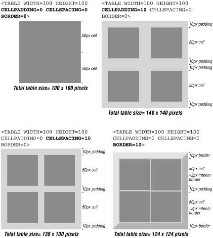
Figure 13-10. Effects of cellpadding, cellspacing, and border settings on table dimensions
13.5.2. Text in Tables
When designing tables that contain text, remember that text size can vary greatly from user to user. This adds an inherent level of unpredictability to the way your tables display.
Not only does text display larger on PCs than on Macs, each browser user can set the font size for text display. So although you've put a nice, tidy column of options in a table cell, for the user whose font is set to 16 points, the text may get some extra line breaks and change your table's dimensions.
In general, variable text sizes affect the height of cells and tables as the cells stretch longer to accommodate their larger contents (particularly if the width has been specified with an absolute pixel value). If you have HTML text in a cell, particularly if the cell needs to be displayed at specific pixel dimensions within the table, be sure to give it lots of extra room and test your page with different browser font settings.
If you are using style sheets, you can control the size of the text by setting it to a specific pixel height; bear in mind, however, that many users still use browsers that do not support style sheets. For browsers that do, your pixel settings will override the browser's font size settings, which means that you risk annoying users by forcing text to be smaller than their preferences.
13.5.3. Form Elements in Tables
Like text, the way form elements display in a browser is dependent on the size of the default monospace (or constant width) font that is specified in the user's browser preferences. If the user has his monospace font set to 24 points (or to "largest" in Internet Explorer), your form elements (particularly text fields) will resize larger accordingly.
In the real-world example in Figure 13-11, I used a table to hold together a badge illustration, which contained a form for entering a name and password. In testing, we found that the target audience generally had their browser fonts set to 18 points (they were working on very high-resolution monitors), which caused the form text fields to resize and break the table apart. Making the badge image larger and incorporating lots of extra space was the solution in this case.
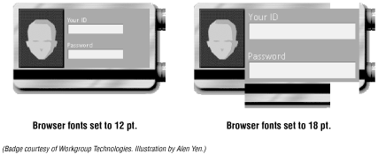
Figure 13-11. The badge with browser fonts set to 12 points and 18 points
13.5.4. Unwanted White Space
It is common for extra white space to creep between table cells (or between the cells and the border). When you are trying to create a seamless effect with colored cells or hold together pieces of a larger image (such as Figure 13-12), this extra space is unacceptable.
13.5.4.1. Returns and spaces within <td> tags
The problem most often lies within the cell (<td>) tag. Some browsers render any extra space within a <td> tag, such as a character space or a line return, as white space in the table. This can occur when the cell contains text; however, the effect is most noticeable when the contents are images.
TIP
Because <table> and <tr> tags are regarded only as containers for other tags, not as containers for actual content or data, spaces and returns within these tags are ignored.
If you want a seamless table, begin by setting the border , cellpadding, and cellspacing in the <table> tag to zero (0). In the code in Figure 13-12, a graphic is divided into four parts and held together with a table. The goal is to hold the graphic together seamlessly. As shown in the figure, the returns and extra spaces within the <td> tags add white space in each cell.
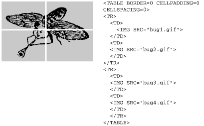
Figure 13-12. Line breaks within <td> tags add white space to table cells
To keep out unwanted white space, be sure that the enclosing <td> and </td> tags are flush against the content of the cell, with no extra spaces or returns. In Figure 13-13, I've kept the <td> tags and their contents on one line, and the problem goes away.

Figure 13-13. Removing line breaks from table cells creates a seamless table
13.5.4.2. Missing end tags
In most cases, cell end tags (</td>) are optional, but omitting them may add extra white space to the cell, because the line break to the next starting <td> tag is rendered as extra space.
The following code, in which the </td> tags have been left out, produces extra space (as in Figure 13-12):
<TABLE BORDER=0 CELLPADDING=0 CELLSPACING=0>
<TR>
  <TD><IMG SRC="bug1.gif">
  <TD><IMG SRC="bug2.gif">
<TR>
  <TD><IMG SRC="bug3.gif">
  <TD><IMG SRC="bug4.gif">
</TABLE>
For seamless tables, it is necessary to use end tags and keep them flush to the content, as shown in Figure 13-13.
13.5.4.3. Cellspacing in Navigator
According to the HTML specification, if you set cellspacing=0 within the <table> tag, there should be no extra space between cells. There is a bug in Netscape's table implementation, however, that causes extra space to be added even when the cellspacing is set to 0. To eliminate all extra space for Netscape, you must explicitly include the border=0 attribute in the <table> tag as well.[3]
[3]This tip taken with permission from Creative HTML Design, by Lynda Weinman and William Weinman, published by New Riders Publishing, 1998.
The default value of the border attribute should be 0, but in Netscape it takes up space (even though it doesn't draw a shaded line) unless you explicitly set it to 0. These problems have been fixed in Netscape 6.
13.5.5. Collapsing Cells in Navigator
As of this writing, all versions of Netscape (even 6) collapse empty cells and do not render a background color in a collapsed cell. For that reason, all cells in a table need to contain something in order for it to render properly and with its background color. There are a number of options for filling cells for display in Netscape.
13.5.5.1. Nonrendering text
Sometimes, adding a simple nonbreaking space ( ) or a single line break (<br>) within a cell is enough for the cell to be displayed properly in Navigator. Neither of these text strings renders visibly when the table is displayed in the browser.
Be aware that a nonbreaking space occupies the height and width of a normal text character, even though nothing displays on the page. If you need to fill a very short cell with a specific pixel height, using a nonbreaking space may force the cell to be taller and throw off the dimensions of your table. Try a <br> or a single-pixel graphic instead if your table cell dimensions are misbehaving.
13.5.5.2. The single-pixel trick
Another popular work-around is to place a transparent one-pixel GIF file in the cell and set its width and height dimensions to fill the cell. If you choose this method, be sure to set both the height and the width attributes. If you set only one, many browsers will resize the image proportionally (into a big square), which may not be appropriate for the table.
One drawback to this method is that a missing graphic icon will appear in the cell if the graphic doesn't load properly or if the viewer has the graphics turned off in the browser.
13.5.5.3. Using <spacer>
Table cells can also be held open with a <spacer> tag, which is Netscape's proprietary method for adding blank space on a web page. Set the spacer type to "block" and specify the width and height measurements as follows:
<TD><SPACER TYPE=block WIDTH=n HEIGHT=n></TD>
Although the <spacer> tag is Netscape-specific, the whole cell-collapsing problem is Netscape-specific as well, making spacers a good solution in this situation (although they're best avoided for general use). Browsers that don't understand the <spacer> element just ignore it, but chances are they won't need it to render the table properly anyway.
13.5.6. Restraining Row Heights
You might guess that the following code would create the table shown in Figure 13-14:
<TABLE CELLSPACING=0 CELLPADDING=0 BORDER=1>
<TR>
  <TD ROWSPAN=2><IMG SRC="red.gif"
   WIDTH=50 HEIGHT=150></TD>
  <TD HEIGHT=50><IMG SRC="blue.gif"
   WIDTH=100 HEIGHT=50></TD>
</TR>
<TR>
  <TD ALIGN=center>extra space</TD>
</TR>
</TABLE>
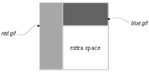
Figure 13-14. The table we're trying to create
However, what actually happens is that the bottom cell shrinks to fit the text it contains, and the cell containing the darker graphic on the right -- despite being set to height=50 -- is stretched vertically, as shown in Figure 13-15.
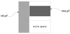
Figure 13-15. The actual result of the code
The problem is that the height attribute specifies a minimum, not a maximum, and a row defaults to the height of its tallest cell (determined by either the cell's contents or its height value). That's why the table doesn't work as intended -- the text in the last cell isn't tall enough to force the desired effect. Since we can determine the exact height that we want in that last cell (by subtracting the height of blue.gif from the column height), giving it a height=100 attribute will make it the proper height.
If you don't know the exact height -- say, because other columns contain text -- you may be better off removing the rowspan attributes and using a nested table instead (a table within a table). The nested table will size its rows based on their content only.[4]
[4]This tip courtesy of Builder.com. It first appeared in the Builder.com article "Advanced HTML Tips," by Paul Anderson. It is reprinted here with permission of Builder.com and CNET. See http://builder.cnet.com/webbuilding/pages/Authoring/AdvHtml/ for the complete article.
13.5.7. Column Span Problems
If you want to create a table with multiple column spans, yet accurately control the width of each column, it is necessary to specify a width for at least one cell in each column. When column spans overlap, it is easy to get unpredictable results.
In order to create the table shown in Figure 13-16, it seems clear that we need a table that is 600 pixels wide with three columns of 200 pixels each. In each row, there is a 400-pixel-wide graphic that should straddle neatly over two columns.

Figure 13-16. The target layout: getting two graphics to span two columns
The first (failed) attempt at coding set the table to a specific width and provided column spans for the graphics, as shown in the following code:
<TABLE BORDER=1 CELLPADDING=0 CELLSPACING=0 WIDTH=600 BGCOLOR="#FFFFFF">
<TR>
   <TD COLSPAN=2><IMG SRC="2col.gif" ALIGN=top WIDTH="400"
       HEIGHT="50" BORDER="0"></TD>
   <TD ALIGN=center>width<BR>(should be 200 pixels)</TD>
</TR>
<TR>
   <TD ALIGN=center>width<br>(should be 200 pixels)
   </TD>
   <TD COLSPAN=2><IMG SRC="2col.gif" ALIGN=TOP WIDTH="400"
       HEIGHT="50" BORDER="0"></TD>
</TR>
</TABLE>
This code, however, doesn't give the browser enough information, particularly about the width of the center column, to accurately render the table. The unsuccessful result of this first code attempt is shown in Figure 13-17. The problem is that the center column is not defined anywhere.

Figure 13-17. The result: middle column was not defined
13.5.7.1. The solution
The solution in this case, because the middle cell is eaten up by column spans in both rows, is to create a dummy row (shown in bold) that specifies an absolute width for all three columns as intended (200-pixels each). This row will not render in the browser because its height is set to 0, but it is enough to tell the browser what to do. Use this dummy row method when you have a table without any rows with all its cells intact.[5]
[5]This tip is courtesy of Builder.com and appeared in the Builder.com article "Advanced HTML Tips," by Paul Anderson. It is reprinted here with permission of Builder.com and CNET. See http://builder.cnet.com/webbuilding/pages/Authoring/AdvHtml/ for the complete article. The solution shown here was submitted by Steven Masters.
The following code produces the desired effect on all browsers that support tables -- and on all platforms.
<TABLE BORDER=1 CELLPADDING=0 CELLSPACING=0 WIDTH=600 BGCOLOR="#FFFFFF">
<TR>
   <TD WIDTH="200" HEIGHT="0"></TD>
   <TD WIDTH="200" HEIGHT="0"></TD>
   <TD WIDTH="200" HEIGHT="0"></TD>
</TR>
<TR>
   <TD colspan=2 WIDTH="400"><IMG SRC="2col.gif" WIDTH="400"
   HEIGHT="50" BORDER="0"></TD>
   <TD WIDTH="200" ALIGN=CENTER>width<BR>(should be 200
   pixels)</TD>
</TR>
<TR>
   <TD WIDTH="200" ALIGN=center>width<br>(should be 200
   pixels)</TD>
   <TD colspan=2 WIDTH="400"><IMG SRC="2col.gif" WIDTH="400"
   HEIGHT="50" BORDER="0"></TD>
</TR>
</TABLE>

Copyright © 2002 O'Reilly & Associates. All rights reserved.


