
10.2. A Case Study: Henry Ford Health System
The Henry Ford Health System (HFHS) is one of the largest health care providers in Michigan, with over 17,000 employees and almost $2 billion in annual revenues. They approached Argus and its strategic partners, Q LTD (which provides graphic design and editorial services) and InterConnect of Ann Arbor (which provides programming and technical design consulting) to create an external corporate web site from scratch. Needless to say, we were delighted to take on the project. We also realized that we would need to avoid the usual problems of main page crowding, political jockeying, poor navigation, and inconsistent look and feel that were abundant in many other health care organizations' sites. Although the HFHS internal Internet committee was very sensitive to these problems, we all faced a huge challenge of creating a useful, user-centered site for such a large corporation.
10.2.1. Org Chart as Default Architecture
We began with the assumption that we could not force the 90 or so HFHS hospitals, medical centers, departments, units, and programs to halt their own web development efforts and comply with the look and feel of the site we were about to create. In fact, it would be better to accept the reality that sites grow organically within an organization, and build a strong umbrella site around these local islands of corporate information. So, we began visualizing an architecture that looked like the one in Figure 10-1.
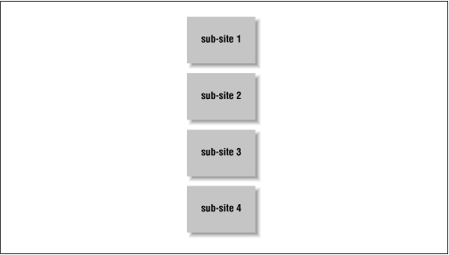
Figure 10-1. The Org Chart architecture. It obviously won't scale well for most large organizations. Imagine a main page with links to 90 sub-sites... on second thought, we're sure you've seen quite a few of those!
Each sub-site represented an organizational entity : a department, unit, division, medical center, hospital, or program sponsored by HFHS. We learned from our initial research that many of these entities did not yet have their own sub-sites, although they would over time. Some entities might never create their own sub-sites. So the reality of their web environment really looked a bit more like Figure 10-2.

Figure 10-2. Expecting future growth
The organization scheme at this point very closely mirrored the political boundaries of the HFHS org chart. Users might come to the main page of such a site and find prominent links to the Department of Gynecology next to the Office of the President. Also, as HFHS is a large organization, there would be many more links than the five represented here. So how could we leave these default organic partitions of information in place, and yet provide a more usable, user-centered view? We had to find a way to cut across the grain of the org chart, yet leave it in place (see Figure 10-3).
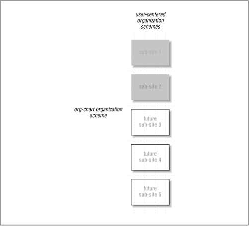
Figure 10-3. Unless we come up with a better solution, the site will be organized like an "org chart" (the horizontal dotted lines). Can we cut "across the grain" of the org chart (the vertical dotted lines) for a more user-centered approach?
10.2.2. Sub-Site Record Pages
Our solution was to create a database of records or meta-information pages to represent each sub-site. These sub-site record pages include information about each sub-site, and are centrally created and controlled by HFHS. Together, they serve as a catalog for the site's sub-sites; using database technology, they are easy to maintain and content duplication is minimized. The fields in these records and the relationships between each type of record were determined through a fairly conventional process of data modeling. The use of fielded information supports improved information retrieval, as described in Chapter 6, "Searching Systems". Also, the whole structure of sub-site records can be bypassed if need be, with users bookmarking an individual sub-site's main page if they so desire.
The sub-site record approach allows the sub-sites themselves to be controlled autonomously and anticipates sub-site growth well. If a sub-site existed, a sub-site record page would also link to the sub-site. If no sub-site existed yet (e.g., sub-site records 4 through 6 in Figure 10-4), the sub-site record would serve as a placeholder until it could be linked to a new sub-site. If a particular department wasn't likely to ever create a sub-site, the sub-site records would at least provide useful information about that department (e.g., sub-site record 3).
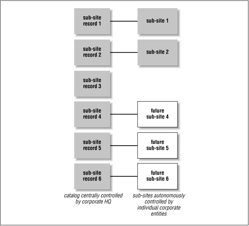
Figure 10-4. Sub-site record pages allow other ways of accessing the site's content, and help delineate responsibility for content ownership and management.
10.2.3. Labeling Systems for Sub-Site Record Pages
To address the need to cut across the grain of the default org chart-centered organization scheme, the sub-site record pages include manually created keyword indexing to support various user-centered means of accessing the sub-sites. In this case, we worked with HFHS' staff librarians to index each sub-site using medical terms in schemes that matched their two primary audiences: one controlled vocabulary for medical professionals and another for regular people. On each sub-site record page, these terms were shown together in one keywords field. Within that field, the keywords served as links to other sub-site record pages which had been similarly indexed, which can greatly enhance user navigation (for example, users can find other HFHS resources that are related to cancer -- see Figure 10-5).
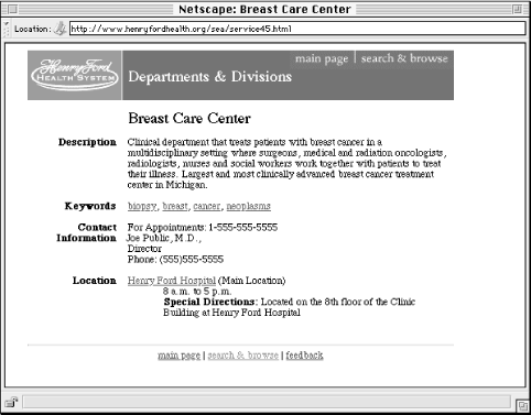
Figure 10-5. A sample sub-site record page can work as a placeholder or as a link to the actual sub-site. It also helps maintain a look and feel consistent with the remainder of the umbrella site.
These topical keywords provide access to the HFHS sub-sites' content in a more user-centered manner than the org chart approach did. We also provided other ways of navigating the sub-sites, leveraging the sub-site records to allow browsing by Organizational Resource (e.g., hospital vs. program vs. department and so on), and by location (City). And we did maintain a browsable org-chart index (Browse By Organizational Resources); browsing the site in this way remains useful in certain cases, especially for internal audiences.
10.2.4. Searching System
We also included a searching facility to allow for fast known-item searching (and, as you can see in Figure 10-6, we integrated it with the browsing options). Queries are run against a set of fields that we selected from the sub-site record pages, including document titles, descriptions, and keywords. Such selective indexing supports improved searching results because queries are run against homogeneous information created and maintained by the same central authority. The results are far more consistent than if a single index of all the content in all of the sub-sites could be created. Creating such an index could also be challenging if the owners of certain sub-sites disallowed spiders to crawl their sites.
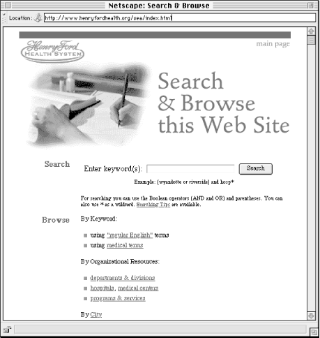
Figure 10-6. Multiple means of searching and browsing the sub-site record pages' content.
The architecture now looked something like that in Figure 10-7.
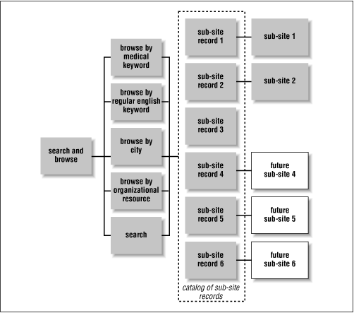
Figure 10-7. Another view of the multiple means of browsing and searching the sub-site record collection.
This architecture provides quick and easy access to content in sub-sites, especially for users who already know what they're looking for or who understand a bit about the nature of HFHS. Users can get straightforward lists of all that HFHS has to offer by city, by keywords, by searching, and so on. But what about users who don't really know what they're looking for? Or those who need a warm, fuzzy introduction to the Henry Ford Health System in general?
10.2.5. Guides
To give users, especially first-timers, a view of the HFHS web environment that goes beyond raw lists of sub-sites, we worked with HFHS staff to create guides[22] to HFHS and its information. Guides add value to the user's experience by telling a story about the site; in effect, they come as close as the Web can to serving as friendly tour guides. They wrap narrative text around featured links to sub-site record pages (or, for that matter, actual sub-site content) in a way that educates users about the site and its sponsor (in this way, they can allow marketing goals to be met). They can stand alone: guides provide value for users even if they don't wish to pursue the links. Guides also can be customized for different audiences or needs, and they can exist somewhat independently of the changes that might happen in the sub-sites themselves.
[22]In this book, we mention the Argus Clearinghouse (http://www.clearinghouse.net) on a number of occasions. The mission of the site is to serve as a central access point for guides to the Internet. If you're interested in seeing hundreds of examples of guides, try the Argus Clearinghouse.
For HFHS, we identified major information needs that users might have when they reached the HFHS main page. Besides wanting to find a sub-site (which we'd already covered with the architecture we've shown so far), users might be members of four primary audiences:
Medical students who were considering doing their residencies at HFHS.
Researchers, both internal and external, who want to keep abreast of the role that HFHS plays in medical research.
Patients who want to know about the care they could receive at HFHS.
Generic users who want to know about HFHS in general.
We knew other audiences could be served by guides, and that there were other ways to define guides, such as by topic or task. But, after much discussion, we felt that these four guides would address the needs of perhaps 80% of first-time users of the site. What about the additional 20%? We hoped that they would be served by the Help Yourself search and browse features. Realistically, our feeling is that most sites' main pages probably don't address even 50% of their users' needs, so we felt that 80% was a pretty good goal. (In fact, the 80/20 Rule is good for web developers in general; use it to remind yourself that you can't always satisfy 100% of all possible users of your site, but that if you can assist 80%, your site will do better than the majority of its competitors.)
Each of the four guides would describe HFHS's offerings in a style that best fit the needs of each audience. Also, each guide would link to the subset of HFHS sub-sites that was relevant to that particular audience (see Figure 10-8).
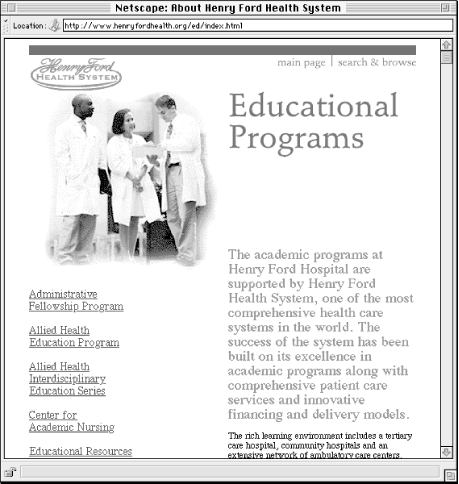
Figure 10-8. A sample guide's main page. Audience-specific narrative text is on the right and links to sub-site records and other useful resources on the left.
10.2.6. Multiple Pathways to Content
Now our architecture supported different ways to get users to information in the HFHS Web environment. Users doing exploratory searching could easily move back and forth between browsing and searching a catalog of sub-site records. Known-item searchers and repeat users could go right to the search engine or quickly scan the browsable indices. New users who wanted a better sense of what HFHS offers could get a taste through any of the four guides to selected HFHS sub-sites. The top-level information architecture was nearing completion (see Figure 10-9).
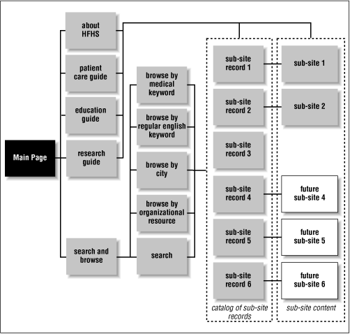
Figure 10-9. Value-added guides complement searching and browsing plain lists of resources.
There were still some other areas we'd not yet dealt with. One area was the news announcements and press releases that HFHS would naturally want to make available. We created a news area in the site and augmented it with a dynamic billboard that showed news headlines and, when clicked, would take users to the story that it had introduced. The billboard adds nice visual splash to the main page. It also helps defuse potentially sticky political situations by unburying sub-site content that deserves occasional exposure on the main page. At this point, we also added the de rigeur "About HFHS" section. So the final top-level architecture looked like Figure 10-10.
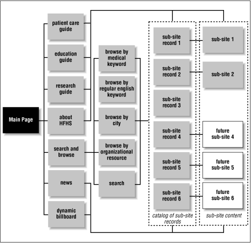
Figure 10-10. The full architecture, including two new ways of reaching content (news and the dynamic billboard).
Pretty confusing, eh? Certainly the blueprint diagram is overwhelming; that's why we always use mock-up pages at this point in the conceptual design phase. However, when you look at the final product, the main page for this site (Figure 10-11), you will note its simplicity.
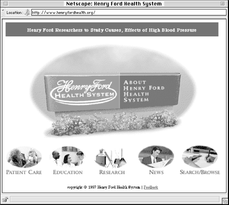
Figure 10-11. The HFHS site's main page -- a concise gateway to a complex information environment
The HFHS main page has few links, a balance between static and dynamic information (e.g., the dynamic billboard at the top of the page), and no names of departments, units, or other political entities that might typically sneak their way there due to political infighting. Yet it provides users with ten ways to reach information in the HFHS Web environment:
10.2.7. Conclusion
We addressed the issues of politics and main page cluttering by creating additional real estate, in the form of guides, just off that most prime real estate, the main page. We moved mention of and links to individual sub-sites from that main page to these guides, thus reducing the clutter of the main page. This approach could be embodied as a policy that would stand up to any unit or department demanding to be linked to from the main page.
We also architected and created a catalog of the entire HFHS Web environment. This alone was a first for the organization: there had never been a comprehensive, up-to-date publicly accessible catalog of HFHS and its offerings. This represented a huge value-add for users. From a maintenance perspective, the sub-site record pages, as well as the various browsable indices, could all be generated by a database. New records could be added without affecting the overall architecture.
We addressed navigation challenges by creating many different ways for users to browse information, and applying these navigation systems consistently on the site's pages (thanks in part to generating these pages from a database with easily configurable templates). We believe that searching performs better thanks to the use of search zones and controlled vocabularies.
Lastly, we allowed sub-sites to maintain their own personalities independently of the umbrella site. We also provided a style guide for others at HFHS to create sub-sites that match the umbrella site's look and feel. Better a carrot than a stick!
All of this was accomplished by considering before production the needs of the site's users and fitting the organization, navigation, labeling, and searching systems around those needs. What we've covered here is an illustration of what information architecture is all about.
We don't intend to portray the architecture depicted in this case study as one-size-fits-all. We feel that it works well as an external site for a large, distributed institution. There are bits and pieces of it that you might apply to your situation, but your site might benefit from a completely different architecture. Your mileage will certainly vary. But as long as you ask the questions, plan ahead, and consider the user, your information architecture should succeed.
 |  |  |
| 10. Information Architecture in Action |  | 11. Selected Bibliography |

Copyright © 2002 O'Reilly & Associates. All rights reserved.