
4.6. Remote Navigation Elements
Remote navigation elements or supplemental navigation systems such as tables of contents, indexes, and site maps are external to the basic hierarchy of a web site and provide an alternative bird's-eye view of the site's content. Increasingly, we are seeing these remote navigation elements displayed outside of the main browser window, in either a separate target window or in a Java-based remote control panel. While remote navigation elements can enhance access to web site content by providing complementary ways of navigating, they should not be used as replacements or bandages for poor organization and navigation systems. In many ways, remote navigation elements are similar to software documentation or help systems. Documentation can be very useful but will never save a bad product. Instead, remote navigation elements should be used to complement a solid internal organization and navigation system. You should provide them but never rely on them.
4.6.1. The Table of Contents
The table of contents and the index are the state of the art in print navigation. Given that the design of these familiar systems is the result of testing and refinement over the centuries, we should not overlook their value for web sites.
In a book or magazine, the table of contents presents the top few levels of the information hierarchy. It shows the organization structure for the printed work and supports random as well as linear access to the content through the use of chapter and page numbers. Similarly, the table of contents for a web site presents the top few levels of the hierarchy. It provides a broad view of the content in the site and facilitates random access to segmented portions of that content. A web-based table of contents can employ hypertext links to provide the user with direct access to pages of the site.
You should consider using a table of contents for web sites that lend themselves to hierarchical organization. If the architecture is not strongly hierarchical, it makes no sense to present the parent-child relationships implicit in a structured table of contents. You should also consider the web site's size when deciding whether to employ a table of contents. For a small site with only two or three hierarchical levels, a table of contents may be unnecessary.
The design of a table of contents significantly affects its usability. When working with a graphic designer, make sure he or she understands the following rules of thumb:
Reinforce the information hierarchy so the user becomes increasingly familiar with how the content is organized.
Facilitate fast, direct access to the contents of the site for those users who know what they want.
Avoid overwhelming the user with too much information. The goal is to help, not scare, the user.
The Search/Browse area of the Argus Clearinghouse, shown in Figure 4-14, provides an example of a table of contents.
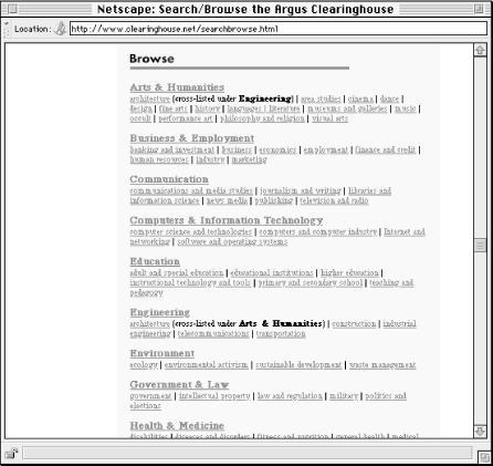
Figure 4-14. This table of contents allows users to select a category (e.g., Arts & Humanities) or jump directly to a subcategory (e.g., architecture). Because of the clean page layout, users can quickly scan the major and minor categories for the topic they're interested in.
Graphics can be used in the design and layout of a table of contents, providing the designer with a finer degree of control over the presentation. Colors, font styles, and a variety of graphic elements can be applied to create a well-organized and aesthetically pleasing table of contents. However, keep in mind that a graphic table of contents will cost more to design and maintain and may slow down the page loading speed for the user. When designing a navigation tool such as a table of contents, form is less important than function.
4.6.2. The Index
For web sites that aren't conducive to strong hierarchical organization, a manually created index can be a good alternative to the more structured table of contents. Similar to an index found in print materials, a web-based index presents keywords or phrases alphabetically, without representing the hierarchy. Unlike a table of contents, indexes generally are flat and present only one or two levels of depth. Therefore, indexes work very well for users who already know the name of the item they are looking for. A quick scan of the alphabetical listing will get them where they want to go.
A major challenge in indexing a web site involves the level of granularity of indexing. Do you index web pages? Do you index individual paragraphs or concepts that are presented on web pages? Or do you index collections of web pages? In many cases, the answer may be all of the above. Perhaps a more valuable question is: What terms are users going to look for? Its answers should guide the index design. To answer this question, you need to know your audience and understand their needs. Before launch of the site, you can learn more about the terms that users will look for through focus group sessions and individual user interviews. After launch, you can employ a query tracking tool that captures and presents all search terms entered by users. Analysis of these actual user search terms should determine refinement of the index. (To learn more about query tracking tools, see Chapter 9, "Production and Operations".)
In selecting items for the index, keep in mind that an index should point only to destination pages, not navigation pages. Navigation pages help users find (destination) pages through the use of menus that begin on the main page and descend through the hierarchy. They are often heavy on links and light on text. In contrast, destination pages contain the content that users are trying to find. The purpose of the index is to enable users to bypass the navigation pages and jump directly to these content-bearing destination pages.
A useful trick in designing an index involves term rotation, also known as permutation. A permuted index rotates the words in a phrase so that users can find the phrase in two places in the alphabetical sequence. For example, in the SIGGRAPH 96 index shown in Figure 4-15, users will find listings for both New Orleans Maps and Maps (New Orleans). This supports the varied ways people look for information. Term rotation should be applied selectively. You need to balance the probability of users seeking a particular term with the annoyance of cluttering the index with too many permutations. For example, it would probably not make sense to present Sunday (Schedule) as well as Schedule (Sunday). If you have the time and budget to conduct focus groups or user testing, that's great. If not, you'll have to fall back on your common sense.
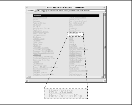
Figure 4-15. The SIGGRAPH 96 index allows for multiple levels of granularity. Selecting "New Orleans" will take you to a page that introduces this adventurous city and includes a number of links. One of those links takes you to a New Orleans map. Since this map is judged to be an important content item, it is also presented in the index.
4.6.3. The Site Map
While the term site map is used indiscriminately in general practice, we define it narrowly as a graphical representation of the architecture of a web site. This definition excludes tables of contents and indexes that use graphic elements to enhance the aesthetic appeal of tools that are primarily textual. A real site map presents the information architecture in a way that goes beyond textual representation.
Unlike tables of contents and indexes, maps have not traditionally been used to facilitate navigation through bodies of text. Maps are typically used for navigating physical rather than intellectual space. This is significant for a few reasons. First, users are not familiar with the use of site maps. Second, designers are not familiar with the design of site maps. Third, most bodies of text (including most web sites) do not lend themselves to graphical representations. As we discussed in Chapter 3, "Organizing Information", many web sites incorporate multiple organization schemes and structures. Presenting this web of hypertextual relationships visually is difficult. These reasons help explain why we see few good examples on the Web of site maps that can improve navigation systems.
Figure 4-16 shows a site map from http://www.sgml.net. To learn more about automatically generated site maps, see http://www.webreview.com/97/05/16/infoarch/index.html.
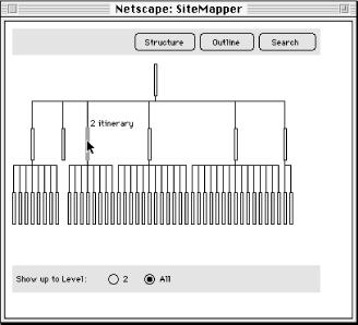
Figure 4-16. In this example of an automatically generated site map, gold bars represent pages within a web site. Users must roll their cursor over a gold bar to see the title of the page. Do you think this approach is more useful than a text-based table of contents?
If you decide to try a site map, consider physical versus symbolic representation. Maps of the physical world do not present the exact geography of an area. Accuracy and scale are often sacrificed for representative contextual clues that help us find our way through the maze of highways and byways to our destination. Often, the higher the level of abstraction, the more intuitive the map. This rule of thumb holds true for all of the remote navigation elements of web sites. When consulting a table of contents or index or site map, a user doesn't need to see every single link on every single page. They need to see the important links, presented in a clear and meaningful way.
4.6.4. The Guided Tour
A guided tour serves as a nice tool for introducing new users to the major content areas of a web site. It can be particularly important for restricted access web sites (such as online magazines that charge subscription fees) because you need to show potential customers what they will get for their money.
A guided tour should feature linear navigation (new users want to be guided, not thrown in), but a hypertextual navigation bar may be used to provide additional flexibility. The tour should combine screenshots of major pages with narrative text that explains what can be found in each area of the web site. See Figure 4-17 for an example.
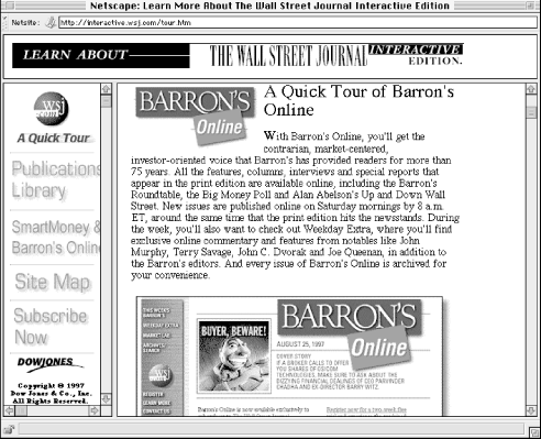
Figure 4-17. In this example, the navigation options on each screen allow users to move through the guided tour in a non-linear manner.
Remember that a guided tour is intended as an introduction for new users and as a marketing opportunity for the web site. Many people may never use it, and few people will use it more than once. For that reason, you might consider linking to the tour from the gateway page[10] rather than the main page. Also, you should balance the inevitable big ideas about how to create an exciting, dynamic, interactive guided tour with the fact that it will not play a central role in the day to day use of the web site.
[10]Web sites sometimes have a gateway page that first-time users encounter before reaching the main page. This gateway might serve as a splash page with fancy graphics and animation, as an audience-selection page that sends users to the appropriate area of a site, or as a preview page that shows users what they will get if they subscribe to that particular web site.
 |  |  |
| 4.5. Integrated Navigation Elements |  | 4.7. Designing Elegant Navigation Systems |

Copyright © 2002 O'Reilly & Associates. All rights reserved.