
Chapter 11. CSS in Action
Contents:
No instructional work would be complete without a chapter that explores ways to put all that theoretical knowledge into practice, and that's just what we'll be doing here. After we look at three different page (re)design projects using CSS, we'll go through a grab bag of tricks and tips that might help you get around some of your biggest CSS frustrations.
11.1. Conversion Projects
Since we've covered the entirety of CSS1, let's exercise that newfound knowledge with three conversion projects. In each of these cases -- two of them web pages and one a print magazine article -- we'll break down the page into its components and determine the best way to recreate the same effects using CSS1 and structural HTML.
11.1.1. Case 1: Consistent Look and Feel
In this project, we will create an external style sheet that will define a basic, consistent look and feel for an entire corporate web site. Our main goal is to create styles that are as simple as possible, using few (if any) classes or IDs. For the purposes of the project, we will assume there is a standard writing guide for employees of the company: document titles are in H1, subheadings in H2, every page uses standard graphics at the top, and so forth.
Marketing has decreed that all pages shall use a white background with a thin dark green stripe running down the left edge, black body text in a serif font, and hyperlinks that are a dark green when unvisited and dark gray when visited. Furthermore, document titles must be underlined and use a color similar to the standard navigation buttons found at the top of every page, which are gray text against a dark green background -- the same dark green you are to use for unvisited hyperlinks and the left edge of the browser window. All headings, including document titles, are to use a sans serif font. The rest is left to our discretion.
A lot of this is fairly straightforward. For the document BODY, we write:
BODY {font-family: Times,serif; color: black;
  background: white url(pix/grstripe.gif) repeat-y top left;}
For the anchors, among other things, we need to know the color value of the green being used. The art department reports that this particular shade of green uses no red or blue, and just 40% green; someone there has had the foresight to use web-safe colors. (Remember, this is a hypothetical situation.) We want to do the same for the visited links, so we write:
A:link {color: rgb(0%,40%,0%);}
A:visited {color: rgb(20%,20%,20%);}
This gives us our dark green and dark gray hyperlinks.
Now for headings. They're all supposed to be in a sans serif font, but H1s have some special rules. In order to cover all the bases in a compact manner, we declare:
H1, H2, H3, H4, H5, H6 {font-family: Verdana,sans-serif;}
H1 {color: rgb(0%,40%,0%); border-bottom: thin solid; width: 100%;}
With the second declaration, not only do we use the standard color, but we enhance the idea of "underlining" by setting a bottom border that will extend from the left edge of the text all the way out to the right edge of the browser window. This line will also inherit the green color of the text and so really punch up the fact that the title and navigation buttons are separate from the rest of the page.
Now that this is all done, we need to link the style sheet into the site's pages. The above declarations are collected into a single file, which is saved to a file with the URL http://www.mycomp.com/style/site.css. Then all of the site's pages are modified so that their HEAD element contains the following:
<LINK REL="stylesheet" TYPE="text/css"
  HREF="http://www.mycomp.com/style/site.css">
This ensures that all documents -- even those without their own style declarations -- will use the site's overall style sheet. Figure 11-1 shows one example of how the pages will appear.
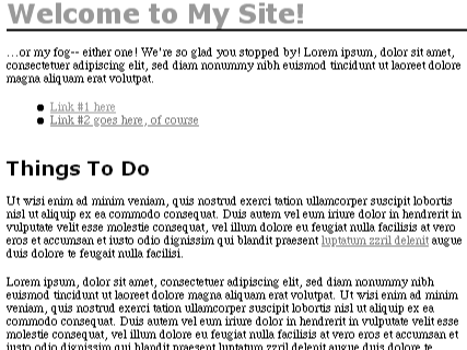
Figure 11-1. Final results
11.1.2. Case 2: Library Catalog System Interface
The library of Wattswith University has been using a web-based library catalog system for the last few years, and their web developers have always tried to keep up with the times. Now that style sheets are gaining currency, the folks in the lab are itching to convert the library system's interface over to use them.
However, the current design has been so popular that a mandate has been handed down from the management: Thou Shalt Not Disrupt The Look And Feel. Annoyed but undaunted, our intrepid websmiths forge ahead. Their mission is to take what's there, then rip it apart and put it all back together again without anyone noticing the difference. (For the purposes of this project, the part of the webmasters will be played by you, the reader.)
The most complicated screen in the system is the record display screen. Composed of three areas -- the system navigation bar, a sidebar with current options, and the record display itself -- it's structured around a table, with each area being enclosed in a table cell. In addition, there is a fourth table cell between the sidebar and the main part of the page, in order to create some blank space. There are also a lot of FONT tags and a few tables imbedded within the main table that determines the page's layout. The skeleton of the page is expressed as a table, with a border and cell padding added to make the structure more clear:
<TABLE CELLSPACING=0 BORDER CELLPADDING="10"> <TR> <TD ROWSPAN=2>sidebar</TD> <TD COLSPAN=2>navigation bar</TD> </TR> <TR> <TD> </TD> <TD>main display</TD> </TR> </TABLE>
This has the appearance shown in Figure 11-2. Obviously, there is a lot more in the cells than what's listed above. The actual content was replaced by labels for the sake of brevity and clarity.
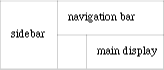
Figure 11-2. A simplified page structure
In order to keep the changes fairly simple, and to avoid stealing a trick I plan to use later in this chapter, for this project we're still going to use a table for the page's overall layout, but we're going to modify it slightly. Instead of four cells, it will only have two: the sidebar and the rest of the screen. The navigation bar will become part of the main display, and the blank "spacing" table cell will be eliminated entirely. This will leave us with the following:
<TABLE CELLSPACING=0>
<TR>
<TD>sidebar</TD>
<TD>navigation bar and main display</TD>
</TR>
</TABLE>
We'll turn to the sidebar first. Each set of links is grouped into a list under a main heading; these headings look different from the links. Each of the sections uses the following tags:
<P>
<FONT FACE="Verdana" COLOR="white" size="+1"><B><U>Heading</U></B></FONT>
<BR>
<FONT FACE="Verdana" SIZE="-1">
<A HREF="link1.html"><FONT COLOR="yellow">Link</FONT></A><BR>
<A HREF="link2.html"><FONT COLOR="yellow">Link</FONT></A><BR>
<A HREF="link3.html"><FONT COLOR="yellow">Link</FONT></A><BR>
</FONT>
</P>
Whew! Already we have our work cut out for us.
Probably the easiest thing to do is to assign a class to the sidebar's table cell, so that we can specify certain appearances that are specific to the sidebar. This leads us to enter the tags <TD CLASS="sidebar"> and </TD> for the beginning and end of the cell, respectively.
Now we have the sidebar enclosed in its very own classed table cell. Since the background color for the sidebar is green, we can create our first style:
.sidebar {background: green;}Moving on with the sidebar, we want to get rid of all the FONT tags, and hopefully the other style tags as well (like <B> and <U>). Since the entirety of the sidebar uses the font Verdana, we can add that to our style sheet:
.sidebar {background: green; font-family: Verdana,sans-serif;}We use font-family here because we don't want to specify a font-size for the sidebar, so we can't use the shorthand font.
Now we could put headings and lists of links in separate paragraphs and then mess around with the padding, margin, and line heights of these paragraphs until they match the current look. However, it's probably easier to simply leave the paragraph and line break tags right where they are and simply SPAN the headings:
<SPAN CLASS="head">Heading</SPAN><BR>
WARNING
The danger in using SPAN instead of logical elements like headings is that pre-CSS browsers won't recognize the SPAN element. Also, indexing robots won't be able to make any sense of SPAN as a piece of document structure. On the other hand, using SPAN avoids having to cope with a number of bugs in early CSS implementations, so I've chosen to use SPAN in this case study instead of something a little more structured.
Having done this, we need a style declaration that will recreate the effects of all the tags we just deleted. This should just about do the trick:
.sidebar .head {font-size: larger; font-weight: bold;
  text-decoration: underline; color: white;}
By using the contextual selector .sidebar .head, we ensure only those .heads inside a .sidebar will receive these styles. Since the entire sidebar is already set to use Verdana, the headings will inherit and use it. As for the links, they need to be yellow, so we declare:
.sidebar A:link {color: yellow;}
.sidebar A:visited {color: yellow;}
.sidebar A:active {color: yellow;}
This will keep the links yellow no matter what, just as they are now. Figure 11-3 shows us the new, improved, FONT-tag-free sidebar which results from the preceding styles, and this markup:
<TD CLASS="sidebar"><P>
<SPAN CLASS="head">Heading</SPAN>
<BR>
<A HREF="link1.html">Link</A><BR>
<A HREF="link2.html">Link</A><BR>
<A HREF="link3.html">Link</A><BR>
</P>
</TD>

Figure 11-3. The well-styled sidebar
That was pretty easy, eh? Now let's tackle the navigation bar at the top of the main part of the page. This area also has a green background, and within it are a few images. Again, we use a DIV tag with a specific class, like this:
<DIV CLASS="navbar">
icons
</DIV>
Now all we need is the style .navbar {background: green;} and we're set. Or are we?
Not quite, no. In the old page, the navigation bar was separated slightly from the main display, but ran right up against the sidebar, thereby creating a sort of inverted green "L" shape. We want to make sure that this is still the case in the new setup. This is most easily accomplished by making sure that the division has no padding or border set, and that it is guaranteed to be as wide as the table cell in which it's found. Plus, we want the bar to have a little bit of blank space after it, so we need a margin of zero on everything but the bottom, where we just want a few pixels. So we add the following:
.navbar {background: green; padding: 0; margin: 0 0 10px 0; width: 100%;}Now everything should be set for the navigation bar, as we can see in Figure 11-4. All we need to do now is make sure the main display has some blank space to its left, and we're done.
Figure 11-4. The greening of the navigational bar
No doubt you already know how this will work. We create another division, this one classed as main and enclosing everything in the main part of the page that isn't the navigation bar. Then we declare:
.main {margin-left: 1.5em;}It seems like a reasonable amount of space, so we go with it. We check the result in Figure 11-5, which is based around this skeleton markup:
<TABLE CELLPADDING="0" CELLSPACING="0" BORDER>
<TR VALIGN="top">
<TD CLASS="sidebar">
(sidebar)
</TD>
<TD>
<DIV CLASS="navbar">
(icons)
</DIV>
<DIV CLASS="main">
(content)
</DIV>
</TR>
</TABLE>
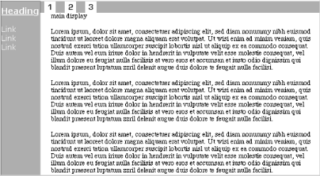
Figure 11-5. Final results
There are a few subtle differences from the original layout, but overall, no significant changes in the document's presentation. We can be quite pleased with the results -- and better still, management will never notice the difference.
The advantages of the new design are twofold: the ability to change colors and fonts by editing a small number of styles instead of a bunch of FONT tags and a reduction in size of the HTML source itself. In a case like this, a page's size can shrink by several kilobytes -- and in cases where a heavily FONTed page is converted to use CSS instead, the document's file size can decrease by as much as 50% !
11.1.3. Case 3: Putting a Magazine Article Online
Finally, we turn to the situation faced by the editorial offices of Meerkat Monthly. This specialist magazine examines the issues of raising a suricate in a domestic environment, away from others of its kind, and also provides general information about the animals themselves. In an effort to boost sales, the editors want to put a few articles online each month.
TIP
This case study ends up using quite a few advanced styles and, as such, may be beyond the capabilities of most older user agents. It's still very instructive, even on a theoretical level, and it should work in a browser that fully and correctly supports CSS1. Just be prepared for one or more errors if you try this in a web browser. You may wish to follow along one step at a time, reloading your page at each step, in order to know when things go wrong -- assuming they do.
For their trial run, they decide to use a one-page article that talks about suricates in general terms, examining their life in the wild and their general appeal to humans. The article appears in the magazine as shown in Figure 11-6.
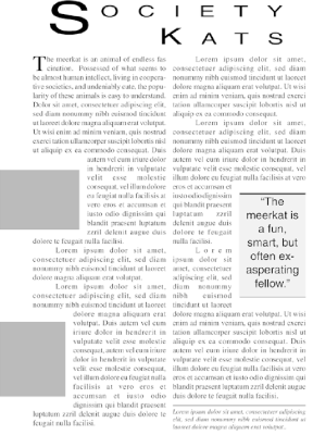
Figure 11-6. The original print document
Obviously, the folks at Meerkat Monthly have been having some fun with their desktop publishing program. It won't be easy to get everything just the way it is on the page, but we'll see what we can do.
First, let's take apart the page's layout and determine what to eliminate. Since there are no pages on the Web, we can drop the page number. Also, the outer margins can be modified to suit our needs, since we don't have to worry about leaving extra space for the staples and so forth. However, the editors want to keep the two-column layout, the picture placement, and the general appearance of the text, so we'll have to bear that in mind.
First, let's create the two columns. Remember, we don't want to use tables or proprietary tags such as MULTICOL, so we'll have to resort to something else. In this case, since each column has a number of paragraphs, we can use a DIV tag -- or, to be more precise, two of them. All we need to do is split the article text roughly in half, and wrap a DIV around each half. (By article text, we mean the actual text of the article, excluding the title.) Let's use the place where the column ends on the printed page as our guide to end the first division and start the second:
blah blah blah.
</P>
</DIV>
<DIV>
<P>
Blah blah blah
Once that's been done, we modify the first DIV with the following style:
<DIV STYLE="float: left; width: 40%; margin-left: 10%; margin-right: 5%;">
This causes the entire set of text in the first division to become a floating block on the left margin and the following text to flow past it on the right. In other words, a two-column layout! This first column is declared to be 40% as wide as the browser window, have a left margin 10% as wide as the browser window, and a right margin that is 5% of the window's width. This will cause the second column to automatically calculate its overall width as 45% (40 + 10 + 5 = 55, and 100 - 55 is 45).
Thus, the two columns will be of not-quite-equal width, as we can see in Figure 11-7, but that's the effect we want.
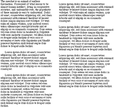
Figure 11-7. Two columns of text
We may eventually have to adjust the point at which the divisions are placed, but for the moment, let's leave things as they are.
Actually, there is one more thing we should add. Here's the markup:
<DIV STYLE="float: right; width: 45%;">
This is the DIV for the second column. Why have we floated it as well? Assume for a moment that the second column is longer than the first. Without the float for the second column, we'd see a situation like that depicted in Figure 11-8.
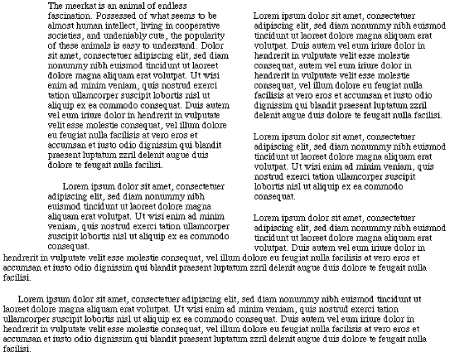
Figure 11-8. Why we float twice
This is entirely consistent with the rules for floating, but it obviously isn't what we want. By floating the second column, we avoid this possibility altogether, and the columns stay straight.
Now let's place the pictures. There are two of them, both in the first column, so that makes things a lot easier. Obviously, they're left-floating images. The interesting part will be recreating the way they hang out into the blank space to the left of the column.
If we just give these pictures the style float: left, they'll be completely contained within the column. However, since the first column has a left margin, all we have to do is give images a negative margin-left, like this:
IMG {float: left; margin-left: -2.5em;}There is a potential danger here. Our floated images have a left margin of 2.5em, but if you'll recall, the column itself has a left margin of 10%. In a sufficiently narrow browser window, the left margin of the column could end up being much less than 2.5em. If that happens, then the images could get pushed far enough to the left that they go partway "offscreen." Mixing units like this, even indirectly, can be risky. A better choice might be this:
IMG{float: left; margin-left: -10%;}This will allow the images' left margins to scale along with the environment.
Since we only have two images, and both of them require the same effect, this declaration will work just fine. Figure 11-9 reveals the result.
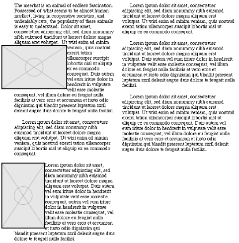
Figure 11-9. Floating images
As you can see, the first column is now quite a bit longer than the second. However, since we haven't done much of anything to the second column, let's leave things as they are for the moment.
An offset block of text showing a quotation in a larger size is usually called a "pull quote." We have one near the middle of the second column, so let's decide how that will be handled. First, the text is a bit larger than the font size of the main article text, and it's in a sans serif font. Also, it has those nice lines at the top and bottom of the pull quote's box, both of which stretch slightly beyond the right and left boundaries of the text itself. The background is a light gray, and there is a bit of space around the box to separate it from the main body text. The pull quote's text is also centered, the box is about half the width of the column, and it's obviously floating to the right.
Here's what we come up with:
.pullq {font: 150% Helvetica,Arial,sans-serif; text-align: center;
  border-top: medium black solid; border-bottom: thin black solid;
  margin: 1em; padding: 0.5em; background: #CCCCCC;
  width: 50%; float: right;}

<P CLASS="pullq">
"The meerkat is a fun, smart, but often exasperating fellow."
</P>
Since we've implemented this quote as a paragraph, if we simply float it in place, the top of the pull quote's box will line up with the beginning of the paragraph that comes after the quote in the HTML document. We decide that's okay and end up with what's shown in Figure 11-10.
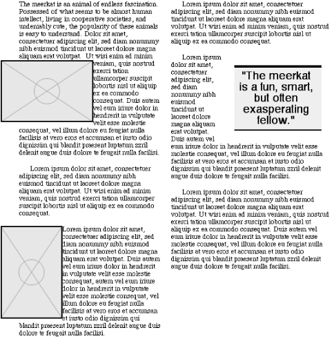
Figure 11-10. A pull quote
Now the document is a bit more even. Adjusting the placement of the DIVs will make it as even as possible, but since we still aren't quite finished, let's put that off yet again.
At the end of the article is a block of text that says a few words about the author of the piece. This is in a smaller text size, italicized, and separated from the rest of the article by a small space and a thin line. We could put a horizontal rule in for the line, but let's stick to CSS1 whenever possible. The following should do quite nicely, as illustrated in Figure 11-11:
.author {font: italic x-small Times,serif; border-top: thin black solid;
  padding-top: 0.25em; margin-top: 0.5em;}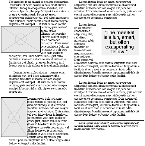
Figure 11-11. Styling the authorial note
Before we create the title, let's clean up a few last details in the article's body. The overall article has fully justified text in a serif font. We decide that it should be easily readable, so we go with Times. We also want the article to have black text on a white background, thereby mimicking the appearance of printed text. Each paragraph has its first line indented about half an inch, but we'll reduce that to a quarter-inch for the web version. We can handle this with the following:
BODY {color: black; background: white;}
P {font-family: Times,serif; text-align: justify; text-indent: 0.25in;}
Figure 11-12 shows the appearance of a paragraph.
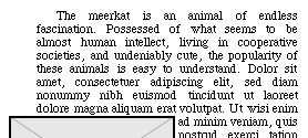
Figure 11-12. Paragraph indenting
The last rule will give us about the correct amount of indenting for each paragraph, no matter the resolution to which the user's monitor has been set. However, the very first letter of the first paragraph of the article is a "drop cap," which means that it's larger and extends down from the first line, with subsequent lines flowing past it. This first paragraph has no indentation of the first line, so we'll have to counteract it somehow. This leads us to the following:
.initial {text-indent: 0;}
P.initial:first-letter {font-size: 200%; float: left;}
These rules will, obviously, require us to add the attribute class="initial" to the first paragraph tag. The declaration of text-indent: 0; overrides previously declared values, as long as this block of declarations comes later in the style sheet. They're also more specific than the other styles we're using, due to the presence of a class selector, so that also helps these rules win out. The values for :first-letter will cause the first letter of the initial paragraph to be twice normal size, and floated left, as shown in Figure 11-13.
TIP
Under CSS2, the same effect can be achieved without the use of a class on the first paragraph. This is done by using new CSS2 selectors, such as the adjacent-sibling selector:
H1 + P {text-indent: 0;}In a CSS2-aware user agent, this will set a text-indent of 0 for any paragraph which immediately follows any H1 element. However, since the paragraph here is the child of a DIV, it doesn't immediately follow the H1. Therefore, we would need to add a child selector and a first-child pseudo-class:
H1 + DIV > P:first-child {text-indent: 0;}This will match any paragraph that is the first child of a DIV that immediately follows an H1 element. See Chapter 10, "CSS2: A Look Ahead", CSS2: A Look Ahead, for more details.
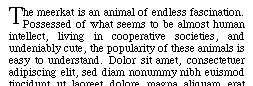
Figure 11-13. First-letter styling
Having set the article's body to the appearance we want, all that remains is to adjust the placement of the divisions so that the columns are of roughly equal length. We can do this now because regardless of what we do to the title, the columns will be the same length. So we move the divisions appropriately. Note that we may not get an exact balance because of the need to break the divisions between paragraphs. Whether the longer column should be the first or the second is up to you.
With all that done, all that remains is for us to recreate the document's title. Looking at it closely in Figure 11-14, we see that this is an interesting specimen: it's right-justified and yet not aligned with the right margin of the document; the letters are spaced rather far apart; the text is small caps, and yet the first letter is much bigger than the others; finally, the entire thing is set in a large sans serif font.
Figure 11-14. The original document's title
Rather than dream up a new class for the title, let's just put it into an H1 and set styles on that element. At a rough visual guess, the text is about three times larger than the body text, and the space between each letter is about the size of one of the letters. Starting with the easy stuff, here's what we have for the title H1:
H1 {font: 300% Helvetica,sans-serif; font-variant: small-caps;
  letter-spacing: 0.75em;}
As was already observed, the title is right-justified but isn't up against the right margin. The easiest thing to do is insert some padding to the H1's right side, which leads us to the following declarations:
H1 {font: 300% Helvetica,sans-serif; font-variant: small-caps;
  letter-spacing: 0.75em; text-align: right; padding-right: 1em;}
Figure 11-15 shows us our progress so far.
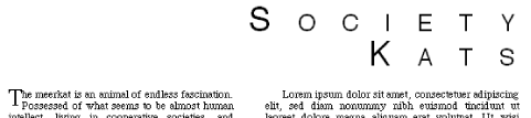
Figure 11-15. The styled title: a work in progress
We're getting close; in fact, the only thing left is that first letter of the title. We can easily handle it with a :first-letter selector, so let's do that. The "S" is about twice the size of the "K" in "Kats," so we set the following:
H1 {font: 300% Helvetica,sans-serif; font-variant: small-caps;
  letter-spacing: 0.75em; text-align: right; padding-right: 1em;
  line-height: 1em;}
H1:first-letter {font-size: 200%; line-height: 1px; vertical-align: -100%;}
Consulting Figure 11-16, we see that it looks about right!
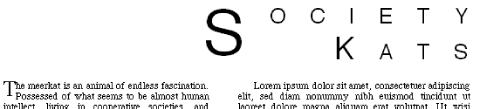
Figure 11-16. The final styled title
The line-height and vertical-align values deserve a small discussion. What's been done is that the inline box of the "S" has been reduced so that it's only one pixel tall. (We could have used almost any length value here, so long as it was a very small amount.) This inline box, as we saw in Chapter 8, "Visual Formatting", is centered vertically inside the "S" itself. Then the baseline of the "S" is lowered so that it's as far down as the baseline of the next line of text (since a -100% vertical alignment will lower the baseline the same distance as the font-size of the parent element). Ordinarily, this would make the first line box correspondingly taller, but since we're declared line-height: 1px for the "S", the actual inline box is so small that it has almost no effect on the height of the line box. While the title shown in Figure 11-16 may not precisely match the title in Figure 11-14, they're very close to each other.
So, put together, here's the entire style sheet:
BODY {color: black; background: white;}
P {font-family: Times,serif; text-align: justify; text-indent: 6em;}
IMG{float: left; margin: 0.5em 0.5em 0.5em -10%;}
.pullq {font: 200% Helvetica,Arial,sans-serif; text-align: center;
  border-top: medium black solid; border-bottom: thin black solid;
  margin: 1em; padding: 0.5em; background: #CCCCCC;
  width: 50%; float: right;}
.author {font: italic x-small Times,serif; border-top: thin black solid;
  padding-top: 0.25em; margin-top: 0.5em;}
.initial {text-indent: 0;}
P.initial:first-letter {font-size: 200%; float: left;}
H1 {font: 300% Helvetica,sans-serif; font-variant: small-caps;
  letter-spacing: 0.75em; text-align: right; padding-right: 1em;
  line-height: 1em;}
H1:first-letter {font-size: 200%; line-height: 1px;vertical-align: -100%;}
Figure 11-17 shows a side-by-side comparison of the original article and its online cousin.

Figure 11-17. A comparison
Furthermore, if we view the web page using a browser without style sheets, it will come out looking like Figure 11-18. It may not be as pretty, but it's still quite readable.
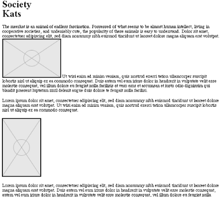
Figure 11-18. The styled page without any styles
11.1.3.1. Cleaning up
There are a few places where the CSS version isn't quite the same as the printed version, as a detailed study of Figure 11-17 reveals, and of course the creation of the columns is a bit of a hack. How can these be addressed?
The title of the article is the most obvious visual difference between the two layouts. The printed version of the article has a title which is stretched out, so to speak. This could be easily recreated using the CSS2 property font-stretch, but sadly, this property was not supported at the time of this writing. See Chapter 10, "CSS2: A Look Ahead" for a look at font-stretch.
The opening dropped capital "T" also doesn't seem to quite match up. This might also be addressed using font-stretch, or perhaps by giving the letter a font-weight of 900. However, it might be best to leave things as they are, since this is a small effect and not too important.
How about those columns, though? In order to get these columns to display properly, we were forced to enclose each column in its own DIV. While this approach is certainly preferable to using tables, it still requires us to do some small violence to the structure of the page -- and trying to create visual effects by adding elements is never a good idea. It would be far better to simply set the BODY contents to be flowed into two columns. Unfortunately, CSS2 contains no provisions for columns or column flow. There have been discussions in the CSS community about adding such behaviors to CSS, and perhaps they will be added in the future. For now, we're forced to do things like add DIVs to represent columns.
This assumes that you wish to create columns at all, of course. We went to a great deal of effort to get those columns, but was it really worth it? Multiple-column layouts can be very difficult to read on a monitor, since the user may be forced to scroll downward to read the first column, then back up to the top of the second, then down again. Adding the columns was an interesting theoretical exercise, but it may not be the best approach for the Web.
 |  |  |
| 10.9. Summary |  | 11.2. Tips & Tricks |

Copyright © 2002 O'Reilly & Associates. All rights reserved.