
7.4. Borders
The border of an element is simply a line (sometimes more than one) that surrounds the content and padding of an element. Thus, the background of the element will stop at the outer edge of the border, since the background does not extend into the margins, and the border is just inside the margin. The CSS specification strongly implies that the background extends to the outside edge of the border, since it talks about the borders being drawn "on top of the background of the element," but not all browsers seem to agree. This is important because some borders are "intermittent" -- for example, dotted and dashed styles -- and the element's background should appear in the spaces between the visible portions of the border.
Every border has three aspects: its width, or thickness; its style, or appearance; and its color. The default value for the width of a border is medium , which is not explicitly defined but usually works out to be two or three pixels. Despite this, the reason you don't usually see borders is that the default style is none, which prevents them from existing. If a border has no style, then it may as well not exist, so it doesn't. The absence of a border style also resets the width, but we'll get to that in a little while.
Finally, the default border color is the foreground color of the element itself. If no color has been declared for the border, then it will be the same color as the text of the element. If, on the other hand, an element has no text -- let's say a table which contains only images -- then thanks to the fact that color is inherited, the border color for that table would be the text color of its parent element. This is likely to be BODY, DIV, or another TABLE. Thus, if an image has a border, and the BODY is its parent, given this rule:
BODY {color: purple;}then, by default, the border around the image will be purple. Of course, to get that border to appear, you have to do a little work first.
7.4.1. Borders with Style
We'll talk about the border's style first because it is the most important part of a border. It's most important not because it controls the appearance of the border, although it does do that, but because without a style there would be no border at all.
There are nine distinct styles for the property border-style defined in CSS1, including the default value of none. They are demonstrated in Figure 7-29.
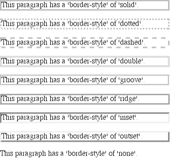
Figure 7-29. Border styles
TIP
The most interesting border style is double. It's defined such that the width of the two lines, plus the width of the space between them, is equal to the value of border-width (discussed in the next section). However, the specification doesn't say whether one of the lines should be thicker than the other, or if they should be the same width, or if the space should be thicker or thinner than the lines. All of these things are left up to the user agent to decide.
All of the borders shown in Figure 7-30 are based on a color of gray, which makes all of the effects easier to see. The look of a border style is always based in some way on the color of the border, although the exact method may vary between user agents. For example, Figure 7-30 illustrates two different ways of rendering an inset border.
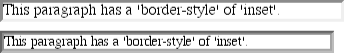
Figure 7-30. Two valid ways of rendering inset
So let's assume that you want to define a border style for images that are inside a hyperlink. You might make them outset, so they have a "raised button" look, as depicted in Figure 7-31:
A:link IMG {border-style: outset;}
Figure 7-31. Applying an outset border to a hyperlinked image
Again, the color of the border is based on the element's value for color, which in this circumstance is likely to be blue (although we can't show that in print). This is due to the fact that the image is contained with a hyperlink, and the foreground color of hyperlinks is usually blue. If we so desired, we could change that color to be silver, like this:
A:link IMG {border-style: outset; color: silver;}As Figure 7-32 shows, the border is now based on the light gray silver, since that's now the foreground color of the image -- even though the image doesn't actually use that color, it's still passed on to the border. We'll talk about another way to change border colors in a later section.
Figure 7-32. Changing the color of the border
7.4.1.1. Multiple styles
It's also possible to define more than one style for a given border. For example:
P.aside {border-style: solid dashed dotted solid;}The result, shown in Figure 7-33, is a paragraph with a solid top border, a dashed right border, a dotted bottom border, and a solid left border.
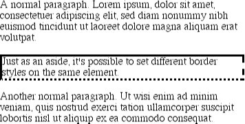
Figure 7-33. Multiple border styles on a single element
Again we see the top-right-bottom-left order of values. This is just like the ability to set different margins with multiple values. All the same rules about value replication apply to border styles, just as they did with margins and padding. Thus, the following two statements would have the same effect, as depicted in Figure 7-34:
P.new1 {border-style: solid dashed none;}
P.new2 {border-style: solid dashed none dashed;}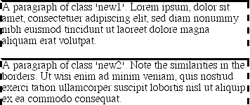
Figure 7-34. Equivalent style rules
In case you're wondering, under CSS1, there is no way to directly set the style for only a single side using something like border-top-style, since no such property exists in CSS1 (although that property, and others like it, were introduced in CSS2). You can, however, sneak around this limitation by declaring the style for a given border using one of the shorthand properties we'll discuss later in the chapter.
7.4.1.2. Falling back on solid
There is one interesting thing about CSS that can make life difficult for authors. According to CSS1, a user agent is allowed to interpret any value of border-style (besides none) as solid. Because of this allowance, a user agent that is technically CSS1-compliant could display the following as all solid:
P.new3 {border-style: ridge dashed double;}The result shown in Figure 7-35 wouldn't be what the author had in mind, of course, but it's technically correct. So long as none and solid are supported, and any other legal values are interpreted as solid, that's enough to be CSS1-compliant. Accordingly, even though Navigator 4.x fails to render dashed and dotted borders, since it does render them as solid, it's not behaving badly.
Figure 7-35. Using solid to stand in for unrecognized border styles
You may have noticed that all of the examples in this section had borders of exactly the same width. That's because we didn't define a width, so it defaulted to a certain value. Next, we'll find out about that default, and much more.
7.4.2. Border Widths
Once you've assigned a style, the next step in customizing a border is to give it some width. This is done with the property border-width. You can also use one of the cousin properties: border-top-width , border-right-width , border-button-width , and border-left-width .
Each of these is used to set the width on a specific border side, of course, just as with the margin properties.
border-width
- Values
[ thin | medium | thick | <length> ]{1,4}
- Initial value
not defined for shorthand properties
- Inherited
no
- Applies to
all elements
border-top-width, border-right-width, border-bottom-width, border-left-width
- Values
thin | medium | thick | <length>
- Initial value
medium
- Inherited
no
- Applies to
all elements
There are four ways to assign a width to a border: you can give it a length value such as 4px or 0.1em or use one of three keywords. These keywords are thin , medium (the default value), and thick. These keywords don't necessarily correspond to any particular width but are simply defined in relation to one another. According to the specification, thick is always wider than medium , which is in turn always wider than thin.
However, the exact widths are not defined, so one user agent could set them to be equivalent to 5px , 3px , and 2px , while another sets them to be 3px , 2px , and 1px . Whatever width the user agent uses for each keyword, it will be the same throughout the document, regardless of the circumstances. If medium is the same as 2px , then a medium-width border will always be two pixels wide, whether the border surrounds an H1 or a P element. Figure 7-36 illustrates one way to handle these three keywords, as well as how they relate to each other and to the content they surround.
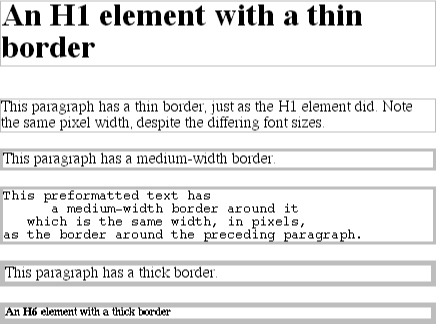
Figure 7-36. The relation of border-width keywords to each other
Let's suppose a paragraph has margins, a background color, and a border style set as shown in Figure 7-37:
P {margin: 5px; background-color: silver; border-style: solid;}
Figure 7-37. Margins, backgrounds, and borders
The border's width is, by default, medium , as we can see in Figure 7-37. We can change that to the result in Figure 7-38 as follows:
P {margin: 5px; background-color: silver;
  border-style: solid; border-width: thick;}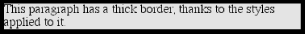
Figure 7-38. Changing the width of the border
This can be taken to fairly ridiculous extremes, such as setting 20-pixel borders as depicted in Figure 7-39:
P {margin: 5px; background-color: silver;
  border-style: solid; border-width: 20px;}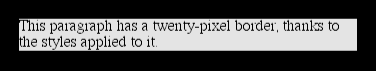
Figure 7-39. Inflating the border width to unhealthy levels
This is all as expected: the style and width combine to create a border whose color is based on the foreground color of the element.
It's also possible to set widths for individual sides. This is done in two familiar ways. The first is to use any of the specific properties mentioned at the beginning of the section, such as border-bottom-width. The other way is to use value replication in border-width. These are both illustrated in Figure 7-40.
H1 {border-style: none none dotted; border-bottom-width: thin;}
P {border-style: solid; border-width: 15px 2px 7px 4px;}
Figure 7-40. Value replication and uneven border widths
7.4.2.1. No border at all
So far, we've only talked about what happens when you're using a visible border style such as solid or outset. Things start to get interesting, though, when the border style is set to be none:
P {margin: 5px; border-style: none; border-width: 20px;}As we can see in Figure 7-41, despite the fact that the border's width was set to be 20px , when the style is set to none, not only does the border's style go away, so does its width! Why?
Figure 7-41. The incredible disappearing border
If you'll remember, the terminology used in the previous section was that a border with a style of none does not exist. Those words were picked carefully because they help explain what's going on here. Since the border doesn't exist, it can't have any width, so the width is automatically set to 0 (zero). This may seem completely backward, but it actually makes a great deal of sense. After all, if a drinking glass is empty, you can't really describe it as being half-full of nothing. You can only discuss the depth of a glass's contents if it has actual contents. In the same way, talking about the width of a border only makes sense in the context of borders that have some existence.
This is important to bear in mind because a common mistake is to forget to declare a border style. This leads to all kinds of author frustration because at first glance, the styles appear correct. The result, though, is a paragraph with no border:
P {margin: 5px; border-width: 20px;}Since the default value of border-style is none, failure to declare a style is exactly the same as declaring border-style: none. Therefore, if you want a border to appear, you need to pick a style and declare it.
7.4.3. Border Colors
Compared to the other aspects of borders, setting the color is pretty easy. In CSS1, there is the single property border-color, which can accept up to four color values at one time.
border-color
- Values
<color>{1,4}
- Initial value
the value of <color> for the element
- Inherited
no
- Applies to
all elements
If there are less than four values, value replication takes effect. So if you want H1 elements to have thin, black top and bottom borders with thick, gray side borders, and medium, gray borders around P elements, this will suffice, as we can see in Figure 7-42:
H1 {border-style: solid; border-width: thin thick; border-color: black gray;}
P {border-style: solid; border-color: gray;}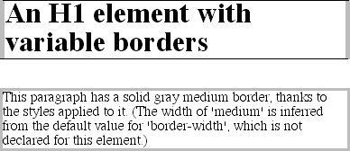
Figure 7-42. Borders have many aspects
By default, a single color value will be applied to all four sides, as with the paragraph in the previous example. On the other hand, if you supply four color values, you can get a different color on each side. Any type of color value can be used, from named colors to hexadecimal and RGB values.
P {border-style: solid; border-width: thick;
  border-color: black rgb(25%,25%,25%) #808080 silver;}
Figure 7-43 shows us varying shades of gray for borders. Thanks to the grayscale nature of this book, I've been sticking mostly to shades of gray, but any color could be used. If you wanted an H1 with a red, green, blue, and yellow border, it's this easy:
H1 {border-style: solid; border-color: red green blue yellow;}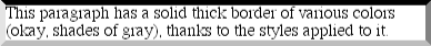
Figure 7-43. One border, many colors
As previously discussed, if no colors are defined, then the default color is the foreground color of the element. Thus, the following declaration will be displayed as shown in Figure 7-44:
P.shade1 {border-style: solid; border-width: thick; color: gray;}
P.shade2 {border-style: solid; border-width: thick; color: gray;
   border-color: black;}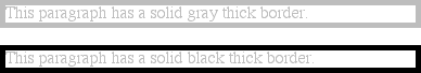
Figure 7-44. Border colors based on the element's foreground (top) and the value of the border-color property (bottom)
The result is that the first paragraph has a gray border, having taken the value gray from the foreground color of the paragraph itself. The second paragraph, on the other hand, has a black border because that color was explicitly assigned using border-color.
7.4.4. Shorthand Border Properties
While it's nice to have shorthand properties like border-color and border-style, they aren't always a whole lot of help. For example, you might want to set all H1 elements to have a thick, gray, solid border, but only along the bottom. There are two ways to accomplish this:
H1 {border-bottom-width: thick;   /* option #1 */
  border-style: none none solid;
  border-color: gray;}
H1 {border-width: 0 0 thick;     /* option #2 */
  border-style: none none solid;
  border-color: gray;}
Neither is really convenient, given all the typing involved. Fortunately, a better solution is available:
H1 {border-bottom: thick solid gray;}This will apply the values to the bottom border alone, as shown in Figure 7-45, leaving the others to their defaults. Since the default border style is none, no borders appear on the other three sides of the element.
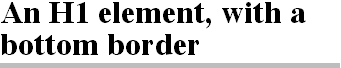
Figure 7-45. Shorthand properties make styles easier
As you may have guessed, there are a total of four such shorthand properties.
border-top, border-right, border-bottom, border-left
- Values
<border-width> || <border-style> || <color>
- Initial value
refer to individual properties
- Inherited
no
- Applies to
all elements
It's possible to use these properties to create some complex borders, such as those shown in Figure 7-46:
H1 {border-left: 3px solid gray;
  border-right: black 0.25em dotted;
  border-top: thick silver inset;
  border-bottom: double rgb(33%,33%,33%) 10px;}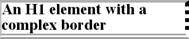
Figure 7-46. Very complex borders
As you can see, the order of the actual values doesn't really matter. The following three rules will yield exactly the same border, as illustrated in Figure 7-47:
H1 {border-bottom: 3px solid gray;}
H2 {border-bottom: solid gray 3px;}
H3 {border-bottom: 3px gray solid;}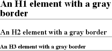
Figure 7-47. Getting the same result in three different ways
You can also leave out some values and have their defaults kick in, like this:
H3 {color: gray; border-bottom: 3px solid;}Since no border color is declared, the default value (the element's foreground) is applied instead, as we can see in Figure 7-48. Just remember that if you leave out a border style, the default value of none will prevent your border from appearing at all.
Figure 7-48. Letting default values fill in the gaps
By contrast, if you set only a style, you will still get a border. For example, let's say you simply want a border style of dashed for the top of an element and are willing to let the width default to medium and the color to be inherited from the element itself. All you need in such a case is the following:
P.roof {border-top: dashed;}Another thing to note is that since each of these "border-side" properties applies only to a specific side, there isn't any possibility of value replication -- it wouldn't make any sense. There can only be one of each type of value: that is, only one width value, only one color value, and only one border style. So don't try to declare more than one value type:
H3 {border: thin thick solid purple;} /* two width values--WRONG */In such a case, the entire statement will be invalid and should be ignored altogether.
Finally, you need to take the usual precautions with shorthand properties: if you omit a value, the default will be filled in automatically. This can have unintended effects. Consider the following:
H4 {border-style: dashed solid double;}
H4 {border: medium green;}
This will result in H4 elements having no border at all, because the lack of a border-style in the second rule means that the default value of none will be used. As we've seen, that will turn the border off altogether.
7.4.4.1. Setting borders as quickly as possible
With all of this shorthand stuff, you're probably starting to suspect that it goes even further, and you're right. We finally come to the shortest shorthand border property of all: border.
border
- Values
<border-width> || <border-style> || <color>
- Initial value
refer to individual properties
- Inherited
no
- Applies to
all elements
This property has the advantage of being very compact, although that brevity introduces a few limitations. Before we worry about that, let's see how border is used. If you want all H1 elements to have a thick, silver border, it's very simple. This declaration would be displayed as shown in Figure 7-49:
H1 {border: thick silver solid;}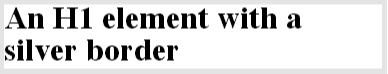
Figure 7-49. A really short border declaration
The values are applied to all four sides. This is certainly preferable to the next-best alternative, which would be:
H1 {border-top: thick silver solid;
  border-bottom: thick silver solid;
  border-right: thick silver solid;
  border-left: thick silver solid;}  /* same as previous markup */
The drawback with border is that you can only define "global" styles, widths, and colors. In other words, the values you supply for border will apply to all four sides equally. If you want the borders to be different for a single element, you'll need to use some of the other border properties. Of course, it's possible to turn the cascade to your advantage:
H1 {border: thick silver solid;
  border-left-width: 20px;}
The second rule overrides the width value for the left border assigned by the first rule, thus replacing thick with 20px , as we see in Figure 7-50.
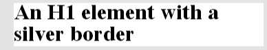
Figure 7-50. Using the cascade to one's advantage
7.4.5. Borders and Inline Elements
A lot of this story will sound pretty familiar because it's largely the same as what we discussed with margins and inline elements.
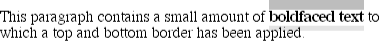
In the first place, no matter how thick you make your borders on inline elements, the line-height of the element won't change. Let's set top and bottom borders on boldfaced text:
B {border-top: 10px solid gray; border-bottom: 5px solid silver;}Once more, this is allowed in the specification, but it will have absolutely no effect on the line height. However, since borders are visible, they'll be drawn -- as you can see for yourself in Figure 7-51.
Figure 7-51. Borders on inline elements
The borders have to go somewhere. This is where they went.
Again, all of this is only true for the top and bottom sides of inline elements; the left and right sides are a different story. We'll start by considering the simple case of a small inline element within a single line, as depicted in Figure 7-52.
Figure 7-52. An inline element
Here, if we set values for the left or right border, not only will they be visible, but they'll displace the text around them, as we see in Figure 7-53:
B {border-left: 10px double gray; background: silver;}
Figure 7-53. An inline element with a left border
As expected, Figure 7-53 shows a little extra space on the left side of the inline element and no extra space above or below it.
With borders, just as with margins, the browser's calculations for line-breaking are not directly affected by any box properties set for inline elements. The only effect is that the space taken up by the borders may shift portions of the line over a bit, which may in turn change which word is at the end of the line. Turn to Figure 7-54 to see what happens when an inline element with a border is displayed across multiple lines:
B {border: 3px solid gray; background: silver;}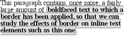
Figure 7-54. An inline element with a border displayed across multiple lines of text
In Figure 7-54, the left border is applied to the beginning of the element, and the right border to the end of it. Borders are not necessarily applied in this fashion; they can also be applied to the right and left side of each line in the element, if the situation seems to demand it. For example, a grooved border might look better enclosed on each line end, as shown in Figure 7-55.
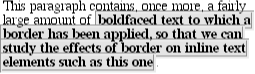
Figure 7-55. An inline element with a border displayed across multiple lines of text, with the border boxes closed
It's also acceptable for the lines to be "open" as shown in Figure 7-54.
WARNING
Borders cannot be applied to inline elements in Navigator 4.x or Explorer 4.x/5.x. Only Opera 3.x draws borders around inline elements, and it only caps the beginning and end of the element. This is in agreement with the CSS specification, although this is not discussed here (see Chapter 8, "Visual Formatting", for more details).
7.4.6. Borders: Known Issues
Of course, there are a few problems with using borders. The most distressing is the fact that Navigator 4.x won't draw a border around the content area of a block-level element but instead inserts some space between the content and the border. There doesn't seem to be any way to override this behavior.
Despite its limitations, border is obviously a very useful property. It can even be used to work around what seems like a completely unrelated bug in Netscape Navigator 4.x. If you assign a background color to an element and then view it in Navigator 4.x, the color will only appear behind the letters in the text and not cover the entire content area and padding. You can get around this by declaring:
border {0.1px solid none;}Despite the fact that no border will appear, and this shouldn't have anything to do with background colors, this will cause Navigator 4.x to fill in the background of the content area with the assigned color.
Speaking of Navigator, it is extremely dangerous to set borders -- or any other box properties -- on inline elements. This is as true for borders as it is for margins, and for much the same reasons.
 |  |  |
| 7.3. Margins |  | 7.5. Padding |

Copyright © 2002 O'Reilly & Associates. All rights reserved.