
 |  |
23.10. The ProgressBar Widget
Using a ProgressBar is a great way to show the user something is still happening when you are doing lots of processing. Without it, the user wonders, "Is the application still running? Why isn't it responding?" Figure 23-18 shows what a fairly typical progress bar looks like. This screenshot was generated with the following code:
use Tk;
use Tk::ProgressBar;

my $mw = MainWindow->new(-title => 'ProgressBar example');

$progress = $mw->ProgressBar(
        -width => 30,
        -from => 0,
        -to => 100,
        -blocks => 50,
        -colors => [0, 'green', 50, 'yellow' , 80, 'red'],
        -variable => \$percent_done
    )->pack(-fill => 'x');

$mw->Button(-text => 'Go!', -command=> sub {
   for ($i = 0; $i < 1000; $i++) {
     $percent_done = $i/10;
     print "$i\n";
     $mw->update;  # otherwise we don't see how far we are.
  }
 })->pack(-side => 'bottom');

MainLoop; 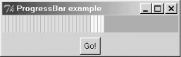
Figure 23-18. A ProgressBar
The callback that is part of the Go button is just a quick way of showing how to do something and update the ProgressBar as part of the process. You could be loading a file, doing some number crunching, or anything else that seems to cause your program to pause.
23.10.1. ProgressBar Options
Here is a list of options available for ProgressBar:
- -anchor => 'n' | 's' | 'e' | 'w'
- Determines the starting point of the bar. For horizontal bars (such as our example), use 'e' or 'w'. Vertical bars use 's' or 'n'.
- -blocks => number
- The number of blocks used in constructing the bar. The larger the number, the more blocks. The default is 10.
- -colors => [ pos0, color0, pos1, color1, ... ]
- An anonymous list containing positions and colors. The position is where to start using that particular color in the bar. That color will be used until it finds another position/color or runs out of room in the bar.
- -from => number
- The lower limit on the progress bar. Defaults to 0. Nothing is displayed if you try to use a value on the bar below this number.
- -gap => amount
- Controls the amount of space left between blocks. Default is 1. Use 0 to get a solid bar.
- -length => amount
- The long dimension of the progress bar as a valid screen distance. This is ignored if you use -fill with the pack command. If this is a vertical progess bar, this value will be used for the height.
- -resolution => amount
- A real value specifying the resolution for the scale. If greater than zero, the scale's value will always be rounded to an even multiple of this value, as will tick marks and the endpoints of the scale. If the value is less than zero, no rounding occurs. Defaults to 1 (i.e., the value will be integral).
- -to => number
- Sets the the upper limit of the progress bar. Defaults to 100. If you ask the progress bar to display a value higher than this limit, the bar will be completely filled.
- -variable => \$var
- A scalar variable that holds the progress bar's current value. Use this instead of configuring the -value option all the time.
- -value => amount
- The value currently displayed on the progress bar.
- -width => amount
- The amount of screen distance allocated to the thin portion of the progress bar. For a horizontal bar, this is the height; for a vertical progress bar, this becomes the width.
|  | |
| 23.9. The Pane Widget |  | 23.11. Widgets Not in the Perl/Tk Distribution |

Copyright © 2002 O'Reilly & Associates. All rights reserved.