
 |  |
23.6. The BrowseEntry Widget
BrowseEntry is a composite widget created to be like a combo box (also known as a drop-down listbox on some platforms) using an Entry widget, a Listbox, and a small arrow button. The combination of these three widgets in the BrowseEntry is very powerful.
Before we list the options and methods for a BrowseEntry, let's look at an example:
use Tk;
use Tk::ROText;
use Tk::BrowseEntry;

$mw = MainWindow->new(-title => "Text search using BrowseEntry");

# Create Browse Entry to enter search text in, and save off
# already entered text that you've searched for.
$f = $mw->Frame(-relief => 'ridge', -borderwidth => 2)
  ->pack(-fill => 'x');
# Use ROText so user can't change speech
$t = $mw->Scrolled('ROText', -scrollbars => 'osoe')
  ->pack(-expand => 1, -fill => 'both');

$t->insert('end', <<'EOD'
"Give Me Liberty or Give Me Death"
March 23, 1775
By Patrick Henry
No man thinks more highly than I do of the patriotism, as well as abilities, of the
very worthy gentlemen who have just addressed the house. But different
<snipped...> I
know not what course others may take; but as for me, give me liberty or give me death!

EOD
);

# define a new tag to use on selected text
# (making it look just like normal selection)
# This way the Text widget doesn't need focus to show selection
$t->tagConfigure('curSel', -background => $t->cget(-selectbackground),
                  -borderwidth => $t->cget(-selectborderwidth),
                  -foreground => $t->cget(-selectforeground));

my $search_string = "";

# If user selects item from list manually, invoke do_search
$be = $f->BrowseEntry(-variable => \$search_string,
                      -browsecmd => \&do_search)->pack(-side => 'left');
# If user types in word and hits return, invoke do_search
$be->bind("<Return>", \&do_search);
$be->focus;  # Start w/focus on BrowseEntry

# Clicking the Search button will invoke do_search
$f->Button(-text => 'Search', -command => \&do_search)
    ->pack(-side => 'left');
$f->Button(-text => 'Exit', -command => \&do_exit)
    ->pack(-side => 'right');

sub do_search {
  # Add search string to list if it's not already there
  if (! exists $searches{$search_string}) {
    $be->insert('end', $search_string);
  }
  $searches{$search_string}++;

  # Calculate where to search from, and what to highlight next
  my $startindex = 'insert';
  if (defined $t->tagRanges('curSel')) {
    $startindex = 'curSel.first + 1 chars';
  }
  my $index = $t->search('-nocase', $search_string, $startindex);
  if ($index ne '') {
    $t->tagRemove('curSel', '1.0', 'end');
    my $endindex = "$index + " .  (length $search_string) . " chars";
    $t->tagAdd('curSel', $index, $endindex);
    $t->see($index);
  } else { $mw->bell; }

  $be->selectionRange(0, 'end'); # Select word we just typed/selected
}

# print stats on searching before we exit.
sub do_exit {
  print "Count	Word\n";
  foreach (sort keys %searches) {
    print "$searches{$_}	$_\n";
  }
  exit;
}

MainLoop;
Take a look at Figure 23-13 to see the screenshot of this application. The BrowseEntry is in the upper-left corner. We have shown it with the list part of the BrowseEntry down (after the down arrow button has been pressed).
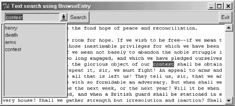
Figure 23-13. BrowseEntry used to perform searches in a Text widget
In this example, we are using the BrowseEntry with mostly default settings. We added a callback so that when the user selected an entry from the list manually, the search subroutine was invoked as well. The easiest way to know what the user has selected/typed is to use the -variable option. Most of the code for this example has to do with figuring out where the word is in the Text widget.
The BrowseEntry supports all the options a LabEntry does (see Chapter 5, "Label and Entry Widgets"), except -textvariable. Additional BrowseEntry options are:
- -arrowimage => image
- This option changes the picture on the little button.
- -browsecmd => callback
- This callback will be invoked whenever the user selects something from the list. BrowseEntry already performs the work to display the new selection in the edit box.
- -choices => list
- You can put choices in the list using this option. Examples are: -choices => [ qw/one two three/ ] or -choices => @init_choices. You can also add items to the list using the insert method ($be->insert('end', 'newchoice'); ).
- -listcmd => callback
- Specify a callback to be invoked when the arrow button is pushed. This will be called before the list is displayed, so if you need to change the contents of the drop-down list, this is a great place to do so.
- -listwidth => amount
- The width of the popup listbox. The listbox will not automatically grow to fit your choices if you have long strings in it.
- -variable => \$scalar
- Place the user's selection in $scalar.
- -state => 'normal' | 'readonly' | 'disabled'
- A state of 'normal' that the user can type in new entries and select entries from the list. A 'readonly' state limits the user to only selecting items from the list. A state of 'disabled' will not allow any interaction with the user at all.
In addition to all the methods of Tk::Entry, the BrowseEntry widget supports its own insert and delete methods:
$be->insert('index', 'string');
$be->delete('index1', 'index2');
The insert method adds a new item into the list at the specified index. The delete method removes list entries that are between the two indexes.
|  | |
| 23.5. The Balloon Widget |  | 23.7. The LabFrame Widget |

Copyright © 2002 O'Reilly & Associates. All rights reserved.