
 |  |
18.2. Item Styles
Creating and using a style is very similar to creating and using a tag in the Text widget, except you get a bit more reusability with Tix item styles. If you predefine what you'd like the style to look like, you can use it throughout your program many times with different Tix widgets. If you need to change how those items are displayed, you can change the definition of the style instead of changing each individual item.
To create a new style, call the ItemStyle method:
$styleref = $parentwidget->ItemStyle('text',
       -stylename => 'stylename',
       [ option => value, ... ] );
The first parameter to ItemStyle must be an item type (image, text, imagetext, or window). What $parentwidget you use is important only because it determines the default values of all the style options. If you use a TList as the parent widget, with a default font of "Courier 14", then the style will use that font unless the -font option is explicitly changed. You can use any widget as the parent widget, including the MainWindow ($mw).
The rest of the arguments to ItemStyle are option/value pairs. You can use any of the following option/value pairs with ItemStyle:
- -stylename => 'stylename'
- Gives the style a name. Note that you don't really need this, because you use the reference to the style when creating items, not the name of the style. However, it's useful if you intend to let users create and manipulate styles, since it might help them remember which style is which.
- -refwindow => $otherwidget
- Normally the default values for the style are taken from the parent widget. If you specify -refwindow, then the defaults are taken from $otherwidget.
- -option => value
- Each item type has a different set of options you can change (font, color, etc.). See Table 18-2 for details on what is valid for the item type you're using.
To use the style you've created, specify it with the -style option as you create the item:
# Create the item style
$blue = $mw->ItemStyle('text', -foreground => 'blue',
  -selectforeground => 'white', -font => "Courier 8");
# Use item style with an item
$tl->insert('end', -itemtype => 'text', -style => $blue,
   -text => 'Blue text');
Now the item you've created will have blue text normally and white text when selected, and the text is displayed in 8 point Courier font. It is important that the style's item type and new item's type match, or you'll get an error (see Table 18-2).
Table 18-2. Style options by item type for Tix widgets
|
Option |
Text |
Imagetext |
Image |
Window |
|---|---|---|---|---|
|
|
|
|
|
|
|
|
|
|
|
|
|
|
|
|
|
|
|
|
|
|
|
|
|
|
|
|
|
|
|
|
|
||
|
|
|
|
|
|
|
|||
|
|
|
||
|
|
|
|
|
|
|
|
|
|
|
|
|
|
|
|
|
|
|
|
|
|
|||
|
|
|

Let's look at a few examples of creating styles and using them with a Tix widget. The TList is the simplest to understand right now, so we'll use that as our display mechanism.
use Tk;
require Tk::TList;
require Tk::ItemStyle;

$mw = MainWindow->new(-title => 'TList');

# Create first style
$blue = $mw->ItemStyle('text', -foreground => 'blue',
  -selectforeground => 'white', -font => 'Courier 8');

# Create second style
$bluebig = $mw->ItemStyle('text', -foreground => 'blue',
  -selectforeground => 'white', -font => 'Courier 14');

$tl = $mw->TList->pack(-expand => 1, -fill => 'both');
$tl->insert('end', -itemtype => 'text', -text => 'small blue style',
            -style => $blue, -underline => 2);
$tl->insert('end', -itemtype => 'text', -text => 'big blue style',
            -style => $bluebig, -underline => 2);

MainLoop;
We've shown the whole program this time. When working with the Tix widgets, we require both Tk::TList and Tk::ItemStyle. We continue to create our MainWindow like we normally do, then start creating the styles we'd like to use. Notice that we are using $mw as the parent widget of our styles. Since we're doing this, the defaults for the style options we don't specify come from the MainWindow instead of from the TList we're going to use them in. If the user has configured any specific TList widget preferences, those preferences won't apply to these styles. (See Chapter 16, "User Customization" for information on allowing the user to specify options.)
Next in our example, we create our TList widget and insert some text. Figure 18-3 shows what the window looks like. You can see that the second item inserted is much larger than the first, and the font colors are blue when not selected and white when selected.
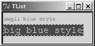
Figure 18-3. A TList that uses more than one style
If we had other Tix widgets that we wanted to use these styles with, we'd simply use the -style option (where applicable) when creating the new display items in those widgets as well. Unlike Text widget tags, which you can use only within the Text widget in which you created them (you can't even share tags between two different Text widgets in the same application), Tix styles are usable across multiple widgets and widget types.
18.2.1. Item Style Methods
We've already talked about the ItemStyle method itself, which creates a new style:
$style1 = $parent->ItemStyle('imagetext', .... );Once you have a reference to that style, you can do only three things with it. You can call cget to get information about how the options are set, or you can call configure to change the values of options:
$color = $style1->cget(-foreground);
$style1->configure(-foreground => 'red');
The only thing you can't change when calling configure on a style is the type of item the style is designed to modify.
The last thing you can do with a style is delete it:
$style1->delete( );
The moment you delete a style, all items that use it will stop using the style and will be displayed using the Tix widget's default option values.
|  | |
| 18. A Tk Interface Extension Tour |  | 18.3. The TList Widget |

Copyright © 2002 O'Reilly & Associates. All rights reserved.