
 |  |
12.6. Option Menus
An option menu is a simple widget with a label and an indicator. Clicking the indicator posts a menu of selections from which we can choose any single value, which is then displayed in the label. An option menu has an associated Perl variable that keeps the current option value and may also have a -command callback that is invoked after the new option value is stored in the variable.
Perl/Tk has two option menu widgets: Tk::Optionmenu from the standard distribution and a native option menu that almost no one is aware of but that you will see shortly. Each has its pros and cons, so pick one based on the job at hand. Both option menus are based on a Menubutton widget, which posts its menu items when pressed.
12.6.1. Tk::Optionmenu
If we want to select a color from a small set of colors, we could use an Optionmenu like that shown in Figure 12-8. The operative word is small, because an Optionmenu's menu is limited to a single column. The -options option expects a reference to a list of options, which may be string values and/or array references of the form ['label' => 'value']. The 'label' is what's displayed in the menu, and the 'value' is stored in the variable. The -command option is a standard Perl/Tk callback. When the callback is invoked, the value of the option menu is appended to the callback argument list.
my $palette;
my @colors = qw/Black red4 DarkGreen NavyBlue gray75 Red Green Blue
    gray50 Yellow Cyan Magenta White Brown DarkSeaGreen DarkViolet/;

my $om = $mw->Optionmenu(
    -variable => \$palette,
    -options  => [@colors],
    -command  => [sub {print "args=@_.\n"}, 'First'],
);
$om->pack;
The Optionmenu widget has an addOptions method to add more items to the menu.
$om->addOptions(['chlorophyll' => '#8395ffff0000']);
And that's pretty much all you can do with a Tk::Optionmenu widget.
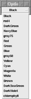
Figure 12-8. Tk::Optionmenu widgets are limited to a single column
12.6.2. A Native Option Menu
It's possible to build an option menu from standard Perl/Tk components that's more powerful than one created by Tk::Optionmenu. It is more complex and, because it's not part of the standard distribution, we have to carry extra baggage around. But we have direct access to its Menu, which provides us with a lot of flexibility.
Figure 12-9 illustrates how the new option menu displays our list of colors as an array of radiobutton menu items.[27] In this context, it's convenient to break the color list into several columns, plus the radiobutton's indicator serves to identify the widget's current value while the menu is posted.
[27] In Chapter 17, "Images and Animations", we expand on this idea and use a color palette of Photo images rather than plain radiobutton menu items.
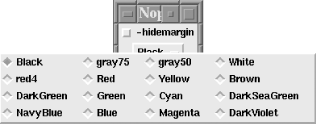
Figure 12-9. A multicolumn native option menu
The actual user code is very similar to the Tk::Optionmenu code. The main difference is we call a subroutine instead of invoking a Tk method. (As an exercise, turn this code into a Perl/Tk class.) The subroutine uses positional parameters rather than option/value pairs: the first argument is the widget's parent, the second argument is the variable, the third argument is the callback, and the remaining arguments are the menu options.
use subs qw/native_optionmenu/;

my $palette;
my @colors = qw/Black red4 DarkGreen NavyBlue gray75 Red Green Blue
    gray50 Yellow Cyan Magenta White Brown DarkSeaGreen DarkViolet/;

my $nom = native_optionmenu(
    $mw,
    \$palette,
    [sub {print "args=@_.\n"}, 'First'],
    @colors);
$nom->pack;;
The following chunk of code breaks the menu into columns. The variable $nom is actually a reference to a Menubutton widget from which we fetch the menu reference. Then we loop, setting the -columnbreak option on every fourth menu item.
my $menu = $nom->cget(-menu);
for my $i (0 .. $#colors) {
    $menu->entryconfigure($i, -columnbreak => 1) unless $i % 4;
}
The native_optionmenu subroutine builds the actual option menu for us. First, we default the option menu variable to the first option value, which becomes the Menubutton's initial label. As the variable referenced by the -textvariable option changes, so does the text on the Menubutton. The -indicatoron option is what makes the Menubutton look and behave as an "OptionMenubutton." The -anchor and -direction options ensure that the tearoff-less menu pops up, centered directly on top of the Menubutton. Finally, we loop through the list of option values, populate the menu with radiobutton menu items, and return a reference to the Menubutton. The only trickiness is normalizing the -command callback and appending the correct "selected value" to the callback argument list.
sub native_optionmenu {

    my($parent, $varref, $callback, @optionvals) = @_;

    $$varref = $optionvals[0];

    my $mb = $parent->Menubutton(
        -textvariable       => $varref,
        -indicatoron        => 1,
        -relief             => 'raised',
        -borderwidth        => 2,
        -highlightthickness => 2,
        -anchor             => 'c',
        -direction          => 'flush',
    );
    my $menu = $mb->Menu(-tearoff => 0);
    $mb->configure(-menu => $menu);

    my $callback = ref($command) =~ /CODE/ ? [$command] : $command;

    foreach (@optionvals) {
        $menu->radiobutton(
            -label     => $_,
            -variable  => $varref,
            -command   => [$callback, $_],
        );
    }

   $mb;

} # end native_optionmenu
Menu items have left and right margins, and it's in these margins that the radiobutton and checkbutton indicators are drawn. If you want to dispense with the margin, be aware that the indicators disappear too. This code sets each radiobutton's -hidemargin option based on the true/false setting of a Checkbutton widget:
sub hide {
    my $menu = $nom->cget(-menu);
    foreach (@colors) {
        $menu->entryconfigure($_, -hidemargin => ${$cb->cget(-variable)});
    }
}
Figure 12-10 shows a native option menu with a -hidemargin set to 1.
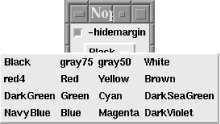
Figure 12-10. A native option menu with -hidemargin => 1
|  | |
| 12.5. Popup Menus |  | 12.7. Menu Virtual Events |

Copyright © 2002 O'Reilly & Associates. All rights reserved.