
 |  |
4.13. Changing the Size of a Button
Normally the size of the Button is automatically determined by the application and is dependent on the text string or image displayed in the Button. The width and height can be specified explicitly by using the -width and -height options:
-width => x, -height => y
The values specified for x and y vary depending on whether a bitmap/image or text is displayed in the Button. When a bitmap or image is displayed, the values in x and y represent valid screen distances. If text is displayed on the Button, x and y are character sizes.
This example shows one Button that is the default size and another drawn with -width of 10 and -height of 10. (It is not necessary that the amounts for -width and -height be the same or that you use both options.)
$mw->Button(-text => "Exit",
            -command => sub { exit })->pack(-side => 'left');
$mw->Button(-text => "Exit",
            -width => 10, -height => 10,
            -command => sub { exit })->pack(-side => 'left');
In Figure 4-28, which illustrates this example, the second Button is much taller than it is wide, because text characters are taller than they are wide.
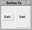
Figure 4-28. Default -width and -height (left) versus Button with -width and -height set (right)
The values specified for both -width and -height are characters, because the Button is displaying text. When -width and -height are used with a bitmap, the amount specified is in screen distance. Here is an example of using -width and -height with a bitmap:
$mw->Button(-bitmap => 'error',
            -width => 10, -height => 10,
            -command => sub { exit })->pack(-side => 'left');
$mw->Button(-bitmap => 'error',
            -command => sub { exit })->pack(-side => 'left');
$mw->Button(-bitmap => 'error',
            -width => 50, -height => 50,
            -command => sub { exit })->pack(-side => 'left');
The first Button is created with a restriction of 10 on the -width and -height. The middle Button looks like it would normally. The third Button is created with a -width and -height of 50. Figure 4-29 shows the resulting window.

Figure 4-29. A bitmap displayed three times, with different values for -width and -height
The default value for both -width and -height is 0. Using 0 allows the program to decide the height and width of the Button dynamically.
The total width for Buttons with text is calculated by the width the text takes up plus 2 x -padx amount. The height is the text height plus 2 x -pady amount. The width and height of a Button with a bitmap is just the width and height of the bitmap itself. Any -padx or -pady options are ignored when a bitmap is displayed.
As an alternative to specifying an explicit width or height, it is possible to increase the size of the Button by using the options -padx and-pady to add padding between the text and edge of the Button:
-padx => amount, -pady => amount
The amount specified with -padx is added to both the left and right sides of the Button. The amount specified with -pady is added to both the top and bottom of the Button. Figure 4-30 shows an example.
By using these options you are telling the Button to be sized larger than it normally would, but you don't have to worry that it will be sized too small, as you would if you set -width and -height explicitly.
Figure 4-30. Default width and height (left) versus Button with -padx => 20, -pady => 20 (right)
Remember, -padx and -pady are ignored when a bitmap is displayed.
|  | |
| 4.12. Altering the Button's Style |  | 4.14. Adding a Keyboard Mapping |

Copyright © 2002 O'Reilly & Associates. All rights reserved.