Chapter 6 TOC Chapter 8
Chapter 7. A Tkinter Tour, Part 1
7.1 "Widgets and Gadgets and GUIs, Oh My!"
This chapter is a continuation of our look at GUI programming in Python. The previous chapter used simple widgets to demonstrate the fundamentals of Tkinter coding in Python -- buttons, labels, and the like. That was simple by design: it's easier to grasp the big GUI picture if widget interface details don't get in the way. But now that we've seen the basics, this chapter and the next move on to present a tour of more advanced widget objects and tools available in the Tkinter library.
As we'll find, this is where GUI scripting starts getting both practical and fun. In these two chapters we'll meet classes that build the interface devices you expect to see in real programs -- sliders, checkboxes, menus, scrolled lists, dialogs, graphics, and so on. After these chapters, the last GUI chapter moves on to present larger GUIs that utilize the coding techniques and the interfaces shown in all prior GUI chapters. In these two chapters, though, examples are small and self-contained so that we can focus on widget details.
7.1.1 This Chapter's Topics
Technically, we've already used a handful of simple widgets in Chapter 6. So far we've met Label, Button, Frame, and Tk, and studied pack geometry management concepts along the way. Although these are all basic, they are representative of Tkinter interfaces in general, and can be workhorses in typical GUIs. Frame containers, for instance, are the basis of hierarchical display layout.
In this and the following chapter, we'll explore additional options for widgets we've already seen, and move beyond the basics to cover the rest of the Tkinter widget set. Here are some of the widgets and topics we'll explore in this chapter:
· Toplevel and Tk widgets
· Message and Entry widgets
· Checkbutton, Radiobutton, and Scale widgets
· Images: PhotoImage and BitmapImage objects
· Dialogs: both standard and custom
· Widget configuration options
· Low-level event binding
· Tkinter variable objects
Chapter 8, concludes the tour by presenting the remainder of the Tkinter library's tool set: menus, text, canvases, animation, and more.
To make this tour interesting, I'll also introduce a few notions of component reuse along the way. For instance, some later examples will be built using components written for prior examples. Although these two tour chapters introduce widget interfaces, this book is really about Python programming in general; as we'll see, Tkinter programming in Python can be much more than simply drawing circles and arrows.
7.2 Configuring Widget Appearance
So far, all the buttons and labels in examples have been rendered with a default look-and-feel that is standard for the underlying platform. That usually means gray on Windows, with my machine's color scheme. Tkinter widgets can be made to look arbitrarily different, though, using a handful of widget and packer options.
Because I generally can't resist the temptation to customize widgets in examples, I want to cover this topic early on the tour. Example 7-1 introduces some of the configuration options available in Tkinter.
Example 7-1. PP2E\Gui\Tour\config-label.py
from Tkinter import *
root = Tk()
labelfont = ('times', 20, 'bold') # family, size, stylewidget = Label(root, text='Hello config world')
widget.config(bg='black', fg='yellow') # yellow text on black labelwidget.config(font=labelfont) # use a larger fontwidget.config(height=3, width=20) # initial size: lines,charswidget.pack(expand=YES, fill=BOTH)
root.mainloop()
Remember, we can call a widget's config method to reset its options at any time, instead of passing them all to the object's constructor. Here, we use it to set options that produce the window in Figure 7-1.
Figure 7-1. A custom label appearance
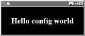
This may not be completely obvious unless you run this script on a real computer (alas, I can't show it in color here), but the label's text here shows up in yellow on a black background, and with a font that's very different from what we've seen so far. In fact, this script customizes the label in number of ways:
Color
By setting the bg option of the label widget here, its background is displayed in black; the fg option similarly changes the foreground (text) color of the widget to yellow. These color options work on most Tkinter widgets, and accept either a simple color name (e.g., 'blue') or a hexadecimal string. Most of the color names you are familiar with are supported (unless you happen to work for Crayola). You can also pass a hexadecimal color identifier string to these options to be more specific; they start with a # and name a color by its red, green, and blue saturations, with an equal number of bits in the string for each. For instance, '#ff0000' specifies eight bits per color, and defines pure red -- "f" means four "1" bits in hexadecimal. We'll come back to this hex form when we meet the color selection dialog later in this chapter.
Size
The label is given a preset size in lines high and characters wide by setting its height and width attributes. You can use this setting to make the widget larger than the Tkinter geometry manager would by default.
Font
This script specifies a custom font for the label's text by setting the label's font attribute to a three-item tuple giving the font family, size, and style (here: Times, 20-point, and bold). Font style can be normal, bold, roman, italic, underline, overstrike, and combinations of these (e.g., "bold italic"). Tkinter guarantees that Times, Courier, and Helvetica font family names exist on all platforms, but others may work too (e.g., system gives the system font on Windows). Font settings like this work on all widgets with text, such as labels, buttons, entry fields, listboxes, and Text (the latter of which can display more than one font at once with "tags"). The font option still accepts older X-style font indicators -- long strings with dashes and stars -- but the new tuple font indicator form is more platform independent.
Layout and expansion
Finally, the label is made generally expandable and stretched by setting the pack expand and fill options we met in the last chapter; the label grows as the window does. If you maximize this window, its black background fills the whole screen and the yellow message is centered in the middle -- try it.
In this script, the net effect of all these settings is that this label looks radically different then the ones we've been making so far. It no longer follows the Windows standard look-and-feel, but such conformance isn't always important. Tkinter provides additional ways to customize appearance, not used by this script:
Border and relief
A bd=N widget option can be used to set border width, and a relief=S option can specify a border style; S can be FLAT, SUNKEN, RAISED, GROOVE, SOLID, or RIDGE -- all constants exported by the Tkinter module.
Cursor
A cursor option can be given to change the appearance of the mouse pointer when it moves over the widget. For instance, cursor='gumby' changes the pointer to a Gumby figure (the green kind). Other common cursor names used in this book include watch, pencil, cross, and hand2.
State
Some widgets also support the notion of a state, which impacts their appearance. For example, a state=DISABLED option will generally stipple (gray out) a widget on screen, and make it unresponsive; NORMAL does not.
Padding
Extra space can be added around many widgets (e.g., buttons, labels, and text) with the padx=N and pady=N options. Interestingly, you can set these options both in pack calls (where it adds empty space around the widget in general), and in a widget object itself (where it makes the widget larger).
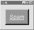
To illustrate some of these extra settings, Example 7-2 configures the custom button captured in Figure 7-2 and changes the mouse pointer when above it.
Example 7-2. PP2E\Gui\Tour\config-button.py
from Tkinter import *
widget = Button(text='Spam', padx=10, pady=10)
widget.pack(padx=20, pady=20)
widget.config(cursor='gumby')
widget.config(bd=8, relief=RAISED)
widget.config(bg='dark green', fg='white')
widget.config(font=('helvetica', 20, 'underline italic'))mainloop()
Figure 7-2. Config button at work
To see the effects generated by these two script's settings, try out a few changes on your computer. Most widgets can be given a custom appearance in the same way, and we'll see such options used repeatedly in this text. We'll also meet operational configurations, such as focus (for focusing input), and more. In fact, widgets can have dozens of options; most have reasonable defaults that produce a native look-and-feel on each windowing platform, and this is one reason for Tkinter's simplicity. But Tkinter lets you build more custom displays when you want to.
7.3 Toplevel Windows
Tkinter GUIs always have a root window, whether you get it by default or create it explicitly by calling the Tk object constructor. This main root window is the one that opens when your program runs, and is where you generally pack your most important widgets. In addition, Tkinter scripts can create any number of independent windows, generated and popped up on demand, by creating Toplevel widget objects.
Each Toplevel object created produces a new window on the display, and automatically adds it to the program's GUI event-loop processing stream (you don't need to call the mainloop method of new windows to activate them). Example 7-3 builds a root and two pop-up windows.
Example 7-3. PP2E\Gui\Tour\toplevel0.py
import sys
from Tkinter import Toplevel, Button, Label
win1 = Toplevel() # two independent windowswin2 = Toplevel() # but part of same processButton(win1, text='Spam', command=sys.exit).pack()
Button(win2, text='SPAM', command=sys.exit).pack()
Label(text='Popups').pack() # on default Tk() root windowwin1.mainloop()
The toplevel0 script gets a root window by default (that's what the Label is attached to, since it doesn't specify a real parent), but also creates two standalone Toplevel windows that appear and function independently of the root window, as seen in Figure 7-3.
Figure 7-3. Two Toplevel windows and a root window
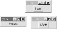
The two Toplevel windows on the right are full-fledged windows; they can be independently iconified, maximized, and so on. Toplevels are typically used to implement multiple-window displays, and pop-up modal and nonmodal dialogs (more on dialogs in the next section). They stay up until explicitly destroyed, or the application that created them exits.
But it's important to know that although Toplevels are independently active windows, they are not separate processes -- if your program exits, all its windows are erased, including all Toplevel windows it may have created. We'll learn how to work around this rule later by launching independent GUI programs.
7.3.1 Toplevel and Tk Widgets
A Toplevel is roughly like a Frame that is split off into its own window, and has additional methods that allow you to deal with top-level window properties. The Tk widget is roughly like a Toplevel, but is used to represent the application root window. We got one for free in Example 7-3 because the Label had a default parent; in other scripts, we've made the Tk root more explicit by creating it directly like this:
root = Tk()
Label(root, text='Popups').pack() # on explicit Tk() root windowroot.mainloop()
In fact, because Tkinter GUIs are built as a hierarchy, you always get a root window by default, whether it is named explicitly like this or not. You should generally use the root to display top-level information of some sort -- if you don't attach widgets to the root, it shows up as an odd empty window when you run your script. Technically, you can suppress the default root creation logic and make multiple root windows with the Tk widget, as in Example 7-4.
Example 7-4. PP2E\Gui\Tour\toplevel1.py
import Tkinter
from Tkinter import Tk, Button
Tkinter.NoDefaultRoot()
win1 = Tk() # two independent root windowswin2 = Tk()
Button(win1, text='Spam', command=win1.destroy).pack()
Button(win2, text='SPAM', command=win2.destroy).pack()
win1.mainloop()
When run, this script displays the two pop-up windows of the screen shot in Figure 7-3 only (there is no third root window). But it's more common to use the Tk root as a main window, and create Toplevel widgets for an application's pop-up windows.
7.3.2 Top-Level Window Protocols
Both Tk and Toplevel widgets export extra methods and features tailored for their top-level role, as illustrated by Example 7-5.
Example 7-5. PP2E\Gui\Tour\toplevel2.py
##################################################################
# popup three new window, with style
# destroy() kills one window, quit() kills all windows and app;
# top-level windows have title, icon (on Unix), iconify/deiconify
# and protocol for wm events; there always is an app root window,
# whether by default or created as an explicit Tk() object; all
# top-level windows are containers, but never packed or gridded;
# Toplevel is like frame, but is a new window, and can have menu;
##################################################################
from Tkinter import *
root = Tk() # explicit roottrees = [('The Larch!', 'light blue'),('The Pine!', 'light green'),
('The Giant Redwood!', 'red')]
for (tree, color) in trees:
win = Toplevel(root) # new window
win.title('Sing...') # set border
win.protocol('WM_DELETE_WINDOW', lambda:0) # ignore close
msg = Button(win, text=tree, command=win.destroy) # kills one win
msg.pack(expand=YES, fill=BOTH) msg.config(padx=10, pady=10, bd=10, relief=RAISED) msg.config(bg='black', fg=color, font=('times', 30, 'bold italic'))root.title('Lumberjack demo')Label(root, text='Main window', width=30).pack()
Button(root, text='Quit All', command=root.quit).pack() # kills all approot.mainloop()
This program adds widgets to the Tk root window, immediately pops up three Toplevel windows with attached buttons, and uses special top-level protocols. When run, it generates the scene captured in living black-and-white by Figure 7-4 (the buttons' text shows up blue, green, and red on a color display).
Figure 7-4. Three Toplevel windows with configurations
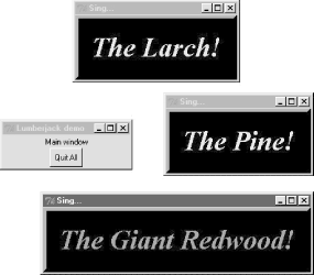
There are a few operational details worth noticing here, all of which are more obvious if you run this script on your machine:
Intercepting closes: protocol
Because the window manager close event has been intercepted by this script using the top-level widget protocol method, pressing the X in the top-right corner doesn't do anything in the three Toplevel pop-ups. The name string WM_DELETE_WINDOW identifies the close operation. You can use this interface to disallow closes apart from the widgets your script creates -- the function created by this script's lambda:0 does nothing but return zero.
Killing one window: destroy
Pressing the big black buttons in any one of the three pop-ups only kills that pop-up, because the pop-up runs the widget destroy method. The other windows live on, much as you would expect of a pop-up dialog window.
Killing all windows: quit
To kill all the windows at once and end the GUI application (really, its active mainloop call), the root window's button runs the quit method instead. Pressing the root window's button ends the application.
Window titles: title
As introduced in Chapter 6, top-level window widgets (Tk and Toplevel) have a title method that lets you change the text displayed on the top border. Here, the window title text is set to the string "Sing..." to override the default "tk".
Geometry management
Top-level windows are containers for other widgets, much like a standalone Frame. Unlike frames, though, top-level window widgets are never themselves packed (or gridded, or placed). To embed widgets, this script passes its windows as parent arguments to label and button constructors.
In addition, top-level window widgets support other kinds of protocols that we will utilize later on this tour:
State
The iconify and withdraw top-level widget methods allow scripts to hide and erase a window on the fly; deiconify redraws a hidden or erased window. The state method queries a window's state (it returns "iconic", "withdrawn", or "normal"), and lift and lower raise and lower a window with respect to others. See the alarm scripts near the end of Chapter 8 for usage.
Menus
Each top-level window can have its own window menus too; both the Tk and Toplevel widgets have a menu option used to associate a horizontal menu bar of pull-down option lists. This menu bar looks as it should on each platform on which your scripts are run. We'll explore menus early in Chapter 8.
Notice that this script passes its Toplevel constructor calls an explicit parent widget -- the Tk root window (that is, Toplevel(root)). Toplevels can be associated with a parent like other widgets, even though they are not visually embedded in their parents. I coded the script this way to avoid what seems like an odd feature; if coded instead like this:
win = Toplevel() # new window
If no Tk root yet exists, this call actually generates a default Tk root window to serve as the Toplevel's parent, just like any other widget call without a parent argument. The problem is that this makes the position of the following line crucial:
root = Tk() # explicit root
If this line shows up above the Toplevel calls, it creates the single root window as expected. But if you move this line below the Toplevel calls, Tkinter creates a default Tk root window that is different than the one created by the script's explicit Tk call. You wind up with two Tk roots just as in Example 7-5. Move the Tk call below the Toplevel calls and rerun it to see what I mean -- you'll get a fourth window that is completely empty! As a rule of thumb, to avoid such oddities, make your Tk root windows early and explicit.
All of the top-level protocol interfaces are only available on top-level window widgets, but you can often access them by going through other widgets' master attributes -- links to the widget parents. For example, to set the title of a window in which a frame is contained, say something like this:
theframe.master.title('Spam demo') # master is the container window
Naturally, you should only do so if you're sure that the frame will only be used in one kind of window. General-purpose attachable components coded as classes, for instance, should leave window property settings to their client applications.
Top-level widgets have additional tools, some of which we may not meet in this book. For instance, under Unix window managers, you can also call icon-related methods to change the bitmap used for top-level windows (iconbitmask), and set the name used on the window's icon (iconname). Because such icon options are only useful when scripts run on Unix, see other Tk and Tkinter resources for more details on this topic. For now, the next scheduled stop on this tour explores one of the more common uses of top-level windows.
7.4 Dialogs
Dialogs are windows popped up by a script to provide or request additional information. They come in two flavors, modal and nonmodal:
· Modal dialogs block the rest of the interface until the dialog window is dismissed; users must reply to the dialog before the program continues.
· Nonmodal dialogs can remain on screen indefinitely without interfering with other windows in the interface; they can usually accept inputs at any time.
Regardless of their modality, dialogs are generally implemented with the Toplevel window object we met in the prior section, whether you make the Toplevel or not. There are essentially three ways to present pop-up dialogs to users with Tkinter: by using common dialog calls, by using the now-dated Dialog object, and by creating custom dialog windows with Toplevels and other kinds of widgets. Let's explore the basics of all three schemes.
7.4.1 Standard (Common) Dialogs
Because standard dialog calls are simpler, let's start here first. Tkinter comes with a collection of precoded dialog windows that implement many of the most common pop-ups programs generate -- file selection dialogs, error and warning pop-ups, and question and answer prompts. They are called standard dialogs (and sometimes "common" dialogs), because they are part of the Tkinter library, and use platform-specific library calls to look like they should on each platform. A Tkinter file open dialog, for instance, looks like any other on Windows.
All standard dialog calls are modal (they don't return until the dialog box is dismissed by the user), and block the program's main window while displayed. Scripts can customize these dialogs' windows by passing message text, titles, and the like. Since they are so simple to use, let's jump right into Example 7-6.
Example 7-6. PP2E\Gui\Tour\dlg1.pyw
from Tkinter import *
from tkMessageBox import *
def callback():
if askyesno('Verify', 'Do you really want to quit?'): showwarning('Yes', 'Quit not yet implemented') else: showinfo('No', 'Quit has been cancelled')errmsg = 'Sorry, no Spam allowed!'
Button(text='Quit', command=callback).pack(fill=X)
Button(text='Spam', command=(lambda: showerror('Spam', errmsg))).pack(fill=X)mainloop()
A lambda anonymous function is used here to wrap the call to showerror, so that it is passed two hardcoded arguments (remember, button press callbacks get no arguments from Tkinter itself). When run, this script creates the main window in Figure 7-5.
Figure 7-5. dlg1 main window: buttons to trigger pop-ups

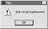
Pressing this window's Quit button pops up the dialog in Figure 7-6, by calling the standard askyesno function in the tkmessagebox module. This looks different on Unix and Macintosh, but looks like you'd expect when run on Windows. This dialog blocks the program until the user clicks one of its buttons; if the dialog's Yes button is clicked (or the Enter key is pressed), the dialog call returns with a true value and the script pops up the standard dialog in Figure 7-7 by calling showwarning.
Figure 7-6. dlg1 askyesno dialog (Windows)
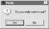
Figure 7-7. dlg1 showwarning dialog
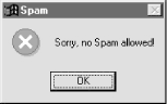
There is nothing the user can do with Figure 7-7's dialog but press OK. If No is clicked in Figure 7-6's quit verification dialog, a showinfo call makes the pop-up in Figure 7-8 instead. Finally, if the Spam button is clicked in the main window, the standard dialog captured in Figure 7-9 is generated with the standard showerror call.
Figure 7-8. dlg1 showinfo dialog
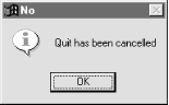
Figure 7-9. dlg1 showerror dialog
This all makes for a lot of window pop-ups, of course, and you need to be careful not to rely on these dialogs too much (it's generally better to use input fields in long-lived windows, than to distract the user with pop-ups). But where appropriate, such pop-ups save coding time and provide a nice native look-and-feel.
7.4.1.1 A "smart" and reusable quit button
Let's put some of these canned dialogs to better use. Example 7-7 implements an attachable Quit button that uses standard dialogs to verify the quit request. Because it's a class, it can be attached and reused in any application that needs a verifying Quit button. Because it uses standard dialogs, it looks as it should on each GUI platform.
Example 7-7. PP2E\Gui\Tour\quitter.py
#############################################
# a quit button that verifies exit requests;
# to reuse, attach an instance to other guis
#############################################
from Tkinter import * # get widget classesfrom tkMessageBox import askokcancel # get canned std dialogclass Quitter(Frame): # subclass our GUIdef __init__(self, parent=None): # constructor method
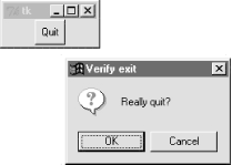
Frame.__init__(self, parent) self.pack() widget = Button(self, text='Quit', command=self.quit) widget.pack(side=LEFT) def quit(self): ans = askokcancel('Verify exit', "Really quit?") if ans: Frame.quit(self)if __name__ == '__main__': Quitter().mainloop()
This module is mostly meant to be used elsewhere, but puts up the button it implements when run standalone. Figure 7-10 shows the Quit button itself in the upper left, and the askokcancel verification dialog popped up when Quit is pressed.
Figure 7-10. Quitter, with askokcancel dialog
If you press OK here, Quitter runs the Frame quit method to end the GUI to which this button is attached (really, the mainloop call). But to really understand how such a spring-loaded button can be useful, we need to move on to study a client GUI in the next section.
7.4.1.2 A dialog demo launcher bar
So far, we've seen a handful of standard dialogs, but there quite a few more. But rather than just throwing these up in dull screen shots, let's write a Python demo script to generate them on demand. Here's one way to do it. First of all, in Example 7-8 we write a module to define a table that maps a demo name to a standard dialog call (and use lambda to wrap the call if we need to pass extra arguments to the dialog function).
Example 7-8. PP2E\Gui\Tour\dialogTable.py
# define a name:callback demos table
from tkFileDialog import askopenfilename # get standard dialogs
from tkColorChooser import askcolor # they live in Lib/lib-tkfrom tkMessageBox import askquestion, showerrorfrom tkSimpleDialog import askfloat
demos = {'Open': askopenfilename,
'Color': askcolor, 'Query': lambda: askquestion('Warning', 'You typed "rm *"\nConfirm?'), 'Error': lambda: showerror('Error!', "He's dead, Jim"), 'Input': lambda: askfloat('Entry', 'Enter credit card number')}
I put this table in a module so that it might be reused as the basis of other demo scripts later (dialogs are more fun than printing to stdout). Next, we'll write a Python script, Example 7-9, that simply generates buttons for all of this table's entries -- use its keys as button labels, and its values as button callback handlers.
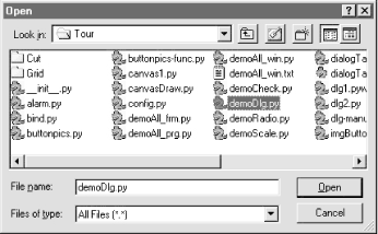
Example 7-9. PP2E\Gui\Tour\demoDlg.py
from Tkinter import * # get base widget setfrom dialogTable import demos # button callback handlersfrom quitter import Quitter # attach a quit object to meclass Demo(Frame):
def __init__(self, parent=None): Frame.__init__(self, parent) self.pack() Label(self, text="Basic demos").pack() for (key, value) in demos.items():Button(self, text=key, command=value).pack(side=TOP, fill=BOTH)
Quitter(self).pack(side=TOP, fill=BOTH) if __name__ == '__main__': Demo().mainloop()
This script creates the window shown in Figure 7-11 when run as a standalone program; it's a bar of demo buttons, that simply route control back to the values of the table in module dialogTable when pressed.
Figure 7-11. demoDlg main window
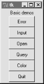
Notice that because this script is driven by the contents of the dialogTable module's dictionary, we can change the set of demo buttons displayed by changing just dialogTable (we don't need to change any executable code in demoDlg). Also note that the Quit button here is an attached instance of the Quitter class of the prior section -- it's at least one bit of code that you never have to write again.
We've already seen some of the dialogs triggered by this demo bar window's other buttons, so I'll just step through the new ones here. Pressing the main window's Query button, for example, generates the standard pop-up in Figure 7-12.
Figure 7-12. demoDlg query, askquestion dialog
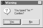
This askquestion dialog looks like the askyesno we saw earlier, but actually returns either string "yes" or "no" (askyesno and askokcancel return 1 or 0, true or false). Pressing the demo bar's Input button generates the standard askfloat dialog box shown in Figure 7-13.
Figure 7-13. demoDlg input, askfloat dialog
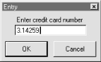
This dialog automatically checks the input for valid floating-point syntax before it returns, and is representative of a collection of single-value input dialogs (askinteger and askstring prompt for integer and string inputs too). It returns the input as a floating-point number object (not a string) on the OK button and enter key presses, or the Python None object if the user clicks Cancel. Its two relatives return the input as integer and string objects instead.
When the demo bar's Open button is pressed, we get the standard file open dialog made by calling askopenfilename, and captured in Figure 7-14. This is Windows look-and-feel; it looks radically different on Linux, but appropriately so.
Figure 7-14. demoDlg open, askopenfilename dialog
A similar dialog for selecting a save-as filename is produced by calling asksaveasfilename (see the Text widget section under Section 8.4 in Chapter 8 for an example). Both file dialogs let the user navigate through the filesystem to select a subject filename, returned with its full directory pathname when Open is pressed; an empty string comes back if Cancel is pressed instead. Both also have additional protocols not demonstrated by this example:
· They can be passed a filetypes keyword argument -- a set of name patterns used to select files, that appear in the "Files of type" pulldown at the bottom of the dialog.
· They can be passed an initialdir (start directory), initialfile (for "File name"), title (for the dialog window), defaultextension (appended if the selection has none), and parent (to appear as an embedded child, instead of a pop-up dialog).
· They can be made to remember the last directory selected, by using exported objects instead of these function calls.
We'll use most of these interfaces later in the book, especially for the file dialogs in the PyEdit example in Chapter 9 (but feel free to flip ahead for more details now). Finally, the demo bar's Color button triggers a standard askcolor call, which generates the standard color selection dialog shown in Figure 7-15.
Figure 7-15. demoDlg color, askcolor dialog
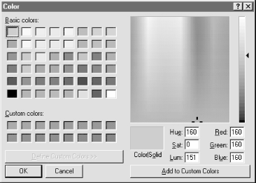
If you press its OK button it returns a data structure the identifies the selected color, which can be used in all color contexts in Tkinter. It includes RGB values and a hexadecimal color string (e.g., ((160, 160, 160), '#a0a0a0')). More on how this tuple can be useful in a moment. If you press Cancel, the script gets back a tuple containing two nones (Nones of the Python variety, that is).
7.4.1.3 Printing dialog results (and passing callback data with lambdas)
The dialog demo launcher bar displays standard dialogs, and can be made to display others by simply changing the dialogTable module it imports. As coded, though, it really only shows dialogs; it would also be nice to see their return values so we know how to use them in scripts. Example 7-10 adds printing of standard dialog results to the stdout standard output stream.
Example 7-10. PP2E\Gui\Tour\demoDlg-print.py
####################################################
# same, but show returns values of dialog calls;
# the lambda saves data from the local scope to be
# passed to the handler (button handlers normally
# get no args) and works like this def statement:
# def func(self=self, name=key): self.printit(name)
####################################################
from Tkinter import * # get base widget setfrom dialogTable import demos # button callback handlersfrom quitter import Quitter # attach a quit object to meclass Demo(Frame):
def __init__(self, parent=None): Frame.__init__(self, parent) self.pack() Label(self, text="Basic demos").pack() for (key, value) in demos.items():func = (lambda self=self, name=key: self.printit(name))
Button(self, text=key, command=func).pack(side=TOP, fill=BOTH) Quitter(self).pack(side=TOP, fill=BOTH) def printit(self, name): print name, 'returns =>', demos[name]() # fetch, call, print
if __name__ == '__main__': Demo().mainloop()
This script builds the same main button-bar window, but notice that the callback handler is an anonymous function made with a lambda now, not a direct reference to dialog calls in the imported dialogTable dictionary:
func = (lambda self=self, name=key: self.printit(name))
This is the first time we've actually used lambda like this, so let's get the facts straight. Because button press callbacks are run with no arguments, if we need to pass extra data to the handler it must be wrapped in an object that remembers that extra data and passes it along. Here, a button press runs the function generated by the lambda -- an indirect call layer that retains information from the enclosing scope by assigning it to default arguments. The net effect is that the real handler, printit, receives an extra name argument giving the demo associated with the button pressed, even though this argument wasn't passed back from Tkinter itself.
Notice, though, that this lambda assigns both self and key to defaults, to retain them for use on callbacks. Like all functions, lambda results only have access to their local scope, the enclosing global module scope, and the built-in names scope -- not the local scope of the method function that created them, and that is where name self really lives. Because bound methods remember both a self object and a method function, this lambda could also be written like this:
func = (lambda handler=self.printit, name=key: handler(name))
You can also use a callable class object here that retains state as instance attributes (see the tutorial's __call__ example in Chapter 6 for hints). But as a rule of thumb, if you want a lambda's result to use any names from the enclosing scope when later called, simply pass them in as defaults.
When run, this script prints dialog return values; here is the output after clicking all the demos buttons in the main window, and picking both Cancel/No and OK/Yes buttons in each dialog:
C:\...\PP2E\Gui\Tour>python demoDlg-print.py
Error returns => ok
Input returns => None
Input returns => 3.14159
Open returns =>
Open returns => C:/PP2ndEd/examples/PP2E/Gui/Tour/demoDlg-print.py
Query returns => no
Query returns => yes
Color returns => (None, None)
Color returns => ((160, 160, 160), '#a0a0a0')
Now that I've shown you these dialog results, I want to next show you how one of them can actually be useful.
7.4.1.4 Letting users select colors on the fly
The standard color selection dialog isn't just another pretty face -- scripts can pass the hexadecimal color string it returns to the bg and fg widget color configuration options we met earlier. That is, bg and fg accept both a color name (e.g., "blue") and an askcolor result strings that starts with a # (e.g., the #a0a0a0 in the last output line of the prior section).
This adds another dimension of customization to Tkinter GUIs: Rather than hard-coding colors in your GUI products, you can provide a button that pops up color selectors that let users choose color preferences on the fly. Simply pass the color string to widget config methods in callback handlers, as in Example 7-11.
Example 7-11. PP2E\Gui\Tour\setcolor.py
from Tkinter import *
from tkColorChooser import askcolor
def setBgColor():
(triple, hexstr) = askcolor() if hexstr: print hexstr push.config(bg=hexstr)root = Tk()
push = Button(root, text='Set Background Color', command=setBgColor)
push.config(height=3, font=('times', 20, 'bold'))push.pack(expand=YES, fill=BOTH)
root.mainloop()
This script makes the window in Figure 7-16 when launched (its button's background is a sort of green, but you'll have to trust me on this). Pressing the button pops up the color selection dialog shown earlier; the color you pick in that dialog becomes the background color of this button after you press OK.
Figure 7-16. setcolor main window
Color strings are also printed to the stdout stream (the console window); run this on your computer to experiment with available color settings:
C:\...\PP2E\Gui\Tour>python setcolor.py
#c27cc5
#5fe28c
#69d8cd
7.4.1.5 Other standard dialog calls
We've seen most of the standard dialogs and will use these pop-ups in examples throughout the rest of this book. But for more details on other calls and options available, either consult other Tkinter documentation, or browse the source code of the modules used at the top of the dialogTable module; all are simple Python files installed in the lib-tk subdirectory of the Python source library on your machine. And keep this demo bar example filed away for future reference; we'll reuse it later in the tour when we meet other button-like widgets.
7.4.2 The Old-Style Dialog Module
In older Python code, you may see dialogs occasionally coded with the standard Dialog module. This is a bit dated now, and uses an X Windows look-and-feel; but just in case you run across such code in your Python maintenance excursions, Example 7-12 gives you a feel for the interface.
Example 7-12. PP2E\Gui\Tour\dlg-old.py
from Tkinter import *
from Dialog import Dialog
class OldDialogDemo(Frame):
def __init__(self, master=None): Frame.__init__(self, master)Pack.config(self) # same as self.pack()
Button(self, text='Pop1', command=self.dialog1).pack() Button(self, text='Pop2', command=self.dialog2).pack() def dialog1(self): ans = Dialog(self,title = 'Popup Fun!',
text = 'An example of a popup-dialog '
'box, using older "Dialog.py".',bitmap = 'questhead',
default = 0, strings = ('Yes', 'No', 'Cancel')) if ans.num == 0: self.dialog2() def dialog2(self):Dialog(self, title = 'HAL-9000',
text = "I'm afraid I can't let you do that, Dave...",
bitmap = 'hourglass',
default = 0, strings = ('spam', 'SPAM'))if __name__ == '__main__': OldDialogDemo().mainloop()
You supply Dialog a tuple of button labels and a message, and get back the index of the button pressed (the leftmost is index zero). Dialog windows are modal: the rest of the application's windows are disabled until the Dialog receives a response from the user. When you press the Pop2 button in the main window created by this script, the second dialog pops up, as shown in Figure 7-17.
Figure 7-17. Old-style dialog
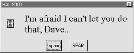
This is running on Windows, and as you can see, is nothing like what you would expect on that platform for a question dialog. In fact, this dialog generates an X Windows look-and-feel, regardless of the underlying platform. Because of both Dialog's appearance and the extra complexity required to program it, you are probably better off using the standard dialog calls of the prior section instead.
7.4.3 Custom Dialogs
The dialogs we've seen so far all have a standard appearance and interaction. They are fine for many purposes, but often we need something a bit more custom. For example, forms that request multiple field inputs (e.g., name, age, shoe size) aren't directly addressed by the common dialog library. We could pop-up one single-input dialog in turn for each requested field, but that isn't exactly user-friendly.
Custom dialogs support arbitrary interfaces, but they are also the most complicated to program. Even so, there's not much to it -- simply create a pop-up window as a Toplevel with attached widgets, and arrange a callback handler to fetch user inputs entered in the dialog (if any) and destroy the window. To make such a custom dialog modal, we also need to wait for a reply, by giving the window input focus, making other windows inactive, and waiting for an event. Example 7-13 illustrates the basics.
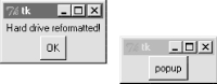
Example 7-13. PP2E\Gui\Tour\dlg-custom.py
import sys
from Tkinter import *
makemodal = (len(sys.argv) > 1)
def dialog():
win = Toplevel() # make a new window
Label(win, text='Hard drive reformatted!').pack() # add a few widgets
Button(win, text='OK', command=win.destroy).pack() # set destroy callback
if makemodal:win.focus_set() # take over input focus,
win.grab_set() # disable other windows while I'm open,
win.wait_window() # and wait here until win destroyed
print 'dialog exit' # else returns right away
root = Tk()
Button(root, text='popup', command=dialog).pack()
root.mainloop()
This script is set up to create a pop-up dialog window in either modal or nonmodal mode, depending on its makemodal global variable. If it is run with no command-line arguments, it picks nonmodal style, captured in Figure 7-18.
Figure 7-18. Nonmodal custom dialogs at work
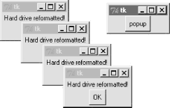
The window in the upper right is the root window here; pressing its "popup" button creates a new pop-up dialog window. Because dialogs are nonmodal in this mode, the root window remains active after a dialog is popped up. In fact, nonmodal dialogs never block other windows, so you can keep pressing the root's button to generate as many copies of the pop-up window as will fit on your screen. Any or all of the pop-ups can be killed by pressing their OK buttons, without killing other windows in this display.
7.4.3.1 Making custom dialogs modal
Now, when the script is run with a command-line argument (e.g., python dlg-custom.py 1), it makes its pop-ups modal instead. Because modal dialogs grab all of the interface's attention, the main window becomes inactive in this mode until the pop-up is killed; you can't even click on it to reactivate it while the dialog is open. Because of that, you can never make more than one copy of the pop-up on screen at once, as shown in Figure 7-19.
Figure 7-19. A modal custom dialog at work
In fact, the call to the dialog function in this script doesn't return until the dialog window on the left is dismissed by pressing its OK button. The net effect is that modal dialogs impose a function call-like model on an otherwise event-driven programming model -- user inputs can be processed right away, not in a callback handler triggered at some arbitrary point in the future.
Forcing such a linear control flow on a GUI takes a bit of extra work, though. The secret to locking other windows and waiting for a reply boils down to three lines of code, which are a general pattern repeated in most custom modal dialogs:
win.focus_set()
Makes the window take over the application's input focus, as if it had been clicked with the mouse to make it the active window. This method is also known by synonym focus, and it's also common to set the focus on an input widget within the dialog (e.g., an Entry) rather than the entire window.
win.grab_set()
Disables all other windows in the application until this one is destroyed. The user cannot interact with other windows in the program while a grab is set.
win.wait_window()
Pauses the caller until the win widget is destroyed, but keeps the main event-processing loop (mainloop) active during the pause. That means that the GUI at large remains active during the wait; its windows redraw themselves if covered and uncovered, for example. When the window is destroyed with the destroy method, it is erased from the screen, the application grab is automatically released, and this method call finally returns.
Because the script waits for a window destroy event, it must also arrange for a callback handler to destroy the window in response to interaction with widgets in the dialog window (the only window active). This example's dialog is simply informational, so its OK button calls the window's destroy method. In user-input dialogs, we might instead install an Enter key-press callback handler that fetches data typed into an Entry widget, and then calls destroy (see later in this chapter).
7.4.3.2 Other ways to be modal
Modal dialogs are typically implemented by waiting for a newly created pop-up window's destroy event, as in this example. But other schemes are viable too. For example, it's possible to create dialog windows ahead of time, and show and hide them as needed with the top-level window's deiconify and withdraw methods (see the alarm scripts in Chapter 8 under Section 8.7 for details). Given that window creation speed is generally fast enough as to appear instantaneous today, this is much less common than making and destroying a window from scratch on each interaction.
It's also possible to implement a modal state by waiting for a Tkinter variable to change its value, instead of waiting for a window to be destroyed. See this chapter's discussion of Tkinter variables (which are class objects, not normal Python variables) and the wait_variable method discussed near the end of Chapter 8 for more details. This scheme allows a long-lived dialog box's callback handler to signal a state change to a waiting main program, without having to destroy the dialog box.
Finally, if you call the mainloop method recursively, the call won't return until the widget quit method has been invoked. The quit method terminates a mainloop call, and so normally ends a GUI program. But it will simply exit a recursive mainloop level if one is active. Because of this, modal dialogs can also be written without wait method calls if you are careful. For instance, Example 7-14 works the same as dlg-custom.
Example 7-14. PP2E\Gui\Tour\dlg-recursive.py
from Tkinter import *
def dialog():
win = Toplevel() # make a new window
Label(win, text='Hard drive reformatted!').pack() # add a few widgets
Button(win, text='OK', command=win.quit).pack() # set quit callback
win.protocol('WM_DELETE_WINDOW', win.quit) # quit on wm close too!
win.focus_set() # take over input focus,
win.grab_set() # disable other windows while I'm open,
win.mainloop() # and start a nested event loop to wait
win.destroy() print 'dialog exit' root = Tk()
Button(root, text='popup', command=dialog).pack()
root.mainloop()
If you go this route, be sure to call quit instead of destroy in dialog callback handlers (destroy doesn't terminate the mainloop level), and be sure to use protocol to make the window border close button call quit too (or else it doesn't end the recursive mainloop level call, and will generate odd error messages when your program finally exits). Because of this extra complexity, you're probably better off using wait_window or wait_variable, not recursive mainloop calls.
We'll see how to build form-like dialogs with labels and input fields later in this chapter when we meet Entry, and again when we study the grid manager in Chapter 8. For more custom dialog examples, see ShellGui (Chapter 9), PyMailGui (Chapter 11), PyCalc (Chapter 18), and the nonmodal form.py (Chapter 10). Here, we're moving on to learn more about events that will prove to be useful currency at later tour destinations.
7.5 Binding Events
We met the bind widget method in the last chapter, when we used it to catch button presses in the tutorial. Because bind is commonly used in conjunction with other widgets (e.g., to catch return key presses for input boxes), we're going to make a stop early on the tour here as well. Example 7-15 illustrates more bind event protocols.
Example 7-15. PP2E\Gui\Tour\bind.py
from Tkinter import *
def showPosEvent(event):
print 'Widget=%s X=%s Y=%s' % (event.widget, event.x, event.y)def showAllEvent(event):
print event for attr in dir(event): print attr, '=>', getattr(event, attr) def onKeyPress(event):
print 'Got key press:', event.chardef onArrowKey(event):
print 'Got up arrow key press'def onReturnKey(event):
print 'Got return key press'def onLeftClick(event):
print 'Got left mouse button click:', showPosEvent(event)def onRightClick(event):
print 'Got right mouse button click:', showPosEvent(event)def onMiddleClick(event):
print 'Got middle mouse button click:', showPosEvent(event) showAllEvent(event)def onLeftDrag(event):
print 'Got left mouse button drag:', showPosEvent(event)def onDoubleLeftClick(event):
print 'Got double left mouse click', showPosEvent(event) tkroot.quit()tkroot = Tk()
labelfont = ('courier', 20, 'bold') # family, size, stylewidget = Label(tkroot, text='Hello bind world')
widget.config(bg='red', font=labelfont) # red background, large fontwidget.config(height=5, width=20) # initial size: lines,charswidget.pack(expand=YES, fill=BOTH)
widget.bind('<Button-1>', onLeftClick) # mouse button clickswidget.bind('<Button-3>', onRightClick)widget.bind('<Button-2>', onMiddleClick) # middle=both on some micewidget.bind('<Double-1>', onDoubleLeftClick) # click left twicewidget.bind('<B1-Motion>', onLeftDrag) # click left and movewidget.bind('<KeyPress>', onKeyPress) # all keyboard presseswidget.bind('<Up>', onArrowKey) # arrow button pressedwidget.bind('<Return>', onReturnKey) # return/enter key pressedwidget.focus() # or bind keypress to tkroottkroot.title('Click Me')tkroot.mainloop()
Most of this file consists of callback handler functions triggered when bound events occur. As we learned in Chapter 6, these callbacks all receive an event object argument that gives details about the event that fired. Technically, this argument is an instance of the Tkinter Event class, and its details are attributes; most of the callbacks simply trace events by displaying relevant event attributes.
When run, this script makes the window shown in Figure 7-20; it's mostly intended just as a surface for clicking and pressing event triggers.
Figure 7-20. A bind window for the clicking
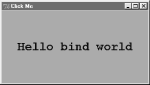
The black-and-white medium of the book you're holding won't really do justice to this script -- when run live, it uses the configuration options shown earlier to make the window show up as black on red, with a large Courier font. You'll have to take my word for it (or run this on your own).
But the main point of this example is to demonstrate other kinds of event binding protocols at work. We saw a script that intercepted left and double-left mouseclicks with the widget bind method earlier; the script here demonstrates other kinds of events that are commonly caught with bind:
<KeyPress>
To catch the press of a single key on the keyboard, register a handler for the <KeyPress> event identifier; this is a low-level way to input data in GUI programs than the Entry widget covered in the next section. The key pressed is returned in ASCII form in the event object passed to the callback handler (event.char). Other attributes in the event structure identify the key pressed in lower-level detail. Key presses can be intercepted by the top-level root window widget or a widget that has been assigned keyboard focus with the focus method used by this script.
<B1-Motion>
This script also catches mouse motion while a button is held down: the registered <B1-Motion> event handler is called every time the mouse is moved while the left button is pressed, and receives the current X/Y coordinates of the mouse pointer in its event argument (event.x, event.y). Such information can be used to implement object moves, drag-and-drop, pixel-level painting, and so on (e.g., see the PyDraw examples in Chapter 9).
<Button-3> , <Button-2>
This script also catches right and middle mouse button clicks (known as buttons 3 and 2). To make the middle button 2 click work on a two-button mouse, try clicking both buttons at the same time; if that doesn't work, check your mouse setting in your properties interface (Control Panel on Windows).
<Return> , <Up>
To catch more specific kinds of key presses, this script registers for the Return/Enter and up-arrow key press events; these events would otherwise be routed to the general <KeyPress> handler, and require event analysis.
Here is what shows up in the stdout output stream, after a left click, right click, left click and drag, a few key presses, a Return and up-arrow press, and a final double-left click to exit. When you press the left mouse button and drag it around on the display, you'll get lots of drag event messages -- one is printed for every move during the drag (and one Python callback is run for each):
C:\...\PP2E\Gui\Tour>python bind.py
Got left mouse button click: Widget=.7871632 X=209 Y=79
Got right mouse button click: Widget=.7871632 X=209 Y=79
Got left mouse button click: Widget=.7871632 X=83 Y=63
Got left mouse button drag: Widget=.7871632 X=83 Y=65
Got left mouse button drag: Widget=.7871632 X=84 Y=66
Got left mouse button drag: Widget=.7871632 X=85 Y=66
Got left mouse button drag: Widget=.7871632 X=85 Y=67
Got left mouse button drag: Widget=.7871632 X=85 Y=68
Got key press: s
Got key press: p
Got key press: a
Got key press: m
Got key press: 1
Got key press: -
Got key press: 2
Got key press: .
Got return key press
Got up arrow key press
Got left mouse button click: Widget=.7871632 X=85 Y=68
Got double left mouse click Widget=.7871632 X=85 Y=68
For mouse-related events, callbacks print the X and Y coordinates of the mouse pointer, in the event object passed in. Coordinates are usually measured in pixels from the upper-left corner (0,0), but are relative to the widget being clicked. Here's what is printed for a left, middle, and double-left click. Notice that the middle-click callback dumps the entire argument -- all of the Event object's attributes. Different event types set different event attributes; most key presses put something in char, for instance:
C:\...\PP2E\Gui\Tour>python bind.py
Got left mouse button click: Widget=.7871632 X=163 Y=18
Got middle mouse button click: Widget=.7871632 X=152 Y=110
<Tkinter.Event instance at 7b3640>
char => ??
height => 0
keycode => 2
keysym => ??
keysym_num => 2
num => 2
send_event => 0
serial => 14
state => 0
time => 5726238
type => 4
widget => .7871632
width => 0
x => 152
x_root => 156
y => 110
y_root => 133
Got left mouse button click: Widget=.7871632 X=152 Y=110
Got double left mouse click Widget=.7871632 X=152 Y=110
Besides the ones illustrated in this example, there are additional kinds of bindable events that a Tkinter script can register to catch. For example:
· <ButtonRelease> fires when a button is released (<ButtonPress> is run when the button first goes down).
· <Motion> is triggered when a mouse pointer is moved.
· <Enter> and <Leave> handlers intercept mouse entry and exit in a window's display area (useful for automatically highlighting a widget).
· <Configure> is invoked when the window is resized, repositioned, and so on (e.g., the event object's width and height give the new window size).
· <Destroy> is invoked when the window widget is destroyed (and differs from the protocol mechanism for window manager close button presses).
· <FocusIn> and <FocusOut> are run as the widget gains and loses focus.
· <Map> and <Unmap> are run when a window is opened and iconified.
· <Escape>, <BackSpace>, and <Tab> catch other special key presses.
· <Down>, <Left>, and <Right> catch other arrow key presses.
This is not a complete list, and event names can be written with a somewhat sophisticated syntax all their own. For example:
· Modifiers can be added to event identifiers to make them even more specific; for instance, <B1-Motion> means moving the mouse with the left button pressed, and <KeyPress-a> refers to pressing the "a" key only.
· Synonyms can be used for some common event names; for instance, <ButtonPress-1>, <Button-1>, and <1> all mean a left mouse button press, and <KeyPress-a> and <Key-a> both mean the "a" key. All forms are case-sensitive : use <Key-Escape>, not <KEY-ESCAPE>.
· Virtual event identifiers can be defined within double bracket pairs (e.g., <<PasteText>>) to refer to a selection of one or more event sequences.
In the interest of space, though, we'll defer to other Tk and Tkinter reference sources for an exhaustive list of details on this front. Alternatively, changing some of the settings in the example script and rerunning can help clarify some event behavior too; this is Python, after all.
7.6 Message and Entry
The Message and Entry widgets allow for display and input of simple text. Both are essentially functional subsets of the Text widget we'll meet later -- Text can do everything Message and Entry can, but not vice versa.
7.6.1 Message
The Message widget is simply a place to display text. Although the standard showinfo dialog we met earlier is perhaps a better way to display pop-up messages, Message splits up long strings automatically and flexibly, and can be embedded inside container widgets anytime you need to add some read-only text to a display. Moreover, this widget sports over a dozen configuration options that let you customize its appearance. Example 7-16 and Figure 7-21 illustrate Message basics; see a Tk or Tkinter reference for other options it supports.
Example 7-16. PP2E\Gui\tour\message.py
from Tkinter import *
msg = Message(text="Oh by the way, which one's Pink?")
msg.config(bg='pink', font=('times', 16, 'italic'))msg.pack()
mainloop()
Figure 7-21. A Message widget at work

7.6.2 Entry
The Entry widget is a simple, single-line text input field. It is typically used for input fields in form-like dialogs, and anywhere else you need the user to type a value into a field of a larger display. Entry also supports advanced concepts such as scrolling, key bindings for editing, and text selections, but it's simple to use in practice. Example 7-17 builds the input window shown in Figure 7-22.
Example 7-17. PP2E\Gui\tour\entry1.py
from Tkinter import *
from quitter import Quitter
def fetch():
print 'Input => "%s"' % ent.get() # get text
root = Tk()
ent = Entry(root)
ent.insert(0, 'Type words here') # set textent.pack(side=TOP, fill=X) # grow horizent.focus() # save a clickent.bind('<Return>', (lambda event: fetch())) # on enter keybtn = Button(root, text='Fetch', command=fetch) # and on button btn.pack(side=LEFT)
Quitter(root).pack(side=RIGHT)
root.mainloop()
Figure 7-22. entry1 caught in the act
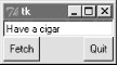
On startup, the entry1 script fills the input field in this GUI with the text "Type words here" by calling the widget's insert method. Because both the Fetch button and the Enter key are set to trigger the script's fetch callback function, either user event gets and displays the current text in the input field, using the widget's get method:
C:\...\PP2E\Gui\Tour>python entry1.py
Input => "Type words here"
Input => "Have a cigar"
We met the <Return> event earlier when we studied bind; unlike button presses, these lower-level callbacks get an event argument, so the script uses a lambda wrapper to ignore it. This script also packs the entry field with fill=X to make it expand horizontally with the window (try it out), and calls the widget focus method to give the entry field input focus when the window first appears. Manually setting the focus like this saves the user from having to click the input field before typing.
7.6.2.1 Programming Entry widgets
Generally speaking, the values typed into and displayed by Entry widgets are set and fetched with either tied "variable" objects (described later in this chapter), or with Entry widget method calls like this:
ent.insert(0, 'some text') # set valuevalue = ent.get() # fetch value (a string)
The first parameter to the insert method gives the position where the text is to be inserted. Here, "0" means the front because offsets start at zero, and integer 0 and string '0' mean the same thing (Tkinter method arguments are always converted to strings if needed). If the Entry widget might already contain text, you also generally need to delete its contents before setting it to a new value, or else new text will be simply added to the text already present:
ent.delete(0, END) # first, delete from start to endent.insert(0, 'some text') # then set value
The name END here is a preassigned Tkinter constant denoting the end of the widget; we'll revisit it in Chapter 8 when we meet the full-blown and multiple-line Text widget (Entry's more powerful cousin). Since the widget is empty after the deletion, this statement sequence is equivalent to the prior:
ent.delete('0', END) # delete from start to endent.insert(END, 'some text') # add at end of empty text
Either way, if you don't delete the text first, new text inserted is simply added. If you want to see how, try changing the fetch function to look like this -- an "x" is added at the front and end of the input field on each button or key press:
def fetch():
print 'Input => "%s"' % ent.get() # get text
ent.insert(END, 'x') # to clear: ent.delete('0', END)
ent.insert(0, 'x') # new text simply added
In later examples, we'll also see the Entry widget's state='disabled' option, which makes it read-only, as well as its show='*' option, which makes it display each character as a * (useful for password-type inputs). Try this out on your own by changing and running this script, for a quick look. Entry supports other options we'll skip here too; see later examples and other resources for additional details.
7.6.2.2 Laying out input forms
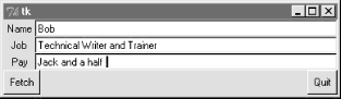
As mentioned, Entry widgets are often used to get field values in form-like displays. We're going to create such displays often in this book, but to show you how this works in simpler terms, Example 7-18 combines labels and entries to achieve the multiple-input display captured in Figure 7-23.
Example 7-18. PP2E\Gui\Tour\entry2.py
# use Entry widgets directly and layout by rows
from Tkinter import *
from quitter import Quitter
fields = 'Name', 'Job', 'Pay'
def fetch(entries):
for entry in entries:print 'Input => "%s"' % entry.get() # get text
def makeform(root, fields):
entries = [] for field in fields:row = Frame(root) # make a new row
lab = Label(row, width=5, text=field) # add label, entry
ent = Entry(row)row.pack(side=TOP, fill=X) # pack row on top
lab.pack(side=LEFT)ent.pack(side=RIGHT, expand=YES, fill=X) # grow horizontal
entries.append(ent) return entriesif __name__ == '__main__':
root = Tk() ents = makeform(root, fields)root.bind('<Return>', (lambda event, e=ents: fetch(e)))
Button(root, text='Fetch', command=(lambda e=ents: fetch(e))).pack(side=LEFT) Quitter(root).pack(side=RIGHT) root.mainloop()
Figure 7-23. entry2 (and entry3) form displays
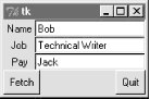
The input fields here are just simple Entry widgets. The script builds an explicit list of these widgets to be used to fetch their values later. Every time you press this window's Fetch button, it grabs the current values in all the input fields and prints them to the standard output stream:
C:\...\PP2E\Gui\Tour>python entry2.py
Input => "Bob"
Input => "Technical Writer"
Input => "Jack"
You get the same field dump if you press the Enter key any time this window has the focus on your screen -- this event has been bound to the whole root window this time, not to a single input field.
Most of the art in form layout has to do with arranging widgets in a hierarchy. This script builds each label/entry row as a new Frame attached to the window's current TOP; labels are attached to the LEFT of their row, and entries to its RIGHT. Because each row is a distinct Frame, its contents are insulated from other packing going on in this window. The script also arranges for just the entry fields to grow vertically on a resize, as in Figure 7-24.
Figure 7-24. entry2 (and entry3) expansion at work
7.6.2.3 Going modal again
Later on this tour, we'll see how to make similar form layouts with the grid geometry manager too. But now that we have a handle on form layout, let's see how to apply the modal dialog techniques we met earlier to a more complex input display like this.
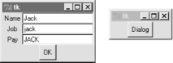
Example 7-19 uses the prior's makeform and fetch functions to generate a form and prints its contents much as before. Here, though, the input fields are attached to a new Toplevel pop-up window created on demand, and an OK button is added to the pop-up window to trigger a window destroy event. As we learned earlier, the wait_window call pauses until the destroy happens.
Example 7-19. PP2E\Gui\Tour\entry2-modal.py
# must fetch before destroy with entries
from Tkinter import *
from entry2 import makeform, fetch, fields
def show(entries):
fetch(entries) # must fetch before window destroyed!
popup.destroy() # fails with msgs if stmt order is reversed
def ask():
global popuppopup = Toplevel() # show form in modal dialog window
ents = makeform(popup, fields) Button(popup, text='OK', command=(lambda e=ents: show(e)) ).pack() popup.grab_set() popup.focus_set()popup.wait_window() # wait for destroy here
root = Tk()
Button(root, text='Dialog', command=ask).pack()
root.mainloop()
When run, pressing the button in this program's main window creates the blocking form input dialog in Figure 7-25, as expected.
Figure 7-25. entry2-modal (and entry3-modal) displays
But there is a subtle danger lurking in this modal dialog code: because it fetches user inputs from Entry widgets embedded in the popped-up display, it must fetch those inputs before destroying the pop-up window in the OK press callback handler. It turns out that a destroy call really does destroy all the child widgets of the window destroyed; trying to fetch values from a destroyed Entry not only doesn't work, but generates a host of error messages in the console window -- try reversing the statement order in the show function to see for yourself.
To avoid this problem, we can either be careful to fetch before destroying, or we can use Tkinter variables, the subject of the next section.
7.6.2.4 Tkinter "variables"
Entry widgets (among others) support the notion of an associated variable; changing the associated variable changes the text displayed in the Entry, and changing the text in the Entry changes the value of the variable. These aren't normal Python variable names, though -- variables tied to widgets are instances of variable classes in the Tkinter module library. These classes are named StringVar, IntVar, DoubleVar, and BooleanVar; you pick one based on the context in which it is to be used. For example, a StringVar class instance can be associated with an Entry field, as demonstrated by Example 7-20.
Example 7-20. PP2E\Gui\Tour\entry3.py
# use StringVar variables and layout by columns
from Tkinter import *
from quitter import Quitter
fields = 'Name', 'Job', 'Pay'
def fetch(variables):
for variable in variables:print 'Input => "%s"' % variable.get() # get from var
def makeform(root, fields):
form = Frame(root) # make outer frame
left = Frame(form) # make two columns
rite = Frame(form) form.pack(fill=X) left.pack(side=LEFT)rite.pack(side=RIGHT, expand=YES, fill=X) # grow horizontal
variables = [] for field in fields:lab = Label(left, width=5, text=field) # add to columns
ent = Entry(rite) lab.pack(side=TOP)ent.pack(side=TOP, fill=X) # grow horizontal
var = StringVar()ent.config(textvariable=var) # link field to var
var.set('enter here') variables.append(var) return variablesif __name__ == '__main__':
root = Tk() vars = makeform(root, fields) Button(root, text='Fetch', command=(lambda v=vars: fetch(v))).pack(side=LEFT) Quitter(root).pack(side=RIGHT)root.bind('<Return>', (lambda event, v=vars: fetch(v)))
root.mainloop()
Except for the fact that this script initializes input fields with the string "enter here", it makes a window identical in appearance and function to that created by script entry2 (see Figure 7-23). For illustration purposes, the window is laid out differently -- as a Frame containing two nested subframes used to build the left and right columns of the form area -- but the end result is the same when displayed on screen.
The main thing to notice here, though, is the use of StringVar variables. Rather than use a list of Entry widgets to fetch input values, this version keeps a list of StringVar objects that have been associated with the Entry widgets like this:
ent = Entry(rite)
var = StringVar()
ent.config(textvariable=var) # link field to var
Once you've tied variables like this, changing and fetching the variable's value:
var.set('text here')value = var.get()
will really change and fetch the corresponding display's input field value.[1] The variable object get method returns as a string for StringVar, an integer for IntVar, and a floating-point number for DoubleVar.
Of course, we've already seen that it's easy to set and fetch text in Entry fields directly, without adding extra code to use variables. So why the bother about variable objects? For one thing, it clears up that nasty fetch-after-destroy peril we met in the prior section. Because StringVars live on after the Entry widgets they are tied to have been destroyed, it's okay to fetch input values from them long after a modal dialog has been dismissed, as shown in Example 7-21.
Example 7-21. PP2E\Gui\Tour\entry3-modal.py
# can fetch values after destroy with stringvars
from Tkinter import *
from entry3 import makeform, fetch, fields
def show(variables):
popup.destroy() # order doesn't matter here
fetch(variables) # variables live on after window destroyed
def ask():
global popuppopup = Toplevel() # show form in modal dialog window
vars = makeform(popup, fields) Button(popup, text='OK', command=(lambda v=vars: show(v)) ).pack() popup.grab_set() popup.focus_set()popup.wait_window() # wait for destroy here
root = Tk()
Button(root, text='Dialog', command=ask).pack()
root.mainloop()
This version is the same as the original (shown in Example 7-19 and Figure 7-25), but show now destroys the pop-up before inputs are fetched through StringVars in the list created by makeform. In other words, variables are a bit more robust in some contexts because they are not part of a real display tree. For example, they are also associated with checkboxes, radioboxes, and scales, to provide access to current settings and link multiple widgets together. Almost coincidentally, that's the topic of the next section.
7.7 Checkbutton, Radiobutton, and Scale
This section introduces three widget types -- the Checkbutton (a multiple-choice input widget), the Radionbutton (a single-choice device), and the Scale (sometimes known as a "slider"). All are variations on a theme, and somewhat related to simple buttons, so we'll explore them as a group here. To make these widgets more fun to play with, we'll reuse the dialogTable module shown in Example 7-8 to provide callbacks for widget selections (callbacks pop up dialog boxes). Along the way, we'll also use the Tkinter variables we just met to communicate with these widgets' state settings.
7.7.1 Checkbuttons
The Checkbutton and Radiobutton widgets are designed to be associated with Tkinter variables: pushing the button changes the value of the variable, and setting the variable changes the state of the button it is linked to. In fact, Tkinter variables are central to the operation of these widgets:
· A collection of checkbuttons implements a multiple-choice interface, by assigning each button a variable of its own.
· A collection of radiobuttons imposes a mutually exclusive single-choice model, by giving each button a unique value and the same Tkinter variable.
Both kinds of buttons provide both command and variable options. The command option lets you register a callback to be run immediately on button-press events, much like normal Button widgets. But by associating a Tkinter variable with the variable option, you can also fetch or change widget state at any time, by fetching or changing the value of the widget's associated variable.
Since it's a bit simpler, let's start with the Tkinter checkbutton. Example 7-22 creates the set of five, captured in Figure 7-26. To make this more useful, it also adds a button that dumps the current state of all checkbuttons, and attaches an instance of the Quitter button we built earlier in the tour.
Example 7-22. PP2E\Gui\Tour\demoCheck.py
from Tkinter import * # get base widget setfrom dialogTable import demos # get canned dialogsfrom quitter import Quitter # attach a quitter object to "me"class Demo(Frame):
def __init__(self, parent=None, **args): Frame.__init__(self, parent, args) self.pack() self.tools() Label(self, text="Check demos").pack() self.vars = [] for key in demos.keys():var = IntVar()
Checkbutton(self, text=key, variable=var, command=demos[key]).pack(side=LEFT) self.vars.append(var) def report(self): for var in self.vars:print var.get(), # current toggle settings: 1 or 0
print def tools(self): frm = Frame(self) frm.pack(side=RIGHT) Button(frm, text='State', command=self.report).pack(fill=X) Quitter(frm).pack(fill=X)if __name__ == '__main__': Demo().mainloop()
Figure 7-26. demoCheck in action
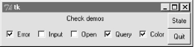
In terms of program code, checkbuttons resemble normal buttons; they are even packed within a container widget. Operationally, though, they are a bit different. As you can probably tell from this figure (and can better tell by running this live), a checkbutton works as a toggle -- pressing one changes its state from off to on (deselected to selected); or from on to off again. When a checkbox is selected, it has a checked display, and its associated IntVar variable has a value of 1; when deselected, its display is empty, and its IntVar has value 0.
To simulate an enclosing application, the State button in this display triggers the script's report method to display the current values of all five toggles on the stdout stream. Here is the output after a few pushes:
C:\...\PP2E\Gui\Tour>python demoCheck.py
0 0 0 0 0
1 0 0 0 0
1 0 1 0 0
1 0 1 1 0
1 0 0 1 0
1 0 0 1 1
Really, these are the values of the five Tkinter variables associated with the checkbuttons with variable options, but they give the buttons' values when queried. This script associates Intvar variables with each of checkbuttons in this display, since they are or 1 binary indicators. StringVars will work here too, although their get methods would return strings "0" or "1" (not integers), and their initial state is an empty string (not the integer 0).
This widget's command option lets you register a callback to be run each time the button is pressed. To illustrate, this script registers a standard dialog demo call as a handler for each of the checkbuttons: pressing a button changes the toggle's state, but also pops up one of the dialog windows we visited earlier on this tour.
Interestingly, you can run the report method interactively too. When working this way, widgets pop up as lines are typed and are fully active even without calling mainloop:
C:\...\PP2E\Gui\Tour>python
>>> from demoCheck import Demo
>>> d = Demo()
>>> d.report()
0 0 0 0 0
>>> d.report()
1 0 0 0 0
>>> d.report()
1 0 0 1 1
7.7.1.1 Checkbuttons and variables
When I first studied this widget, my initial reaction was: So why do we need Tkinter variables here at all when we can register button-press callbacks? Linked variables may seem superfluous at first glance, but they simplify some GUI chores. Rather than asking you to accept this blindly, though, let me explain why.
Keep in mind that a checkbuttons's command callback will be run on every press -- whether the press toggles the checkbutton to a selected or deselected state. Because of that, if you want to run an action immediately when a checkbutton is pressed, you will generally want to check the button's current value in the callback handler. Because there is no checkbutton "get" method for fetching values, you usually need to interrogate an associated variable to see if the button is on or off.
Moreover, some GUIs simply let users set checkbuttons without running command callbacks at all, and fetch button settings at some later point in the program. In such a scenario, variables serve to automatically keep track of button settings. The demoCheck script's report method is representative of this latter approach.
Of course, you could manually keep track of each button's state in press callback handlers too. Example 7-23 keeps its own list of state toggles, and updates it manually on command press callbacks.
Example 7-23. PP2E\Gui\Tour\demo-check-manual.py
# check buttons, the hard way (without variables)
from Tkinter import * states = []
def onPress(i): # keep track of statesstates[i] = not states[i] # changes 0->1, 1->0
root = Tk()
for i in range(10):
chk = Checkbutton(root, text=str(i), command=(lambda i=i: onPress(i)) ) chk.pack(side=LEFT) states.append(0)root.mainloop()
print states # show all states on exit
The lambda here passes along the pressed button's index in the states list (or else we would need a separate callback function for each button). When run, this script makes the 10-checkbutton display in Figure 7-27.
Figure 7-27. Manual checkbutton state window
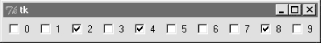
Manually maintained state toggles are updated on every button press, and are printed when the GUI exits (technically, when the mainloop call returns):
C:\...\PP2E\Gui\Tour>python demo-check-manual.py
[0, 0, 1, 0, 1, 0, 0, 0, 1, 0]
This works, and isn't too horribly difficult to manage manually. But linked Tkinter variables make this task noticeably easier, especially if you don't need to process checkbutton states until some time in the future. This is illustrated in Example 7-24.
Example 7-24. PP2E\Gui\Tour\demo-check-auto.py
# check buttons, the easy way
from Tkinter import * root = Tk()
states = [] for i in range(10):
var = IntVar() chk = Checkbutton(root, text=str(i), variable=var) chk.pack(side=LEFT) states.append(var)root.mainloop() # let Tkinter keep trackprint map((lambda var: var.get()), states) # show all states on exit
This looks and works the same, but there is no command button-press callback handler at all, because toggle state is tracked by Tkinter automatically:
C:\...\PP2E\Gui\Tour>python demo-check-auto.py
[0, 0, 1, 0, 0, 0, 1, 0, 0, 0]
The point here is that you don't necessarily have to link variables with checkbuttons, but your GUI life will be simpler if you do.
7.7.2 Radiobuttons
Radiobuttons are toggles too, but they are generally used in groups: just like the mechanical station selector pushbuttons on radios of times gone by, pressing one Radiobutton widget in a group automatically deselects the one pressed last. In other words, at most one can be selected at once. In Tkinter, associating all radiobuttons in a group with unique values and the same variable guarantees that at most one can ever be selected at a given time.
Like checkbuttons and normal buttons, radiobuttons support a command option for registering a callback to handle presses immediately. Like checkbuttons, radiobuttons also have a variable attribute for associating single-selection buttons in a group and fetching the current selection at arbitrary times.
In addition, radiobuttons have a value attribute that lets you tell Tkinter what value the button's associated variable should have when the button is selected. Because more than one radiobutton is associated with the same variable, you need to be explicit about each button's value (it's not just a 1 or toggle scenario). Example 7-25 demonstrates radiobutton basics.
Example 7-25. PP2E\Gui\Tour\demoRadio.py
from Tkinter import * # get base widget setfrom dialogTable import demos # button callback handlersfrom quitter import Quitter # attach a quit object to "me"
class Demo(Frame):
def __init__(self, parent=None): Frame.__init__(self, parent) self.pack() Label(self, text="Radio demos").pack(side=TOP) self.var = StringVar() for (key, value) in demos.items(): Radiobutton(self, text=key, command=self.onPress, variable=self.var, value=key).pack(anchor=NW) Button(self, text='State', command=self.report).pack(fill=X) Quitter(self).pack(fill=X) def onPress(self): pick = self.var.get() print 'you pressed', pick print 'result:', demos[pick]() def report(self): print self.var.get()if __name__ == '__main__': Demo().mainloop()
Figure 7-28 shows what this script generates when run. Pressing any of this window's radiobuttons triggers its command handler, pops up one of the standard dialog boxes we met earlier, and automatically deselects the button previously pressed. Like checkbuttons, radiobuttons are packed; this script packs them to the the top to arrange vertically, and then anchors each on the northwest corner of its allocated space so that they align well.
Figure 7-28. demoRadio in action
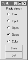
Like the checkbutton demo script, this one also puts up a State button to run the class's report method, and show the current radio state (the button selected). Unlike the checkbutton demo, this script also prints the return values of dialog demo calls run as its buttons are pressed. Here is what the stdout stream looks like after a few presses and state dumps; states are shown in bold:
C:\...\PP2E\Gui\Tour>python demoRadio.py
you pressed Input
result: 3.14
Input
you pressed Open
result: C:/PP2ndEd/examples/PP2E/Gui/Tour/demoRadio.py
Open
you pressed Query
result: yes
Query
7.7.2.1 Radiobuttons and variables
So why variables here? For one thing, radiobuttons also have no "get" widget method to fetch the selection in the future. More importantly, in radiobutton groups, the value and variable settings turn out to be the whole basis of single-choice behavior. In fact, to make radiobuttons work normally at all, it's crucial that they all are associated with the same Tkinter variable, and all have distinct value settings. To truly understand why, though, you need to know a bit more about how radiobuttons and variables do their stuff.
We've already seen that changing a widget changes its associated Tkinter variable, and vice versa. But it's also true that changing a variable in any way automatically changes every widget it is associated with. In the world of radiobuttons, pressing a button sets a shared variable, which in turn impacts other buttons associated with that variable. Assuming that all buttons have distinct values, this works as you expect: When a button press changes the shared variable to the pressed button's value, all other buttons are deselected, simply because the variable has been changed to a value not their own.
This ripple effect is a bit subtle, but it might help to know that within a group of radiobuttons sharing the same variable, if you assign a set of buttons the same value, the entire set will be selected if any one of them is pressed. Consider Example 7-26 and Figure 7-29, for example; because radiobuttons 0, 3, 6, and 9 all have value (the remainder of division by 3), all are selected if any are selected (Figure 7-29).
Example 7-26. PP2E\Gui\Tour\demo-radio-multi.py
# see what happens when some buttons have same value
from Tkinter import * root = Tk()
var = StringVar()
for i in range(10):
rad = Radiobutton(root, text=str(i), variable=var, value=str(i % 3)) rad.pack(side=LEFT)root.mainloop()
Figure 7-29. Radiobuttons gone bad?
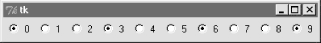
If you press 1, 4, or 7 now, all three of these are selected, and any existing selections are cleared (they don't have value "1"). That's not normally what you want, so be sure to give each button the same variable but a unique value if you want radiobuttons to work as expected. In the demoRadio script, for instance, the name of the demo provides a naturally unique value for each button.
7.7.2.2 Radiobuttons without variables
In Example 7-27, too, you could implement a single-selection model without variables, by manually selecting and deselecting widgets in the group, in a callback handler of your own. On each press event, for example, you could issue deselect calls for every widget object in the group and select the one pressed.
Example 7-27. PP2E\Gui\Tour\demo-radio-manual.py
# radio buttons, the hard way (without variables)
# note that deselect for radio buttons simply sets the button's
# associated value to a null string, so we either need to still
# give buttons unique values, or use checkbuttons here instead;
from Tkinter import * state = ''
buttons = []
def onPress(i):
global state state = i for btn in buttons: btn.deselect() buttons[i].select()root = Tk()
for i in range(10):
rad = Radiobutton(root, text=str(i), value=str(i), command=(lambda i=i: onPress(i)) ) rad.pack(side=LEFT) buttons.append(rad)root.mainloop()
print state # show state on exit
This works -- it creates a 10-radiobutton window that looks just like the one in Figure 7-29, but implements a single-choice radio style interface, with current state available in a global Python variable printed on script exit. By associating Tkinter variables and unique values, though, you can let Tkinter do all this work for you, as shown in Example 7-28.
Example 7-28. PP2E\Gui\Tour\demo-radio-auto.py
# radio buttons, the easy way
from Tkinter import * root = Tk() # IntVars work toovar = IntVar() # state = var.get()
for i in range(10):
rad = Radiobutton(root, text=str(i), value=i, variable=var) rad.pack(side=LEFT)root.mainloop()
print var.get() # show state on exit
This works the same, but is a lot less to type and debug. Notice that this script associates the buttons with an IntVar, the integer type sibling of StringVar; as long as button values are unique, integers work fine for radiobuttons too.
7.7.2.3 Hold on to your variables
One minor word of caution: you should generally hold on to the Tkinter variable object used to link radiobuttons for as long as the radiobuttons are displayed. Assign it to a module global variable, store it in a long-lived data structure, or save it as an attribute of a long-lived class object as done by demoRadio -- just as long as you retain a reference to it somehow. You normally will fetch state anyhow, so it's unlikely that you'll ever care about what I'm about to tell you.
But in the current Tkinter, variable classes have a __del__ destructor that automatically unsets a generated Tk variable when the Python object is reclaimed (i.e., garbage-collected). The upshot is that your radiobuttons may all be deselected if the variable object is collected, at least until the next press resets the Tk variable to a new value. Example 7-29 shows one way to trigger this.
Example 7-29. PP2E\Gui\Tour\demo-radio-clear.py
# hold on to your radio variables (an obscure thing, indeed)
from Tkinter import * root = Tk() def radio1(): # local vars are temporary#global tmp # making it global fixes the problem
tmp = IntVar() for i in range(10): rad = Radiobutton(root, text=str(i), value=i, variable=tmp) rad.pack(side=LEFT)tmp.set(5)
radio1()
root.mainloop()
This should come up with button 5 selected initially, but doesn't. The variable referenced by local tmp is reclaimed on function exit, the Tk variable is unset, and the 5 setting is lost (all buttons come up unselected). These radiobuttons work fine, though, one you start pressing them, because that resets the Tk variable. Uncommenting the global statement here makes 5 start out set, as expected.
Of course, this is an atypical example -- as coded, there is no way to know which button is pressed, because the variable isn't saved (and command isn't set). In fact, this is so obscure that I'll just refer you to demo-radio-clear2.py on the CD for an example that works hard to trigger this oddity in other ways. You probably won't care, but you can't say that I didn't warn you if you ever do.
7.7.3 Scales (Sliders)
Scales (sometimes called "sliders") are used to select among a range of numeric values. Moving the scale's position with mouse drags or clicks moves the widget's value among a range of integers, and triggers Python callbacks if registered.
Like checkbuttons and radiobuttons, scales have both a command option for registering an event-driven callback handler to be run right away when the scale is moved, as well as a variable option for associating a Tkinter variable that allows the scale's position to be fetched and set at arbitrary times. You can process scale settings when they are made, or let the user pick a setting for later use.
In addition, scales have a third processing option -- get and set methods that scripts may call to access scale values directly without associating variables. Because scale command movement callbacks also get the current scale setting value as an argument, it's often enough just to provide a callback for this widget, without resorting to either linked variables or get/set method calls.
To illustrate the basics, Example 7-30 makes two scales -- one horizontal and one vertical -- and links them with an associated variable to keep them in sync.
Example 7-30. PP2E\Gui\Tour\demoScale.py
from Tkinter import * # get base widget setfrom dialogTable import demos # button callback handlersfrom quitter import Quitter # attach a quit frame to meclass Demo(Frame):
def __init__(self, parent=None): Frame.__init__(self, parent) self.pack() Label(self, text="Scale demos").pack() self.var = IntVar()Scale(self, label='Pick demo number',
command=self.onMove, # catch moves
variable=self.var, # reflects position
from_=0, to=len(demos)-1).pack() Scale(self, label='Pick demo number',command=self.onMove, # catch moves
variable=self.var, # reflects position
from_=0, to=len(demos)-1, length=200, tickinterval=1, showvalue=YES, orient='horizontal').pack() Quitter(self).pack(side=RIGHT) Button(self, text="Run demo", command=self.onRun).pack(side=LEFT)Button(self, text="State", command=self.report).pack(side=RIGHT)
def onMove(self, value): print 'in onMove', value def onRun(self): pos = self.var.get() print 'You picked', pospick = demos.keys()[pos] # map from position to key
print demos[pick]() def report(self): print self.var.get()if __name__ == '__main__':
print demos.keys() Demo().mainloop()
Besides value access and callback registration, scales have options tailored to the notion of a range of selectable values, most of which are demonstrated in this example's code:
· The label option provides text that appears along with the scale, length specifies an initial size in pixels, and orient specifies an axis.
· The from_ and to options set the scale range's minimum and maximum values (note that "from" is a Python reserved word, but "from_" is not).
· The tickinterval option sets the number of units between marks drawn at regular intervals next to the scale (the default means no marks are drawn).
· The resolution option provides the number of units that the scale's value jumps on each drag or left mouseclick event (defaults to 1).
· The showvalue option can be used to show or hide the scale's current value next to its slider bar (the default showvalue=YES means it is drawn).
Note that scales are also packed in their container, just like other Tkinter widgets. Let's see how these ideas translate in practice; Figure 7-30 shows the window you get if you run this script live on Windows (you get a similar one on Unix and Macs).
Figure 7-30. demoScale in action
For illustration purposes, this window's State button shows the scales' current values, and "Run demo" runs a standard dialog call as before using the integer value of the scales to index the demos table. The script also registers a command handler that fires every time either of the scales is moved, and prints their new positions. Here is a set of messages sent to stdout after a few moves, demo runs (italic), and state requests (bold):
C:\...\PP2E\Gui\Tour>python demoScale.py
['Error', 'Input', 'Open', 'Query', 'Color']
in onMove 0
in onMove 0
in onMove 1
1
in onMove 2
You picked 2
C:/PP2ndEd/examples/PP2E/Gui/Tour/demoScale.py
in onMove 3
3
You picked 3
yes
7.7.3.1 Scales and variables
As you can probably tell, scales offer a variety of ways to process their selections: immediately in move callbacks, or later by fetching current position with variables or scale method calls. In fact, Tkinter variables aren't needed to program scales at all -- simply register movement callbacks, or call the scale get method to fetch scale values on demand as in the simpler scale example in Example 7-31.
Example 7-31. PP2E\Gui\Tour\demo-scale-simple.py
from Tkinter import *
root = Tk()
scl = Scale(root, from_=-100, to=100, tickinterval=50, resolution=10)
scl.pack(expand=YES, fill=Y)
def report(): print scl.get()
Button(root, text='state', command=report).pack(side=RIGHT)
root.mainloop()
Figure 7-31 shows two instances of this program running on Windows -- one stretched and one not (the scales are packed to grow vertically on resizes). Its scale displays a range from -100 to 100, uses the resolution option to adjust the current position up or down by 10 on every move, and sets the tickinterval option to show values next to the scale in increments of 50. When you press the State button in this script's window, it calls the scale's get method to display the current setting, without variables or callbacks of any kind:
C:\...\PP2E\Gui\Tour>python demo-scale-simple.py
0
60
-70
Figure 7-31. A simple scale without variables
Frankly, the only reason Tkinter variables are used in the demoScale script at all is to synchronize scales. To make the demo interesting, this script associates the same Tkinter variable object with both scales. As we learned in the last section, changing a widget changes its variable, but changing a variable also changes all the widgets it is associated with. In the world of sliders, moving the slide updates that variable, which in turn might update other widgets associated with the same variable. Because this script links one variable with two scales, it keeps them automatically in sync: moving one scale moves the other too, because the shared variable is changed in the process and so updates the other scale as a side effect.
Linking scales like this may or may not be typical of your applications (and borders on deep magic), but it's a powerful tool once you get your mind around it. By linking multiple widgets on a display with Tkinter variables, you can keep them automatically in sync, without making manual adjustments in callback handlers. On the other hand, the synchronization could be implemented without a shared variable at all by calling one scale's set method from a move callback handler of the other. I'll leave such a manual mutation as a suggested exercise, though. One person's deep magic might be another's evil hack.
7.8 Running GUI Code Three Ways
Now that we've built a handful of similar demo launcher programs, let's write a few top-level scripts to combine them. Because the demos were coded as both reusable classes and scripts, they can be deployed as attached frame components, run in their own top-level windows, and launched as standalone programs. All three options illustrate code reuse in action.
7.8.1 Attaching Frames
To illustrate hierarchical GUI composition on a grander scale than we've seen so far, Example 7-32 arranges to show all four of the dialog launcher bar scripts of this chapter in a single frame. It reuses Example 7-9, Example 7-22, Example 7-25, and Example 7-30.
Example 7-32. PP2E\Gui\Tour\demoAll-frm.py
#####################################################
# 4 demo class components (subframes) on one window;
# there are 5 Quitter buttons on this one window too;
# guis can be reused as frames, windows, processes;
#####################################################
from Tkinter import *
from quitter import Quitter
demoModules = ['demoDlg', 'demoCheck', 'demoRadio', 'demoScale']
parts = []
def addComponents(root):
for demo in demoModules:module = __import__(demo) # import by name string
part = module.Demo(root) # attach an instance
part.config(bd=2, relief=GROOVE) part.pack(side=LEFT, fill=BOTH) parts.append(part) # change list in-place
def dumpState():
for part in parts: # run demo report if any
print part.__module__ + ':', if hasattr(part, 'report'): part.report() else:print 'none'
root = Tk() # default toplevel windowLabel(root, text='Multiple Frame demo', bg='white').pack()
Button(root, text='States', command=dumpState).pack(fill=X)
Quitter(root).pack(expand=YES, fill=X)
addComponents(root)
mainloop()
Because all four demo launcher bars are coded to attach themselves to parent container widgets, this is easier than you might think: simply pass the same parent widget (here, the root window) to all four demo constructor calls, and pack and configure the demo objects as desired. Figure 7-32 shows this script's graphical result -- a single window embedding instances of all four of the dialog demo launcher demos we saw earlier.
Figure 7-32. demoAll_frm: nested subframes
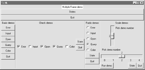
Naturally, this example is artificial, but it illustrates the power of composition when applied to building larger GUI displays. If you pretend that each of the four attached demo objects was something more useful, like a text editor, calculator, or clock, you'll better appreciate the point of this example.
Besides demo object frames, this composite window also contains no less than five instances of the Quitter button we wrote earlier (any one of which can end the GUI), and a States button to dump the current values of all the embedded demo objects at once (it calls each object's report method, if it has one). Here is a sample of the sort of output that shows up in the stdout stream after interacting with widgets on this display; States output is in bold:
C:\...\PP2E\Gui\Tour>python demoAll_frm.py
in onMove 0
in onMove 0
demoDlg: none
demoCheck: 0 0 0 0 0
demoRadio:
demoScale: 0
you pressed Input
result: 1.234
demoDlg: none
demoCheck: 1 0 1 1 0
demoRadio: Input
demoScale: 0
you pressed Query
result: yes
in onMove 1
in onMove 2
You picked 2
C:/PP2ndEd/examples/PP2E/Gui/Tour/demoAll_frm.py
demoDlg: none
demoCheck: 1 0 1 1 0
demoRadio: Query
demoScale: 2
The only substantially tricky part of this script is its use of Python's built-in __import__ function to import a module by a name string. Look at the following two lines from the script's addComponents function:
module = __import__(demo) # import module by name stringpart = module.Demo(root) # attach an instance of its Demo
This is equivalent to saying something like this:
import 'demoDlg'
part = 'demoDlg'.Demo(root)
except that this is not legal Python syntax -- the module name in import statements must be a Python variable, not a string. To be generic, addComponents steps through a list of name strings, and relies on __import__ to import and return the module identified by each string. It's as though all of these statements were run:
import demoDlg, demoRadio, demoCheck, demoScale
part = demoDlg.Demo(root)
part = demoRadio.Demo(root)
part = demoCheck.Demo(root)
part = demoScale.Demo(root)
But because the script uses a list of name strings, it's easier to change the set of demos embedded -- simply change the list, not lines of executable code. Moreover, such data-driven code tends to be more compact, less redundant, and easier to debug and maintain. Incidentally, modules can also be imported from name strings by dynamically constructing and running import statements like this:
for demo in demoModules:
exec 'from %s import Demo' % demo # make and run a from
part = Demo(root) # or eval('Demo')(window)
The exec statement compiles and runs a Python statement string (here, a from to load a module's Demo class); it works here as if the statement string were pasted into the source code where the exec statement appears. Because it supports any sort of Python statement, this technique is more general than the __import__ call, but, it can also be slower, since it must parse code strings before running them.[2] But that slowness may not matter in a GUI; users tend to be slower than parsers.
As we saw in Chapter 6, attaching nested frames like this is really just one way to reuse GUI code structured as classes. It's just as easy to customize such interfaces by subclassing, rather than embedding. Here, though, we're more interested in deploying an existing widget package, rather than changing it; the next two sections show two other ways to present such packages to users.
7.8.2 Independent Windows
Once you have a set of component classes, any parent will work -- both frames, and brand new top-level windows. Example 7-33 attaches instances of all four demo bar objects to their own Toplevel windows, not the same Frame.
Example 7-33. PP2E\Gui\Tour\demoAll-win.py
####################################################
# 4 demo classes in independent top-level windows;
# not processes: when one is quit all others go away
# because all windows run in the same process here
####################################################
from Tkinter import *
demoModules = ['demoDlg', 'demoRadio', 'demoCheck', 'demoScale']
demoObjects = []
for demo in demoModules:
module = __import__(demo) # import by name string
window = Toplevel() # make a new window
demo = module.Demo(window) # parent is the new window
demoObjects.append(demo)def allstates():
for obj in demoObjects: if hasattr(obj, 'report'):
print obj.__module__, obj.report()Label(text='Multiple Toplevel window demo', bg='white').pack()
Button(text='States', command=allstates).pack(fill=X)
mainloop()
We met the Toplevel class earlier; every instance generates a new window on your screen. The net result is captured in Figure 7-33 -- each demo runs in an independent window of its own, instead of being packed together in a single display.
Figure 7-33. demoAll_win: new Toplevel windows
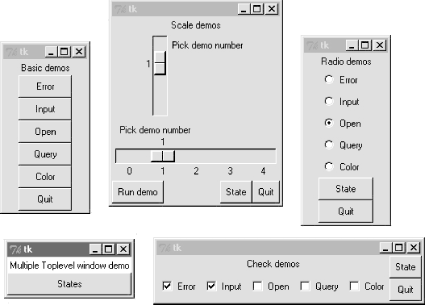
The main root window of this program appears in the lower left of this screen shot; it provides a States button that runs the report method of each of the demo objects, producing this sort of stdout text:
C:\...\PP2E\Gui\Tour>python demoAll_win.py
in onMove 0
in onMove 0
in onMove 1
you pressed Open
result: C:/PP2ndEd/examples/PP2E/Gui/Tour/demoAll_win.txt
demoRadio Open
demoCheck 1 1 0 0 0
demoScale 1
7.8.3 Running Programs
Finally, as we learned earlier in this chapter, Toplevel windows function independently, but they are not really independent programs. Quitting any of the windows created by Example 7-33 quits them all, because all run in the same program process. That's okay in some applications, but not all.
To go truly independent, Example 7-34 spawns each of the four demo launchers as independent programs, using the launchmodes module we wrote at the end of Chapter 3. This only works because the demos were written as both importable classes and runnable scripts -- launching them here makes all their names __main__ when run.
Example 7-34. PP2E\Gui\Tour\demoAll-prg.py
#######################################################
# 4 demo classes run as independent program processes;
# if one window is quit now, the others will live on;
# there is no simple way to run all report calls here,
# and some launch schemes drop child program stdout;
#######################################################
from Tkinter import *
demoModules = ['demoDlg', 'demoRadio', 'demoCheck', 'demoScale']
from PP2E.launchmodes import PortableLauncher
for demo in demoModules: # see Parallel System ToolsPortableLauncher(demo, demo+'.py')() # start as top-level programs
Label(text='Multiple program demo', bg='white').pack()
mainloop()
As Figure 7-34 shows, the display generated by this script is similar to the prior one -- all four demos come up in windows of their own. This time, though, these are really independent programs: if any one of the five windows here is quit, the others live on.
Figure 7-34. demoAll_prg: independent programs
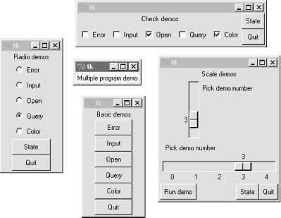
7.8.3.1 Cross-program communication
Spawning GUIs as programs is the ultimate in code independence, but makes the lines of communication between components more complex. For instance, because the demos run as programs here, there is no easy way to run all their report methods from the launching script's window pictured in the middle of Figure 7-34. In fact, the States button is gone this time, and we only get PortableLauncher messages in stdout as the demos start up:
C:\...\PP2E\Gui\Tour>python demoAll_prg.py
demoDlg
demoRadio
demoCheck
demoScale
On some platforms, messages printed by the demo programs (including their own State buttons) may show up the original console window where this script is launched; on Windows, the os.spawnv call used to start programs in launchmodes completely disconnects the child program's stdout stream from its parent. Regardless, there is no way to call all demos' report methods at once -- they are spawned programs in distinct address spaces, not imported modules.
Of course, we could trigger report methods in the spawned programs with some of the IPC mechanisms we met in Chapter 3. For instance:
· The demos could be instrumented to catch a user signal, and run their report in response.
· They could also watch for request strings sent by the launching program to show up in pipes or fifos -- the demoAll launching program would essentially act as a client, and the demo GUIs as servers.
· Independent programs can also converse this way over sockets -- a tool we'll meet in Part III.
Given their event-driven nature, GUI-based programs may need to be augmented with threads or timer-event callbacks to periodically check for such incoming messages on pipes, fifos, or sockets (e.g., see the after method call described near the end of the next chapter). But since this is all well beyond the scope of these simple demo programs, I'll leave such cross-program extensions up to more parallel-minded readers.
7.8.3.2 Coding for reusability
A postscript: I coded all the demo launcher bars deployed by the last three examples to demonstrate all the different ways that their widgets can be used. They were not developed with general-purpose reusability in mind; in fact, they're not really useful outside the context of introducing widgets in this book.
That was by design; most Tkinter widgets are easy to use once you learn their interfaces, and Tkinter already provides lots of configuration flexibility by itself. But if I had in mind to code checkboxes and radiobutton classes to be reused as general library components, they would have to be structured differently:
Extra widgets
They would not display anything but radio- and checkbuttons. As is, the demos each embed State and Quit buttons for illustration, but there really should be just one Quit per top-level window.
Geometry management
They would allow for different button arrangements, and not pack (or grid) themselves at all. In a true general-purpose reuse scenario, it's often better to leave a component's geometry management up to its caller.
Usage mode limitations
They would either have to export complex interfaces to support all possible Tkinter configuration options and modes, or make some limiting decisions that support one common use only. For instance, these buttons can either run callbacks at press time or provide their state later in the application.
Example 7-35 shows one way to code check and radiobutton bars as library components. It encapsulates the notion of associating Tkinter variables, and imposes a common usage mode on callers to keep the interface simple -- state fetches, instead of press callbacks.
Example 7-35. PP2E\Gui\Tour\buttonbars.py
# check and radio button bar classes for apps that fetch state later;
# pass a list of options, call state(), variable details automated
from Tkinter import *
class Checkbar(Frame):
def __init__(self, parent=None, picks=[], side=LEFT, anchor=W): Frame.__init__(self, parent) self.vars = [] for pick in picks: var = IntVar()chk = Checkbutton(self, text=pick, variable=var)
chk.pack(side=side, anchor=anchor, expand=YES) self.vars.append(var) def state(self): return map((lambda var: var.get()), self.vars)class Radiobar(Frame):
def __init__(self, parent=None, picks=[], side=LEFT, anchor=W): Frame.__init__(self, parent) self.var = StringVar() for pick in picks: rad = Radiobutton(self, text=pick, value=pick, variable=self.var) rad.pack(side=side, anchor=anchor, expand=YES) def state(self): return self.var.get()if __name__ == '__main__':
root = Tk() lng = Checkbar(root, ['Python', 'C#', 'Java', 'C++']) gui = Radiobar(root, ['win', 'x11', 'mac'], side=TOP, anchor=NW) tgl = Checkbar(root, ['All']) gui.pack(side=LEFT, fill=Y)lng.pack(side=TOP, fill=X)
tgl.pack(side=LEFT) lng.config(relief=GROOVE, bd=2)gui.config(relief=RIDGE, bd=2)
from quitter import Quitter def allstates(): print gui.state(), lng.state(), tgl.state() Quitter(root).pack(side=RIGHT) Button(root, text='Peek', command=allstates).pack(side=RIGHT) root.mainloop()
To reuse these classes in your scripts, import and call with a list of the options you want to appear in a bar of checkboxes or radiobuttons. This module's self-test code at the bottom of the file gives further usage details. It generates Figure 7-35 when this file is run as a program instead of imported -- a top-level window that embeds two Checkbars, one Radiobar, a Quitter button to exit, and a Peek button to show bar states.
Figure 7-35. buttonbars self-test window
Here's the stdout text you get after pressing Peek -- the results of these classes' state methods:
x11 [1, 0, 1, 1] [0]
win [1, 0, 0, 1] [1]
The two classes in this module demonstrate how easy it is to wrap Tkinter interfaces to make them easier to use -- they completely abstract away many of the tricky parts of radiobutton and checkbox bars. For instance, you can forget about linked variable details completely if you use such higher-level classes instead; simply make objects with option lists and call their state methods later. If you follow this path to its conclusion, you might just wind up with a higher-level widget library on the order of the PMW package mentioned in Chapter 6.
On the other hand, these classes are still not universally applicable; if you need to run actions when these buttons are pressed, for instance, you'll need to use other high-level interfaces. Luckily, Python/Tkinter already provides plenty. Later in this book, we'll again use the widget combination and reuse techniques introduced in this section to construct larger GUIs. For now, this first widget tour chapter is about to make one last stop -- the photo shop.
7.9 Images
In Tkinter, graphical images are displayed by creating independent PhotoImage or BitmapImage objects, and then attaching those image objects to other widgets via image attribute settings. Buttons, labels, canvases, text, and menus can all display images by associating prebuilt image objects this way. To illustrate, Example 7-36 throws a picture up on a button.
Example 7-36. PP2E\Gui\Tour\imgButton.py
gifdir = "../gifs/"
from Tkinter import *
win = Tk()
igm = PhotoImage(file=gifdir+"ora-pp.gif")
Button(win, image=igm).pack()
win.mainloop()
I could try to come up with a simpler example, but it would be tough -- all this script does is make a Tkinter PhotoImage object for a GIF file stored in another directory, and associate it with a Button widget's image option. The result is captured in Figure 7-36.
Figure 7-36. imgButton in action
PhotoImage and its cousin, BitmapImage, essentially load graphics files, and allow those graphics to be attached to other kinds of widgets. To open a picture file, pass its name to the file attribute of these image objects. Canvas widgets -- general drawing surfaces discussed in more detail later on this tour -- can display pictures too; Example 7-37 renders Figure 7-37.
Example 7-37. PP2E\Gui\Tour\imgCanvas.py
gifdir = "../gifs/"
from Tkinter import *
win = Tk()
img = PhotoImage(file=gifdir+"ora-lp.gif")
can = Canvas(win)
can.pack(fill=BOTH)
can.create_image(2, 2, image=img, anchor=NW) # x, y coordinateswin.mainloop()
Figure 7-37. An image on canvas
Buttons are automatically sized to fit an associated photo, but canvases are not (because you can add objects to a canvas, as we'll see in Chapter 8). To make a canvas fit the picture, size it according to the width and height methods of image objects as in Example 7-38. This version will make the canvas smaller or larger than its default size as needed, lets you pass in a photo file's name on the command line, and can be used as a simple image viewer utility. The visual effect of this script is captured in Figure 7-38.
Example 7-38. PP2E\Gui\Tour\imgCanvas2.py
gifdir = "../gifs/"
from sys import argv
from Tkinter import *
filename = (len(argv) > 1 and argv[1]) or 'ora-lp.gif' # name on cmdline?win = Tk()
img = PhotoImage(file=gifdir+filename)
can = Canvas(win)
can.pack(fill=BOTH)
can.config(width=img.width(), height=img.height()) # size to img sizecan.create_image(2, 2, image=img, anchor=NW)
win.mainloop()
Figure 7-38. Sizing the canvas to match the photo
And that's all there is to it. In Chapter 8, well see images show up in a Menu, other Canvas examples, and the image-friendly Text widget. In later chapters, we'll find them in an image slideshow (PyView), in a paint program (PyDraw), on clocks (PyClock), and so on. It's easy to add graphics to GUIs in Python/Tkinter.
Once you start using photos in earnest, though, you're likely to run into two tricky bits which I want to warn you about here:
Supported file types
At present, the PhotoImage widget only supports GIF, PPM, and PGM graphic file formats, and BitmapImage supports X Windows-style .xbm bitmap files. This may be expanded in future releases, and you can convert photos in other formats to these supported formats, of course; but I'll wait to address this issue in more detail in Other Image File Formats: PIL later in this section.
Hold on to your photos
Unlike all other Tkinter widgets, an image is utterly lost if the corresponding Python image object is garbage-collected. That means that you must retain an explicit reference to image objects for as long as your program needs them (e.g., assign them to a long-lived variable name or data structure component). Python does not automatically keep a reference to the image, even if it is linked to other GUI components for display; moreover, image destructor methods erase the image from memory. We saw earlier that Tkinter variables can behave oddly when reclaimed too, but the effect is much worse and more likely to happen with images. This may change in future Python releases (though there are good reasons for not retaining big image files in memory indefinitely); for now, though, images are a "use it or lose it" widget.
7.9.1 Fun with Buttons and Pictures
I tried to come up with an image demo for this section that was both fun and useful. I settled for the fun part. Example 7-39 displays a button that changes its image at random each time it is pressed.
Example 7-39. PP2E\Gui\Tour\buttonpics-func.py
from Tkinter import * # get base widget set
from glob import glob # file name expansion listimport demoCheck # attach checkbutton demo to meimport random # pick a picture at randomgifdir = '../gifs/' # where to look for gif files
def draw():
name, photo = random.choice(images) lbl.config(text=name) pix.config(image=photo)root=Tk()
lbl = Label(root, text="none", bg='blue', fg='red')pix = Button(root, text="Press me", command=draw, bg='white')
lbl.pack(fill=BOTH)
pix.pack(pady=10)
demoCheck.Demo(root, relief=SUNKEN, bd=2).pack(fill=BOTH)
files = glob(gifdir + "*.gif") # gifs for nowimages = map(lambda x: (x, PhotoImage(file=x)), files) # load and hold
print files
root.mainloop()
This code uses a handful of built-in tools from the Python library:
· The Python glob module we met earlier in the book gives a list of all files ending in .gif in a directory; in other words, all GIF files stored there.
· The Python random module is used to select a random GIF from files in the directory: random.choice picks and returns an item from a list at random.
· To change the image displayed (and the GIF file's name in a label at the top of the window), the script simply calls the widget config method with new option settings; changing on the fly like this changes the widget's display.
Just for fun, this script also attaches an instance of the demoCheck checkbox demo bar, which in turn attaches an instance of the Quitter button we wrote earlier. This is an artificial example, of course, but again demonstrates the power of component class attachment at work.
Notice how this script builds and holds onto all images in its images list. The map here applies a PhotoImage constructor call to every .gif file in the photo directory, producing a list of (file,image) tuples that is saved in a global variable. Remember, this guarantees that image objects won't be garbage-collected as long as the program is running. Figure 7-39 shows this script in action on Windows.
Figure 7-39. buttonpics in action
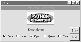
Although it may not be obvious in this grayscale book, the name of the GIF file being displayed is shown in red text in the blue label at the top of this window. This program's window grows and shrinks automatically when larger and smaller GIF files are displayed; Figure 7-40 shows it randomly picking a taller photo globbed from the image directory.
Figure 7-40. buttonpics showing a taller photo
And finally, Figure 7-41 captures this script's GUI displaying one of the wider GIFs, selected completely at random from the photo file directory.[3]
Figure 7-41. buttonpics gets political
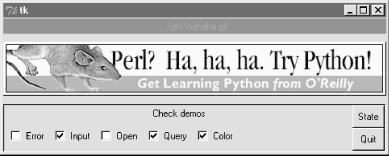
While we're playing, let's recode this script as a class in case we ever want to attach or customize it later (it could happen). It's mostly a matter of indenting and adding self before global variable names, as shown in Example 7-40.
Example 7-40. PP2E\Gui\Tour\buttonpics.py
from Tkinter import * # get base widget setfrom glob import glob # file name expansion listimport demoCheck # attach checkbox example to meimport random # pick a picture at randomgifdir = '../gifs/' # default dir to load gif filesclass ButtonPicsDemo(Frame):
def __init__(self, gifdir=gifdir, parent=None): Frame.__init__(self, parent) self.pack()self.lbl = Label(self, text="none", bg='blue', fg='red')
self.pix = Button(self, text="Press me", command=self.draw, bg='white') self.lbl.pack(fill=BOTH) self.pix.pack(pady=10) demoCheck.Demo(self, relief=SUNKEN, bd=2).pack(fill=BOTH) files = glob(gifdir + "*.gif") self.images = map(lambda x: (x, PhotoImage(file=x)), files) print files def draw(self): name, photo = random.choice(self.images) self.lbl.config(text=name) self.pix.config(image=photo)if __name__ == '__main__': ButtonPicsDemo().mainloop()
This version works the same as the original, but can now be attached to any other GUI where you would like to include such an unreasonably silly button.
Other Image File Formats: PILAs mentioned, Python Tkinter scripts show images by associating independently created image objects with real widget objects. At this writing, Tkinter GUIs can display photo image files in GIF, PPM, and PGM formats by creating a PhotoImage object, as well as X11-style bitmap files (usually suffixed with a .xbm extension) by creating a BitmapImage object. This set of supported file formats is limited by the underlying Tk library, not Tkinter itself, and may expand in the future. But if you want to display files in other formats today (e.g., JPEG and BMP), you can either convert your files to one of the supported formats with an image-processing program, or install the PIL Python extension package mentioned at the start of Chapter 6. PIL currently supports nearly 30 graphic file formats (including JPEG and BMP). To make use of its tools, you must first fetch and install the PIL package (see http://www.pythonware.com). Then, simply use special PhotoImage and BitmapImage objects imported from the PIL ImageTk module to open files in other graphic formats. These are compatible replacements for the standard Tkinter classes of the same name, and may be used anywhere Tkinter expects a PhotoImage or BitmapImage object (i.e., in label, button, canvas, text, and menu object configurations). That is, replace standard Tkinter code like this: from Tkinter import * imgobj = PhotoImage(file=imgdir+"spam.gif") Button(image=imgobj).pack() With code of this form: from Tkinter import * import ImageTk imgobj = ImageTk.PhotoImage(file=imgdir+"spam.jpg") Button(image=imgobj).pack() Or the more verbose equivalent: from Tkinter import * import Image, ImageTk imagefile = Image.open(imgdir+"spam.jpeg") imageobj = ImageTk.PhotoImage(imagefile)Label(image=imageobj).pack() PIL installation details vary per platform; on my Windows laptop, it was just a matter of downloading, unzipping, and adding PIL directories to the front of PYTHONPATH. There is much more to PIL than we have time to cover here; for instance, it also provides image conversion, resizing, and transformation tools, some of which can be run as command-line programs that have nothing to do with GUIs directly. See http://www.pythonware.com for more information, as well as online PIL and Tkinter documentation sets. |
[1] In a now-defunct Tkinter release shipped with Python
1.3, you could also set and fetch variable values by calling them like functions,
with and without an argument (e.g., var(value)
and var()). Today, you should call variable set and get
methods instead. For unknown reasons, the function call form stopped working
years ago, but you may still see it in older Python code (and first editions of
at least one O'Reilly Python book). [back]
[2] As we'll see later, exec
can also be dangerous if running code strings fetched from users or network
connections. That's not an issue for the hardcoded strings in this example. [back]
[3] This particular image appeared as a banner ad on
developer-related web sites like slashdot.com when the book Learning Python
was first published. It generated enough of a backlash from Perl zealots that
O'Reilly eventually pulled the ad altogether. Which is why, of course, it
appears in this book. [back]
Chapter 6 TOC Chapter 8