
4.2. Form Tags
A full discussion of HTML and user interface design is clearly beyond the scope of this book. Many other books are available which discuss these topics at length, such as HTML: The Definitive Guide, by Chuck Musciano and Bill Kennedy (O'Reilly & Associates, Inc.). However, many of these other resources do not discuss the relationship between HTML form elements and the corresponding data sent to the web server when a form is submitted. So let's run through a quick review of HTML form elements before we see how CGI scripts process them.
4.2.1. Quick Reference to Form Tags
Before we get going, Table 4-1 shows a short list of all the available form tags.
Table 4-1. HTML Form Tags
|
Form Tag |
Description |
|---|---|
|
<FORM ACTION="/cgi/register.cgi" METHOD="POST"> |
Start the form |
|
<INPUT TYPE="text" NAME="name" VALUE="value" SIZE="size"> |
Text field |
|
<INPUT TYPE="password" NAME="name" VALUE="value" SIZE="size"> |
Password field |
|
<INPUT TYPE="hidden" NAME="name" VALUE="value" > |
Hidden field |
|
<INPUT TYPE="checkbox" NAME="name" VALUE="value" > |
Checkbox |
|
<INPUT TYPE="radio" NAME="name" VALUE="value" > |
Radio button |
|
<SELECT NAME="name" SIZE=1> <OPTION SELECTED>One</OPTION> <OPTION>Two</OPTION> : </SELECT> |
Menu (drop-down) |
|
<SELECT NAME="name" SIZE=n MULTIPLE> <OPTION SELECTED>One</OPTION> <OPTION>Two</OPTION> : </SELECT> |
Select box |
|
<TEXTAREA ROWS=yy COLS=xx NAME="name"> : </TEXTAREA> |
Multiline text field |
|
<INPUT TYPE="submit" NAME="name" VALUE="value" > |
Submit button |
|
<INPUT TYPE="image" SRC="/image.gif" NAME="name" VALUE="value"> |
Image button |
|
<INPUT TYPE="reset" VALUE="Message!"> |
Reset button |
|
</FORM> |
End the form |
4.2.2. The <FORM> Tag
All forms begin with a <FORM> tag and end with a </FORM> tag:
<FORM ACTION="/cgi/register.cgi" METHOD="POST">
  .
  .
  .
</FORM>
Submitting a form generates an HTTP request just like clicking on a hyperlink, but a request generated by a form is almost always directed at a CGI script (or a similar dynamic resource). You specify the format of the HTTP request via attributes of the <FORM> tag:
- METHOD
METHOD specifies the HTTP request method used when calling the CGI script. The options are GET and POST, and they correspond to the request methods we've already seen as part of the HTTP request line, although they are not case-sensitive here. If the method is not specified, it defaults to GET.
- ACTION
ACTION specifies the URL of the CGI script that should receive the HTTP request made by the CGI script. By default, it is the same URL from which the browser retrieved the form. You are not limited to using a CGI program on your server to decode form information; you can specify a URL of a remote host if a program that does what you want is available elsewhere.
- ENCTYPE
ENCTYPE specifies the media type used to encode the content of the HTTP request. Because GET requests do not have a body, this attribute is only meaningful if the form has POST as its method. This attribute is rarely included since the default -- application/x-www-form-urlencoded -- is appropriate in almost all cases. The only real reason to specify another media type is when creating a form that accepts file uploads. File uploads must use multipart/form-data instead. We will discuss this second option later.
- onSubmit
onSubmit is a JavaScript handler, and it specifies the JavaScript code that should be executed when the form is submitted. If the code returns a false value, it will cancel the submission of the form. Throughout this chapter we will review which JavaScript handler is associated with each HTML form element, but we won't cover JavaScript in detail until Chapter 7, "JavaScript".
A document can consist of multiple forms, but one form cannot be nested inside another form.
4.2.3. The <INPUT> Tag
The <INPUT> tag generates a wide array of form widgets. They are differentiated by the TYPE attribute. Each <INPUT> tag has the same general format:
<INPUT TYPE="text" NAME="element_name" VALUE="Default value">
Like <BR>, this tag has no closing tag. The basic attributes that all input types share are as follows:
- TYPE
TYPE determines the type of the input widget to display. A presentation of each type follows this section.
- NAME
The NAME attribute is important because the CGI script uses this name to access the value of those elements that are submitted.
- VALUE
The meaning of VALUE varies depending on the type of the input element. We will discuss this property in our discussion of each type.
Let's look at each of the input types.
4.2.3.1. Text fields
One of the most basic uses of the <INPUT> tag is to generate a text fields where users may enter a line of data (see Figure 4-2). Text fields are the default input type; if you omit the TYPE attribute, you will get a text field. The HTML for a text field looks like this:
<INPUT TYPE="text" NAME="quantity" VALUE="1" SIZE="3" MAXLENGTH="3">
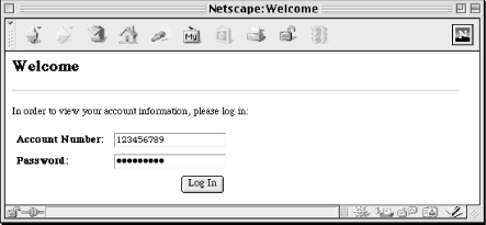
Figure 4-2. Text and password fields
Here are the attributes that apply to text fields:
- VALUE
The VALUE of text fields is the default text displayed in the text field when the form is initially presented to the user. It defaults to an empty string. The user can edit the value of text fields; updates change what is displayed as well as the value passed when the form is submitted.
- SIZE
The SIZE attribute specifies the width of the text field displayed. It roughly corresponds to the number of characters the field can hold, but this is generally only accurate if the element is surrounded by <TT> or <PRE> tags, which indicate that a monospace font should be used. Unfortunately, Netscape and Internet Explorer render the width of fields very differently when monospaced fonts are not used, so certainly test your form with both browsers. The default SIZE for text fields is 20.
- MAXLENGTH
The MAXLENGTH attribute specifies the maximum number of characters that a text field can hold. Browsers generally do not allow users to enter more characters than this. Because the size of text fields can vary with variable-width fonts, it is possible to set MAXLENGTH and SIZE to the same value and yet have a field that appears too large or too small for that number of characters. A text field can have a MAXLENGTH set to more characters than its SIZE can display. By default, there is no specified limit on the size of text fields.
- onFocus, onBlur, onChange
The JavaScript handlers are onFocus, onBlur, and onChange, which are called when the text field has focus (the input cursor is in the field), loses focus (the cursor moves out of the field), and when the value of the field changes, respectively.
4.2.3.2. Password fields
A password field is similar to a text field, except that instead of displaying the true value of the field, the browser represents each character with an asterisk or bullet (refer back to Figure 4-2):
<INPUT TYPE="password" NAME="set_password" VALUE="old_password"
  SIZE="8" MAXLENGTH="8">
This field does not provide any true security; it simply provides basic protection against someone looking over the shoulder of the user. The value is not encrypted when it is transferred to the web server, which means that passwords are displayed as part of the query string for GET requests.
All the attributes that apply to text fields also apply to password fields.
4.2.3.3. Hidden fields
Hidden fields are not visible to the user. They are generally used only with forms which are themselves generated by a CGI script and are useful for passing information between a series of forms:
<INPUT TYPE="hidden" NAME="username" VALUE="msmith">
Like password fields, hidden fields provide no security. Users can view the name and value of hidden fields by viewing the HTML source in their browsers.
We'll discuss hidden fields in much more detail in our discussion of maintaining state in Chapter 11, "Maintaining State".
4.2.3.4. Checkboxes
Checkboxes are useful when users simply need to indicate whether they desire an option. See Figure 4-3.
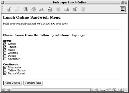
Figure 4-3. Checkboxes
The user can toggle between two states on a checkbox: checked or unchecked. The tag looks like this:
<INPUT TYPE="checkbox" NAME="toppings" VALUE="lettuce" CHECKED>
In this example, if the user selects the checkbox, then "toppings" returns a value of "lettuce". If the checkbox is not selected, neither the name nor the value is returned for the checkbox.
It is possible to have multiple checkboxes use the same name. In fact, this is not uncommon. The most typical situation in which you might do this is if you have a dynamic list of related options and the user could choose a similar action for all of them. For example, you may wish to list multiple options this way:
<INPUT TYPE="checkbox" NAME="lettuce"> Lettuce<BR>
<INPUT TYPE="checkbox" NAME="tomato"> Tomato<BR>
<INPUT TYPE="checkbox" NAME="onion"> Onion<BR>
If, however, the CGI script does not need to know the name of each of the options in order to perform its task, you may wish to do this instead:
<INPUT TYPE="checkbox" NAME="toppings" VALUE="lettuce"> Lettuce<BR>
<INPUT TYPE="checkbox" NAME="toppings" VALUE="tomato"> Tomato<BR>
<INPUT TYPE="checkbox" NAME="toppings" VALUE="onion"> Onion<BR>
If someone selects "lettuce" and "tomato" but not "onion", then the browser will encode this as toppings=lettuce&toppings=tomato. The CGI script can process these multiple toppings, and you may not need to update the CGI script if you later add items to the list. Attributes for checkboxes include:
- VALUE
The VALUE attribute is the value included in the request if the checkbox is checked. If a VALUE attribute is not specified, the checkbox will return "ON" as its value. If the checkbox is not checked, then neither its name nor value will be sent.
- CHECKED
The CHECKED attribute indicates that the checkbox should be selected by default. Omitting this attribute causes the checkbox to be unselected by default.
- onCheck
Checkboxes also take the onCheck attribute, which indicates the JavaScript code that should be executed when the checkbox is selected.
4.2.3.5. Radio buttons
Radio buttons are very similar to checkboxes except that any group of radio buttons that share the same name are exclusive: only one of them may be selected. See Figure 4-4.
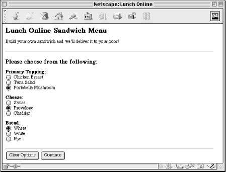
Figure 4-4. Radio buttons
The tag is used just like a checkbox:
<INPUT TYPE="radio" NAME="bread" VALUE="wheat" CHECKED> Wheat<BR>
<INPUT TYPE="radio" NAME="bread" VALUE="white"> White<BR>
<INPUT TYPE="radio" NAME="bread" VALUE="rye"> Rye<BR>
In this example, "wheat" is selected by default. Selecting "white" or "rye" will cause "wheat" to be unselected.
Although you may omit the VALUE attribute with checkboxes, doing so with radio buttons is meaningless since the CGI script will not be able to differentiate between different radio buttons if they all return "ON".
Using the CHECKED attribute with multiple radio buttons with the same name is not valid. Browsers will generally render both as selected, but they will be unselected as soon as the user selects a different option and the user will be unable to return the form to this initial state (unless it has a reset button of course).
Radio buttons use the same attributes as checkboxes.
4.2.3.6. Submit buttons
A submit button does just what the name implies. It submits the contents of the form (see Figure 4-5). When the user clicks on a submit button, the browser runs any associated JavaScript onSubmit handler, formats an HTTP request according to the form method and form encoding type, then sends this request to the URL specified by the form action. The result is then displayed as a new web page.
Figure 4-5. Submit buttons
The HTML for a submit button looks like this:
<INPUT TYPE="submit" NAME="submit_button" VALUE="Submit the Form">
Virtually all forms have a submit button, and you can have multiple submit buttons on one form:
<INPUT TYPE="submit" NAME="option" VALUE="Option 1">
<INPUT TYPE="submit" NAME="option" VALUE="Option 2">
Only the name and value of the submit button clicked is included in the form submission. Here are the attributes it supports:
- VALUE
The VALUE attribute for submit buttons specifies the text that should be displayed on the button as well as the value supplied for this element when the form is submitted. If the value is omitted, browsers supply a default label -- generally "Submit" -- and refrain from submitting a name and value for this element.
- onClick
Submit buttons may have an onClick JavaScript handler, which specifies the code to execute if the user clicks the button. Returning a false value from this code cancels the submit operation.
4.2.3.7. Reset buttons
A reset button allows users to reset the value of all the fields in a form to their default values. From the user's perspective, it generally accomplishes the same thing as reloading the form but is much faster and more convenient. Because the browser accomplishes this event without consulting the web server, CGI scripts never respond to it. The HTML tag looks like this:
<INPUT TYPE="reset" VALUE="Reset the form fields">
You may have multiple reset buttons on the same form, although this would almost certainly be redundant.
- NAME
You may specify a NAME for reset buttons, but neither the name nor the value is ever passed to a CGI script. Thus, the name is only useful to JavaScript code.
- VALUE
The VALUE attribute specifies the text label that should appear on the button.
- onClick
Like submit buttons, reset buttons may have an onClick attribute that specifies the JavaScript code to execute if a user clicks on the button; returning false from this code will cancel the reset operation.
4.2.3.8. Image buttons
You can also have images as buttons. Image buttons function as submit buttons but give you much more flexibility over how the button looks. Keep in mind that users are generally used to having buttons displayed a particular way by the browser and operating system, and a button in a different format may be confusing to a novice. The HTML for an image button tag looks like this:
<INPUT TYPE="image" SRC="/icons/button.gif" NAME="result" VALUE="text only">
Graphical and text-only browsers treat this element very differently. A text-only browser, such as Lynx, sends the name and value together like most other form elements:
result=text+only
However, a graphical browser, like Netscape and Internet Explorer, send the coordinates where the user clicked on the image in addition to the name of the button. The value is not sent. These coordinates are measured in pixels from the upper-left corner of the image (see Figure 4-6).
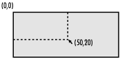
Figure 4-6. Image button coordinates
In this example, a graphical browser would submit:
action.x=50&action.y=20
Here are the attributes for image buttons:
- VALUE
The VALUE attribute is sent as the value for this element by text browsers.
- SRC
The SRC attribute specifies the URL to the image displayed for the button, just as it does in the more common <IMG> tag (if the <IMG> tag looks unfamiliar to you, it's because you probably only recognize it when combined with the SRC attribute: <IMG SRC=...>).
- onClick
This attribute behaves just as it does with standard submit buttons.
4.2.3.9. Plain buttons
The last type of button is just that -- a button; it has no special function. To avoid confusing this button with the other button types, we will refer to it as a plain button. A plain button tag looks like a submit or reset button:
<INPUT TYPE="button" VALUE="Click for a greeting..."
  onClick="alert( 'Hello!' );">
The name and value of a plain button is never passed to a CGI script. Because a plain button has no special action, it is meaningless without an onClick attribute:
- NAME
The NAME attribute is never sent as part of a request, so it is only useful to JavaScript code.
- VALUE
The VALUE attribute specifies the name of the button.
- onClick
The onClick attribute specifies the code to run when the button is clicked. The code's return value has no effect because plain buttons do not cause other behavior.
4.2.4. The <SELECT> Tag
The <SELECT> tag is used to create a list for users to choose from. It can create two different elements that look quite different but have similar function: a scrolling box or a menu (also commonly referred to as a drop-down). Both elements are displayed in Figure 4-7. Unlike the <INPUT> elements, <SELECT> tags have an opening as well as a closing tag.
Here is an example of a menu:
Choose a method of payment:
<SELECT NAME="card" SIZE=1>
  <OPTION SELECTED>American Express</OPTION>
  <OPTION>Discover</OPTION>
  <OPTION>Master Card</OPTION>
  <OPTION>Visa</OPTION>
</SELECT>
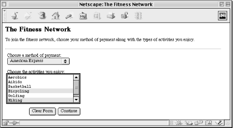
Figure 4-7. Two forms of select lists: a menu and a scrolling box
Here is an example of a scrolling box:
Choose the activities you enjoy:
<SELECT NAME="activity" SIZE=4 MULTIPLE>
  <OPTION>Aerobics</OPTION>
  <OPTION>Aikido</OPTION>
  <OPTION>Basketball</OPTION>
  <OPTION>Bicycling</OPTION>
  <OPTION>Golfing</OPTION>
  <OPTION>Hiking</OPTION>
  ...
</SELECT>
Scrolling boxes may optionally allow the user to select multiple entries. Multiple options are encoded as separate name-value pairs, as if they had been entered by multiple form elements. For example, if someone selects Aikido, Bicycling, and Hiking, the browser will encode it as activity=Aikido&activity=Bicycling& activity=Hiking.
Attributes for the <SELECT> tag are:
- SIZE
The SIZE attribute determines the number of lines visible in the list. Specifying 1 for the SIZE indicates that the list should be a menu instead.
- MULTIPLE
The MULTIPLE attribute allows the user to select multiple values. It is only possible if the SIZE attribute is assigned a value greater than 1. On some operating systems, the user may need to hold down certain modifier keys on their keyboard in order to select multiple items.
4.2.4.1. The <OPTION> tag
The <SELECT> tag does not have a value attribute. Each of its possible values must have an <OPTION> tag around it.
You may override the value used by a particular option by specifying a VALUE attribute like this:
<OPTION VALUE="AMEX" >American Express</OPTION>
Options have two optional attributes:
- SELECTED
The SELECTED attribute specifies that the option should be selected by default. When a form is submitted, the name of the <SELECT> tag is submitted along with the value of the selected options.
- VALUE
The VALUE attribute is the value that is passed for the option if it is selected. If this attribute is omitted, then it defaults to the text between the <OPTION> and </OPTION> tags.
4.2.5. The <TEXTAREA> Tag
The final form element, the <TEXTAREA> tag, allows users to enter multiple lines of text. See Figure 4-8.
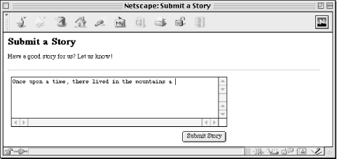
Figure 4-8. Text area
Text areas have an opening and a closing tag:
<TEXTAREA ROWS=10 COLS=40 NAME="comments" WRAP="virtual">Default text</TEXTAREA>
This creates a scrolled text field with a visible area of ten rows and forty columns.
There is no VALUE property for the <TEXTAREA> tag. Default text should be placed between the opening and closing tags. Unlike other HTML tags, white space -- including newlines -- is not ignored between <TEXTAREA> and </TEXTAREA> tags. A browser will render the example above with "Default" and "text" on separate lines.
Attributes for the <TEXTAREA> tag are:
- COLUMNS
The COLUMNS attribute specifies the width of the text area, but like the size of text fields, browsers size columns differently for variable-width fonts.
- ROWS
The ROWS attribute specifies the number of lines that the text area should display. Text bars have scrollbars to access text that does not fit within the display area.
- WRAP
The WRAP attribute specifies what the browser should do if the user types beyond the right margin, but note that the WRAP attribute is not implemented as uniformly as other tags and attributes. Although most browsers support it, it is actually not included in the HTML 4.0 standard. In general, specifying "virtual" as the WRAP results in the text wrapping within the text area, but it is submitted without newlines. Specifying "physical" as the WRAP also results in the text wrapping for the user, but the line breaks are submitted as part of the text. Users on different operating systems will submit different characters for end-of-line characters. If you specify to omit the WRAP attribute or specify "none" for it, then text will typically scroll beyond the right side of the text area.
 |  |  |
| 4. Forms and CGI |  | 4.3. Decoding Form Input |

Copyright © 2001 O'Reilly & Associates. All rights reserved.