
2.2. Fixed Versus Flexible Web Page Design
Closely related to the issue of varying monitor resolutions is the question of whether web pages should be designed to be flexible (resizing and adapting to various window sizes) or fixed at a particular size (giving the designer more control of the page's dimensions). There are very strong opinions on both sides, and there are good reasons for and against each approach, naturally.
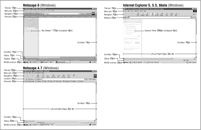
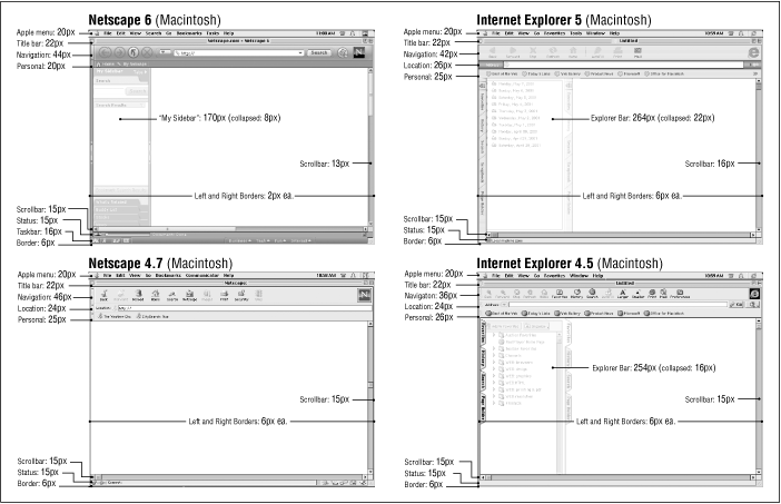
Figure 2-1. Browser and system measurements
You may find that you choose a fixed structure for some sites and allow others to be flexible, or you may have strong convictions that one or the other approach is the only way to go. Either way, it is useful to be familiar with the whole picture and the current opinions of professional web designers. This section attempts to present a balanced overview of the possibilities and the pitfalls.
2.2.1. Flexible Design
Web pages are flexible by default. The text and elements in a straightforward HTML file flow into the browser window, filling all available space, regardless of the monitor size. When the browser window is resized, the elements reflow to adapt to the new dimensions. This is the inherent nature of the Web. Designers who are initially traumatized by the unpredictability of where page elements land usually just learn to let go of some control over the page.
Many designers make a conscious decision to construct pages so they can adapt to stretching and shrinking browser windows. This approach comes with advantages and disadvantages.
2.2.1.1. Advantages
The advantages of a flexible design include the following:
-
The reality is that web pages are displayed on a variety of monitor resolutions and conditions; keeping the page flexible allows it to be "customized" for every display.
-
Designing flexible pages is in keeping with the spirit and the nature of the medium. A "good" web page design by these standards is one that is functional to the greatest number of users.
-
The whole window is filled, without the potentially awkward empty space left over by many fixed-width designs.
-
You don't need to worry about choosing a target monitor resolution.
2.2.1.2. Disadvantages
Keep in mind, though, the following potential pitfalls of a flexible design:
-
On large monitors, the text line length can get out of hand when the text fills the width of the browser. Long lines of text are particularly uncomfortable to read on a screen, so allowing the text to stretch to the full width of the window or frame risks poor reading conditions for some users.
-
Elements float around on large monitors, making the design less coherent and potentially more difficult to use. Likewise, on very small monitors, elements can get cramped.
-
The results of flexible design are unpredictable, and users will have varying experiences of your page.
2.2.1.3. Creating flexible pages
As noted previously, simple HTML files are flexible by default, so you don't need to do anything special to ensure flexibility. However, you can format your page layout and content using relative measurements so that elements resize in proportion to one another.
Tables and frames can be used to give the page a flexible structure. Tables are often used to create columns of text and to divide the page into logical sections. By using relative (percentage) measurements for tables and cells, the table resizes with the browser window; however, the columns and elements remain proportional to one another. For instance, two columns with widths of 25% and 75% always retain those proportions, regardless of the table size. Sizing tables is discussed in Chapter 13, "Tables".
Frames can also be used to add structure to a flexible design. They, too, can be specified with percentage values or to automatically fill any remaining space in the window. For instance, two frames with widths of 25% and 75% always retain those proportions, regardless of the size of the window in which they are displayed. The contents within each frame flow to fill the frame. Frames are discussed in Chapter 14, "Frames".
The size of the content (text size, margins, images, etc.) can be set to relative sizes using Cascading Style Sheets. For instance, style sheets allow designers to specify measurements in ems, a unit used in printing to refer to the width of one capital letter "M". On the Web, an em translates to the font size; in other words, an em unit in 12-point text will be 12 points square. Using em measurements for text height, line length, leading, etc. ensures that page elements will scale proportionally with the user's chosen text preference. See Chapter 17, "Cascading Style Sheets" for more information on using style sheets.
2.2.2. Fixed Design
If you want more control over the layout of a page, you may opt to design a web page with a fixed width that stays the same for all users, regardless of monitor resolution or browser window size. This approach to web design is based on design principles learned in print, such as constant grid, relationship of page elements, and comfortable line lengths.
2.2.2.1. Advantages
These are the advantages of fixed design:
-
The basic layout of the page remains the same regardless of monitor size. This may be a priority for companies interested in presenting a consistent corporate image for every visitor.
-
Fixed-width pages and columns provide better control over line lengths. Tables can be used to prevent line lengths from becoming too long when the page is viewed on a large monitor.
2.2.2.2. Disadvantages
Consider also these disadvantages:
-
If the available browser window is smaller than the grid for the page, parts of the page will not be visible and may require horizontal scrolling to be viewed. Horizontal scrolling is nearly universally considered to be a hindrance to ease of use, so it should be avoided. (One solution is to choose a page size that serves the most people, as discussed later in this section.)
-
It is still difficult to control type size in browsers (see Chapter 3, "Web Design Principles for Print Designers" for more information), so elements may shift unpredictably if the browser type is larger or smaller than the type used in the design process.
-
Trying to exert absolute control over the display of a web page is bucking the medium. The Web is not like print; it has its own peculiarities and strengths. Advocates of the flexible design strategy will tell you that fixed web page designs are out of place on the Web.
2.2.2.3. Creating fixed pages
Fixed web page designs are created by putting all the contents of the page in a structural table with absolute measurements specified in pixels. Other tricks, such as sized transparent graphics or Netscape's proprietary <spacer> tag, may also be used to maintain consistent element placement or to hold specific amounts of white space on the page. Cascading Style Sheets also provide ways to set dimensions and placement of web page elements in specific pixel increments.
Some visual HTML authoring tools make it easy to create fixed-width designs. Most notably, Adobe GoLive (http://www.adobe.com/products/golive/main.html) has an option for laying out your page on a grid as though it were a page-layout program. GoLive then automatically generates the corresponding (and often complicated) table.
2.2.2.4. Pop-up windows
Some web sites take advantage of the ultimate in fixed web page design by automatically popping up a new window sized precisely for displaying the contents of the page. The advantage is that all viewers, regardless of their monitor size, see the page in a browser window with the proper dimensions (unless the window is set to a size larger than the monitor resolution). It gives the designer even more control over the presentation of the page.
This trick is achieved using JavaScript to launch a window with specific pixel dimensions, so the obvious disadvantage is that it will not work for users without JavaScript-enabled browsers. Furthermore, many users have a strong adverse reaction to having new windows spontaneously opened for them. It takes control of the presentation -- and the entire desktop -- away from the end user, which is unacceptable to many web designers. It can also be disorienting for users with disabilities. Many users have learned to automatically close pop-up windows before the content even has time to load in the window, rendering them ineffective. Finally, because users may have different font settings, text might wrap or be cut off in unpredictable ways. See Chapter 28, "Introduction to JavaScript" for a window-opening code example.
2.2.3. Combination Pages
Of course, web pages need not be all-fixed or all-flexible. It is certainly possible to create pages that are a combination of the two.
One common technique is to create a fixed page layout using a table, but then to center the table on the page so it is more balanced when displayed on large monitors (avoiding the "blank right screen" effect). The drawback to this technique is that when a table is centered, it can no longer be precisely placed over a background image. Some sites use color in the background image to reinforce the columns in a fixed page design, but unfortunately, the background image remains in the same place even when the table is allowed to recenter itself on the screen. (One possible solution is to center the background image using Cascading Style Sheets, but that trick is not universally supported.)
Another approach is to use a table or frameset that consists of a combination of absolute- and relative-sized column or frame measurements. With this method, when the window is resized, one column or frame remains the same width while the rest resize and reflow to fill the new available space. These techniques are outlined in Chapter 13, "Tables" and Chapter 14, "Frames".
2.2.4. Choosing a Page Size
Obviously, if you decide to design a fixed web page, you need to make a decision regarding which screen size you want it to fit. Common sense dictates that the page should be accessible (and display properly) to the greatest possible number of people. The idea is to find the most common monitor resolution and design pages that safely fill its live space.
2.2.4.1. 640  480 versus 800 × 600
Although finding the most common monitor resolution sounds fairly
simple, there remains some controversy over which resolution is the
safest. Over the past few years, the number of users with 800
600 monitors or higher has grown substantially, leading many
designers to believe that it is perfectly safe to create web pages
that fill the 800 600 monitor live space. Other designers
disagree, maintaining that 640 480 monitor users should still
be taken into consideration.
2.2.4.2. The statistics
According to TheCounter (http://www.thecounter.com), the breakdown of users browsing the Web with various monitor resolutions in April 2001 is as follows:
|
640 |
6% |
|
800 |
51% |
|
1024 |
35% |
|
1152 |
1% |
|
1280 |
3% |
|
1600 |
0% |
|
unknown |
1% |
Of course, this is only an approximation based on traffic to a limited set of web sites. The only worthwhile statistics are those culled from your own server logs. You can install software to check browser resolution yourself, or sign up for tracking services such as TheCounter (free in exchange for ad placement) or for-pay services such as SuperStats (http://www.superstats.com) or StatMarket (http://www.statmarket.com).
2.2.4.3. The conventional wisdom
Because approximately 92% of users view web pages at resolutions of
800 600 or higher, professional web designers tend to
consider 800 600 to be the standard web page size, as of this
writing. More and more commercial web sites are being designed to
these specifications. (Very few designers create pages for 1024
768 resolutions or higher.)
However, the low-end 640 480 monitor users are not being
written off entirely. Even the small percentage of users with 640
480 monitors translates to millions of viewers.
Again, knowledge of your audience can help you make your design
decision. For instance, if you are designing an online resource for
graphic designers, you can be certain they will be using 800
600 pixel monitors or higher. An 800-pixel page width is also fairly
safe for sites targeting other professional groups because office
hardware is more likely to be upgraded regularly. However, if you are
designing an educational site to be viewed in schools that may not
have the budget for state-of-the-art hardware, the
lowest-common-denominator 640 480 is a safer bet. The same
goes for sites that are likely to be viewed in households, libraries,
or other institutions where older hardware setups are still in use.
Remember that it is possible to use HTML and Cascading Style Sheets to design flexible pages that will resize to fit any window size. You don't need to choose one size or another.
If you are designing a site especially for WebTV (with its particularly small window size) or some other display device, you should follow the appropriate guidelines for those devices. And, as always, test your designs in as many monitor configurations as you can get your hands on to see how your page holds up under diverse conditions.
 |  |  |
| 2. Designing for a Variety of Displays |  | 2.3. Designing "Above the Fold" |

Copyright © 2002 O'Reilly & Associates. All rights reserved.